A patient with a sore lower back picks up a brochure in your waiting room, reads it in four minutes, and books a follow-up before the receptionist calls their name. That small moment is the whole point of good physical therapy brochure ideas. This article gives you free template layouts, real clinic brochure examples, and a simple way to publish your design with Flipbooks AI so the same brochure works in print, on your website, and in a text message.
Whether you run a solo practice or a five-location group, you will find layouts to copy, copy to borrow, and mistakes to skip.
Why Clinics Still Need Brochures
Search ads and social posts get attention for a few seconds. A brochure gets held. People sitting in a waiting room, standing at a health fair, or sitting in a doctor's office have time to read, and a physical piece of paper (or a clean digital page) gives them something to take home and show a spouse.
For physical therapy, that matters even more. Patients are often in pain, nervous about cost, and unsure what a first visit looks like. A brochure answers those questions before they have to ask.
What Patients Actually Read
Patients rarely read every word. They scan for four things:
- Is this for my problem? (back pain, knee surgery, sports injury, balance)
- Who will treat me? A friendly face and a credential.
- What will it cost? Insurance accepted, direct access, self-pay options.
- How do I book? A phone number, a QR code, a link.
If your brochure answers those four questions in the first ten seconds, you are ahead of most clinics.
Print Versus Digital Brochures
You do not have to pick one. The best clinics use both, and here is how they compare.
| Feature | Printed Brochure | Digital Flipbook Brochure |
|---|
| Cost per piece | Printing and shipping | Free to share once built |
| Update speed | Reprint required | Edit and republish in minutes |
| Reach | Waiting room, events | Email, text, social, website |
| Tracking | Almost none | Views, time on page, clicks |
| Video and audio | Not possible | Exercise demos can play inline |
| Shelf life | Until it is tossed | Link stays live |
💡 Pro tip: Put a small QR code on every printed brochure that opens the digital version. Patients who lose the paper still have the link in their phone camera roll.
Eight Brochure Ideas That Work
Most clinics make one generic brochure that says "we treat everything." Specific brochures outperform it because the reader sees their own problem on the front panel. Here are eight ideas, along with who they are for.
| Brochure Idea | Best Audience | Main Goal |
|---|
| New Patient Welcome | First-time visitors | Reduce no-shows and nerves |
| Low Back and Neck Pain | Office workers | Book evaluations |
| Post-Surgery Rehab | Orthopedic referrals | Build referral trust |
| Sports Injury Program | Athletes, parents | Fill after-school slots |
| Fall Prevention | Seniors, caregivers | Enroll in balance classes |
| Pelvic Health | Postpartum patients | Open a niche service line |
| Workplace Ergonomics | HR managers | Win corporate contracts |
| Home Exercise Handout | Active patients | Improve compliance |
New Patient Welcome Brochure
This is the one every clinic should have. Show the front door, the treatment room, and the therapist. Explain what happens in the first 60 minutes: history, movement screen, hands-on treatment, a home plan. Add parking details and what to wear.
A short checklist works well here: bring your insurance card, wear loose clothing, arrive ten minutes early.
Condition-Specific Brochures
One condition, one brochure. A knee replacement brochure can include a simple timeline of what to expect at week 2, week 6, and week 12. Patients love timelines because they turn a vague worry into a plan.

Home Exercise Brochures
Instead of photocopied stick figures, build a short exercise brochure with three to five moves per page, reps, sets, and a photo of correct form. In a digital version, each page can include a short demo video so patients stop guessing at home.
Specialty Program Brochures
Fall prevention, vestibular therapy, pelvic health, and running analysis clinics all work as standalone programs. A specialty brochure signals expertise and gives doctors a clear thing to refer to.
✅ Best practice: Limit each brochure to one audience and one next step. A brochure that tries to serve everyone usually persuades no one.
Free Template Layouts to Copy
You do not need a designer to start. These three layouts handle nearly every clinic need, and you can recreate them in any word processor or design tool, export to PDF, and turn them into a flipbook later.
| Layout | Panels | Best For | Word Count |
|---|
| Tri-fold | 6 | General services, new patients | 250 to 400 |
| Bi-fold | 4 | Condition-specific programs | 200 to 350 |
| Single-page rack card | 1 (two sides) | Events, referrals, quick offers | 80 to 150 |
| Multi-page booklet | 8 to 16 | Exercise plans, post-surgery plans | 600 to 1,200 |
The Tri-Fold Template
The classic. Use this panel plan:
- Front panel: Headline, one strong photo, clinic name.
- Inside left: The problem you solve and who it is for.
- Inside center: Services and how treatment works.
- Inside right: Meet the team, credentials, a short quote from a patient.
- Back panel: Address, hours, insurance, QR code.
- Flap panel: A short offer or the booking call to action.
The Rack Card Template
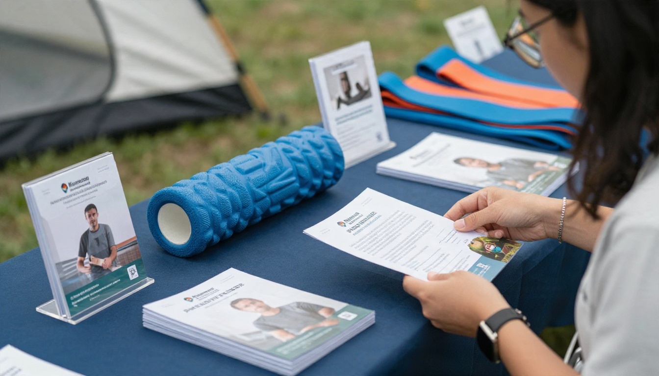
Rack cards are small, bold, and cheap. They fit in referral offices and gyms. Use a single photo, a one-line promise ("Back pain relief without surgery or pills"), three bullet benefits, and a QR code. Skip the long text.
The Booklet Template
Booklets are best for exercise programs and post-op plans. Think cover page, welcome page, a page per exercise block, a progress tracker, and a final contact page. They convert beautifully into page-turning flipbooks.
Clinic Brochure Examples in Practice
Here are two realistic scenarios showing how clinics put these pieces together.
Example: A Sports Rehab Clinic
A clinic near a high school builds a bi-fold titled "Back on the Field Faster." The front shows a teenager mid-stretch. Inside, a three-step plan explains evaluation, strengthening, and return-to-sport testing. A callout reads "Most athletes start with a free movement screen." The back panel has a QR code to book.
Result: coaches hand it to injured players, and parents arrive already knowing what to expect.
Example: A Senior Mobility Practice
A practice serving older adults produces a large-print tri-fold called "Stay Steady, Stay Independent." Fonts are 14 points or larger, contrast is high, and photos show seniors walking outdoors rather than clinical equipment. It includes a simple balance self-check and lists transportation options.
Result: adult children pick it up for their parents, and the clinic fills its weekly balance class.

⚠️ Warning: Never print a patient photo without a signed release. Use staff, licensed stock photos, or consenting volunteers. Also avoid promising outcomes like "cure" or "guaranteed relief," which can violate advertising rules in many states.
What to Write Inside
Good design gets the brochure picked up. Good words get the phone to ring.
Headlines That Get Opened
A strong headline names the problem or the result. Compare these:
| Weak Headline | Stronger Headline |
|---|
| Quality Physical Therapy Services | Back Pain Keeping You Up at Night? |
| Our Clinic | Walk Without Fear of Falling |
| Sports Rehab | Get Back to Your Sport in Weeks |
| Welcome | Your First Visit, Step by Step |
Calls to Action That Fill Schedules
Every panel set needs one clear action. Pick from these and use only one per brochure:
- Book an evaluation: "Scan to pick a time that works."
- Free movement screen: a low-risk offer for new patients.
- Call your doctor-referral line: useful for post-surgery programs.
- Download the exercise plan: best for digital versions.
Place the call to action on the back panel and repeat it once inside. Include direct access language if your state allows patients to book without a physician referral, since many people do not know they can.

Design Choices That Build Trust
- Colors: Teal, soft green, navy, and warm white feel calm and clinical without being cold.
- Photos: Real movement beats stock handshakes. Show people doing something.
- Fonts: One serif or sans for headings, one clean sans for body, 11 points minimum.
- White space: Leave room. Crowded panels look anxious.
How to Build One with Flipbooks AI
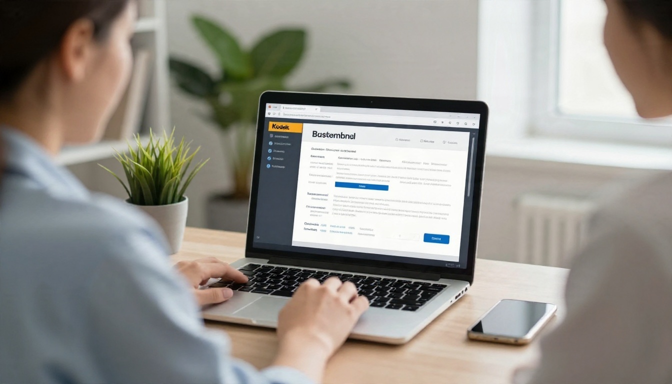
A PDF brochure is fine, but a flipbook is better. It opens fast on phones, turns pages like a real booklet, plays videos, and does not need a download. You can use the Brochure Flipbook Maker or the Online Brochure Designer to go from a finished file to a shareable page.
Upload and Convert
- Create your account. Go to Flipbooks AI and sign up.
- Upload your PDF. Drag in your tri-fold, bi-fold, or booklet. The PDF to Flipbook Converter turns each page into a flippable spread in seconds.
- Check the page order. For a tri-fold, put the outside spread and inside spread in the order patients will read them.
💡 Pro tip: Export your PDF at 150 to 300 DPI. Sharper images make exercise photos easier to read on phones.
Brand It Your Way
- Add your branding. Upload your logo, choose your clinic colors, and pick a page-turn effect that feels smooth rather than flashy.
- Add multimedia. Embed a 30-second video of a calf stretch or a short audio welcome from the lead therapist. Patients get a real sense of who they will see.
- Set a background. A soft neutral or a blurred clinic photo keeps focus on the pages.
Share It Everywhere
- Copy the direct link for text messages and appointment reminders.
- Use the embed code to place it on your site. The Embed Flipbook on Website page walks through it.
- Add password protection for post-surgery programs or employer-specific materials.
- Download for offline use so staff can show it on a tablet at a health fair with no Wi-Fi.
Track What Works
On the Professional plan you get analytics and lead generation. See which pages get read, which links get clicked, and capture an email before a reader opens your booklet. Compare pricing plans to see what fits a single clinic or a multi-location group.
| Feature | What It Does for a Clinic |
|---|
| No watermarks | Your brochure looks like your brand only |
| Unlimited flipbooks (Standard and up) | One for every service line |
| Password protection | Safe sharing of patient plans |
| Analytics (Professional) | See which topics get read |
| Lead capture (Professional) | Build a patient email list |
| Mobile-responsive | Reads well on any phone |
| Video and audio embeds | Exercise demos in the page |
If you list services and rates, the Digital Price List Generator can help you present self-pay packages cleanly, and the Spa & Wellness Menu Creator suits clinics that add massage or recovery-style services.
Mistakes to Avoid
Even good clinics trip on the same few issues.
- Too much text. If a panel has more than 60 words, cut it.
- Medical jargon. Write "shoulder pain" before "rotator cuff tendinopathy."
- No clear next step. If a reader has to hunt for your phone number, you lose them.
- Outdated info. Wrong hours or an old therapist's name makes the whole piece feel stale. Digital versions solve this fast.
- Ignoring accessibility. Use high contrast and large type, especially for senior-focused pieces.
- No tracking. If you cannot tell which brochure brought in a patient, add a unique QR code to each one.
✅ Best practice: Ask every new patient how they found you and record the brochure name. After three months, you will know which ideas deserve a reprint.
Ready to Publish Yours?
You now have eight brochure ideas, three templates, two real-world examples, and a repeatable way to turn them into something patients can read on any device. Pick one brochure, write it for one audience, and publish it this week.
Your patients are already looking for answers. A clear, well-built brochure makes sure they find yours.


