A patient sits in your waiting room for eleven minutes. In that time they will glance at their phone, look at the wall, and, if you are lucky, pick up a brochure. What that piece of paper says and how it looks decides whether they book the whitening consult or forget about it by the time they reach the car park. This article shows you real dental brochure examples, practical templates, design ideas and copy patterns that work, and how to turn any of them into a shareable digital version with Flipbooks AI.
Whether you run a one-chair family practice or a multi-location clinic, the same rules apply: be clear, be warm, and make the next step obvious.
Why Dental Brochures Still Work
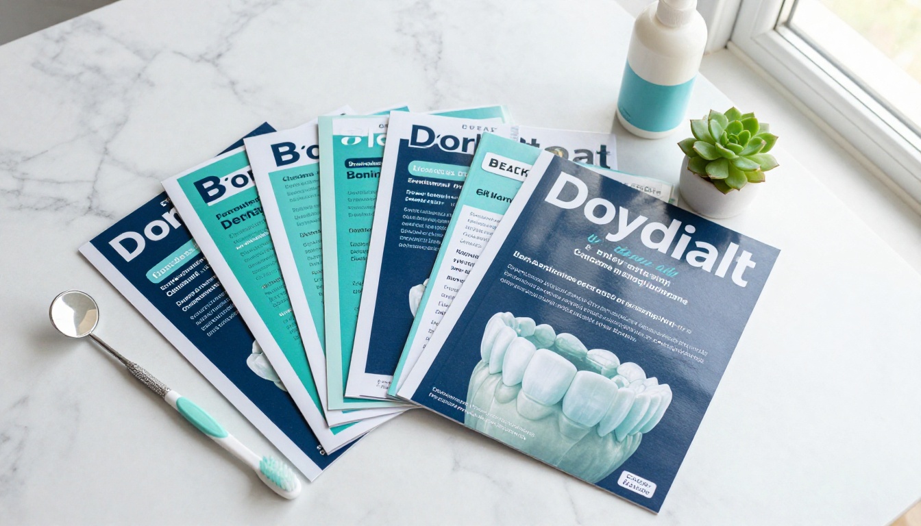
Dentistry is a trust business. People rarely choose a dentist from a single ad. They compare, ask friends, check reviews and, once inside the clinic, they look for proof that you are careful, modern and kind. A well-made patient brochure delivers that proof in about thirty seconds.
What Patients Actually Want
Ask ten patients what they want from a brochure and the answers repeat. They want to know:
- What will it feel like? Pain and anxiety sit behind most missed appointments.
- How long will it take? Treatment timelines matter more than technical names.
- What will it cost? Even a rough range, or a mention of payment plans, builds trust.
- Who will treat me? A friendly photo of the team beats any stock image.
- What do I do next? A phone number, a booking link, a QR code. One clear action.
If your brochure answers those five questions, you are already ahead of most clinics.
Print, Digital or Both
The old debate of paper against screen is a false choice. Paper works in the waiting room and at the front desk. A digital flipbook works in emails, text reminders, social bios and on your website. The same file can serve both.
| Format | Best Use | Strength | Weakness |
|---|
| Printed tri-fold | Waiting room, front desk, community events | Tangible, easy to hand over | Cost per run, hard to update |
| PDF download | Email attachments, new patient forms | Simple, familiar | Plain reading experience, no tracking |
| Digital flipbook | Website, social links, text follow-ups | Page-turn feel, mobile friendly, trackable | Needs a link or QR code to reach |
| Hybrid (print + QR) | Chairside, mailers, referral cards | Paper reach with digital depth | Requires a short setup |
💡 Pro tip: Put a small QR code on every printed brochure that points to the digital version. Patients keep the link long after the paper is gone.
Dental Brochure Examples to Borrow From
The best patient brochures are specific. A pediatric practice and a cosmetic studio should not look alike. Below are six example directions, each with the structure that makes it work.
General and Family Practice
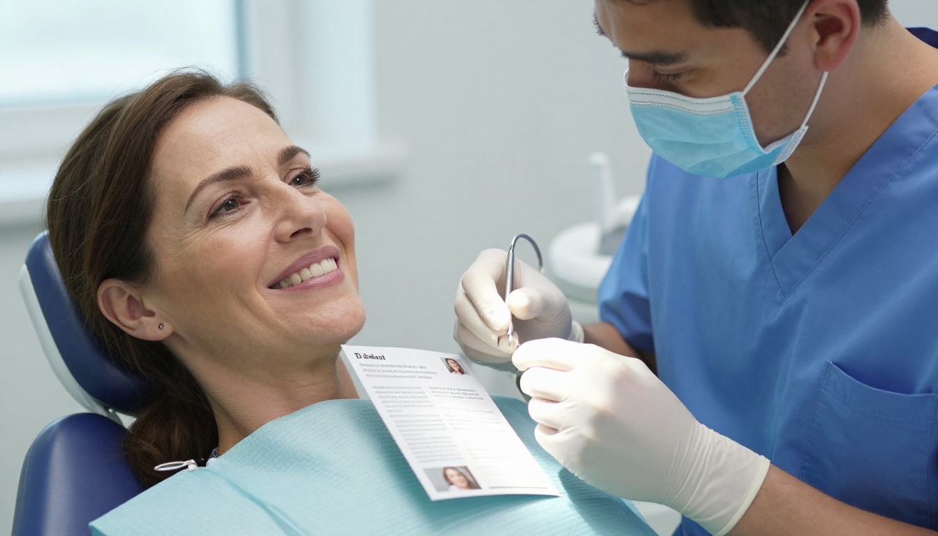
This is your all-rounder. The goal is to say "we look after everyone" without sounding generic.
- Front panel: A real photo of your team, a short promise such as "Gentle care for every age," and your logo.
- Inside spread: Three or four core services (checkups, fillings, hygiene, emergency visits) with one sentence each.
- Back panel: Opening hours, a map, insurance logos and a booking QR code.
Example scenario: A family clinic in a suburban area replaced a dense list of 22 services with six icons and short descriptions. Front desk staff reported that patients started asking about specific services by name, which shortened intake conversations.
Pediatric Dentistry
Parents read these. Children look at them. Design for both.
- Use soft, warm colors such as mint, butter yellow and sky blue.
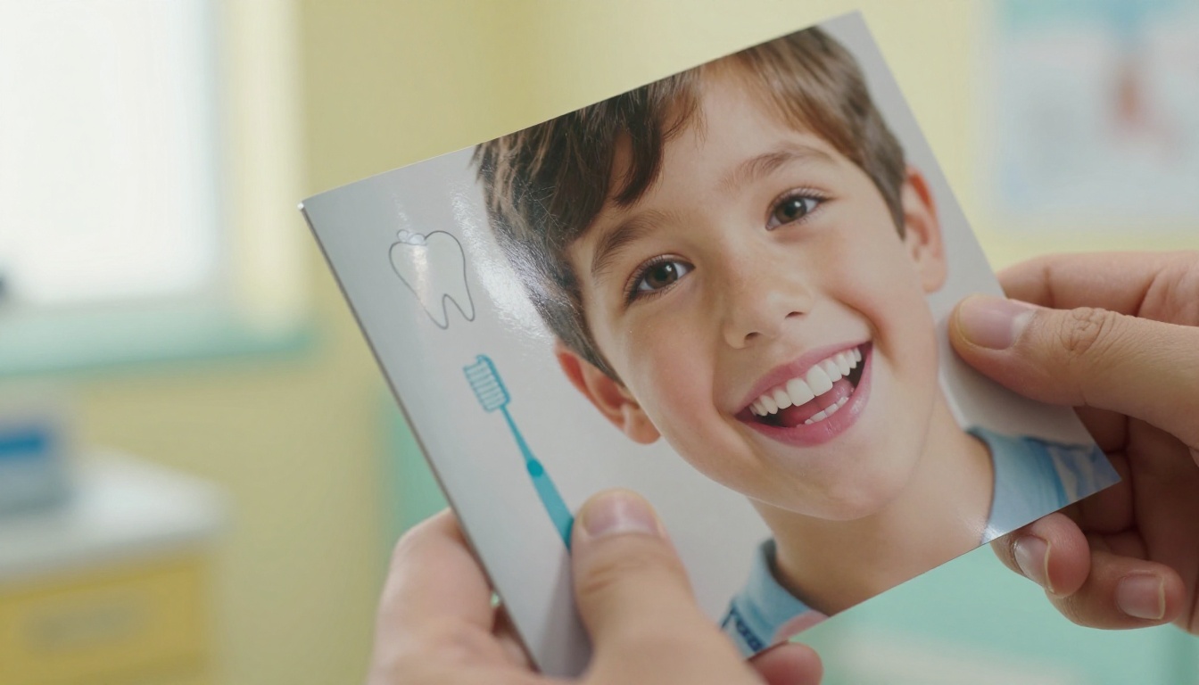
- Show real children (with consent) smiling, not clinical close-ups of teeth.
- Add a "What to expect at the first visit" panel, because the first visit is the biggest worry for parents.
- Include a small activity, like a brushing chart, as a reason to keep the brochure.
Cosmetic and Whitening
Here the product is a result, so lead with the result. Large photography, generous white space and restrained type signal quality.
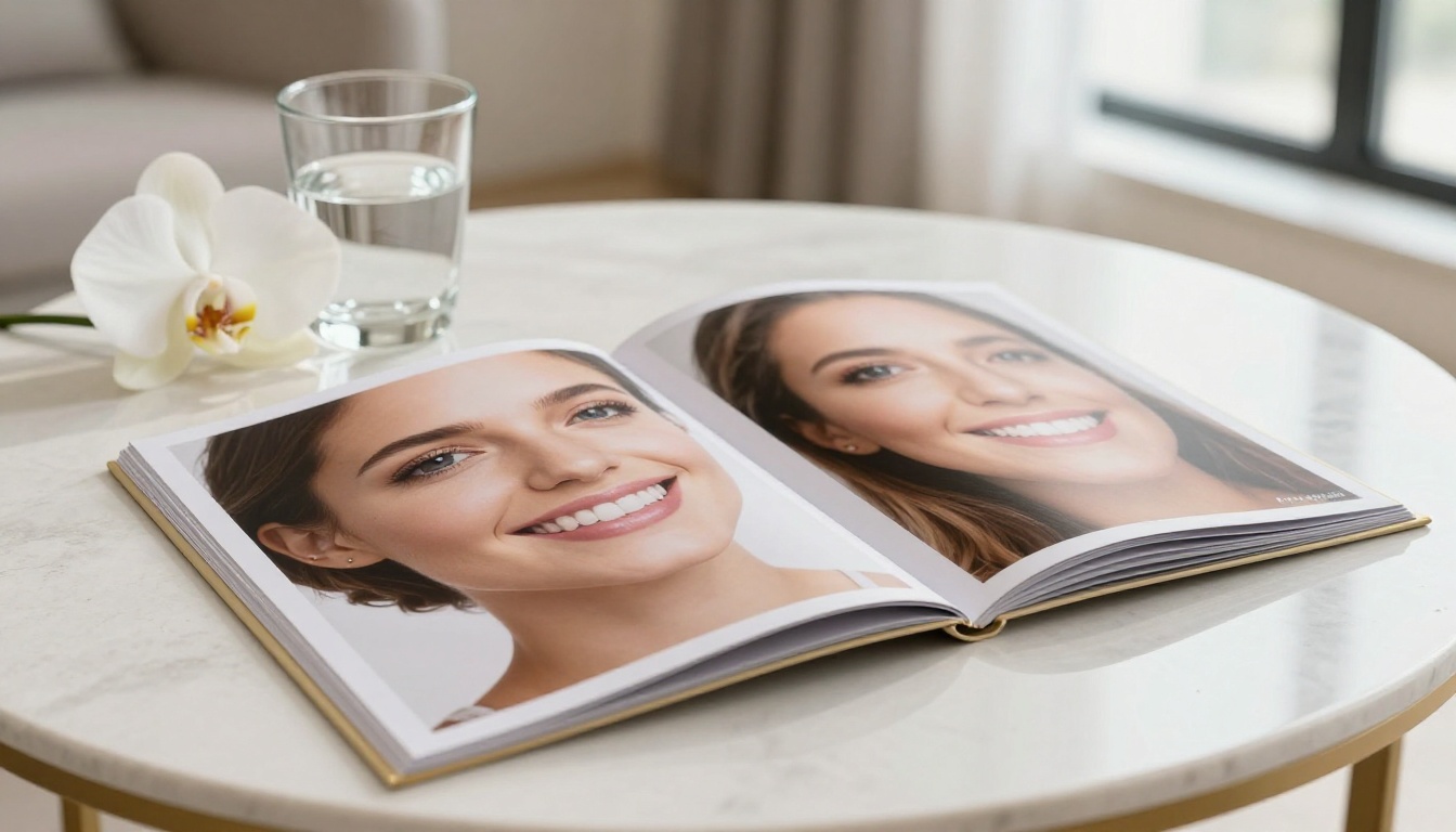
- Before and after spreads with consistent lighting and angles.
- Short patient quotes that name the outcome ("I stopped covering my smile in photos").
- A clear price signal, such as "Whitening packages from..." with a consult invitation.
⚠️ Warning: Check local advertising rules before publishing before and after photos. Many regions require written consent and clear disclaimers.
Orthodontics and Aligners
Teens and adults are often both audiences, so keep the tone flexible.
- Compare braces, clear aligners and retainers in a simple table.
- Show a timeline graphic from first scan to final fitting.
- Mention payment plans near the call to action, not buried at the back.
Implants and Restorative Care
These are high-value, high-worry decisions. Your brochure should slow the reader down and reassure them.
- Explain the process in numbered steps: consultation, scan, placement, healing, final crown.
- Use a calm, deep palette like navy and soft grey with one warm accent.
- Add a "Common questions" panel covering pain, recovery time and lifespan.
Anxious Patient Care
A growing number of clinics build a brochure just for nervous patients. It may be the most useful one you make.
- Open with empathy: "You are not the only one who feels this way."
- List comfort options such as headphones, breaks on request, numbing options and sedation where offered.
- Keep imagery quiet and human. No drills, no needles.
Side by Side: Which Example Fits Your Practice
| Brochure Type | Primary Audience | Tone | Hero Image | Call to Action |
|---|
| Family practice | Households | Friendly, steady | Team photo | Book a checkup |
| Pediatric | Parents | Playful, reassuring | Smiling child | Schedule a first visit |
| Cosmetic | Adults 25 to 55 | Polished, confident | Smile close-up | Request a consult |
| Orthodontic | Teens and parents | Upbeat, clear | Aligner or brace detail | Free assessment |
| Implants | Adults 45+ | Calm, expert | Clinician with patient | Talk to the dentist |
| Anxious patient | Nervous adults | Gentle, honest | Relaxed waiting room | Call for a quiet visit |
Layouts and Templates That Work
Most dental brochures fall into three formats. Pick the one that matches how much you have to say and where it will be used.
The Tri-Fold Template
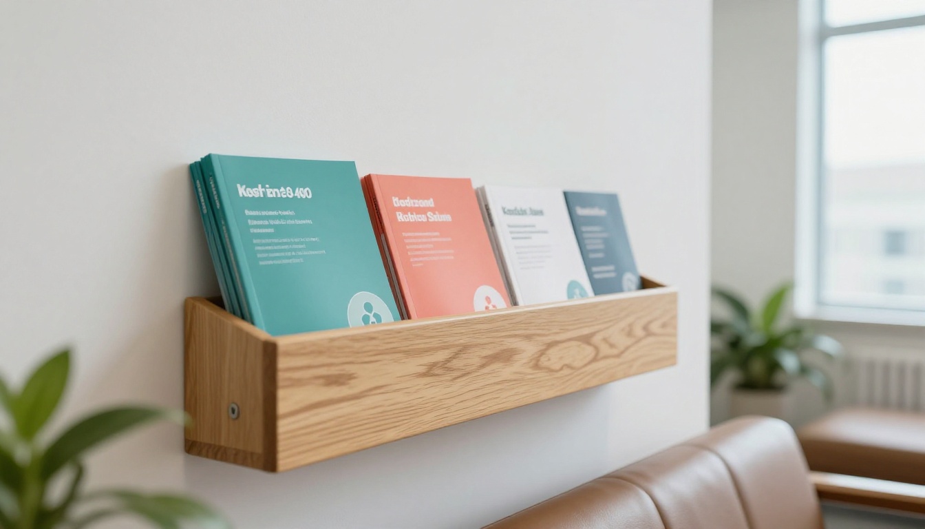
The classic. Six panels, easy to read and cheap to print.
- Outer front: Brand, promise, hero image.
- Inner left: Who you are and what makes the practice different.
- Inner center: Services or the main treatment story.
- Inner right: Proof, such as reviews, awards or before and after images.
- Outer back: Contact details, hours, map, QR code.
- Flap panel: A short offer or first-visit invitation.
The Bi-Fold Template
Four panels. Cleaner and more premium, which makes it ideal for cosmetic and implant work. Use big images and fewer words. One treatment per brochure often performs better than a list of everything.
The Booklet or Welcome Pack
Eight pages or more. Use it for new patient packs: forms, policies, treatment explanations, payment options and aftercare notes. This format benefits most from going digital, because patients can open it at home before the first appointment.
| Layout | Panels or Pages | Word Count Range | Best For | Print Cost |
|---|
| Tri-fold | 6 panels | 200 to 350 | General overview | Low |
| Bi-fold | 4 panels | 100 to 200 | One treatment, premium look | Low to medium |
| Booklet | 8 to 24 pages | 600 to 2,000 | Welcome pack, treatment plans | Medium to high |
| Digital flipbook | Unlimited | Flexible | Websites, emails, QR links | Minimal |
✅ Best practice: Keep your tri-fold under 350 words. If you need more room, move the detail to a digital flipbook and link to it.
Design Ideas That Build Trust
Good design in a clinic is quiet. It should feel clean, organized and kind, the same way your treatment room should.
Color That Calms
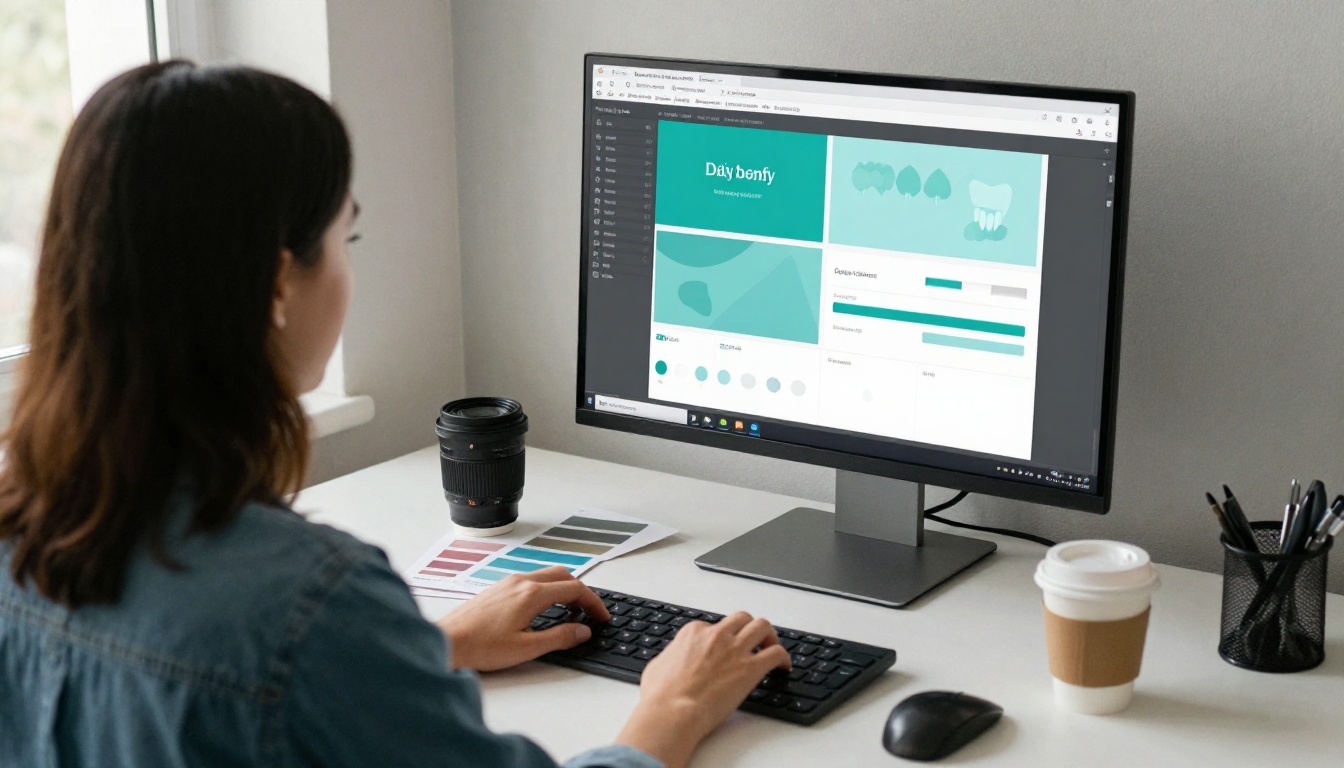
Blue and teal remain popular because they suggest cleanliness and calm. Green says fresh and natural. White gives breathing room. Warm accents like coral or soft gold add personality without shouting.
- Choose two main colors and one accent. More than that looks busy.
- Avoid harsh red as a dominant color. It can recall blood and alarm.
- Check contrast. Body text should be dark grey or navy on a light background for easy reading.
Photography Over Stock Icons
Real photos of your reception, your team and your treatment rooms outperform generic imagery. Patients want to see where they will sit. If a professional shoot is out of budget, use natural light, tidy the space and take photos on a good phone.
- Use people smiling naturally, not posed with perfect teeth.
- Keep backgrounds uncluttered.
- Show hands and tools sparingly; patients prefer faces.
Type and Copy That Sound Human
Choose one clean sans-serif for body text and, if you like, one friendly serif or rounded font for headings. Then write the way you speak at the chair.
| Instead of | Try |
|---|
| "We provide comprehensive oral healthcare solutions" | "We look after your teeth, gums and smile." |
| "Periodontal therapy" | "Treatment for gum disease" |
| "Utilize our online scheduling portal" | "Book online in under a minute." |
| "Sedation modalities available" | "Options to help you feel relaxed." |
💡 Pro tip: Read your draft aloud. If you would not say a sentence to a nervous patient, rewrite it.
Calls to Action That Get Used
Every panel does not need a button, but the back panel must. Offer one primary action (book) and one secondary (call or message). Add a QR code, a short URL and a phone number. Make the type at least 12 points so older patients can read it without effort.
Build a Digital Dental Brochure with Flipbooks AI
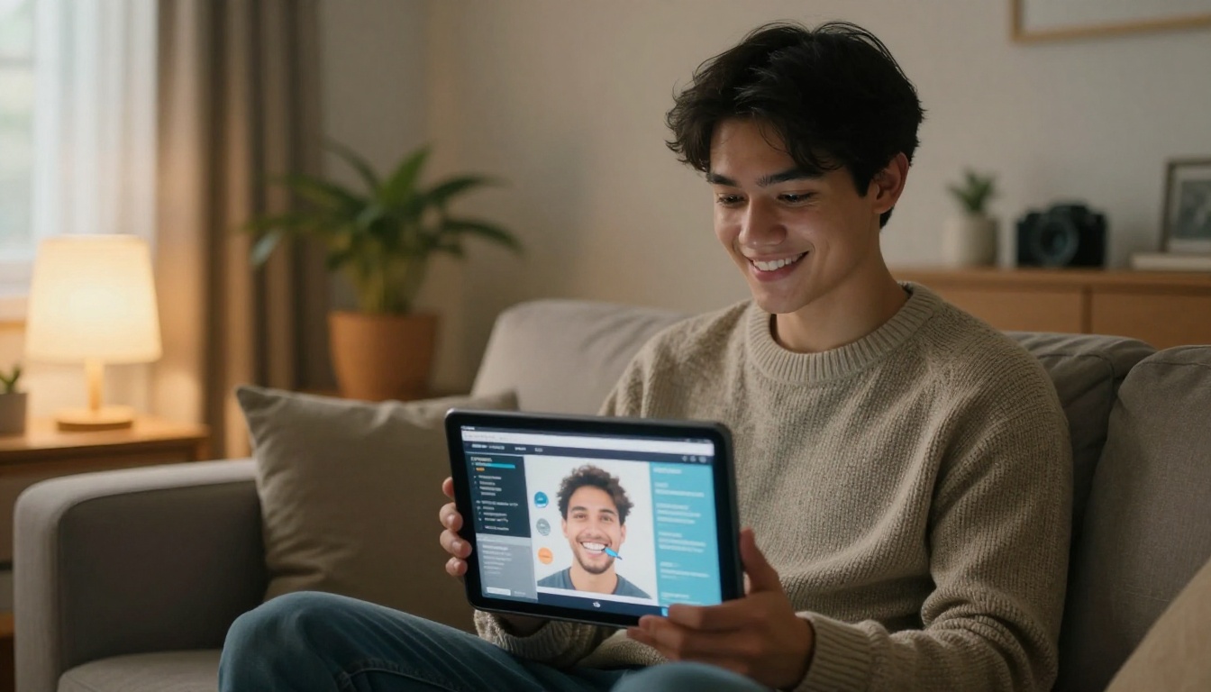
Printed brochures are great in the clinic, but they stop working the moment a patient walks out. A digital version lives in your email signature, your social profile and your appointment reminders. The steps below take a finished PDF and turn it into an interactive page-turning flipbook.
Step by Step
- Open your account. Go to Flipbooks AI and sign up. You can start free and review the pricing plans when you are ready to publish more.
- Prepare your PDF. Export your brochure from your design tool (Canva, Adobe InDesign, Word or any editor). Use single pages for a booklet, or export tri-fold panels in reading order.
- Upload and convert. Drop the file into the PDF to Flipbook Converter. Your pages become a page-turning flipbook in moments.
- Customize the look. Add your clinic logo, set brand colors, choose page-turn effects and pick a background that matches your waiting room palette. The Brochure Flipbook Maker and Online Brochure Designer are useful starting points.
- Add multimedia. Embed a short welcome video from the dentist, or an audio note that explains what happens at a first visit. Videos and audio can be dropped straight into pages.
- Protect private content. Use password protection for patient-only welcome packs, treatment plans or internal training material.
- Share it everywhere. Copy the direct link for text messages and email, or use the Embed Flipbook on Website tool to place it on your services page. Download an offline copy for events and tablets in the waiting room.
- Track and follow up. On the Professional plan you get analytics and lead generation, so you can see which pages are read most and capture contact details from interested visitors.
Every flipbook is mobile responsive, carries no watermarks, ever, and the Standard plan and above allows unlimited flipbooks. That means you can publish one brochure per service without worrying about limits.
💡 Pro tip: Create a separate flipbook for each treatment (whitening, aligners, implants). Send the matching link right after a consultation so the patient has the right information at the right moment.
Where Each Version Fits
| Version | Where It Lives | Who Sees It | Tracking |
|---|
| Printed brochure | Front desk, waiting room | Walk-in patients | None |
| Flipbook link | Email, SMS, social bio | Existing and new patients | Page views (Professional plan) |
| Embedded flipbook | Website service pages | Search visitors | Page views and leads (Professional plan) |
| Password flipbook | Welcome pack, forms | New patients only | Controlled access |
Related tools can help if your practice also publishes other material. A spa-style cosmetic studio might look at the Spa and Wellness Menu Creator for a treatment price list, or the Digital Price List Generator for fee schedules. You can browse everything in the flipbook tools directory.
Getting the Team on Board
A brochure only works if people use it. Staff are your best distribution channel, so involve them from the first draft.

Here is a simple rollout that works for small clinics:
- Week 1: Collect the five most common patient questions from front desk and hygienists.
- Week 2: Draft copy that answers those questions in plain language.
- Week 3: Design, proof and approve. Ask two patients to read it and tell you what is unclear.
- Week 4: Print a short run, publish the flipbook, add the QR code, and brief the team on when to hand it out.
Hand-out moments that work:
- At check-in, for new patients.
- After a hygiene visit, for the next-step treatment.
- After a consultation, with the flipbook link sent by text.
- At community events, schools and local businesses.

Mistakes That Waste Your Print Budget
Even good clinics fall into the same traps. Watch for these:
- Trying to say everything. A brochure that lists 30 services says nothing. Choose a focus.
- Clinical language. Words like "prophylaxis" and "occlusion" push readers away. Use plain terms.
- Tiny text. If your patient has to hold the page at arm's length, they will put it down.
- Dated information. Wrong hours, an old phone number or a dentist who left last year damages trust fast. This is where a digital flipbook beats print: update the PDF and the link stays the same.
- No clear next step. Always finish with one obvious action.
- Stock photos of perfect models. Real people feel more honest.
- Ignoring privacy and advertising rules. Get written consent for patient photos and check local regulations before publishing claims or results.
⚠️ Warning: Never publish identifiable patient photos or testimonials without signed consent. Keep copies on file.
A Quick Checklist Before You Print
| Check | Pass If |
|---|
| Headline | Says one clear benefit in under 10 words |
| Photos | Real, bright, and consented |
| Body text | At least 11 to 12 points, high contrast |
| Contact details | Phone, address, hours and booking link all verified |
| QR code | Scans correctly on two different phones |
| Proof | Includes reviews, credentials or years of experience |
| Call to action | One main action on the back panel |
Ready to Build Yours?
A great dental brochure does not need a big agency or a long project. It needs a clear focus, honest photos, plain language and a simple next step. Pick the example above that matches your practice, sketch it on a tri-fold or bi-fold template, and then give it a second life online.
Ready to publish your first patient brochure? Create your free account on Flipbooks AI and convert your PDF in minutes. Want more control over analytics, lead capture and unlimited flipbooks? Compare the pricing plans and choose what suits your practice. And if you want inspiration for other formats, browse all the flipbook tools and templates to find the right fit for every service you offer.



