A brochure gets about three seconds before someone decides to read it or put it down. In those three seconds, nobody admires your logo or your clever copy. They squint, or they don't. Font size is the first thing a reader judges, and it quietly decides whether your message lands. This article gives you exact numbers for headings, body text, captions and fine print, shows how print and screen differ, and finishes with a tutorial on publishing a readable digital version with Flipbooks AI.
Why Font Size Decides Everything
Most brochure problems that look like "bad design" are really size problems. Text that is too small tires the eye. Text that is too large wastes space and makes the layout feel childish. The goal is a comfortable middle that matches your audience, your paper and the place where the brochure is read.
What Readers Actually Do
Readers do not read brochures from top to bottom. They scan: headline first, then images, then subheads, and only then a paragraph that caught their interest. That means each size level has a different job:
- Headline: stops the scan.
- Subheads: let the reader jump to what matters.
- Body text: delivers the detail to people who already care.
- Captions and fine print: support, never compete.
If those levels look too similar, the scan fails and the page reads as a gray block.
Points, Pixels and Viewing Distance
Print uses points (pt). One point is 1/72 of an inch. Screens use pixels (px), and in CSS one point equals roughly 1.33 px. So 12 pt is about 16 px. A printed brochure is held about 30 to 40 cm from the eyes. A phone sits closer but has a tiny viewport, and a monitor sits farther away. Size has to follow distance.
💡 Pro tip: Set your page at 100% scale and print one copy on your office printer before anything else. A screen at 200% zoom lies to you about how small text really is.
Headings That Pull People In
Main Headline Sizes
For a tri-fold or A4 brochure, the main headline works best between 28 and 48 pt on panels, and up to 60 pt on a full cover page spread. A narrow panel of about 9 cm cannot hold a 60 pt line without awkward breaks, so check how many words fit per line. Two or three lines is a healthy limit.
Short headlines win. If you need more than eight words, drop the size one step and keep the weight bold rather than shrinking the whole line.
Subheads and Hierarchy
Subheads should sit clearly between the headline and body text. A simple rule: make each level 1.25 times larger than the one below it. This is called a modular scale, and it gives a layout a calm, organized rhythm without any guesswork.
Here is what that scale looks like when body text is 10 pt:
| Level | Multiplier | Size (print) | Typical use |
|---|
| Body text | 1.00 | 10 pt | Paragraphs, lists |
| Subhead (H3) | 1.25 | 12.5 pt | Short labels inside a section |
| Section head (H2) | 1.56 | 16 pt | Panel or section titles |
| Large head (H1) | 1.95 | 20 pt | Page titles |
| Headline | 3.0 to 4.0 | 30 to 40 pt | Cover or hero statement |
You can scale the whole table up or down. If your body copy goes to 11 pt, multiply every row by 1.1 and the relationships stay intact.
✅ Best practice: Use no more than three or four distinct sizes in a single brochure. More than that, and the page starts to look like a ransom note.
Body Text Sizes That Work
Print Body Text Ranges
For most printed brochures, body text between 9 and 11 pt is the sweet spot. Within that range, the typeface matters, because two fonts at the same point size can look very different. A font with a tall x-height (the height of lowercase letters like "x" and "e") looks larger than one with a short x-height.
| Audience | Recommended body size | Notes |
|---|
| General consumers | 10 to 11 pt | Safe default for most layouts |
| Corporate or technical | 9 to 10 pt | Works with tight columns and good contrast |
| Seniors or healthcare | 12 to 14 pt | Larger size, higher contrast, extra spacing |
| Children or education | 12 to 16 pt | Simple, open letterforms |
| Luxury or fashion | 8.5 to 10 pt | Only with high-quality paper and generous margins |
Leading and Line Length
Size alone does not make text readable. Two other settings matter just as much.
- Leading (line spacing): set it to 120 to 145% of the font size. For 10 pt text, that means 12 to 14.5 pt leading. Tight leading makes lines collide, and loose leading breaks the paragraph apart.
- Line length: aim for 45 to 75 characters per line, with 66 as the classic target. A narrow brochure panel often lands there naturally, which is one reason tri-folds read so comfortably.
- Paragraph spacing: add space between paragraphs rather than indenting, especially in short blocks.
Captions, Footnotes and Fine Print
Captions can drop to 8 or 9 pt. Legal text and fine print should not go below 7 pt, and only if the paper is smooth and the contrast is strong. Anything under 6 pt tends to fill in with ink on uncoated stock and becomes unreadable. If a legal line matters to the customer, give it room.
⚠️ Warning: Regulations in some industries, such as finance, food labeling and healthcare, set minimum text sizes. Check the rules for your sector before you shrink anything.
Print vs Screen Differences
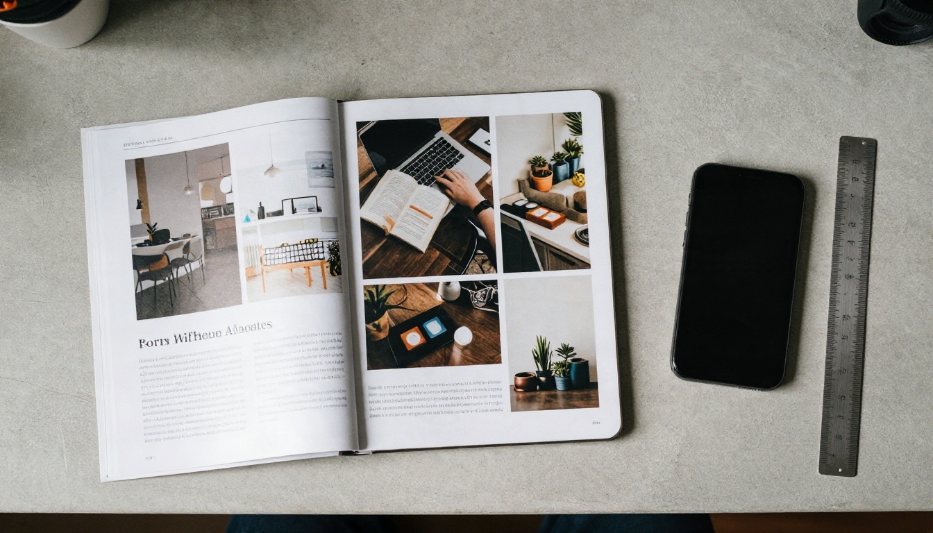
Why Screens Need Larger Type
Paper reflects light, while screens emit it. Paper at 300 dpi or higher also has far finer detail than a typical display. That is why 10 pt text feels crisp on a page and fuzzy on a monitor. As a result, text that works in print usually needs to be about 20 to 30% larger on screen to feel equally comfortable.
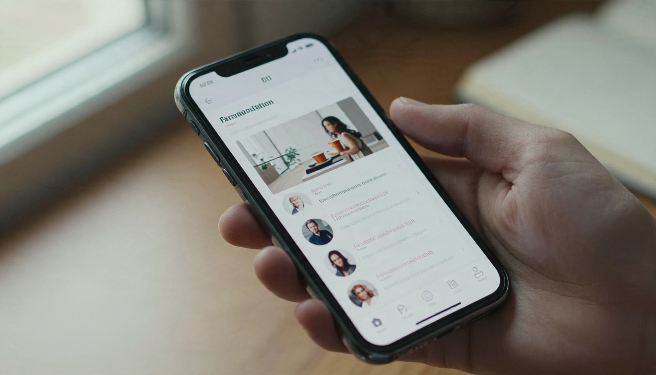
Phones add another twist. People hold them close, but the viewport is narrow, so every line break matters. The body text floor for mobile is 16 px (about 12 pt). Anything smaller forces readers to pinch and zoom, and many will simply leave.
Brochure Sizes by Format
Use this table as a starting point. It assumes a standard sans serif or serif typeface with a medium x-height.
| Element | Print (pt) | Desktop screen (px) | Mobile screen (px) |
|---|
| Headline | 30 to 48 | 40 to 56 | 28 to 36 |
| Section head | 16 to 22 | 24 to 32 | 20 to 26 |
| Subhead | 12 to 14 | 18 to 22 | 18 to 20 |
| Body text | 9 to 11 | 16 to 18 | 16 to 18 |
| Caption | 8 to 9 | 13 to 14 | 13 to 14 |
| Fine print | 7 minimum | 12 minimum | 12 minimum |
Notice that mobile headlines are actually smaller in pixels than desktop headlines. A 56 px headline on a 375 px wide phone breaks into one or two words per line. Scale headings to the width you have, not the width you wish you had.
Readability Tips That Actually Help
Contrast and Color
Size gets text noticed, and contrast keeps it readable. The WCAG accessibility standard sets a ratio of 4.5:1 for body text and 3:1 for large text (18 pt or 14 pt bold and up). Black on cream or dark charcoal on white easily clears that bar. Light gray on white, or white on pastel colors, usually does not.
- Avoid placing body text over busy photos. If you must, add a solid or semi-transparent panel behind it.
- Skip pure black on pure white for long passages. A soft black (such as #1A1A1A) reduces glare.
- Reversed text (light on dark) needs about one point more size and slightly looser spacing than dark on light.
Choosing Typefaces

The typeface can make 10 pt feel like 12 pt, or the other way around. Look for these traits:
- Large x-height: letters stay open and clear at small sizes.
- Open counters: the holes in "a", "e" and "o" do not close up.
- Distinct letterforms: a capital "I", a lowercase "l" and a numeral "1" should look different.
- Multiple weights: regular, medium and bold give you hierarchy without adding a second family.
Stick to two typefaces at most. A common pairing is a serif for body text and a sans serif for headings, or a single versatile family in several weights.
| Style | Works well for | Watch out for |
|---|
| Serif | Long body text in print | Thin strokes can blur on low-resolution screens |
| Sans serif | Headings, screens, small text | Can feel cold in long paragraphs |
| Script or decorative | One short phrase | Illegible at small sizes, never for body text |
| Condensed | Tight captions and labels | Fatiguing in paragraphs |
Three Quick Tests
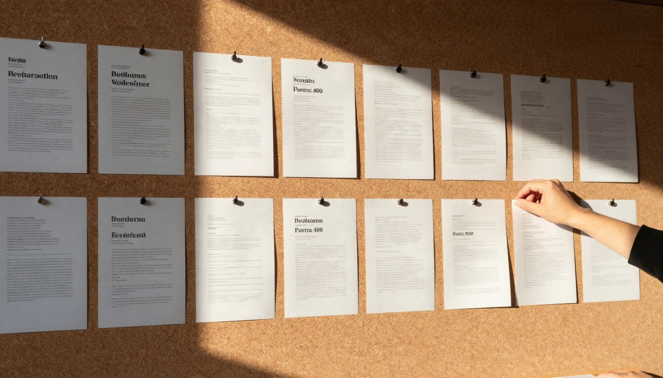
Before you send a file to the printer or publish it online, run these checks:
- The arm's length test. Hold the printed page at arm's length. Can you still tell the headline from the subheads?
- The squint test. Squint until the page blurs. You should still see a clear order: headline, image, subheads, body.
- The tired reader test. Hand the proof to someone over 50 and ask them to read a paragraph without glasses if they normally wear them. Their reaction is more useful than any rule.
💡 Pro tip: Print three versions of the same page at 9, 10 and 11 pt, pin them side by side and ask five people which is easiest to read. Real opinions beat theory every time.
How to Publish a Readable Digital Brochure
Print reaches people who pick it up. A digital brochure reaches everyone else, and it solves the biggest problem of small print: readers can zoom in. With Flipbooks AI, you can turn a finished PDF into a page-turning flipbook that works on phones, tablets and desktops. Here is the process.
Upload and Convert
- Export your brochure as a high-resolution PDF (150 dpi or more, with fonts embedded). Use the sizes from the table above.
- Go to Flipbooks AI and create a free account.
- Upload the PDF with the PDF to Flipbook Converter. The pages convert in seconds and keep your typography sharp.
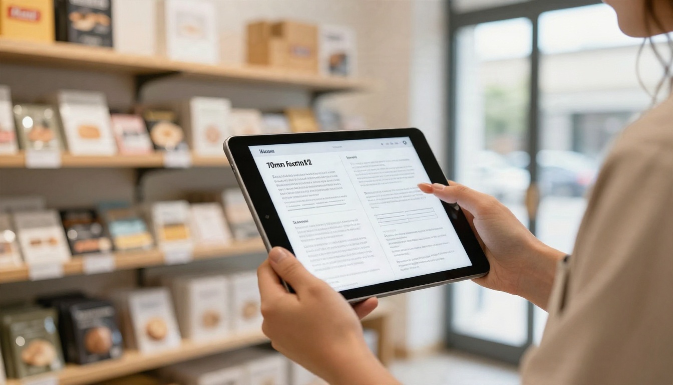
- Preview on desktop and phone, and check that body text is legible without zooming on both.
If you are building from scratch, the Online Brochure Designer and the Brochure Flipbook Maker give you a faster route. For specific industries, try the Hotel Brochure or Real Estate Brochure tools.
Customize and Share
Once the flipbook is live, tune it for readers:
- Branding: add your logo, brand colors and a custom background so the page feels like yours. There are no watermarks, ever.
- Page effects: choose the page-turn style and zoom behavior that suits your content.
- Multimedia: embed videos and audio to explain detail that would otherwise need small text.
- Mobile-responsive design: the flipbook adapts to each screen, so readers can zoom on a phone without breaking the layout.
- Sharing: copy a direct link, or use an embed code to place the brochure on your site with the Embed Flipbook on Website tool.
- Password protection: lock private brochures such as price lists or investor material.
Teams that need numbers can use analytics and lead generation on the Professional plan. See how readers move through pages, where they stop and which sections they zoom into. That is useful feedback on whether your font sizes are working. Offline downloads let readers save the brochure for later. Compare options on the pricing page.
| Feature | Why it helps readability | Plan |
|---|
| Zoom and full-screen view | Readers enlarge small text themselves | All plans |
| Mobile-responsive layout | Pages fit each device | All plans |
| Embedded video and audio | Replaces dense explanatory text | All plans |
| Analytics | Shows which pages hold attention | Professional |
| Lead generation | Captures contacts from engaged readers | Professional |
| Offline downloads | Reading on paper or without internet | Available |
Common Mistakes
Even experienced designers repeat the same errors. Check your layout against this list:
| Mistake | Why it hurts | Fix |
|---|
| Body text under 9 pt | Tires the eye, loses older readers | Move to 10 pt and trim copy |
| One size for everything | No scan path, reads as a wall of text | Use a clear scale with 3 or 4 levels |
| Tight leading | Lines blur together | Set leading at 120 to 145% |
| Long lines across wide pages | Eyes lose their place | Use columns of 45 to 75 characters |
| Light gray text | Low contrast, fails accessibility | Use dark text at 4.5:1 or better |
| Print sizes copied to mobile | Forces pinching and zooming | Raise body to 16 px minimum |
| Too many fonts | Looks unfocused | Keep to two typefaces |
⚠️ Warning: Cutting a paragraph is nearly always better than cutting the font size. If copy does not fit at a readable size, the copy is too long.
A short checklist to run before every release:
- Headline readable from 1 meter away.
- Body text between 9 and 11 pt in print, 16 px or more on screen.
- Leading at least 120%.
- Contrast ratio at 4.5:1 or higher.
- Two typefaces, three or four sizes.
- Proof printed and tested on a real person.
Ready to Publish Yours?
Good typography is mostly restraint: a few sizes, honest spacing and enough contrast that nobody has to try hard. Set your headline between 30 and 48 pt, body text between 9 and 11 pt, raise everything by roughly a quarter for screens, and test on a real reader before you hit print.
When your layout is ready, create your free Flipbooks AI account and publish it as an interactive brochure that readers can zoom, share and revisit. Browse the full set of flipbook tools to find a template for your industry, or compare pricing plans to see which one fits your team.


