A customer opens your WhatsApp catalogue, sees a sweater with the sleeves chopped off, and scrolls away. It takes about two seconds, and you never find out it happened. The fix is rarely a better camera. It is the right WhatsApp catalogue image size, a tidy photo setup, and a layout that looks the same on every phone. This article gives you exact dimensions, design ideas that work for real shops, and a way to pair your in-app catalogue with a polished PDF built on Flipbooks AI.
Why Image Size Matters
WhatsApp Business shows each product as a square thumbnail in the catalogue grid. Whatever you upload gets cropped, scaled and compressed to fit that box. If your photo is tall, wide or tiny, the app decides what to cut. It will not decide in your favour.

What Customers Actually See
Most buyers browse on a phone, one thumb, often on mobile data. They see a grid of small squares first and only tap into a product when something catches their eye. That means your first image carries the whole sales job. It has to be readable at thumbnail size.
The Cost of a Bad Crop
A wrongly sized image creates three problems:
- Cut off products: a long dress or a tall bottle loses its top or bottom.
- Blurry results: small files get stretched and look soft.
- Uneven grids: mixed shapes make the catalogue look unplanned, and shoppers read that as an unreliable shop.
💡 Pro tip: Open your own catalogue on a friend's older phone. If your product is still clear on a small, cheap screen, your sizing is working.
The Best WhatsApp Catalogue Size
The short answer: shoot and export square, 1:1 images. A safe target is 1080 x 1080 pixels. It is sharp on high resolution screens, light enough to load quickly, and the same shape as the thumbnail grid.
Recommended Pixel Dimensions
| Use | Recommended size | Ratio | Notes |
|---|
| Product photo (main) | 1080 x 1080 px | 1:1 | Best all round choice |
| Minimum acceptable | 500 x 500 px | 1:1 | Looks soft on large phones |
| Extra product angles | 1080 x 1080 px | 1:1 | Keep the same shape as image one |
| Business profile photo | 640 x 640 px | 1:1 | Displayed inside a circle |
| Status or promo image | 1080 x 1920 px | 9:16 | Full screen vertical |
Going far above 1080 pixels adds file weight without a visible gain on a phone. Going far below 500 pixels is where blur begins.
File Format and Weight Limits
Use JPG for photos and PNG only when you need a transparent or flat graphic background. WhatsApp has set limits on file size per image (around 5 MB at the time of writing) and on how many products a catalogue can hold, so check the current numbers inside the Business app before a large upload. Aim for 200 KB to 800 KB per photo. That is small enough to load instantly and large enough to stay crisp.
| Format | Best for | File size | Quality |
|---|
| JPG | Product photos, food, fashion | Small | Very good |
| PNG | Logos, flat graphics, text overlays | Medium to large | Excellent |
| WebP | Not always accepted, so convert it | Small | Very good |
⚠️ Watch out: Screenshots of your own phone are often tall rectangles. Crop them to a square before you upload, or the app will crop them for you.
Shooting Photos That Fit
Size is half the work. The other half is what happens inside the square.
Light and Background
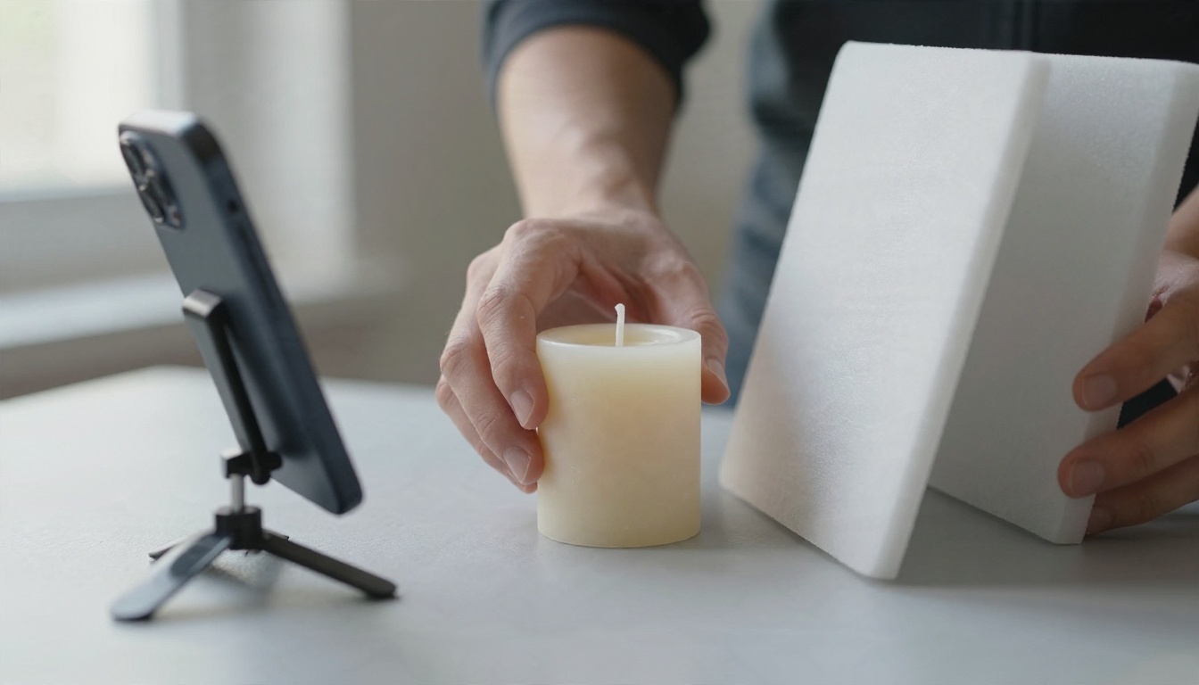
You do not need a studio. Put a table beside a window, hang a sheet of pale grey or white paper behind the product, and place a white foam board opposite the window to bounce light back into the shadows. Turn off the room lights, because mixed colour temperatures make whites look yellow.
A simple setup list:
- A window with soft, indirect light.
- A plain background, such as paper, linen or a wooden board.
- A phone on a small tripod or propped on books.
- A white reflector, which can be a sheet of foam board.
- A clean lens. Wipe it with a soft cloth first.
Framing for the Square
Think of the square before you press the shutter. Switch your camera app to 1:1 so you can see the final crop live. Leave about 10 percent breathing room around the product so rounded corners and app overlays do not clip it.
- Centre single products and fill about 70 to 80 percent of the frame.
- For tall items, shoot slightly from a distance and step back rather than tilting the phone.
- Use the same distance, angle and background across the whole catalogue.

Design Ideas That Sell
A catalogue is a shop window that fits in a pocket. These ideas keep it clean without extra apps.
Fashion and Boutique Layouts
For clothing, use image one as a clean front view on a plain background. Use image two for a detail shot, such as stitching or fabric. Use image three for the item worn. Keep colours consistent so the grid looks like a lookbook. For a larger collection, a digital Fashion Catalog lets you show full outfits that a square thumbnail cannot hold.
Jewellery and Small Items
Small products fail when they are tiny in the frame. Fill the square, use a dark slate or neutral tile so metal pops, and add a macro detail as your second image. A hand holding the piece gives instant scale, which cuts down on "how big is it?" messages.

Food and Bakery Photos
Food needs warmth and texture. Shoot near a window, slightly from above at about 45 degrees, and show the product in a natural moment: a croissant torn open, a cake slice on a plate. Keep the price and weight in the description and keep text off the photo.

Furniture and Home Pieces
Large items need context. Use a wide first image showing the piece in a room so the buyer can judge size, and a second close up of the material. State the dimensions in the description, not on the image.

✅ Best practice: Put your most popular items in the first row. Buyers rarely scroll past the first six products.
Real Examples by Business Type
These patterns come up again and again among small sellers who run their shops through chat.
| Business | First image | Second image | Description starts with |
|---|
| Clothing boutique | Front view on plain wall | Fabric detail | Sizes and colours |
| Bakery | Product on marble | Sliced or opened view | Weight and ordering deadline |
| Jewellery | Close up on slate | Worn on a hand | Material and length |
| Furniture | Staged in a room | Material close up | Dimensions in cm |
| Skincare | Bottle on pale background | Ingredient flat lay | Volume and skin type |
| Textiles and crafts | Folded stack | Pattern detail | Size and care |
Example: A Market Stall Owner
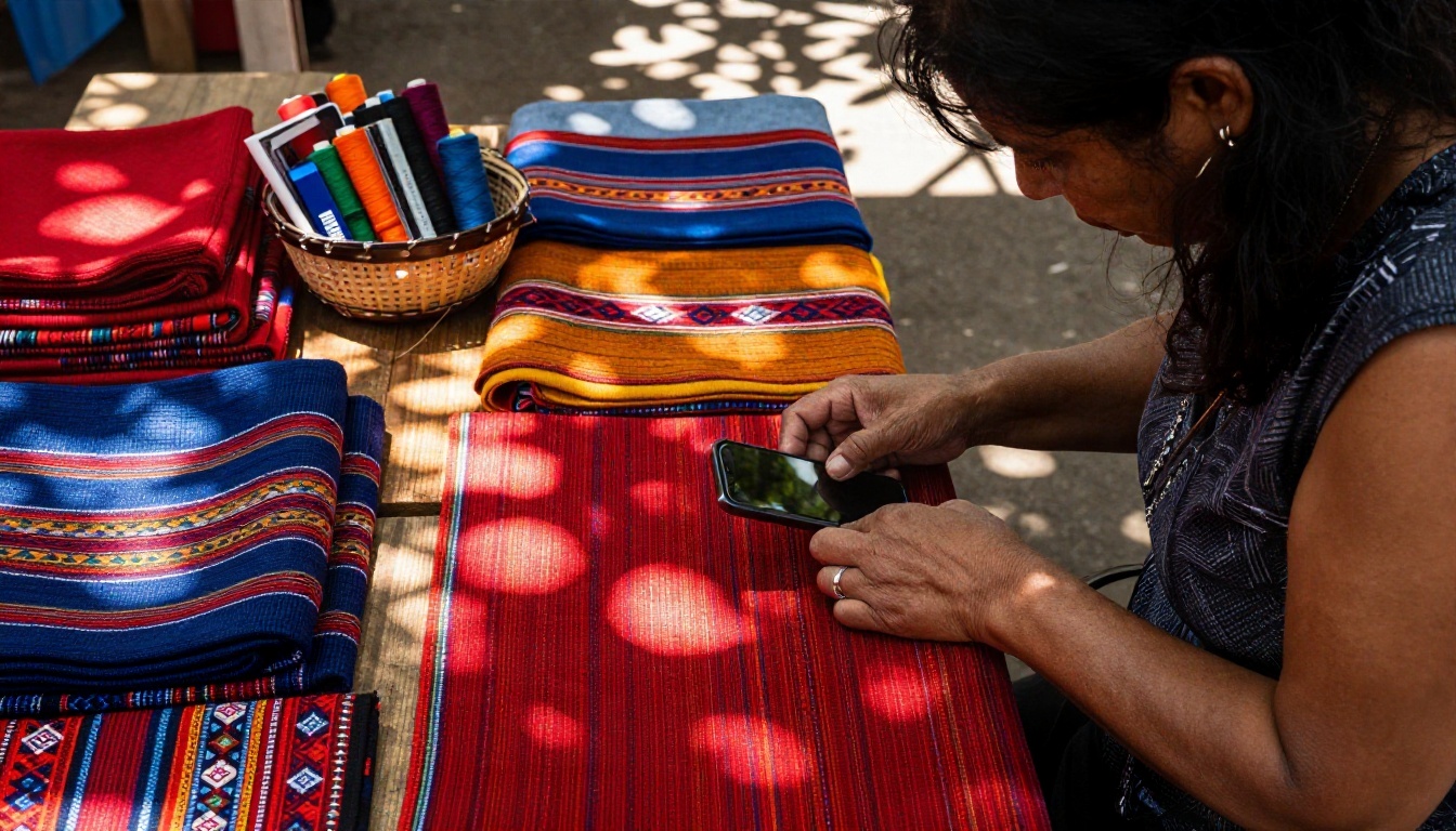
A seller of handwoven textiles photographed each piece folded on the same wooden table, always with the pattern facing up, always square. The second image showed a close up of the weave. Her catalogue looked like a single curated collection instead of fifty random pictures, and customers began asking about colour options rather than "do you have more photos?".
Example: A Candle Maker
A small candle brand shot every product on grey paper with window light from the left. The only thing that changed was the candle. A customer sees the range as a set, which makes bundles easier to sell.
When a PDF Catalogue Works Better
An in-app catalogue is quick, but it has limits: a square thumbnail, short descriptions, a cap on items, and no page layout. A PDF or flipbook fills the gaps.
What the In-App Catalogue Cannot Do
- Show full collections on a single spread.
- Use brand fonts, colours and page effects.
- Embed video or audio.
- Track who opened it and how long they stayed.
- Work as a printed or emailed document.
Combining Both Formats
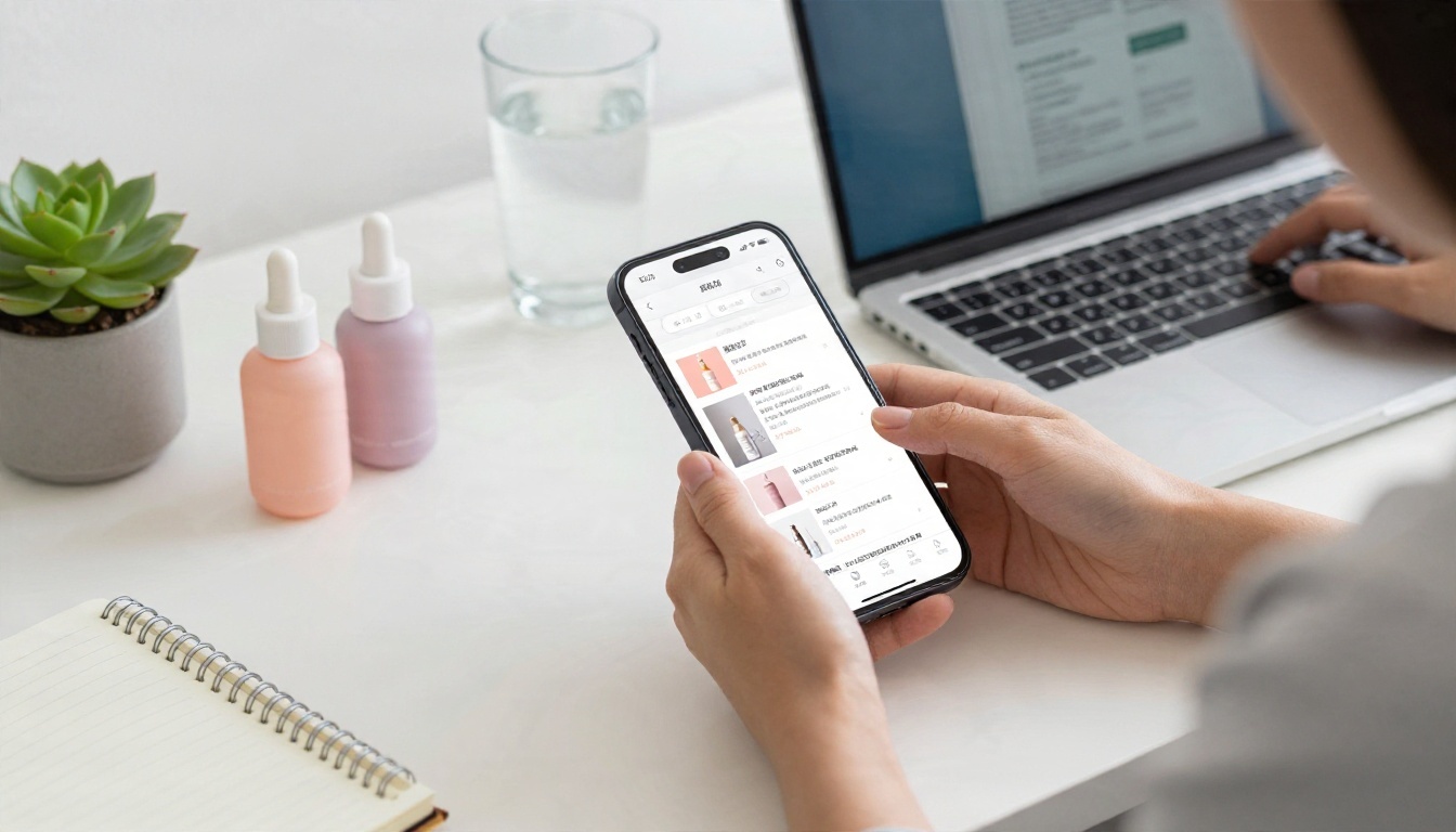
The strongest setup is simple. Keep your WhatsApp catalogue for everyday browsing and quick orders. Create a flipbook catalogue for seasonal ranges, wholesale lists and detailed lookbooks, then paste the link into a chat reply or a status.
| Feature | WhatsApp catalogue | Flipbook catalogue |
|---|
| Image shape | Square only | Any page size |
| Layout control | Limited | Full page design |
| Branding | Basic | Custom colours and logo |
| Multimedia | Images only | Video and audio |
| Link sharing | Within the app | Any channel, plus embed |
| Analytics | Basic business stats | Available on the Professional plan |
| Password protection | No | Yes |
How to Create a Flipbook Catalogue
If you already have a PDF with your products, the process takes a few minutes. Use the Digital Catalog Maker or the Product Catalog Generator for a ready layout.
Step by Step
- Open the platform. Go to Flipbooks AI and create an account.
- Upload your PDF. Use the PDF to Flipbook Converter. Each page becomes a flippable page, and the conversion is automatic.
- Customize the look. Add your logo, pick brand colours, choose a page turn effect and set a background that matches your photos.
- Add multimedia. Drop in a product video or a short audio note on the pages that need it.
- Set sharing options. Copy a direct link for WhatsApp, grab an embed code for your website with the Embed Flipbook on Website tool, or protect the flipbook with a password for wholesale customers.
- Allow offline downloads. Buyers with weak signal can save it and browse later.
- Share and track. Send the link in a chat, then check results.
💡 Pro tip: Export your PDF pages at the same visual style as your square photos. Matching colours and spacing makes the two formats feel like one brand.
Pro Features Worth Using
Analytics and lead generation sit in the Professional plan. They show which pages get opened and let you capture contact details before someone views the catalogue. Compare options on the pricing page. Every plan produces flipbooks without watermarks, and the Standard plan and above offers unlimited flipbooks. Mobile responsive design means pages fit a phone screen just as well as a laptop.
If you sell menus, price lists or lookbooks, take a look at the Digital Price List Generator and the Interactive Lookbook Designer.
Common Mistakes to Avoid
Even careful sellers repeat the same errors. Check your catalogue against this list.
| Mistake | What happens | Fix |
|---|
| Uploading wide landscape photos | Sides get cropped | Shoot or export 1:1 |
| Text inside the photo | Unreadable on small screens | Put details in the description |
| Different backgrounds on each item | Grid looks chaotic | Use one backdrop |
| Heavy files over 5 MB | Slow loading or rejection | Compress to under 800 KB |
| Over filtered photos | Colour mismatch, more returns | Edit lightly |
| No second image | Few details shown | Add at least two angles |
Three Small Habits That Help
- Name products clearly. Use the product name buyers would type, not an internal code.
- Refresh monthly. Remove sold out items and update the first row.
- Test on two phones. One new, one older, just to confirm every thumbnail reads.

Ready to Sell Better in Chat?
Start with the basics: 1080 x 1080 pixels, square, JPG, under 800 KB, with one backdrop and one lighting direction across the whole range. Then give your best customers a richer experience with a flipbook that carries your branding, video and full collections.
Get started for free on Flipbooks AI, browse all flipbook tools, or compare pricing plans to pick what fits your shop. If you are ready to go further, sign in and upgrade to turn on analytics and lead capture.


