You have a finished design, a PDF export button, and one question that decides how the whole thing looks on screen: A4, Letter or Square? The page size you pick before you export controls how your pages fit a laptop, how they read on a phone, and whether anything gets cropped or surrounded by awkward empty bars. If you plan to publish with Flipbooks AI, the good news is that the converter keeps whatever proportions your PDF already has. The bad news is that a poor choice is baked in the moment you export.
This article compares the three most common formats side by side, shows where each one shines, and ends with a short checklist you can run in under a minute.
Why Page Size Matters Online
In print, page size is mostly about paper, cost and shipping. On screen, it is about proportion. A flipbook is displayed inside a viewer, and the viewer sits inside a browser window, which sits on a screen with its own shape. Three shapes collide: the page, the viewer and the device.
When the page proportion matches the space available, the reader sees large, sharp pages. When it does not, the viewer shrinks the page to fit, and the text gets smaller than you intended. That is the whole story behind most complaints like "my flipbook text is tiny on mobile".
Here is what changes with page size:
- Readable text size: the taller the page, the smaller the text on a landscape monitor.
- Spread width: two pages side by side get wider as the page gets wider.
- File weight: bigger pages with the same dpi mean bigger images and slower loading.
- Print fallback: if readers download and print the flipbook, the page size decides how it lands on paper.
💡 Pro tip: Decide the page size before you design the first page. Resizing a finished layout almost always breaks margins, image crops and text flow.
Before the details, here are the raw numbers. The aspect ratio is the one figure that matters most for on-screen reading.
| Format | Dimensions | Aspect ratio (W:H) | Orientation | Typical region |
|---|
| A4 | 210 x 297 mm (8.27 x 11.69 in) | 1 : 1.414 | Portrait | Europe, Latin America, Asia, most of the world |
| US Letter | 8.5 x 11 in (216 x 279 mm) | 1 : 1.294 | Portrait | United States, Canada, Mexico |
| Square | e.g. 210 x 210 mm or 8 x 8 in | 1 : 1 | Square | Global, popular for visual books |
Notice how close A4 and Letter are. Letter is slightly shorter and wider, A4 is slightly taller and narrower. The difference is only about 17 mm in height, yet it is enough to shift margins and line breaks when you convert between them.
A4: The Global Default
A4 is the safest choice if your audience is international or based outside North America. It is the format most design templates, word processors and brand kits assume.
Why it works for flipbooks:
- It is the tallest of the three, which gives text-heavy pages a comfortable column of reading space.
- Almost every magazine, report and manual template already exists in A4, so your PDF probably starts there.
- On a phone held upright, the tall shape fills the screen nicely.
Where it struggles:
- On a landscape laptop or monitor, a single A4 page is height-limited. A 1080 px tall viewer shows an A4 page about 764 px wide, so body text can shrink if the font was set small.
- A two-page spread becomes very wide (1.414 : 1 in a single-page proportion, or roughly 2.83 : 2 as a spread), which forces more scaling on narrow windows.
✅ Best practice: Use body text of at least 10 to 11 pt on A4 flipbooks so it stays readable after the viewer scales the page down.
US Letter: The North American Standard
If most of your readers are in the United States or Canada, Letter is the natural fit. It matches what they already print, store and email.
Why it works:
- Its shorter, wider proportion fills landscape screens slightly better than A4.
- Business documents such as proposals, annual reports and training manuals are usually authored in Letter already.
- If readers print a copy at an office, nothing gets scaled or clipped.
Where it struggles:
- Outside North America, printing a Letter PDF on A4 paper leaves odd margins.
- Some templates built for A4 need small layout adjustments after resizing.
A real-world scenario: a US consultancy sending a 24-page proposal to prospects will get a cleaner reading experience with Letter, because the client's printer, the PDF and the flipbook all share the same proportions.
Square: Built for Visual Storytelling
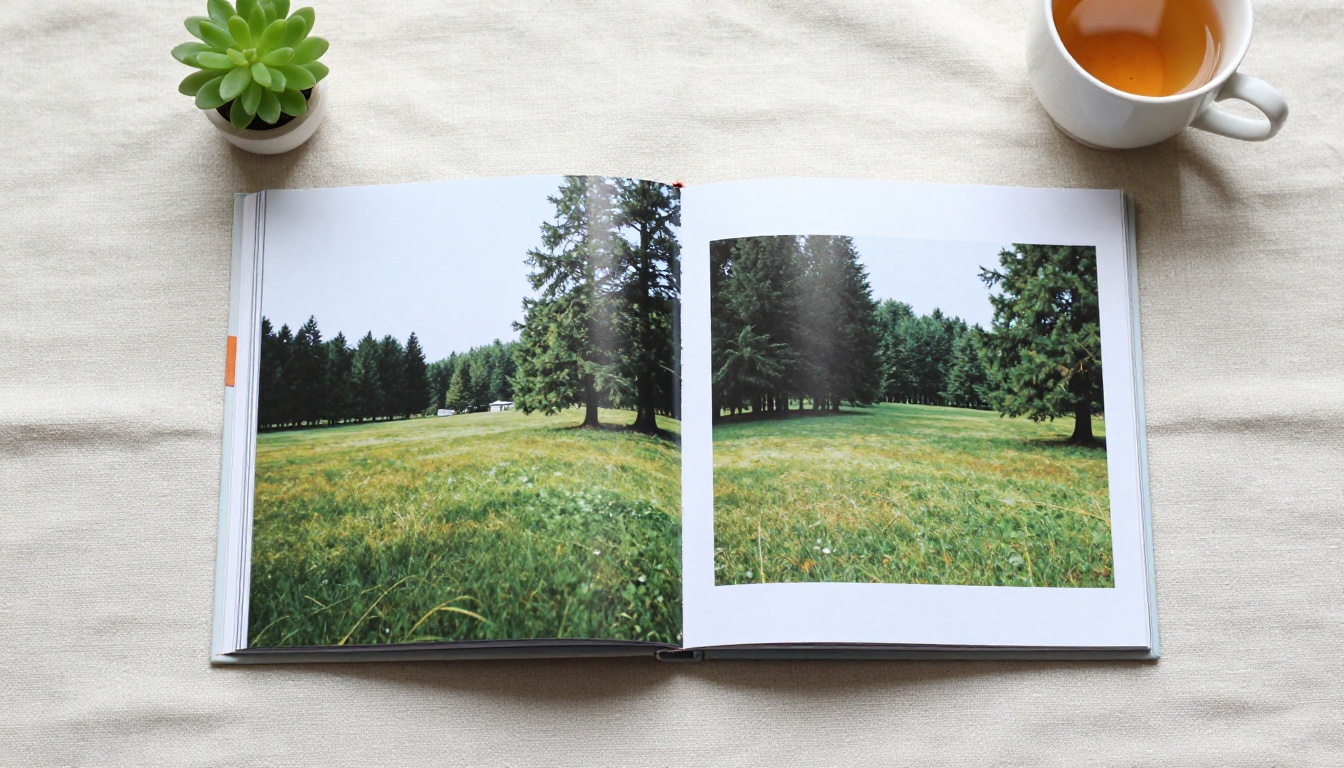
Square pages break the "document" feeling and make a flipbook feel like a photo book or a lookbook. They also behave very differently on screens.
Why it works:
- A square page leaves room for photos in either orientation without awkward cropping.
- A spread of two square pages is exactly 2 : 1, a wide panorama that sits comfortably in a desktop viewer.
- Social previews and embedded cards look balanced because the shape is neutral.
Where it struggles:
- Long paragraphs feel cramped, because square pages give less vertical room for text columns.
- Printing on standard paper wastes space or requires custom sizes.
- On a portrait phone, a square page uses only the middle of the screen, leaving empty bands above and below.
⚠️ Warning: Avoid dense text blocks in square formats. If your content is mostly paragraphs, A4 or Letter will serve readers better.
How Each Size Looks on Real Screens
The device matters as much as the page. This table shows how much of the screen each format typically fills in a single-page view.
| Device and orientation | A4 | Letter | Square |
|---|
| Phone, portrait | Fills well, small side margins | Fills well, slightly larger bars | Centered, large bars top and bottom |
| Phone, landscape | Height-limited, small page | Height-limited, small page | Larger than portrait formats |
| Tablet, portrait | Excellent fit | Excellent fit | Good, some empty space |
| Tablet, landscape | Spread works, text moderate | Spread works, slightly larger | Spread works very well |
| Laptop or desktop | Spread is wide, text moderate | Spread is wide, text a bit larger | Spread is balanced and large |
The pattern is simple. Tall pages win on phones held upright. Wider and squarer pages win on desktop spreads. Since most flipbook traffic comes from mobile devices, portrait formats usually have the edge unless your content is image-led.
Match the Size to Your Content
Format is easier to choose once you know what you are publishing. Use this table as a starting point.
| Content type | Recommended size | Reason |
|---|
| Product catalog | A4 or Letter | Grids of products and price lists need vertical room |
| Restaurant menu | A4, or tall custom size | Fits columns of dishes and prices |
| Photography portfolio | Square or landscape | Images stay uncropped |
| Lookbook | Square or A4 | Depends on whether photos are mostly vertical |
| Annual report | A4 or Letter | Dense text, tables and charts |
| Training manual | A4 or Letter | Printable, text-first |
| Recipe book | Square or A4 | Photo plus ingredients list |
| Magazine | A4 or Letter | Matches print layouts |
Some quick examples:
- A fashion brand building a seasonal lookbook with the Lookbook Flipbook Builder can choose square for bold imagery and keep captions short.
- A hotel preparing a property brochure with the Hotel Brochure Designer usually benefits from A4 or Letter, because rooms, amenities and rates need structured text.
- A photographer using the Photography Portfolio tool can match page proportions to the photos themselves, which is often square or 4 : 3.
Single Pages Versus Spreads
Flipbooks usually display either one page at a time or a two-page spread that mimics an open book. Your page size interacts with that choice.
| Layout | A4 | Letter | Square |
|---|
| Single page ratio | 0.71 | 0.77 | 1.00 |
| Spread ratio | 1.41 | 1.55 | 2.00 |
| Fits a 16:9 monitor (1.78) | Leaves side space | Leaves less side space | Slightly too wide, small side shrink |
A 16:9 monitor has a ratio of about 1.78. A Letter spread at 1.55 comes closest to that without exceeding it, which is why Letter spreads tend to feel large on desktops. A square spread at 2.00 is wider than the screen, so the viewer scales it by width instead of height, which is still comfortable because square pages are not tall.
Cover pages and back covers
In a spread layout, the front page often sits alone on the right. Keep this in mind when you design the first page: a lone square cover looks balanced, while a lone A4 cover leaves an empty left half unless the viewer centers it.
Margins, Bleed and Safe Zones
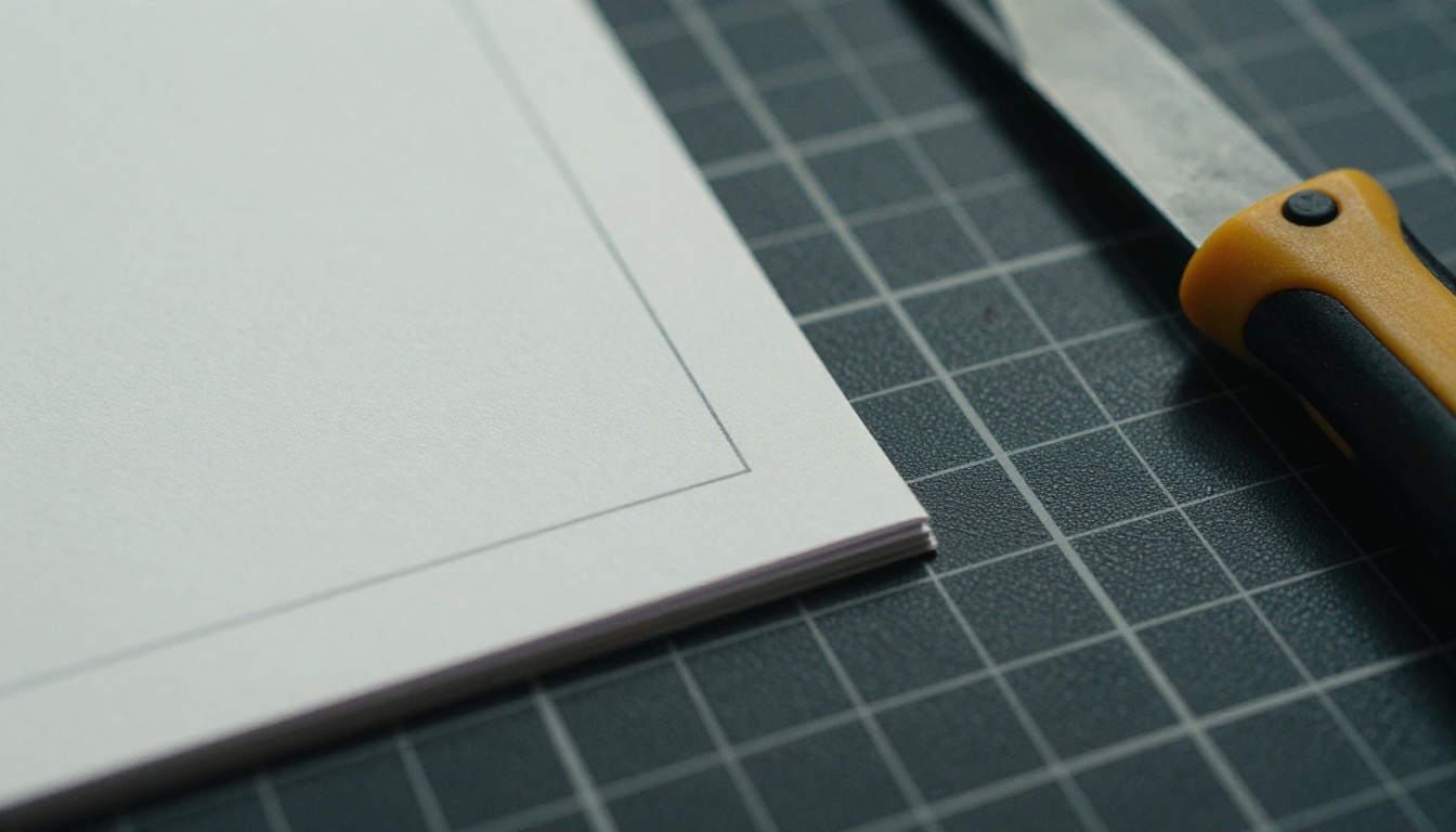
Whatever size you choose, margins protect your content from cropping at the edges of the viewer.
Practical margin settings:
- Outer margins: at least 12 to 15 mm (about 0.5 in) on every side.
- Inner margin near the fold: add 3 to 5 mm extra, because the spread view draws a soft shadow near the center.
- Bleed: only necessary if you also plan to print. For screen-only flipbooks, you can skip it.
- Safe zone for text: keep critical text and logos inside the inner 90 percent of the page.
💡 Pro tip: If you design in Letter but your audience is split between regions, keep critical content well inside the margins. Then the same layout survives a later A4 export with minimal edits.
Resolution and File Size
Page size also affects file weight. A flipbook converts each page into an image-based layer for smooth flipping, so large pages with heavy photos load more slowly.
| Format | Suggested export dpi | Approx. pixel size | Good for |
|---|
| A4 | 150 | 1240 x 1754 | Web reading |
| Letter | 150 | 1275 x 1650 | Web reading |
| Square (8 in) | 150 | 1200 x 1200 | Photo-led books |
| Any size | 300 | Roughly double | Print downloads only |
For screen reading, 150 dpi is plenty. Going to 300 dpi doubles the width and height, quadruples the pixel count, and makes pages slower on mobile networks with little visible gain.
Step by Step: Set the Right Size and Publish
Here is a practical workflow, from setting up your document to a live flipbook.
- Pick your format using the content table above. If in doubt, choose A4 for a global audience or Letter for a North American one.
- Set the document size in your design tool before adding any content. Set margins at 12 to 15 mm.
- Design with portrait in mind if mobile readers matter, and keep text at 10 to 11 pt or larger.
- Export as PDF at 150 dpi, with images compressed to a reasonable quality.
- Open the converter: go to the PDF to Flipbook Converter or create an account to start.
- Upload your PDF and wait for the conversion. Your page proportions carry over automatically.
- Customize the flipbook: set colors, logo and background to match your branding, and add video or audio where it helps.
- Preview on three devices: a phone, a tablet and a desktop. Check that the text is readable on the smallest.
- Share it: use a direct link, or grab the embed code from the Embed Flipbook on Website tool. Add password protection if the content is private.
- Track results with analytics and lead capture on the Professional plan. See the pricing plans for the full feature list.
Flipbooks AI never adds watermarks, so your published pages look exactly like your export, and the responsive viewer adapts to every screen your readers use.
Common Mistakes to Avoid
Most page size problems come from a short list of habits.
- Mixing sizes in one PDF. A single square page inside an A4 document makes the viewer jump in scale while flipping.
- Tiny body text. Anything under 9 pt becomes hard to read on a phone.
- Heavy margins on square pages. Large margins waste the limited space and shrink content further.
- Designing in landscape for a portrait audience. Landscape pages shrink on upright phones.
- Exporting at 300 dpi for web only. It adds weight without a visible benefit.

⚠️ Warning: Do not stretch a PDF to change its proportion. Distorted fonts and squashed photos make a flipbook look unprofessional. Re-export from the source design instead.
A Quick Decision Checklist
Answer these five questions in order, and stop at the first clear answer.
- Is your content mostly photos with short captions? Choose Square.
- Are your readers mainly in the United States or Canada? Choose Letter.
- Are readers international, or do you already have an A4 template? Choose A4.
- Is most of your traffic mobile? Lean toward a portrait format (A4 or Letter).
- Will anyone print it? Match their paper: Letter in North America, A4 elsewhere.
If two answers conflict, give priority to the device your readers use most. A beautiful page that is hard to read on a phone loses more readers than a slightly mismatched print size.
Custom and unusual sizes
Nothing forces you to use a standard size. Some publishers choose 5 x 8 in for novels, 6 x 9 in for trade books, or an 8.5 x 8.5 in square for children's stories. Flipbooks AI accepts any PDF page size, as long as every page in the file is the same. Treat custom sizes as a design choice rather than an accident: test them on a phone first.
Real Examples You Can Copy
Here are three starting setups that work well in practice.
| Scenario | Size | Margins | Text size | Notes |
|---|
| Furniture catalog for European retailers | A4 | 15 mm | 10 pt | Two or three products per page, large photos |
| US real estate listing brochure | Letter | 0.6 in | 11 pt | Hero photo, price table, agent contact |
| Wedding album | Square, 10 x 10 in | 12 mm | 12 pt captions | Full-bleed images, minimal text |
The Furniture Catalog Maker and Real Estate Brochure Creator fit the first two setups, while the Wedding Album Flipbook pairs naturally with the square format.
Pick a Size and Publish
The right answer is rarely dramatic. A4 serves most international text-led projects, Letter is the comfortable choice for North American business documents, and Square is the winner when images do the talking. Whichever you choose, keep the size consistent, set generous margins, export at 150 dpi, and test on a phone before you share.
Ready to see your pages in action? Get started for free on Flipbooks AI, browse all flipbook tools to find a template that fits your format, or compare pricing plans to choose what works for you.



