Page numbers sound simple. Add them, move on. But any designer who has ever stared at a spread that looks busy, cramped, or just off knows that page numbers are silently responsible for a lot of that visual tension. They are small, yes, but they sit on every single page, which means every mistake is multiplied across your entire publication.
The good news: page numbers only create clutter when they are placed wrong, sized wrong, or styled in ways that fight the rest of your layout. Fix those three things and they disappear into the design where they belong, doing their job without demanding attention. Flipbooks AI makes this even simpler for digital publications, but let us start with the fundamentals that apply everywhere.

Why Page Numbers Fail
Page numbers fail for a handful of consistent, predictable reasons. Once you can name them, you can avoid them.
They Are Too Large
The most common mistake. A page number at 12pt or 14pt in a body-text font is competing directly with your content. Page numbers should sit at 70-80% of your body text size. If your body copy runs at 10pt, your page numbers should be 7-8pt. If you are using 12pt body copy, cap page numbers at 9-10pt.
They Are Too Heavy
Using the same weight as your body text makes page numbers blend into the content stream rather than recede into the background. The fix is simple: drop a weight. If your body text is Regular, set page numbers in Light or Thin. The number stays readable but stops competing.
They Are Too Close to the Content
Without enough margin between your text block and the page number, the folio becomes visually attached to your last line of body text. It reads as part of the content rather than a navigational element. Always leave at least 12pt of clear space between your text block and the page number.
They Are Too Dark
Full black (#000000) for page numbers creates unnecessary contrast. Use a softer tone, anywhere from 40% to 60% black, or pick a color from your secondary palette at reduced opacity. The number stays legible while retreating from the visual hierarchy.
| Problem | Symptom | Fix |
|---|
| Too large | Number reads as content | Set to 70-80% of body text size |
| Too heavy | Blends with text blocks | Drop one font weight |
| Too close | Appears attached to content | Minimum 12pt spacing buffer |
| Too dark | Draws the eye away from content | 40-60% black or secondary palette color |
| Wrong position | Interrupts reading flow | Outer corners or centered footer |

The Right Placement for Page Numbers
Placement is the decision with the most impact. Get this wrong and no amount of styling will save you.
Outer Corners vs. Center Footer
Outer corners are the professional standard for multi-page publications with a clear two-page spread structure. Catalogs, annual reports, magazines, and e-books all benefit from outer-corner folios because readers naturally look to the outside edge of a page when searching for navigation. The page number is exactly where the eye expects it.
Centered footers work best for single-column documents: white papers, academic publications, and simple PDF reports. When there is no strong left-right page relationship, centering provides balance without favoring either side.
Headers (top of page) are increasingly rare in modern design and should be avoided unless the publication explicitly requires running headers with chapter titles. Mixing a header with both chapter information and page numbers creates exactly the kind of clutter this article exists to prevent.
The Margin Math That Prevents Clutter
Your page number should live inside a clearly defined margin zone, not floating freely in the design:
- Bottom margin: Page number baseline should sit 12-18pt above the page edge
- Outer margin: Left-page number aligns to the left text boundary; right-page number aligns to the right text boundary
- Breathing room: Minimum 20pt of clear space between the page number and any other element (decorative rule, footer text, caption)
💡 A simple test: place your finger over the page number. Does the layout look better without it visible? If yes, the number is creating clutter. Adjust size, weight, or spacing until the answer is no.

Typography Choices That Stay Invisible
The goal for a page number's typography is invisibility. It should be present and readable, but it should not announce itself.
The Best Fonts for Page Numbers
Not every typeface handles small sizes gracefully. Choose fonts with these characteristics:
- High x-height: Taller lowercase letters stay readable at 7-9pt
- Open counters: Numerals with open bowls (look at the 6, 8, 9) do not close up at small sizes
- Optical size support: Some type families designed for print have specific optical sizes for caption and footnote use
Recommended typeface pairings:
| Publication Type | Body Font | Recommended Folio Font |
|---|
| Fashion / Lifestyle Catalog | Didot, Bodoni | Futura Light, Gill Sans |
| Annual Report / Corporate | Times New Roman, Georgia | Helvetica Neue Light |
| E-Book / Digital Publication | Minion Pro, Caslon | Source Sans Pro Light |
| Menu / Brochure | Playfair Display | Proxima Nova Thin |
| Technical Document | Arial, Calibri | Roboto Light |
Old-Style Figures vs. Lining Numerals
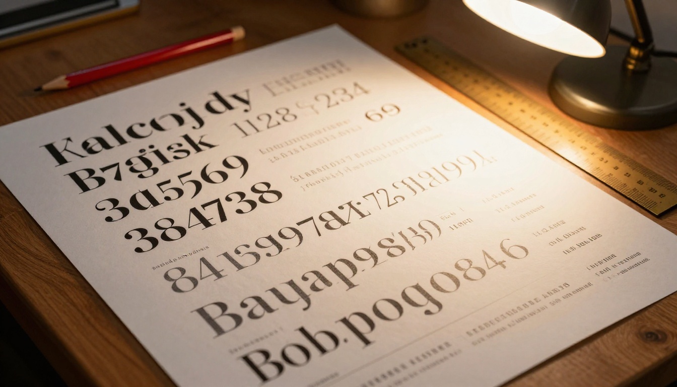
This is a detail most designers skip and should not. Old-style figures (where numerals have ascenders and descenders, like handwritten numbers) integrate more naturally into body text because they sit within the same optical rhythm as lowercase letters. Lining numerals (all the same height, all sitting on the baseline) feel more formal and modern.
For most publications, lining numerals at reduced weight are the safer choice. They are clean, they do not introduce visual rhythm disruption, and they scale consistently across print and screen.
3 Spacing Rules That Prevent Visual Noise
Spacing is what separates a page number that disappears into the design from one that creates friction.
Rule 1: Match Your Grid
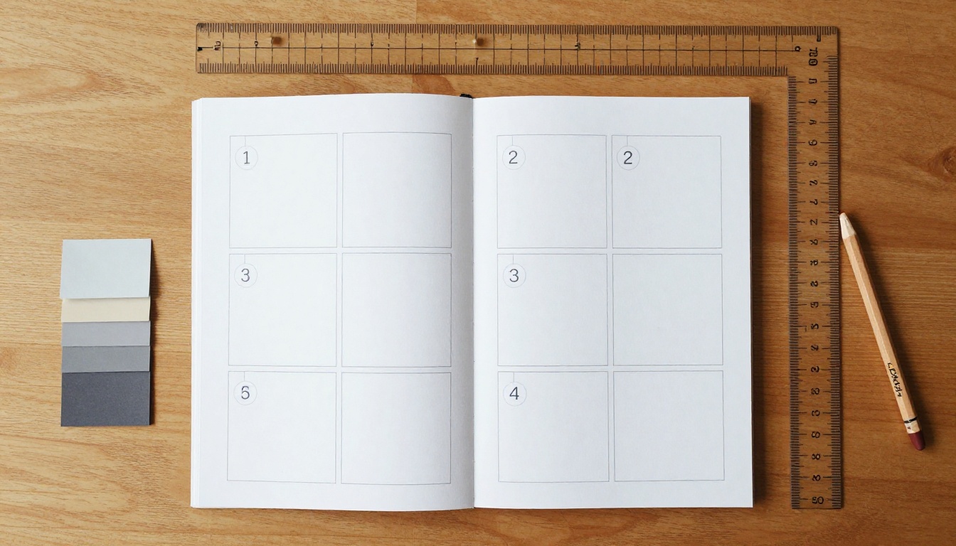
Your page number should align to your publication's underlying grid, not sit arbitrarily on the page. If your grid has a 6pt baseline, snap the page number baseline to a grid increment. This creates invisible alignment that makes layouts feel cohesive even if readers cannot articulate why.
Rule 2: One Element Per Zone
The footer zone belongs to the page number alone, or to a thin decorative rule plus the page number, but never to three or more elements at once. The moment you add a URL, a copyright notice, a chapter title, and a page number all in the footer, you have created a navigation bar that competes with your content. Distribute these elements across zones or drop the ones that are not critical.
Rule 3: Consistent Inset on Every Page
The exact position of your page number must be pixel-perfect across every single spread. Nothing breaks the professional polish of a publication faster than page numbers that drift slightly between pages. When working in InDesign or any DTP software, use master pages. When working in a digital platform like Flipbooks AI, use the platform's built-in folio controls to ensure consistent placement without manual adjustment per page.
⚠️ Never position page numbers manually per page. Even 1-2pt of inconsistency becomes obvious when flipping through a document and creates a sense of amateur production.
Page Numbers Across Different Publication Types
The right approach changes depending on what you are publishing. One rule does not fit every format.
Product Catalogs
Catalogs live or die by navigation. A customer flipping through a 60-page catalog needs to find the product they want and return to it. For catalogs, outer-corner placement with a clean sans-serif at 8pt in medium gray is the industry standard. Some catalog designers add a thin 0.5pt rule above the page number in the brand's accent color, which creates a micro-boundary between content and navigation without adding visual weight.
You can build exactly this style using the Digital Catalog Maker on Flipbooks AI, which gives you full control over folio position, font, and color as part of the upload and conversion flow.
E-Books and Reports
Long-form text documents need page numbers primarily for reference, not active navigation. Readers look up a page number when someone cites "page 34" in a discussion. For this use case, centered footers at 8-9pt in a toned-down version of the body font work perfectly. No flourishes needed.
Reports especially benefit from restraint. An annual report that uses its footer for nothing but a subtle page number reads as more authoritative than one cluttered with logos, dates, and URLs fighting for space with the folio.
Menus and Brochures
Short publications (under 20 pages) present an interesting question: do they need page numbers at all? For menus, the answer is usually no. For brochures that will be referenced (real estate, automotive, event programs), a minimal folio helps. The rule of thumb: if someone might need to say "turn to page 8 for the floor plan," include page numbers. If the document is meant to be read cover-to-cover in one sitting, omit them.
✅ For any short document where page numbers feel forced, consider using section markers instead: a discreet label like "Interiors" or "Specifications" in the footer position instead of a number. It provides navigation context without the clinical feeling of numerical sequencing.
Fashion Lookbooks and Portfolios
Page numbers in luxury publications require the most care. The brand aesthetic demands that nothing interrupt the visual impact of editorial photography. In these contexts:
- Folio size: 6-7pt maximum
- Color: warm gray (not cool gray), approximately 35-40% black
- Font: thin weight of whatever geometric sans the brand uses
- Placement: bottom outer corner, with 24pt minimum clearance from any image bleed

How to Add Page Numbers in Flipbooks AI
Flipbooks AI handles the page numbering problem elegantly because it works from your existing PDF. When you upload a document, the platform converts it into an interactive flipbook while preserving your original layout, including any page numbers you already set in InDesign, Word, or Canva.
Here is how to set up your publication for perfect page numbers through the full workflow:
-
Design your PDF with page numbers in place: Before uploading, apply the numbering rules from this article in your design software. Set the folio to 70-80% of body text size, reduce the weight, and position it in the outer corners or centered footer depending on your publication type.
-
Create your account: Head to Flipbooks AI and sign up. No watermarks appear on any plan.
-
Upload your PDF: Use the PDF to Flipbook Converter. The tool processes your document and retains your page numbering exactly as designed.
-
Customize your flipbook: Add your brand colors, select a background, toggle page-turn animations, and embed any multimedia content. The page numbers you set in your source PDF carry through without distortion.
-
Choose your sharing method: Flipbooks AI gives you a direct link, an embed code for your website, or both. The Embed Flipbook on Website tool makes it simple to drop your publication into any page.
-
Access analytics (Professional plan): See exactly which pages readers visit and how long they spend there, available on the Professional plan. This data tells you whether your navigation, including the page numbers that make it usable, is working.
💡 If you are starting from scratch and want to build a catalog or report directly, try the Digital Catalog Maker or the Annual Report Creator, both of which come with professionally formatted templates where page numbering is already handled correctly.
Flipbooks AI Plan Features at a Glance:
| Feature | Free | Standard | Professional |
|---|
| Watermark-free | No | Yes | Yes |
| Unlimited flipbooks | No | Yes | Yes |
| Custom branding | No | Yes | Yes |
| Password protection | No | Yes | Yes |
| Analytics dashboard | No | No | Yes |
| Lead generation forms | No | No | Yes |
| Offline downloads | No | No | Yes |
| Embed on website | Yes | Yes | Yes |
3 Common Mistakes to Avoid
Mistake 1: Using the Same Style Everywhere
A page number in a product catalog should not look the same as a page number in a clinical white paper. Calibrate your folio style to the publication's personality. A luxury catalog can afford a warm gray thin-weight numeral. A legal document needs something more neutral and legible at first glance.
Mistake 2: Adding Decorative Elements to the Number
Brackets around the page number, dashes flanking it, or a circle behind it all add visual weight that works against the goal. If you feel the page number needs decoration to "fit in" with the design, the real problem is that the rest of your layout is too busy, not that the number needs company.
Mistake 3: Applying Page Numbers to Image-Heavy Spreads Mechanically
When a page spread is dominated by a full-bleed photograph, a dark gray page number in the bottom corner can disappear or fight against the image. Two solutions: either reverse the page number out to white (or a very light tint) when it sits over a dark image, or use a small opaque background chip behind the number to ensure readability across any image.

When to Skip Page Numbers Entirely
Not every publication needs page numbers. Knowing when to leave them out is as important as knowing how to add them well.
Skip page numbers when:
- The document has 8 pages or fewer and reads linearly
- The entire publication consists of one continuous visual flow with no specific pages worth referencing
- Page numbers would interrupt a visual concept where the design intentionally has no conventional margins or footer zones
- You are creating a looping presentation or autoplay slideshow where sequential page identity has no navigational meaning
Keep page numbers when:
- The publication will be referenced by page number in conversation, email, or meetings
- The document has more than 16 pages
- The publication will be printed as well as distributed digitally
- You are creating a catalog, report, or manual where navigation is part of the value
Make Every Page Count
A well-placed page number signals that a document was designed with intention. It tells the reader that the designer thought about every millimeter of the layout, including the parts most people ignore. That is the standard that separates professional publications from polished-looking documents.
The rules are consistent whether you are building a 200-page annual report, a 24-page product catalog, or a seasonal lookbook: small, light, properly spaced, and exactly where the eye expects it.
If you are building flipbooks or digital publications and want all of this to work without wrestling with layout software, Flipbooks AI gives you a clean starting point. Upload your designed PDF, convert it in seconds, and share it anywhere. The platform handles the technical side so you can focus on the design decisions that actually matter.
Browse all tools to find the right format for your next publication, or compare plans to see which tier fits your workflow.



