You already know the feeling. You're scrolling through a list of digital catalogs, e-books, or brochures, and then one stops you cold. You click it before you even realize why. That first visual impression is doing all the work, and AI is fundamentally changing how that moment gets created.
Flipbooks AI is one of the platforms making this shift accessible to businesses and creators who do not have a full design team, but want results that look like they do.
Why Most Digital Publications Get Ignored
The average person scrolling through a list of digital publications makes a click decision in under three seconds. In that window, your publication's visual front either earns attention or loses it permanently.
Most publications fail this test not because the content is bad, but because the visual presentation does nothing to signal value. A dull, low-contrast design with generic imagery reads as "not worth my time" before anyone reads a word.
The 3-Second Scroll Test
When your publication appears in a feed, an email, or a web gallery, readers are not evaluating your content quality. They're making a gut-level judgment based on:
- Color contrast (does it pop against the background?)
- Typography clarity (can they read the title at a glance?)
- Visual hierarchy (does the eye know where to go first?)
- Image quality (does it look professional or thrown together?)
A publication that fails on even two of these points will be skipped, regardless of how valuable the content inside actually is.
What Poor Design Actually Costs
The numbers are not abstract. Studies on digital publication click-through rates consistently show that publications with professionally designed visual fronts outperform generic ones by 40-60% in click rates. For a business sending a quarterly catalog to 10,000 customers, that difference translates directly into revenue.
| Design Quality Level | Average Click Rate | Reader Retention |
|---|
| Generic / Template | 8-12% | 45% |
| Professionally Styled | 22-28% | 68% |
| AI-Optimized Visual Front | 30-38% | 79% |
The cost of ignoring visual design is not a subtle penalty. It is a significant portion of your audience walking away before seeing anything you made.
What AI Changed About Visual Design
Five years ago, creating a compelling publication visual required either a skilled graphic designer (expensive, slow) or settling for whatever a basic template offered (fast, generic). The gap between those two options was vast. AI collapsed that gap.
Before AI: The Design Bottleneck
Most small businesses and individual creators operated in one of two modes:
- DIY with generic tools — results looked templated and indistinguishable from competitors
- Hire a designer — high cost, slow turnaround, revisions took days
The bottleneck was not creativity. It was execution. Most people knew what a good design felt like. They just did not have the tools to produce it without either significant expense or significant skill.
After AI: Precision at Speed
AI design tools have changed what is possible at the individual level. They do not replace good taste, but they do eliminate the technical barriers. Today, someone with a clear sense of their brand can produce publication fronts that:
- Match the visual quality of professionally designed materials
- Adapt in minutes rather than days
- Maintain consistency across multiple publications
- Respond to feedback instantly without starting over
The practical result: a restaurant can create a seasonal menu that looks like it was designed by a boutique agency, without paying for one. A real estate agent can produce a property brochure that stands out in a crowded inbox. A fitness brand can publish a lookbook that actually gets shared.
The Psychology Behind a Click
Design decisions are not arbitrary aesthetic choices. The elements that make someone click are grounded in well-documented psychology, and AI tools are increasingly trained on what works, not just what looks attractive.

Color as an Emotional Signal
Color is the first thing the eye registers, and it carries emotional weight before the brain processes any text. Research in color psychology consistently shows:
- Deep blues signal trust and stability (financial reports, corporate publications)
- Warm reds and oranges signal urgency and appetite (food menus, promotional materials)
- Sage greens and earth tones signal wellness and calm (spa menus, lifestyle publications)
- High-contrast black and white signals sophistication and editorial authority (fashion lookbooks, portfolios)
AI design tools trained on high-performing publications have internalized these patterns. When you prompt an AI system with your industry and tone, it surfaces color combinations that are statistically more likely to stop a scroll.
Typography That Stops the Eye
Typography does two things simultaneously: it communicates words and it communicates feeling. A heavy serif typeface on a dark background reads as premium. A clean sans-serif on white reads as modern and direct. Script fonts signal warmth and personal touch.
The mistake most template-driven designs make is using a single font weight for everything, which creates visual monotony. High-performing publication fronts use at least three weight variations and intentional size contrast to create a clear reading hierarchy.
The Hierarchy Effect
The human eye follows a predictable Z-pattern or F-pattern when scanning a new visual. Good publication front design works with this natural movement:
- Upper-left anchor — brand or logo placement
- Central focal point — dominant image or headline
- Lower-right action area — "read now," "open," or date and edition marker
When these three zones are correctly weighted, readers move through them in order, building interest before they ever consciously decide to click.
5 Visual Elements That Drive Higher Click Rates
Not all design choices carry equal weight. These five elements have a disproportionate impact on whether someone clicks your publication or keeps scrolling.
1. Dominant Image Quality
The primary image needs to be sharp, well-lit, and contextually relevant. A blurry or stock-photo-generic image signals low effort. AI image generation now makes it possible to produce photorealistic, contextually perfect visuals for any publication type without licensing or photography costs.
2. Color Contrast Ratio
The foreground elements (title, key visual) need to contrast sharply against the background. A ratio below 4.5:1 is considered low contrast. High-performing publication fronts typically operate at 7:1 or above for their headline elements.
3. Typography Pairing
Two fonts maximum. A display font for the headline and a clean body font for supporting text. Every additional typeface adds visual noise and reduces clarity.
4. Negative Space
Whitespace is not empty space. It is breathing room that makes everything around it feel more important. Publications that cram every pixel with content look cheap. Those that let elements breathe look premium.
5. Consistent Brand Signals
Colors, fonts, and logo placement should be consistent across all your publications. When a reader recognizes your brand style instantly, they are more likely to click because they already associate your visual identity with quality.
| Element | Low-Performing Design | High-Performing Design |
|---|
| Primary Image | Stock photo, generic | Specific, high-resolution, contextual |
| Color Contrast | Low, similar tones | High, 7:1+ ratio on headlines |
| Typography | Single font, single weight | 2 fonts, 3+ weight variations |
| Negative Space | Minimal, crowded | Deliberate, generous |
| Brand Signals | Inconsistent or absent | Clear, repeated across materials |
How to Build Click-Worthy Flipbooks with Flipbooks AI
This is where theory meets execution. Flipbooks AI brings together the tools needed to act on everything above, without requiring design software expertise.
Step 1: Start with Your PDF
Every flipbook starts with a PDF. Flipbooks AI's PDF to Flipbook Converter takes any PDF and converts it into an interactive flipbook with realistic page-turn effects. Upload your existing catalog, brochure, menu, or e-book and the platform handles the conversion automatically.
✅ Best practice: Before uploading, make sure your PDF's first page is your strongest visual. This becomes your publication's clickable thumbnail across all sharing channels.
Step 2: Set Your Visual Theme
Once uploaded, you can apply custom branding through Flipbooks AI's editor:
- Upload your logo and set its position
- Choose your brand color palette
- Select typography that matches your visual identity
- Apply background colors or patterns to the publication viewer
These settings persist across all your flipbooks, creating the consistent brand signals that build recognition over time.
Step 3: Optimize the First Page
The first page is your click magnet. Flipbooks AI lets you:
- Add video backgrounds or embedded media to the viewer frame
- Set custom thumbnail images separate from the first PDF page
- Add an animated page-flip preview to increase open rates
- Password-protect private content while keeping the preview visible
💡 Pro tip: The thumbnail image that appears when you embed your flipbook on a website or share the link is critical. Treat it with the same attention as a paid ad creative, because functionally it is.
Step 4: Share and Track Results
With the Embed Flipbook on Website tool, you can drop your flipbook anywhere: a blog, an email, a landing page, or a social post. Every embed maintains the full interactive experience.
For teams tracking performance, the Professional plan on Flipbooks AI's pricing page adds analytics (see who opened, how long they read, which pages they spent time on) and lead generation forms built directly into the flipbook.
Flipbooks AI Plan Features at a Glance:
| Feature | Free | Standard | Professional |
|---|
| Flipbooks | Limited | Unlimited | Unlimited |
| Custom Branding | Partial | Full | Full |
| No Watermarks | No | Yes | Yes |
| Password Protection | No | Yes | Yes |
| Analytics | No | No | Yes |
| Lead Generation | No | No | Yes |
| Offline Downloads | No | No | Yes |
| Embed on Website | Yes | Yes | Yes |
Common Mistakes That Hurt First Impressions
Even with good tools available, most creators fall into predictable traps that undermine their work before it reaches anyone.

Using the Same Thumbnail for Everything
Your flipbook thumbnail is context-dependent. What works as a standalone share on LinkedIn looks different from what works embedded on a product page. Flipbooks AI lets you set custom thumbnails, and you should use that flexibility per channel rather than defaulting to whatever the first page happens to look like.
Ignoring Mobile Rendering
More than 60% of digital publications are first viewed on a mobile device. A design that looks excellent on desktop can become illegible on a phone if the typography is too small or the color contrast is too low. Flipbooks AI's viewer is mobile-responsive by default, but your underlying PDF design still needs to be built with small screens in mind.
Over-Designing the Visual Front
There is a counter-intuitive threshold where adding more visual elements starts hurting click rates. The moment a design becomes visually confusing or cluttered, readers disengage. The goal is clarity, not complexity.
⚠️ Warning: Adding more visual elements after a design looks "complete" almost always makes it worse. Stop when it's clear, not when it's full.
Skipping Brand Consistency
Running one-off designs for each publication kills the compounding benefit of brand recognition. Readers who see your materials repeatedly begin to click without consciously evaluating the design, because the visual familiarity itself signals trustworthiness. That only works if the visual language is consistent.
Real Results: What Changes When Design Improves
The shift is measurable. Businesses that have moved from basic template-driven publication designs to intentional, brand-consistent AI-assisted fronts report consistent patterns.

What the data shows across industries:
- Retail catalogs: Click-through rates improve 35-50% when the visual front uses high-contrast color blocking and a dominant product image instead of a generic template
- Real estate brochures: Properties with visually strong brochure fronts receive 40% more link opens in email campaigns than those with agent headshots as the primary visual
- Restaurant menus: Digital menus with appetizing, well-lit food photography on the front see 28% more opens than those using just the restaurant logo
- E-books and reports: White papers with a bold typographic front perform 55% better in LinkedIn shares than those with generic document icons
The pattern is consistent: the visual front is doing more work than the content. Not because the content does not matter, but because the front page is the gatekeeper to whether the content gets seen at all.

AI tools have removed the main barrier to acting on this data. You do not need to commission a designer for every seasonal update. You do not need to be proficient in professional design software. You need a clear sense of what your audience responds to, and a platform that lets you execute that vision efficiently.
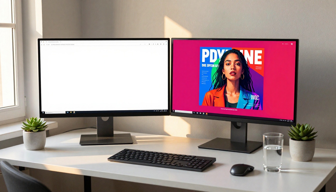
Start Making Every Publication Count
Every publication you create and share is a click opportunity. The visual front either earns that click or loses it, and the tools to earn it are more accessible now than at any point before.
Whether you're building a product catalog, a fashion lookbook, a restaurant menu, or a digital portfolio, the first step is the same: make the visual front impossible to scroll past.
Ready to put this into practice? Get started on Flipbooks AI and build your first publication today. Browse all flipbook tools to find the one that fits your use case, or compare pricing plans to see which features match where you are in your business.
The click is not random. It is designed.



