You don't need a design degree to make something that looks expensive. AI has flipped that assumption entirely, and if you're one of the millions of people who freeze up the moment someone asks them to "just put together a quick layout," this is for you. Flipbooks AI is built precisely for this scenario, automating the hard design decisions so your documents, presentations, and publications look polished without requiring any knowledge of grids, kerning, or color theory.
Why Non-Designers Struggle with Layout
Most people aren't bad at design. They're bad at starting. The blank page problem is real, and it's worse when you don't know what "good" looks like or why. Traditionally, getting a professional-looking layout meant either hiring a designer or spending weeks learning software like Adobe InDesign or Figma.
AI layout tools have compressed that learning curve from months to minutes. They handle the decisions that used to require formal training: where to place content, how much white space to leave, which fonts pair well together, and how to create visual hierarchy so readers know where to look first.
What Makes a Layout Look Professional
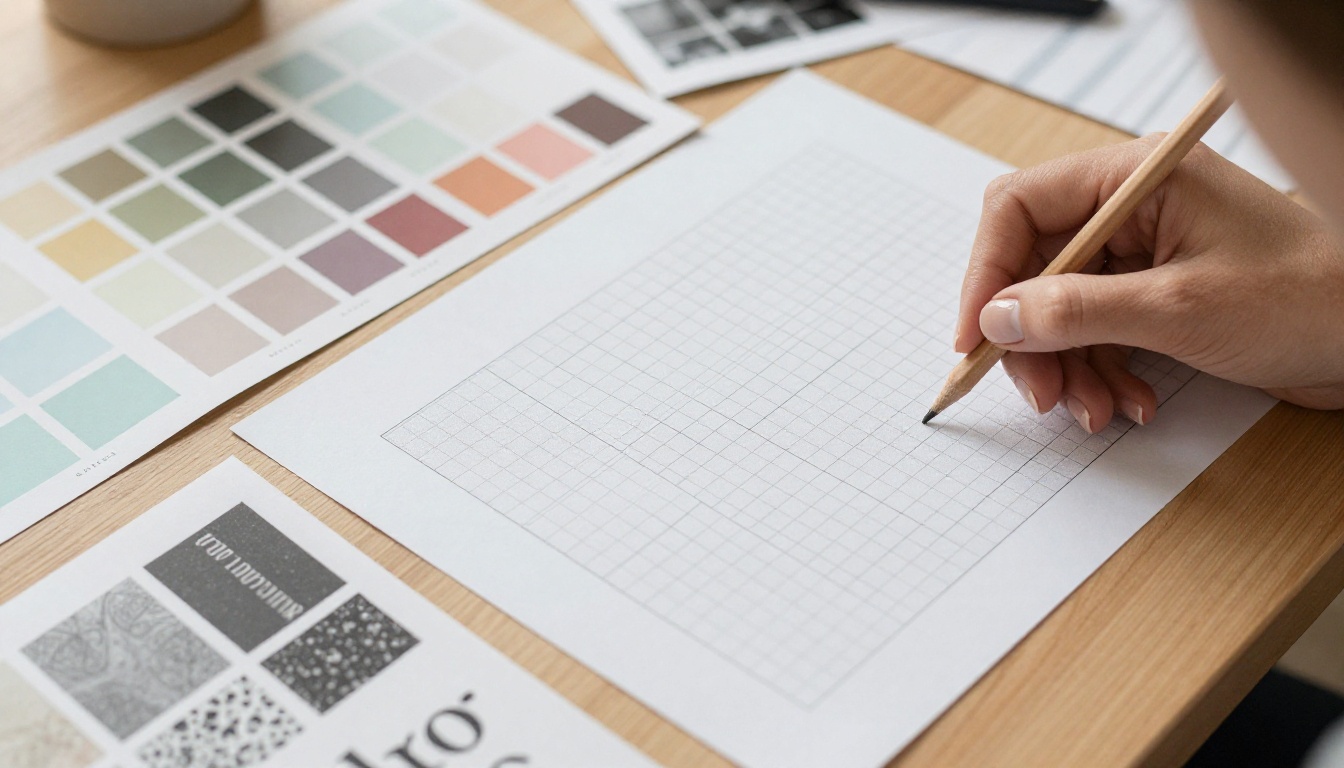
Before AI can help you, it helps to know what it's actually optimizing for. Professional layouts succeed at three things:
- Visual hierarchy: a clear order that tells the eye where to start, where to go next, and what matters most
- Breathing room: enough white space so elements don't compete with each other
- Consistency: repeating the same fonts, spacing, and color choices throughout so nothing feels random
AI tools bake all three into every template they generate. You don't have to think about them; they're already built in by default.
Why Starting from Scratch Is Wrong
If you open a blank document and start dragging things around, you'll spend 90% of your time adjusting and readjusting. A far better workflow: start from a template, swap in your content, and adjust one thing at a time. This is how designers actually work, and it's how AI layout systems are structured. Templates aren't a shortcut; they're a starting point that professionals rely on too.
5 Layout Principles AI Handles for You
The intimidating vocabulary of design hides some surprisingly simple rules. Here's what AI is doing behind the scenes when it generates a layout for you.
1. The Rule of Thirds for Page Composition
Borrowed from photography, the rule of thirds divides a page into a 3x3 grid. The most important content sits at the intersection points, not the center. AI templates already position headlines, images, and call-to-action sections at these hotspots, which is why template-based layouts consistently feel more balanced than layouts assembled by hand.
2. Color Harmony Without a Color Wheel
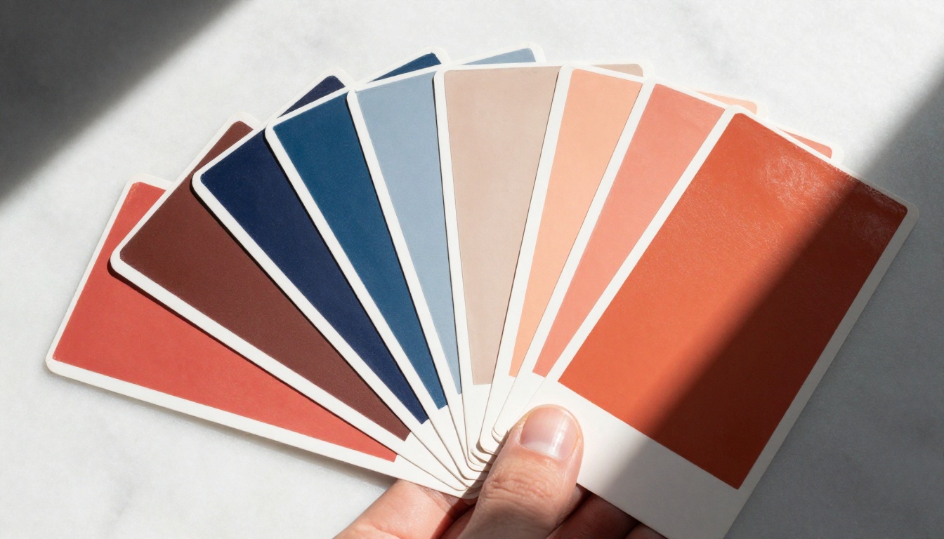
Random colors feel amateur. Harmonious color palettes follow one of three simple relationships:
- Complementary: colors opposite each other on the color wheel (blue and orange, red and green)
- Analogous: colors that sit next to each other (blue, blue-green, green)
- Monochromatic: variations of a single hue at different saturation levels
AI layout tools auto-generate palettes that follow these rules. If you're using Flipbooks AI, you can apply a custom brand color and the system adjusts complementary tones throughout your document automatically.
3. Font Pairing Logic
There are thousands of fonts, but the pairing logic is simple: contrast works, similarity doesn't. A bold serif headline with a clean sans-serif body text is the most reliable combination in publishing. AI systems preload tested font pairs so you never end up with two fonts fighting each other for attention on the same page.
4. Grid Systems and Alignment
Nothing looks more amateur than slightly misaligned elements. Grid systems (8pt grids, 12-column layouts) create invisible scaffolding that keeps everything aligned. Manually maintaining this takes discipline and a trained eye. In AI-powered tools, alignment is enforced automatically, so your images, headers, and body text all sit on the same invisible grid without you touching a single element.
5. Visual Weight and Balance
Heavy visual elements (large images, dark color blocks, thick borders) need counterbalancing on the opposite side of the page. This is called visual weight. Symmetrical layouts balance heavy elements on both sides; asymmetrical layouts intentionally shift weight for a modern editorial feel. AI templates use both approaches and label them clearly so you can pick the aesthetic that fits your brand.
Best AI Layout Ideas by Content Type
Different documents need different structures. Here's a breakdown of the most effective AI layout ideas for specific content types.

For Catalogs: The Grid Wins Every Time
Product and fashion catalogs work best with consistent tile grids. Each product gets equal visual real estate, and the buyer's eye moves predictably from top left to bottom right. The Fashion Catalog Creator pre-loads this grid layout automatically, so all you're doing is dropping in product images and descriptions.
💡 Pro tip: Odd-number grids (3-column, 5-column) feel more natural to the eye than even-number grids. AI catalog tools default to 3-column for exactly this reason.
For Presentations: One Idea Per Slide
The single most common presentation mistake is cramming too much onto one slide. AI layout tools for presentations enforce a one-idea-per-slide structure visually by allocating large image space and minimal text areas. The constraint forces clarity, and the result is a presentation that reads confidently rather than anxiously. The Sales Presentation Flipbook applies this rule automatically across every slide.
For Brochures: Full-Bleed Images Always Win
A full-bleed image (one that runs edge-to-edge with no white border) immediately signals quality. For hotel, automotive, and real estate brochures, this technique alone separates professional materials from amateur ones. The Hotel Brochure Designer and Automotive Brochure Generator both default to full-bleed hero layouts because they consistently produce higher reader attention and time spent on each page.
Create a Flipbook Layout in 5 Steps
The good news: you don't need to know any of the above rules to get a result that follows all of them. Here's how the workflow runs in practice using Flipbooks AI.
Step 1: Create your account and pick a tool
Head to Flipbooks AI and sign up for free. From the dashboard, browse the tools directory and pick the one that matches your content type, whether that's a catalog, brochure, magazine, portfolio, or annual report.
Step 2: Upload your PDF
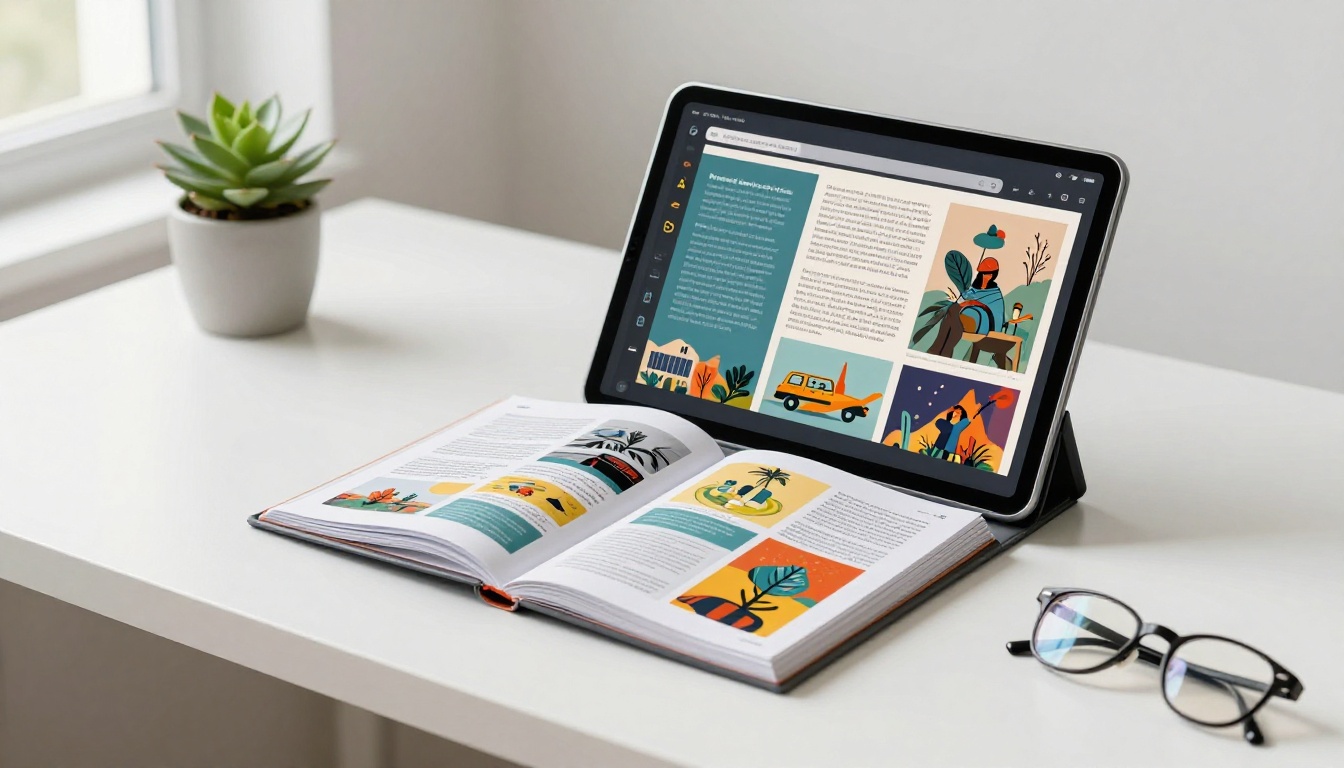
If you already have a PDF, even one built in Google Docs or Canva, upload it directly. The PDF to Flipbook Converter converts your static document into an interactive, page-turning digital flipbook in seconds. Your existing layout transfers automatically with no reformatting required.
Step 3: Apply your branding
In the editor, set your brand color and the system adjusts the theme throughout the entire document. Add your logo to the front page. Select a font pairing from the curated options. None of these choices require design knowledge; the tool only surfaces combinations that are already proven to work together.
Step 4: Add interactive elements
This is where digital flipbooks pull ahead of static PDFs. You can embed videos, audio clips, and links anywhere on the page. For a restaurant menu, that might mean a link to your online reservation system. For a real estate brochure, a virtual tour video embedded directly into the page. The Interactive Lookbook Designer handles this particularly well for fashion and product content.
Step 5: Share or embed
When you're done, you get a shareable link, an embed code for your website, and an option to password-protect the flipbook for private distribution. Professional plan users also get analytics showing who viewed which pages, for how long, and where they dropped off. Check pricing plans to see which tier includes these analytics and lead generation features.
✅ Best practice: Always preview your flipbook on mobile before sharing. Flipbooks AI renders all flipbooks with mobile-responsive design by default, but previewing catches any content that needs minor adjustments before it goes live.
Real Layout Ideas for Different Industries
Abstract layout principles are easier to remember when tied to concrete real-world scenarios. Here's how real businesses use AI layout ideas in practice.
Real Estate Agents
A two-page property spread works like this: the left page is a full-bleed exterior photo of the property, and the right page has a clean two-column layout with specs on the left (bedrooms, bathrooms, square footage, price) and a smaller interior gallery on the right. This is a proven format in print real estate advertising that translates directly to digital with the Real Estate Brochure Creator.
Restaurant Owners
A well-designed digital menu separates sections with visual breaks rather than horizontal lines. Each section (Starters, Mains, Desserts) gets its own visual treatment: a background tone shift, a different image style, or a bold section header in a contrasting color. The Menu Flipbook Designer automates exactly this structure, so you get clean section separation without manually designing every break.
Teachers and Trainers
Course materials that feel professionally published get taken more seriously. A clean single-column layout with generous margins, bold pull quotes, and numbered steps for tutorials works far better than a wall of paragraphs. The Course Material Publisher and Training Manual Flipbook are built specifically around this kind of content hierarchy.

Wedding Photographers
Photo albums live or die on image sequencing and white space. A tight grid with no breathing room makes an album feel rushed. A layout that alternates full-bleed spreads with tighter multi-image grids creates visual rhythm. The Wedding Album Flipbook tool applies this alternating rhythm automatically based on the number of images you upload.
Non-Profits and Annual Reports
Non-profit organizations often need to present impact data in a way that's emotionally resonant as well as factually clear. AI layout tools for reports separate data sections from narrative sections visually: charts and statistics get a clean white background with bold numbers, while story sections get warmer colors and photography. The Non-Profit Annual Report tool structures this balance automatically.
Picking Colors with No Design Instinct
Color is the area where most non-designers feel most lost. Here's a shortcut that works every time: steal from photographs.
Pick the dominant color in your hero image and use it as your primary brand color throughout the document. Then pick a neutral (white, off-white, or light grey) for backgrounds. Finally, pick a third color that appears as a secondary tone in the same photo and use it as an accent. This method produces color palettes that feel cohesive because they come from a single visual source.
| Color Role | What to Use | Where to Apply |
|---|
| Primary | Dominant color from hero image | Headlines, buttons, borders |
| Background | White or off-white | Page background, section fills |
| Accent | Secondary color from hero image | Pull quotes, icons, highlights |
| Text | Near-black (not pure black) | Body copy |
⚠️ Warning: Pure black (#000000) text on white looks harsh on screen. Use a dark charcoal (#1a1a1a or #222222) instead. AI layout tools default to this automatically, which is one of the subtle reasons template-based documents look more polished than manually assembled ones.
Not all AI layout tools are equal. Here's a practical comparison of what you get at each investment level.
| Feature | Free Tools | Flipbooks AI Standard | Flipbooks AI Professional |
|---|
| Templates | 10-20 generic | Unlimited, industry-specific | Unlimited, industry-specific |
| Watermarks | Yes | No watermarks | No watermarks |
| Custom branding | Limited | Full branding control | Full branding control |
| Flipbooks per month | 1-3 | Unlimited | Unlimited |
| Analytics dashboard | None | None | Full analytics |
| Password protection | No | Yes | Yes |
| Website embed code | No | Yes | Yes |
| Offline downloads | No | Yes | Yes |
| Lead generation tools | No | No | Yes |
| Embedded video/audio | No | Yes | Yes |
| Mobile-responsive | Partial | Yes | Yes |
The right choice depends on volume and visibility. If you're creating one or two documents for internal use, free tools work fine. If you're producing content that represents your brand externally, the no-watermark and custom branding features in Flipbooks AI's paid plans pay for themselves immediately by removing any sign that a tool was involved.
Typography That Never Fails
You don't need to know typography deeply. You need three things.
1. Size contrast creates hierarchy. Your headline should be at least 2x the size of your body text. Your subheadings should sit between them. This simple ratio creates clear structure without any other design work.
2. Two fonts maximum. One for headlines (usually a serif or bold sans-serif), one for body copy (usually a clean sans-serif). More than two fonts in a single document almost always looks chaotic, even if each individual font is attractive on its own.
3. Line spacing matters more than people think. Body text at 1.5x line spacing is significantly more readable than 1.0x. AI layout tools set this correctly by default. If you're ever adjusting it manually, don't go below 1.4x for body copy.
Layout Mistakes That Are Consistently Overused
Knowing what to avoid is as valuable as knowing what to do.
- Centered text for body copy: Works for short headlines. Painful for paragraphs. Always left-align body text.
- Too many typefaces: More than two fonts in one document signals inexperience. Pick two and stay with them.
- Random color accents: Introducing a fourth or fifth color "for variety" breaks visual cohesion. If it's not in your core palette, it doesn't belong.
- Borders as decoration: Boxes and borders should solve a problem, like separating sections or highlighting callouts. They shouldn't be used decoratively throughout the page.
- Equal emphasis on everything: When everything is bold, nothing is. Reserve emphasis for the 10-20% of content that actually needs to stand out.
💡 Pro tip: If a layout element makes you think "that might be too much," it probably is. The instinct to add more is the amateur instinct. The professional instinct is to remove until nothing else can be taken away without losing meaning.
Put Your Layout Ideas Into Practice
The ideas in this article, from color stealing to grid layouts to font pairing ratios, are the same building blocks that working designers use, whether they learned them in school or picked them up through years of practice. AI tools have packaged those rules into interfaces that anyone can use without knowing the vocabulary.
If you're ready to test these layout ideas on a real document, create your free account on Flipbooks AI and start with a template that matches your content type. Browse the full range of flipbook tools to find the specific tool built for your use case, and compare pricing plans if you need analytics, lead generation, or offline download features.
The gap between "I have no design skills" and "this looks professionally made" has never been narrower.



