Nobody reads a 120-page PDF from start to finish anymore, and investors, donors and employees have stopped pretending they do. The annual report design trends to watch in 2027 all point in one direction: shorter paths to insight, stronger visual identity and formats that feel at home on a phone. If you build reports on Flipbooks AI, you already have the delivery side covered. This article focuses on the design choices that make people actually stay on the page.
You will find seven trends, three comparison tables, real-world examples, a short tutorial and a checklist you can hand to your design team today.
Why Report Design Is Changing
Annual reports used to be compliance documents with a cover photo. Now they double as brand assets, recruiting tools and sales material. Three forces are pushing the shift:
- Attention is scarce. Readers decide within seconds whether a page is worth their time.
- Screens dominate. More than half of first opens happen on a phone or tablet.
- Stakeholders want proof, not adjectives. Numbers, charts and clear before-and-after stories beat vague claims.
💡 Pro tip: Before you pick a single font, write down the three numbers your readers must remember. Every design decision should make those three numbers easier to find.
Trend 1: Oversized Typography
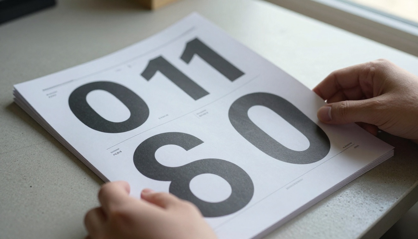
Big type is the loudest trend of the year. Instead of tiny 9-point body text under a decorative header, designers are building pages around massive numerals and short statements. A single figure such as "42%" set at 200 points does more work than a paragraph of explanation.
How to Use It Well
- Pair one expressive display typeface with a quiet, highly readable text face.
- Limit each spread to one hero number.
- Keep line lengths between 50 and 75 characters for body copy.
What to Avoid
Do not stack three display fonts on one page. The trend works because of contrast, so the supporting text must stay calm. Restraint is what makes large type look premium instead of loud.
Trend 2: Data Storytelling Over Data Dumps
The old model was a table of financials on page 64. The new model builds a narrative around each metric. A good spread has a headline claim, one clean chart, and two sentences of context.

Chart Choices That Work
- Single-series bar charts for year-over-year comparisons.
- Annotated line charts where one callout explains the spike or dip.
- Small multiples to compare regions or product lines without clutter.
- Simple icons with numbers for impact metrics.
Chart Choices That Fail
3D pies, rainbow palettes and dual axes confuse more than they clarify. If a reader has to study a legend, the chart has lost.
| Chart Type | Best For | Common Mistake |
|---|
| Bar chart | Comparing years or segments | Too many bars per page |
| Line chart | Trends over time | Missing annotations |
| Small multiples | Regional or product comparison | Inconsistent scales |
| Big number tile | Headline results | Adding unrelated decoration |
| Stacked area | Composition over time | More than four layers |
Trend 3: Earthy, Muted Color Palettes
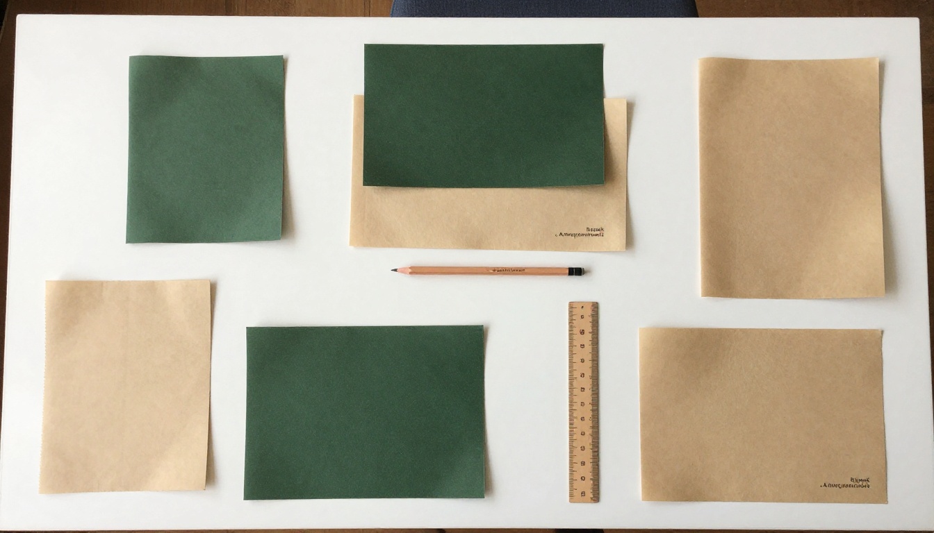
Bright corporate gradients are fading. In 2027 the dominant palettes are sand, moss, clay, deep navy and warm off-white. These colors print well on uncoated stock and also look calm on a screen.
Building a Palette in Four Steps
- Start from your brand color and mute its saturation by 20 to 30 percent.
- Add one warm neutral for backgrounds.
- Add one dark tone for text, never pure black.
- Reserve a single accent for the one number you want noticed.
✅ Best practice: Test your palette in grayscale. If the hierarchy still reads clearly, the contrast is strong enough for print, screens and color-blind readers.
Trend 4: Sustainability You Can See
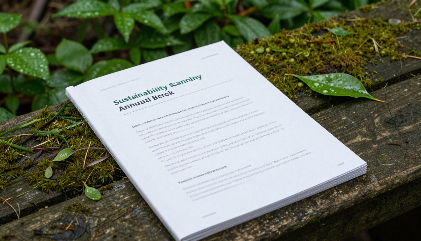
Readers have grown skeptical of green claims that arrive without evidence. The strongest reports now show progress with real photography, measured targets and plain language about what has not worked yet.
Practical Moves
- Replace stock leaf icons with photographs from your own sites and projects.
- Present targets as a simple table: goal, deadline, current status.
- Publish the miss as well as the win. Honesty reads as strength.
A regional food cooperative, for example, could pair a photograph of its new solar-roofed warehouse with one number: kilowatt-hours generated this year. That is more convincing than three pages of mission language. Non-profits can use the same approach with the Non-Profit Annual Report tool.
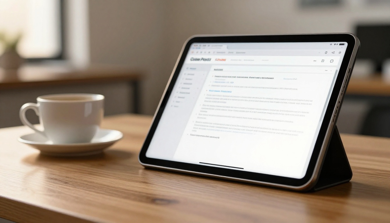
The biggest structural change is the move from static PDF to interactive publication. A flipbook keeps the familiar page-turning rhythm while adding links, video, audio and trackable reading behavior. It also loads fast on mobile, which a 40 MB PDF never does.
Format Comparison
| Feature | Static PDF | Web Microsite | Flipbook |
|---|
| Build time | Fast | Slow | Fast |
| Mobile reading | Poor | Excellent | Excellent |
| Page-turn feel | None | None | Yes |
| Embedded video and audio | No | Yes | Yes |
| Reader analytics | Limited | Yes | Yes |
| Password protection | Basic | Custom work | Built in |
| Development cost | Low | High | Low |
A microsite gives full flexibility but needs developers. A flipbook sits in the middle: the polish of a designed publication with none of the engineering overhead. If your team already exports a PDF from InDesign, the PDF to Flipbook Converter turns it into an interactive version in minutes.
Trend 6: Accessibility as a Design Feature
Accessibility used to be a footnote. In 2027 it is a visible quality signal, and in several regions a legal expectation.
The Basics Every Report Needs
- Contrast ratio of at least 4.5:1 for body text.
- Alt text on every image and chart.
- Logical reading order so screen readers follow the story.
- Minimum body size of 11 points in print and 16 pixels on screen.
- Color is never the only signal. Pair color with labels or patterns.
⚠️ Warning: Text placed over photographs is the most common accessibility failure in annual reports. Add a solid or semi-opaque panel behind it.
Trend 7: Mobile-First Reading
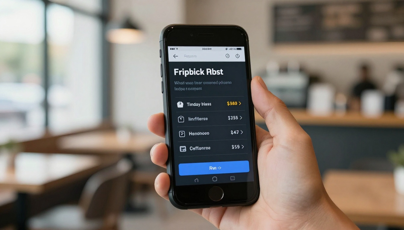
Executives skim reports on phones between meetings. That changes layout decisions: single-column sections, larger tap targets and charts that stay legible at 375 pixels wide.
Mobile Layout Rules
- Design the phone view first, then scale up.
- Keep one idea per screen.
- Avoid tables wider than four columns.
- Compress images so pages load in under two seconds.
Because a responsive flipbook adapts to any screen and can be embedded directly into your investor relations page, readers never have to download anything.
Trends at a Glance
| Trend | Impact on Readers | Effort | Best For |
|---|
| Oversized typography | Instant clarity | Low | Corporate and startup reports |
| Data storytelling | Higher trust | Medium | Finance and SaaS |
| Muted color palettes | Calm, premium feel | Low | Every sector |
| Visible sustainability | Credibility | Medium | Manufacturing, retail, food |
| Interactive formats | Longer reading time | Low | Any organization |
| Accessibility | Wider audience | Medium | Public companies, education |
| Mobile-first layout | Easier skimming | Medium | Global teams |
Real-World Scenarios
A mid-size software company replaces its dense financial section with five big-number spreads, each followed by a one-paragraph explanation. Investor questions about basic figures drop because the answers are now impossible to miss.
A hospital foundation publishes its report as a flipbook with embedded patient stories on video. Donors can watch a two-minute clip without leaving the page, and the foundation sees which stories get the most views.
A manufacturer shares a password-protected version with distributors that includes extra product-line detail, and a public version without it. Same design, two audiences.
How to Build a 2027-Style Report
Here is a practical workflow using Flipbooks AI and the Annual Report Creator.
Step-by-Step Tutorial
- Create your account. Sign up at Flipbooks AI and open a new project.
- Upload your PDF. Export your designed report at 150 DPI for the best balance of quality and load speed. The platform converts it into page-turning format automatically.
- Apply your branding. Set your logo, brand colors and background. Choose a page-turn effect that matches your tone: subtle for finance, livelier for creative sectors.
- Add multimedia. Embed a CEO video message, an audio summary or links from each chart to its source data.
- Choose sharing options. Copy the embed code for your investor page, share a direct link, or add password protection for board and lender versions.
- Turn on analytics. On the Professional plan, track which pages hold attention and capture leads from downloads. See the pricing plans for details.
- Allow offline downloads. Some stakeholders still want a copy for flights and quiet reading.
💡 Pro tip: Review analytics after the first week. Pages with high exit rates usually have too much text or a chart that is hard to read. Fix them in the next revision.
Related Tools Worth Trying
Common Mistakes to Avoid
- Too many trends at once. Pick three that match your brand and execute them well.
- Decorative photography. A generic handshake photo adds nothing. Use real people and places.
- Ignoring page weight. Heavy images slow every device. Compress before you export.
- Writing for the board only. Employees, customers and candidates read these reports too.
- Skipping a design review on mobile. Always scroll through your own report on a phone before publishing.

A Quick Pre-Publish Checklist
- Are the three most important numbers visible within the first five pages?
- Does every chart have one clear message?
- Does the palette hold up in grayscale?
- Is every image labeled with alt text?
- Does the report read comfortably on a 6-inch screen?
- Is there a clear next step for the reader, such as a link, a contact or a download?
Ready to Publish Yours?
The strongest annual reports of 2027 will not be the longest or the flashiest. They will be the ones that make a reader say "I get it" within ten seconds, on whatever device they happen to hold.
Ready to turn your report into something people actually open? Get started for free on Flipbooks AI, browse all available flipbook tools and templates, or compare pricing plans to pick the right fit for your team.



