Nobody opens an annual report hoping to be confused. Readers want to know whether revenue grew, where the money went, and what comes next, and they want the answer in seconds. Yet most reports bury those answers under cramped tables, decorative charts and walls of grey text. The good news is that clear numbers are mostly a layout problem, not a data problem. Whether you publish in print or as an interactive flipbook with Flipbooks AI, the same design rules decide whether a figure lands or gets skipped.
This article walks through the layout ideas that work best: grids, type scales, chart choices, table styling, color and white space. Each section includes examples you can copy and a quick checklist to run before sign-off.
Why Numbers Get Ignored
Before changing anything, it helps to see why readers skip figures in the first place. In most cases the cause is not the data. It is how the data is presented.

Too Many Competing Signals
When every number is bold, colored and boxed, nothing stands out. Readers cannot tell the headline result from a footnote. A page needs one clear focal figure, a few supporting figures, and the rest quietly in the background.
Tables Built for Auditors
Financial statements are required, but they are not the only way to show results. A 40-row table is a reference tool, not a story. Put the summary up front and push the detail to an appendix.
Charts That Decorate Instead of Explain
Three-dimensional bars, gradient fills and busy legends all add effort for the reader. A chart should answer one question, and the title should state that answer.
💡 Pro tip: Write the sentence you want the reader to take away first. Then design the page so that sentence is obvious in under five seconds.
Build a Grid First
Every readable report sits on a grid. A grid is just a set of invisible columns and margins that keeps numbers, captions and charts lined up from page to page.

Pick a Column Structure
A 12-column grid is flexible because it divides into halves, thirds and quarters. A three-column page suits highlight pages with big numerals, while a two-column page works well for narrative text beside a chart.
Keep Margins Generous
Tight margins make numbers feel crowded. Aim for outer margins of at least 15 mm on print pages, and give the gutter extra room so figures near the spine do not disappear into the fold.
Repeat the Same Positions
If the headline figure sits top left on page four, put it top left on page eight. Repetition teaches readers where to look, so they stop hunting.
| Layout Type | Best For | Typical Grid | Risk |
|---|
| Single column | Narrative letters | 1 wide column | Charts feel isolated |
| Two columns | Text plus chart | 6 + 6 | Uneven column heights |
| Three columns | Highlight figures | 4 + 4 + 4 | Text gets too narrow |
| Asymmetric | Editorial spreads | 8 + 4 | Needs strict alignment |
Give Big Numbers Room
The simplest way to make a figure easy to read is to make it big and give it space. A highlight page with three oversized numerals often does more than five pages of tables.
Use a Clear Type Scale
Choose a scale and stick to it. A reliable pattern looks like this:
- Hero figure: 60 to 96 pt, bold weight
- Supporting figure: 28 to 36 pt, medium weight
- Label or caption: 9 to 11 pt, regular weight, in grey
- Body text: 9.5 to 10.5 pt with 14 to 16 pt line spacing
Pair Every Number With a Label
A bare figure is meaningless. Add a short caption directly beneath it, such as "Revenue growth, year over year". Keep the unit next to the number, not buried in a footnote.
Choose Numerals Carefully
Use tabular figures (where every digit has the same width) in tables so columns line up. Use proportional figures in running text so spacing looks natural. Most professional typefaces offer both.
✅ Best practice: Round hero figures. "$4.2 billion" reads faster than "$4,187,340,512". Keep the exact value in the statement tables.
Choose the Right Chart
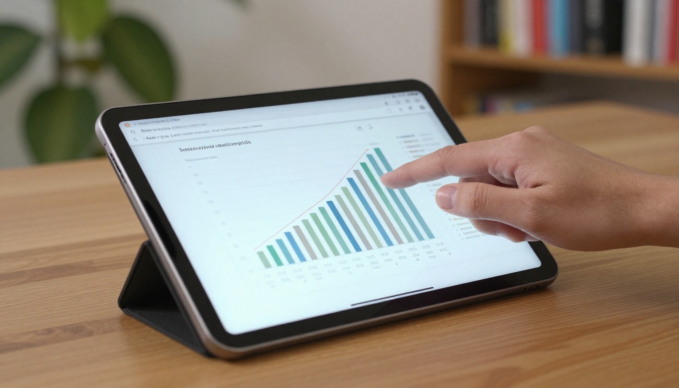
The wrong chart makes readers work. The right one answers the question without a legend.
Match Chart to Question
| Question | Best Chart | Avoid |
|---|
| How did we change over time? | Line chart | 3D columns |
| How do categories compare? | Horizontal bar chart | Pie with 8+ slices |
| What makes up the whole? | Stacked bar or simple donut | Exploded pie |
| Did we hit the target? | Bullet chart or progress bar | Speedometer gauge |
| How did the budget flow? | Waterfall chart | Dense table only |
Label Directly
Put values at the end of bars and names beside lines. Direct labels remove the back-and-forth between chart and legend, which is where most readers lose patience.
Start Bars at Zero
Bar lengths represent quantity. A truncated axis exaggerates differences and damages trust. Lines can use a non-zero baseline, but say so clearly.
Highlight One Series
Color a single bar or line in your brand accent and set the rest in neutral grey. The eye goes straight to the story.
Design Tables People Can Read
Tables are unavoidable in an annual report. They do not have to be painful.

Remove the Grid Lines
Vertical lines and full borders add noise. Use thin horizontal rules every few rows, or light row shading, and let white space separate columns.
Align Numbers Right
Right-align numerals so the decimal points stack. Left-align text labels. Mixing the two is the most common reason tables look messy.
Group and Subtotal
Break long tables into labeled groups of four to six rows. Make subtotals bold and add a slightly heavier rule above totals.
A Quick Before and After
| Element | Before | After |
|---|
| Borders | Full grid, 1 pt black | Horizontal hairlines only |
| Alignment | Centered numbers | Right-aligned, tabular figures |
| Row height | Tight, 12 pt | Relaxed, 18 pt |
| Totals | Same weight as rows | Bold with top rule |
| Negative values | Minus sign only | Parentheses and muted red |
Use Color With Discipline
Color should carry meaning, not decoration. A restrained palette makes figures easier to scan and easier to print.

Limit the Palette
Pick one primary brand color, one accent and a set of greys. That is enough for nearly every chart in the report. More than four chart colors forces readers to consult a legend.
Keep Meaning Consistent
If teal means revenue on page six, it should mean revenue on page thirty. Do not reuse a color for a different series.
Check Contrast and Color Blindness
Body text and numerals need strong contrast against the background. About 1 in 12 men has some form of color vision deficiency, so never rely on red versus green alone. Add labels, patterns or direction arrows.
⚠️ Warning: Light grey text on a white page may look elegant on a monitor but vanishes in print. Test a physical proof or a low-brightness screen.
Let White Space Do the Work
White space is not wasted space. It is the pause that lets a number register.
One Idea Per Page
Resist the urge to fit three topics on one spread. A page with one chart, one headline and a short paragraph is faster to read than a crowded dashboard.
Group Related Items
Place a figure close to its explanation and far from unrelated content. Proximity tells readers what belongs together without extra lines or boxes.
Break Up Long Sections
Use a pull-out number or a short summary box every two or three pages. These act as rest stops and reward skimmers.
Layout Ideas to Copy
Here are four page patterns that consistently perform well:
- The Three-Number Opener: Three hero figures across the top, each with a one-line caption, and a short paragraph below.
- The Chart Plus Takeaway: A single chart on the left two-thirds, with a bold sentence and two bullet points on the right.
- The Annotated Table: A simple table with one row highlighted and a callout explaining the change.
- The Year in Numbers Strip: A horizontal band of small figures running across the bottom of several pages, giving a consistent reference point.
A Real-World Scenario
A mid-sized logistics company replaced a ten-page financial summary with a two-page spread: three hero figures, one waterfall chart for operating costs, and a compact table in the appendix. Their finance team reported fewer follow-up questions from investors, because the main numbers were visible before anyone needed to ask.

Plan the Page Sequence
Readable numbers also depend on order. A good report moves from summary to detail.
Suggested Flow
| Section | Purpose | Layout Tip |
|---|
| Highlights | Fast headline results | Three or four hero figures |
| Leadership letter | Context and tone | Single column, one pull quote |
| Operating review | Explain performance | Chart plus short text |
| Financial summary | Core statements | Clean tables, subtotals |
| Appendix | Reference detail | Compact, consistent tables |
Sketch Before You Build
Thumbnail every page on paper or a whiteboard first. Seeing the whole rhythm of the report reveals where it is too dense or too repetitive.

Publish It as a Flipbook
A clear layout deserves a format that keeps it intact. PDFs force pinching and zooming on phones, which punishes small numbers. A flipbook preserves your grid, turns pages naturally and adapts to mobile screens.
How to Create an Annual Report Flipbook
Follow these steps with Flipbooks AI:
- Export your report as a PDF from your layout tool, at full resolution with fonts embedded.
- Create an account at Flipbooks AI and open the PDF to Flipbook Converter.
- Upload the PDF. Conversion keeps your pages, charts and tables sharp.
- Customize the look. Add your logo, set brand colors and choose a page-turn effect.
- Add multimedia. Embed a short CEO video or audio summary beside the highlights page.
- Share it. Copy a direct link, grab an embed code for your investor page, or add password protection for board-only drafts.
For purpose-built options, try the Annual Report Creator, the Corporate Report Maker or the Non-Profit Annual Report tool. You can also embed the flipbook on your website without losing quality.
Features That Help Readers
- ✅ No watermarks, ever
- ✅ Mobile-responsive pages that keep numbers legible
- ✅ Password protection for private content
- ✅ Offline downloads for travelers
- ✅ Analytics and lead generation on the Professional plan, so you can see which pages hold attention
| Format | Number Legibility on Phone | Interactivity | Tracking |
|---|
| Print | Not applicable | None | None |
| Plain PDF | Poor, needs zoom | Minimal | Download count only |
| Flipbook | Good, responsive | Video, audio, links | Page-level analytics |
Final Checklist Before Sign-Off
Run through this list on every spread:
- Is there one obvious focal figure?
- Does every number have a label and a unit?
- Are table numerals right-aligned with tabular figures?
- Does each chart answer one question, with a title that states the answer?
- Is color used with the same meaning throughout?
- Is there enough white space around the main figures?
- Did you test on a phone and a printed proof?

💡 Pro tip: Hand the draft to someone outside the finance team and ask them to find the revenue figure. If it takes more than five seconds, adjust the layout.
Put These Ideas to Work
Readable numbers come from a handful of habits: a steady grid, a clear type scale, honest charts, calm tables, disciplined color and plenty of white space. Apply them page by page and your annual report will answer questions before readers think to ask them.
Ready to publish? Get started for free on Flipbooks AI, browse all flipbook tools and templates, or compare pricing plans to pick the right fit for your team.



