Picture an investor on a morning train, thumb and forefinger spread across the screen, hunting for one revenue figure in a sea of eight-point type. They give it ninety seconds, then close the file. Your carefully produced annual report just lost a reader it spent months trying to win. If you publish reports as plain PDFs, this scene happens every day, and a platform like Flipbooks AI exists largely to stop it.
This article walks through the annual report PDF mistakes that frustrate phone readers most often, shows what each one costs you, and gives a practical fix. You will also get comparison tables, a quick audit checklist and a short tutorial for converting an existing PDF into something that reads well on a small screen.
Why Phone Readers Matter Now
Annual reports used to be printed, mailed and read at a desk. Today analysts skim them between meetings, journalists check figures from a taxi, and donors open a nonprofit report from a link in an email. Email itself is the main driver: most newsletters are opened on mobile first, so the link to your report lands on a phone before it ever reaches a laptop.
A PDF was built to preserve a printed page. That is its strength and, on a phone, its biggest weakness. The page keeps its fixed size, so a letter-sized layout gets shrunk to roughly the width of a playing card.
💡 Pro tip: Open your last annual report on your own phone today, without zooming. If you cannot read the body text and the main chart in ten seconds, your readers cannot either.
The Behavior Gap
Desktop readers scroll, compare and cross-reference. Phone readers scan, tap and leave. Designing for the first group while serving the second is the root of nearly every mistake below.
What Frustration Costs
A frustrated reader rarely complains. They simply leave, and you lose:
- Time on page, which makes your report look less interesting than it is
- Trust, because a clumsy file suggests a clumsy organization
- Follow-up actions such as investor inquiries, donations or contact requests
Mistake 1: Text Too Small to Read

This is the most common complaint. A standard annual report uses 9 to 10 point body text on a page about 8.5 inches wide. On a phone that fits a screen roughly 2.5 inches wide, the text shrinks to something like 3 points in apparent size.
The Pinch and Pan Problem
Zooming in solves the size but creates a new problem. Once zoomed, readers must pan left and right to finish every line, losing their place constantly. Reading a paragraph becomes a physical workout.
The Fix
- Use a responsive format where text reflows to the screen width
- If you keep a fixed layout, make sure it opens in a viewer that fits the page to screen and supports smooth tap-to-zoom
- Set pull quotes and key statements at a larger size so at least the headline message survives the shrink
Mistake 2: Print Layouts Forced Onto Small Screens
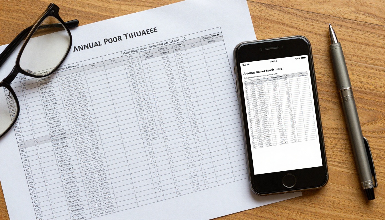
Multi-column pages, sidebars, footnotes and full-bleed photos look elegant in print. On a phone they become a puzzle. The reader does not know whether to read down the first column or across the page.
| Print Layout Element | What Happens on a Phone | Better Mobile Approach |
|---|
| Three-column body text | Columns are tiny, reading order is unclear | Single column, short paragraphs |
| Sidebars and callout boxes | Squeezed beside the main text | Inline callouts between paragraphs |
| Two-page spreads | Pages appear as small halves | Single page view with swipe navigation |
| Footnotes at page bottom | Unreadable and easy to miss | Inline notes or short expandable text |
| Full-bleed photos with overlay text | Text gets lost in the image | Image above, text below |
Think in Screens, Not Pages
Treat every phone screen as a small card with one idea on it. If a page holds four ideas, it will feel crowded no matter how well it is designed.
Mistake 3: Huge File Sizes and Slow Loading

Annual reports are full of high-resolution photography prepared for print. It is common to see PDFs of 40, 60 or even 100 MB. On a mobile connection, that means a long wait with a blank screen.
Many readers will not wait. Some mobile browsers also refuse to preview very large files and push a download instead, which then sits unopened in a downloads folder.
Where the Weight Comes From
- Print-resolution images at 300 DPI or higher
- Embedded fonts in many weights and styles
- Unused hidden layers left from the design software
- Vector charts with thousands of tiny points
The Fix
- Export a separate web version of the report, not the print master
- Compress photos to roughly 150 DPI for screen use
- Subset fonts so only the characters used are embedded
- Load pages progressively so the first page appears before the entire file has finished downloading
⚠️ Warning: Never replace your print master with the compressed file. Keep both versions and label them clearly.
Mistake 4: Tables That Cannot Be Read

Financial statements are the heart of an annual report, and they are also the worst offenders. A table with eight columns of figures simply cannot fit into a portrait phone screen at a readable size.
Charts Fare No Better
A chart with a legend, eight data series and axis labels in 7 point type becomes a colored smudge on a phone. Readers cannot tell which line is which.
| Content Type | Common Mistake | Mobile-Friendly Alternative |
|---|
| Financial tables | Eight or more columns on one page | Split into two tables of three or four columns |
| Line charts | Legend far from the lines | Label lines directly at the endpoint |
| Pie charts | Many tiny slices with small labels | Limit to four slices or use a bar chart |
| Infographics | Dense text inside the graphic | Short captions placed below the image |
| Year-over-year comparisons | Five years of columns | Show three years and link to the full dataset |
The Fix
- Highlight the three to five figures people actually look for, such as revenue, profit and growth, in a large, simple summary at the top
- Keep detailed tables available, but make them a deliberate second layer
- Design important charts so they still work when the reader rotates the phone to landscape
A mouse pointer is precise. A thumb is not. Underlined links set in 9 point text sit so close together that a tap often opens the wrong one, or nothing at all.
Table of contents entries are a classic case. A long list of closely spaced page numbers feels impossible to tap accurately.
Tap Target Basics
Interface guidelines generally recommend touch targets of at least 44 by 44 pixels with a little spacing around them. A typical inline PDF link is a fraction of that.
The Fix
- Turn your table of contents into large, spaced-out tappable rows
- Replace long web addresses with short text like "See the sustainability data"
- Use clear buttons for the most important actions, such as contacting investor relations or downloading the full financials
Mistake 6: No Mobile-Friendly Navigation
A 120 page PDF with no usable navigation forces readers to swipe endlessly. Phone users want to jump straight to what they came for, whether that is the CEO letter, the balance sheet or the sustainability section.
Common Navigation Failures
- No bookmarks or outline in the file
- A table of contents on page 3 with no way to return to it
- No visible page numbers or progress indicator
- No search that works smoothly on a touch screen
The Fix
Give readers a persistent way to move around: a visible thumbnail strip or menu, a quick link back to the contents, and a search box. When a reader can reach any section in two taps, the report feels short even when it is long.
Mistake 7: Ignoring the Rest of the Experience
Some mistakes are less about the file and more about how it reaches the reader.
| Mistake | Why Readers Get Frustrated | Quick Fix |
|---|
| Forced download before viewing | Extra steps and storage clutter | Open in the browser directly |
| Login required to view | Friction on a small keyboard | Offer a simple password only when needed |
| Video and audio not embedded | Reader must leave the report | Embed media inside the pages |
| No sharing option | Cannot forward a section to a colleague | Provide a short shareable link |
| Dark text on busy photo backgrounds | Glare outdoors reduces readability | Use strong contrast and solid backgrounds |
Accessibility Is Also Mobile Design
Readers with low vision rely on text scaling and screen readers. Scanned images of text and untagged PDFs break both. Fixing these helps everyone, because a good reading experience for the hardest case is a good reading experience for all.
How to Audit Your Report in 15 Minutes
Before redesigning anything, test what you have. A simple audit shows you where the biggest losses are.
- Send yourself the link and open it from an email on your phone, not your laptop
- Time the first page load on mobile data, not office Wi-Fi
- Read one paragraph without zooming and note how it feels
- Find a specific figure, such as net income, and time how long it takes
- Tap three links in a row and count the misses
- Rotate the phone and check whether charts become more readable
- Ask a colleague outside your team to repeat steps 3 to 5 and watch silently
✅ Best practice: Test on at least two different phones, one older and one newer, with different screen sizes. Problems that never show up on a flagship device can ruin the experience for half your audience.
Scoring Your Results
| Test | Good Result | Needs Work |
|---|
| First page load | Under 3 seconds | Over 8 seconds |
| Reading without zoom | Comfortable | Requires pinching |
| Finding a figure | Under 20 seconds | Over a minute |
| Tapping links | No misses | Two or more misses |
Fixing It Without Redesigning Everything

Many teams assume the fix means rebuilding the entire report in a new layout tool. That is expensive and slow. A more practical route is to convert the existing PDF into a responsive flipbook that handles zooming, navigation and loading for you, while keeping the design your team already approved.
PDF vs Flipbook on a Phone
| Feature | Standard PDF | Flipbook Format |
|---|
| Opens in the browser | Often downloads first | Yes, via a simple link |
| Loading | Whole file at once | Page by page |
| Navigation | Basic scrolling | Swipe, thumbnails, contents menu |
| Embedded video and audio | Limited | Supported |
| Analytics | None | Views, time on page, clicks |
| Password protection | Limited | Built in |
How to Convert an Annual Report With Flipbooks AI
If you want a quick result, the Annual Report Creator and the PDF to Flipbook Converter are built for this exact job. Here is the short path.
- Create an account. Go to Flipbooks AI and sign up. The free option lets you test your first report.
- Upload your web version PDF. Drag the compressed file into the uploader. The conversion runs automatically and keeps your pages in order.
- Check the mobile view. Open the preview on your phone, not just your laptop. Confirm that text is readable and pages fit the screen.
- Customize the look. Add your logo, set brand colors, pick a page turn effect and add a clear cover. There are no watermarks on your flipbooks.
- Add interactive layers. Embed a short CEO video or an audio summary, and make the table of contents tappable.
- Set sharing options. Copy a direct link, use the embed code for your investor relations page, or protect the report with a password for board-only sections.
- Track results. On the Professional plan you get analytics and lead generation, so you can see which sections get read. Compare options on the pricing page.
💡 Pro tip: Offline downloads let investors keep the report on a phone for a flight or a commute with no signal, which removes the loading problem completely.
Real-World Scenarios
- A nonprofit sends its yearly impact report to donors by email. With a flipbook link, donors read the story on a phone in a few swipes, and the team uses the Non-Profit Annual Report tool to match its brand.
- A mid-size company publishes its results to shareholders. A mobile-friendly Corporate Report Maker file loads quickly and lets analysts jump straight to the financials.
- A startup shares an investor update after each quarter. Analytics show which slides investors revisit, guiding the next conversation.
Design Habits That Prevent These Problems

Fixing this year's report is good. Building habits so next year's report is right from the start is better.
Start With the Phone
Draft the summary page for a phone first. If the story works on a small screen, adding detail for larger screens is easy. Going the other direction rarely works.
Write for Skimming
- Keep paragraphs to three or four lines
- Use descriptive headings so readers know where they are
- Put the most important number at the top of each section
- Prefer short sentences over long, formal ones
Build a Mobile Checklist
| Stage | Question to Ask |
|---|
| Planning | Which three numbers must a phone reader see first? |
| Design | Is the smallest text still comfortable at phone width? |
| Export | Is the web file under a size a mobile connection handles easily? |
| Review | Did someone outside the team test it on a real phone? |
| Launch | Does the link open without a download or login? |
Keep Both Audiences Happy
Not every reader is on a phone. Board members may still want a printable version. Keep the print master available as a secondary download, while making the flipbook the main link you share.
What a Good Result Looks Like
When you get this right, the experience changes in small but noticeable ways. The first page appears quickly. The headline numbers are readable without zooming. The reader taps once to jump to the financials, rotates the phone to see a chart at full width, and shares one page with a colleague through a short link.
Nothing about this requires a new brand, a new designer or a new report. It requires respect for the way people actually read in 2027: quickly, on small screens, and with very little patience for friction.
Ready to Fix Your Report?
Start by testing your current file on your own phone today. Then pick the two or three mistakes that hurt most and fix those first.
Your readers are already holding their phones. Give them a report that works in their hands.



