You export a gorgeous brochure from Canva, send it to your whole mailing list, and then a reader who uses a screen reader tells you the file sounds like a pile of random words. It happens more often than designers expect. Beautiful on screen does not mean readable out loud. If you publish documents online, whether as PDFs or as interactive pages on a platform like Flipbooks AI, accessibility deserves a place in your workflow from the first draft.
So, are Canva PDFs accessible to screen readers? Partly. Canva produces real, selectable text and working links, which is a solid start. But reading order, heading structure, alt text and document language are often incomplete, and those gaps decide whether a blind or low-vision reader can actually follow your document.
This article walks through what works, what breaks, how to test your own files in ten minutes, and what to do when a PDF is not enough.
What a Screen Reader Needs

A screen reader such as NVDA, JAWS, VoiceOver or TalkBack does not look at your page. It reads a hidden structure behind it. In a PDF, that structure is called the tag tree. Without tags, the software guesses the order from raw text positions, and guesses go wrong fast on designed layouts.
The Four Basics
For a PDF to read well, it needs:
- Real text, not text flattened into an image or outlined shapes.
- A logical reading order that matches how a sighted person reads the page.
- Headings, lists and tables marked as such in the tags.
- Alt text for meaningful images, and a document language and title.
Why Design Tools Struggle
Layout tools think in layers and positions. A text box placed at the right of a photo is simply "somewhere on the page." A screen reader needs to know whether it comes first, second or last. That gap between visual placement and logical sequence is where most Canva exports fail.
💡 Pro tip: Press the Tab key through a published document or listen with a free screen reader for two minutes. You will notice order problems faster than any checklist can show them.
What Canva Does Well
Canva has improved its export over time, and it is fair to give credit where it is due.
Real, Selectable Text
When you export a standard PDF, Canva keeps your text as live text with embedded fonts. That means a screen reader can voice the words, users can zoom without blur, and the content can be searched. This is the single biggest advantage over exporting a flat image or screenshot.
Working Links
Hyperlinks you add inside Canva survive the export and are clickable in the PDF. Screen reader users can list all links on a page and jump between them, as long as the link text makes sense on its own. "Click here" is useless out of context. "Download the 2027 price list" works.
Alt Text Fields
Canva lets you add alternative text to images and mark purely decorative ones. When you fill those in, they can travel into the exported file. The catch is that most people never open that field.
Where Canva PDFs Break
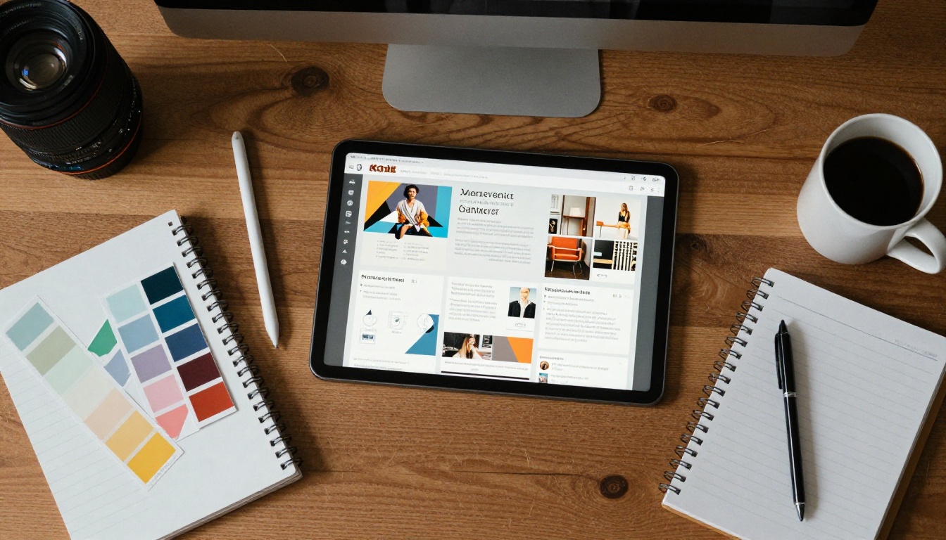
The problems cluster in a few predictable places. Results can vary by export option and by how a design was built, so treat the table below as a checklist of risks rather than a promise.
| Accessibility Item | Typical Canva Result | Risk for Screen Reader Users |
|---|
| Selectable text | Usually present | Low |
| Reading order | Follows layer order, often wrong | High |
| Heading tags (H1, H2) | Often missing or flattened | High |
| Alt text on images | Only if you added it | Medium to high |
| Document language | Sometimes unset | Medium |
| Data tables | Rarely tagged as true tables | High |
| Color contrast | Depends entirely on your design | Medium |
| Links | Work, but text may be vague | Low to medium |
Reading Order Problems
Canva often reads elements in the order they were created or layered, not in the order a person would read them. If you added the footer first and the headline last, a screen reader may announce the footer first. Designs with overlapping boxes, text over photos and multiple columns are the worst offenders.
Missing Heading Structure
Large bold text looks like a heading to your eyes. To a screen reader, it is just a paragraph unless it is tagged. Without headings, users cannot skip to a section, which is the main way blind readers move through long documents. Imagine reading a 40-page report with no table of contents and no chapter breaks, only a single endless scroll.
Tables Built From Text Boxes
Many designers build pricing grids or schedules from separate text boxes and lines. A screen reader hears the cells as a loose stream of words with no row or column relationship. "Basic, 10, Pro, 50, Team, 200" tells the listener nothing without the headers.
Text Baked Into Images
Infographics, stylized quotes and anything exported as a picture are invisible to assistive tools unless you supply alt text. If a menu, a schedule or a price list lives inside an image, a blind reader gets nothing at all.
How to Test Your Canva PDF

You do not need to be an expert. A short audit catches the big failures.
Step by Step Check
- Export your file from Canva as a standard PDF.
- Open it in Adobe Acrobat and run the built-in accessibility checker from the Tools menu.
- Check the Tags panel to see whether headings, paragraphs and figures appear in a sensible order.
- Listen to it. Use NVDA on Windows (free) or VoiceOver on Mac and read the first two pages aloud.
- Try the free PAC checker if you want a stricter, standards-based report.
- Note every failure and decide whether it can be fixed in Canva or needs repair afterward.
What the Checker Cannot Tell You
Automated tools catch missing tags, language and alt text. They cannot tell you whether your alt text is useful or whether the order sounds natural. Only a human ear can judge that.
⚠️ Warning: A file that passes an automated checker can still be frustrating to read. Always combine a tool report with a listening test.
Fixing a Canva PDF Before Export
Most problems are easier to prevent than to repair. These habits make a noticeable difference.
Design With Order in Mind
- Use a single-column layout whenever the content allows it.
- Avoid stacking text over busy photos.
- Create elements in the order a person should read them.
- Keep each page to one clear idea.
Write Real Alt Text
Describe the purpose of the image, not just what it shows. "Chart showing sales rising 40 percent from January to June" helps. "Graph" does not. Mark decorative flourishes as decorative so they are skipped.
Choose Contrast and Sizes Carefully
Low-vision readers depend on strong contrast even when they do not use a screen reader. Aim for a contrast ratio of at least 4.5 to 1 for body text. Keep body type at 12 points or larger and avoid thin light-gray fonts.
| Element | Recommended Minimum | Common Mistake |
|---|
| Body text contrast | 4.5 to 1 | Light gray on white |
| Large text contrast | 3 to 1 | Pastel on pastel |
| Body font size | 12 pt or more | 9 pt captions in dense blocks |
| Link text | Descriptive phrase | "Click here" |
| Image alt text | One or two clear sentences | Empty or "image1" |
Fix the Rest in Acrobat
If the file still fails, Acrobat's Accessibility tools let you set the language, reorder tags, add heading levels and fix alt text. It is slower than getting it right at the source, but it works for one-off documents.
Real-World Scenarios

Accessibility sounds abstract until you picture the people behind it.
A Restaurant Menu
A cafe owner designs a menu in Canva and posts the PDF. A blind customer opens it on a phone and hears dishes and prices in a scrambled order, so "Grilled salmon" is followed by someone else's dessert price. A single-column menu with real headings for Starters, Mains and Desserts solves this.
A Nonprofit Annual Report
A 30-page report full of charts goes out to donors and board members. Several readers use screen readers or magnify pages. Charts without alt text and statistics trapped in images exclude the very people the organization serves.
A Real Estate Brochure
An agent shares a property brochure with photos, a floor plan and contact details. The floor plan is an image with no description, and the phone number sits in a decorative graphic. A buyer using assistive tech cannot find either.
Legal Pressure Is Real
Accessibility is not only kindness. Many regions require accessible documents for public bodies, education and, increasingly, businesses. Standards such as WCAG and PDF/UA set the expectations. Even where the law is quiet, accessible files reach more readers and perform better in search.
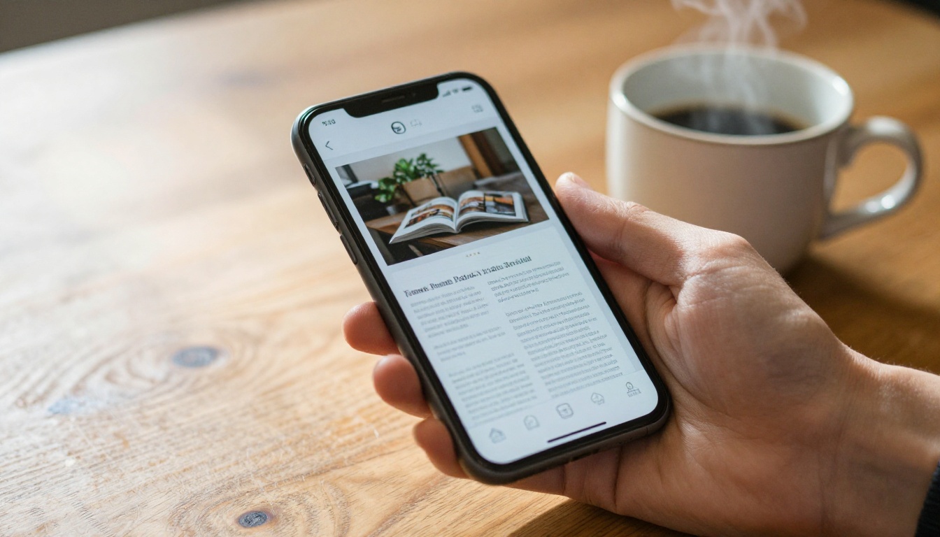
PDFs are fixed-layout files. They were built to look identical everywhere, which is the opposite of how assistive technology prefers to work. On small phone screens, users pinch and pan across a page, and reflowing text is limited.
What HTML Does Better
Web-based documents can reflow, resize text, follow semantic headings and respond to screen reader navigation naturally. That is why many teams now publish a web version beside, or instead of, the PDF.
| Format | Screen Reader Support | Mobile Reading | Effort to Make Accessible |
|---|
| Untagged PDF | Poor | Pinch and pan | Low effort, poor result |
| Tagged PDF | Good if tagged well | Pinch and pan | Medium to high |
| Web page or HTML | Excellent | Reflows naturally | Medium |
| Interactive flipbook | Good with text content and alt text | Responsive | Low to medium |
A Practical Middle Path
If your audience loves the page-turning feel of a brochure or catalog, you can keep the visual design and still offer a better reading experience online. Converting your PDF with the PDF to Flipbook Converter gives you a responsive, mobile-friendly viewer with no watermarks, and a text-based source file gives assistive tools more to work with.
✅ Best practice: Offer an accessible alternative, such as a plain text version or tagged PDF, next to any visual flipbook. Tell readers where to find it.
How to Publish an Accessible Flipbook

If you design in Canva and want a more flexible output, here is a simple path to a shareable flipbook. Start with a PDF that already follows the habits above, then convert it.
Upload and Convert
- Go to Flipbooks AI and create a free account.
- Upload your Canva PDF. Text-based files convert best, so avoid exporting pages as flat images.
- Wait a few moments while the pages are processed into a flipbook.
- Preview it on desktop and on your phone.
Customize the Experience
- Add your logo and brand colors so the viewer looks like your own site.
- Choose a page effect that feels natural, or keep it subtle for readers sensitive to motion.
- Embed videos and audio when they help, and always provide a text equivalent such as captions or a transcript.
Share It Your Way
- Copy a direct link for email and social posts.
- Use the Embed Flipbook on Website tool to place it on any page.
- Turn on password protection for private documents.
- Allow offline downloads so readers can open the file in their preferred tool.
Measure What Happens
The Professional plan adds analytics and lead generation, so you can see which pages people read and where they leave. Compare options on the pricing page.
💡 Tools built for specific documents can speed things up. Try the Digital Catalog Maker for product lines or the Restaurant Menu Creator for menus.
A Practical Accessibility Checklist

Print this and keep it near your desk. Run through it before every export.
Before You Design
- Decide the reading order of each page.
- Pick a font at 12 points or larger and a high-contrast color pair.
- Plan headings: one main title, then logical sections.
While You Design
- Add alt text to every meaningful image.
- Mark decorative elements as decorative.
- Write link text that makes sense out of context.
- Avoid putting essential information only inside images.
After You Export
- Run Acrobat's accessibility checker.
- Check the tag order and heading levels.
- Set the document title and language.
- Listen to the first pages with a screen reader.
Common Mistakes to Avoid
- Assuming a good-looking file is an accessible file.
- Using color alone to signal meaning, such as red for errors with no label.
- Building tables from text boxes and lines.
- Skipping the listening test because the checker said "pass."
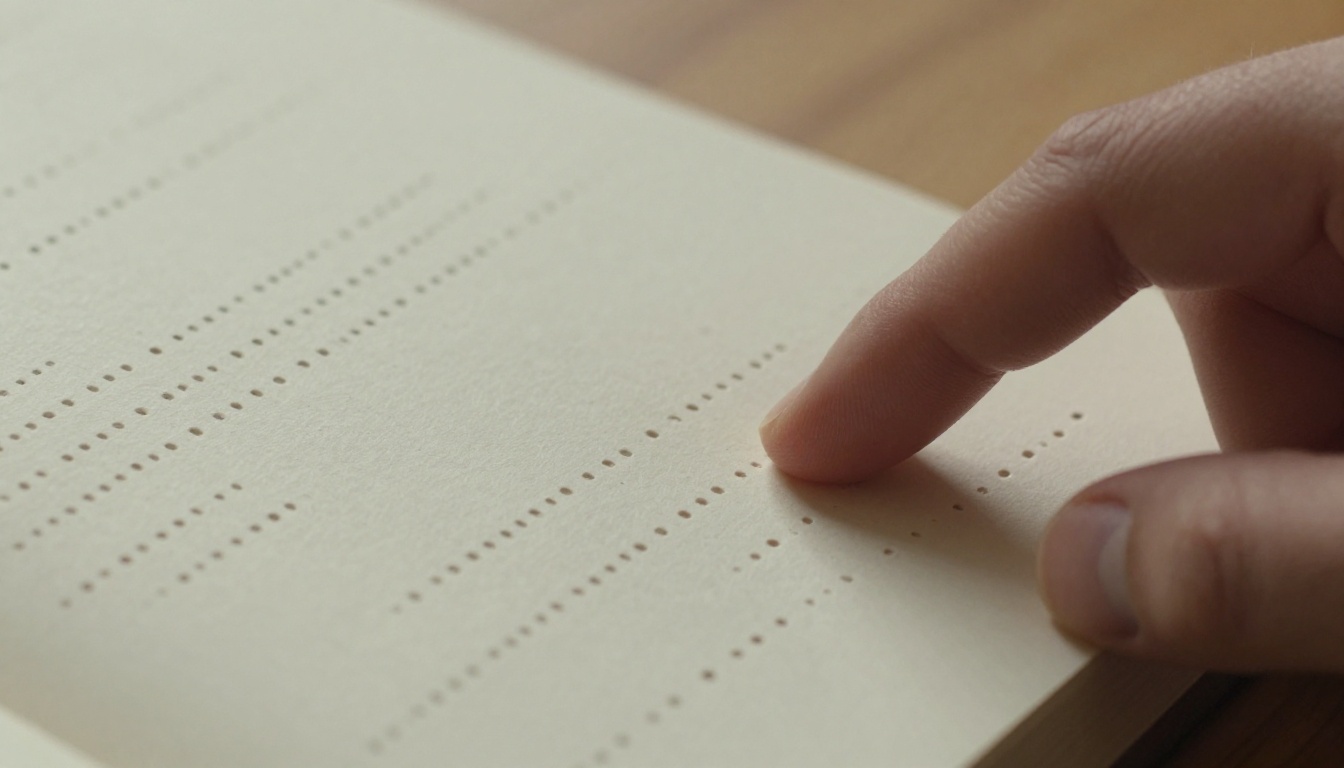
Accessibility benefits more people than you might guess. Captions help commuters on silent trains. Clear headings help skimmers. Strong contrast helps anyone reading outdoors. When you design for the edge, the middle gets better too.
Make Every Reader Welcome

So, are Canva PDFs accessible to screen readers? They can be, but only when you build them that way. Out of the box you get live text and working links, and you often get scrambled reading order, missing headings and silent images. A fifteen-minute check can reveal which of those your file has.
Start small. Add alt text. Simplify the layout. Run the checker. Listen to the result. Then decide whether a PDF is the right container, or whether a responsive flipbook serves your audience better.
Ready to try? Get started for free on Flipbooks AI and turn your next PDF into a flipbook that works on every screen. Browse all flipbook tools to find the right template, or compare pricing plans to choose what works for you.



