Autumn is the strongest quarter for home product sales, and it's not even close. Shoppers redecorate, nest, and gift with an urgency that no other season replicates, and the brands that prepare their catalogs specifically for that emotional moment are the ones that win the season. Whether you sell textiles, ceramics, furniture, or seasonal decor, a well-crafted autumn catalog is one of the highest-ROI pieces of content you can produce. Flipbooks AI makes it straightforward to turn that catalog into an interactive digital experience that reaches customers wherever they are.
Why Autumn Drives Home Purchases
The psychology behind fall buying
When temperatures drop, people spend significantly more time at home. That shift in behavior translates directly into a desire to invest in their living spaces. Retail data consistently shows a 30-45% spike in home goods purchases between September and November compared to summer. Consumers aren't shopping purely for utility; they're buying a feeling: warmth, safety, coziness, the comfort of a well-appointed home. Your autumn catalog is your brand's bid for that emotional purchase, and every page needs to earn it.
What fall shoppers actually respond to
Autumn catalog shoppers aren't looking at products in isolation. They're looking for:
- Tactile textures they can almost feel through the screen: chunky knit throws, brushed linen, matte ceramic glazes, weathered wood
- Warm color stories that mirror what's happening outside: amber, burnt sienna, deep forest green, dusty burgundy
- Room context that shows products living in spaces, not floating on white backgrounds
- Layered, curated styling that suggests how products work together as a collection
Miss any of these, and the catalog feels generic. Nail them all, and you have a document that makes people want to shop.
Autumn Color Palettes That Work

Color is the first thing a reader processes before reading a single word. Getting your autumn palette right is foundational to everything else in the catalog.
Warm earth tones versus deep jewel tones
There are two distinct directions autumn catalogs tend to take, and both work depending on your brand positioning:
| Palette Direction | Core Colors | Best For | Mood |
|---|
| Warm Earth Tones | Terracotta, ochre, raw sienna, oatmeal, sage | Artisanal, handmade, organic brands | Grounded, natural, hygge |
| Deep Jewel Tones | Burgundy, forest green, navy, plum, brass | Luxury, heritage, premium brands | Rich, moody, sophisticated |
| Mixed Harvest | Rust, cream, amber, muted gold, dark brown | Mass-market, lifestyle brands | Versatile, approachable, warm |
💡 Pick one dominant direction and accent with the other. A jewel-tone catalog with terracotta ceramics as accent props feels intentional. A pure terracotta catalog with no depth reads as flat.
How to pair neutrals with accent colors
Neutrals do the heavy lifting in any autumn catalog. They give the eye a place to rest between richer, more stimulating pages. The formula that works across most home brand categories:
- 60% neutral base (warm white, oatmeal, natural linen, stone)
- 30% mid-tone autumn color (rust, sage, amber, clay)
- 10% deep accent (burgundy, dark walnut, aged brass, black)
Apply this ratio to backgrounds, props, and even typography choices when designing individual catalog spreads.
Product Photography for Fall Catalogs
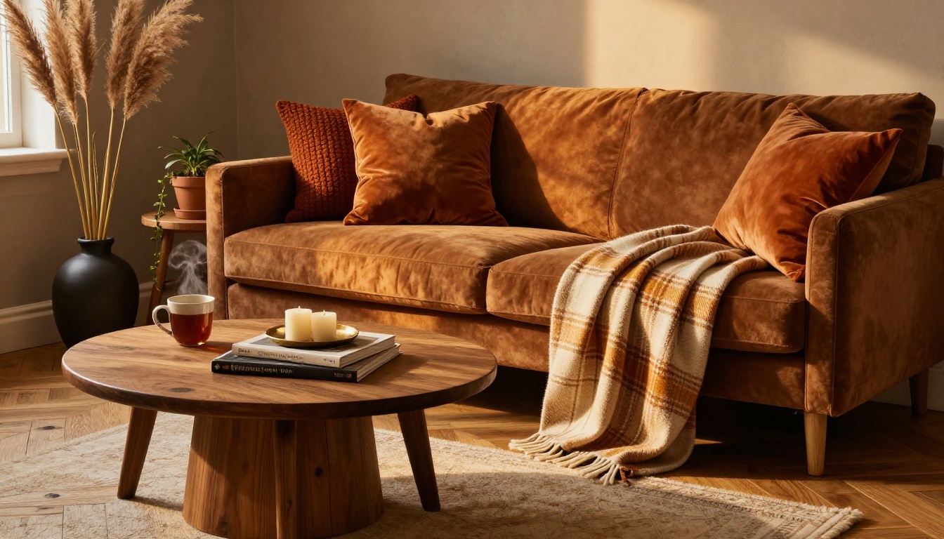
Photography is where autumn catalogs are won or lost. The rules of fall product photography differ from any other season.
Natural lighting tricks for autumn shots
Autumn light has a quality that's genuinely beautiful and genuinely difficult to fake in post-production. The goal is to capture it correctly from the start:
- Shoot in morning or late afternoon: Golden hour in September and October creates a warmth that's impossible to replicate artificially. Schedule shoots between 8-10 AM and 4-6 PM.
- Use north-facing windows for diffused light: Overcast autumn days are ideal for even, shadowless product photography. A cloudy day is an asset, not a setback.
- Side-light for texture: Raking light from the side reveals the texture of fabrics, ceramics, and wood grain in ways that flat frontal lighting completely destroys.
- Avoid overhead fluorescents: Fluorescent light reads as blue-green on camera. In autumn product photography, that kills the warmth entirely.
Props and styling for autumn scenes
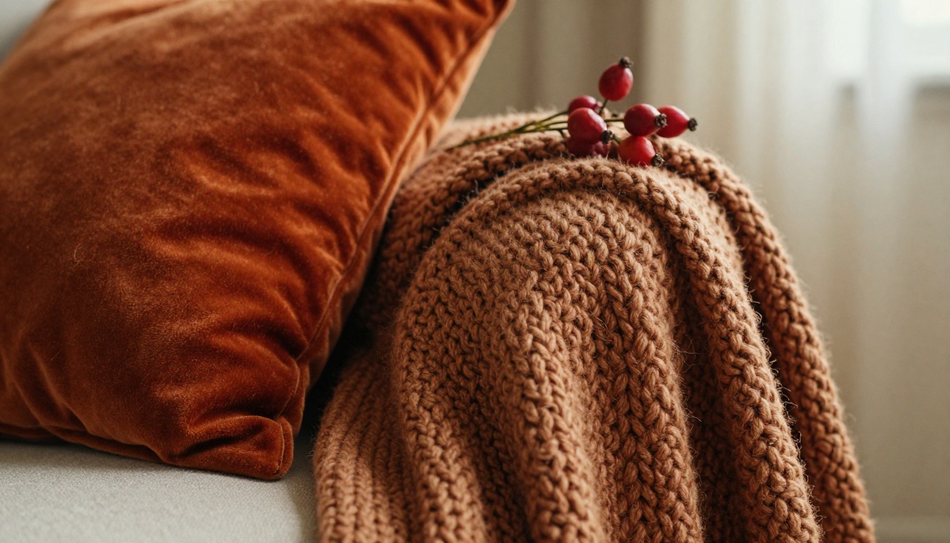
Your props are as important as your products. The right secondary items amplify the seasonal mood without overwhelming the hero product.
Best autumn props by category:
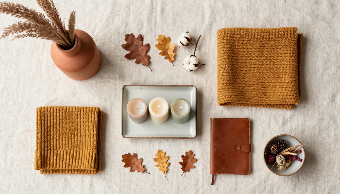
- Natural elements: Dried oak leaves, pampas grass stems, dried wheat bundles, seasonal gourds, pressed botanicals, acorns, pinecones
- Textiles: Raw linen runners, chunky knit throws, tartan wool blankets
- Vessels: Terracotta pots, hand-thrown stoneware bowls, amber glass bottles, brass candlestick holders
- Food-adjacent: Dried orange slices, whole cloves, cinnamon sticks, dried herb bundles
⚠️ Over-propping is the most common autumn catalog mistake. Three to five props maximum per scene. More than that and the eye can't find the product.
Catalog Layout Ideas by Room
The most effective autumn home brand catalogs aren't organized by product category. They're organized by room or by use occasion. Here's how to approach each primary space:
Living room spreads

The living room is the most aspirational space in any home catalog. It's where lifestyle sells. Lead with a full-bleed double-page spread showing the room in full, then break down individual items across the following pages. Show throw combinations, not single throws. Show a cushion arrangement, not one cushion.
Living room catalog items for autumn:
- Throw blankets and knit cushion collections
- Floor and table lamps with warm amber bulbs
- Coffee table decor arrangements
- Accent rugs in terracotta, burgundy, or deep olive
Kitchen and dining setups
The kitchen and dining room carry the highest emotional charge in autumn because of their association with gathering and seasonal meals. Ceramics, serving ware, and textiles should be styled together as a full table setting rather than isolated product shots.
| Catalog Section | Products to Include | Styling Tip |
|---|
| Table Setting | Plates, bowls, serving platters | Style for four, shoot from above and from the side |
| Kitchen Counter | Mugs, oil pourers, utensil holders | Include fresh herbs and autumn produce as props |
| Dining Chair | Chair pads, cushions, throws | Show the chair with a folded throw as a natural accent |
| Open Shelving | Stacked dishware, glass jars | Style three-deep with varying heights |
Bedroom cozy collections
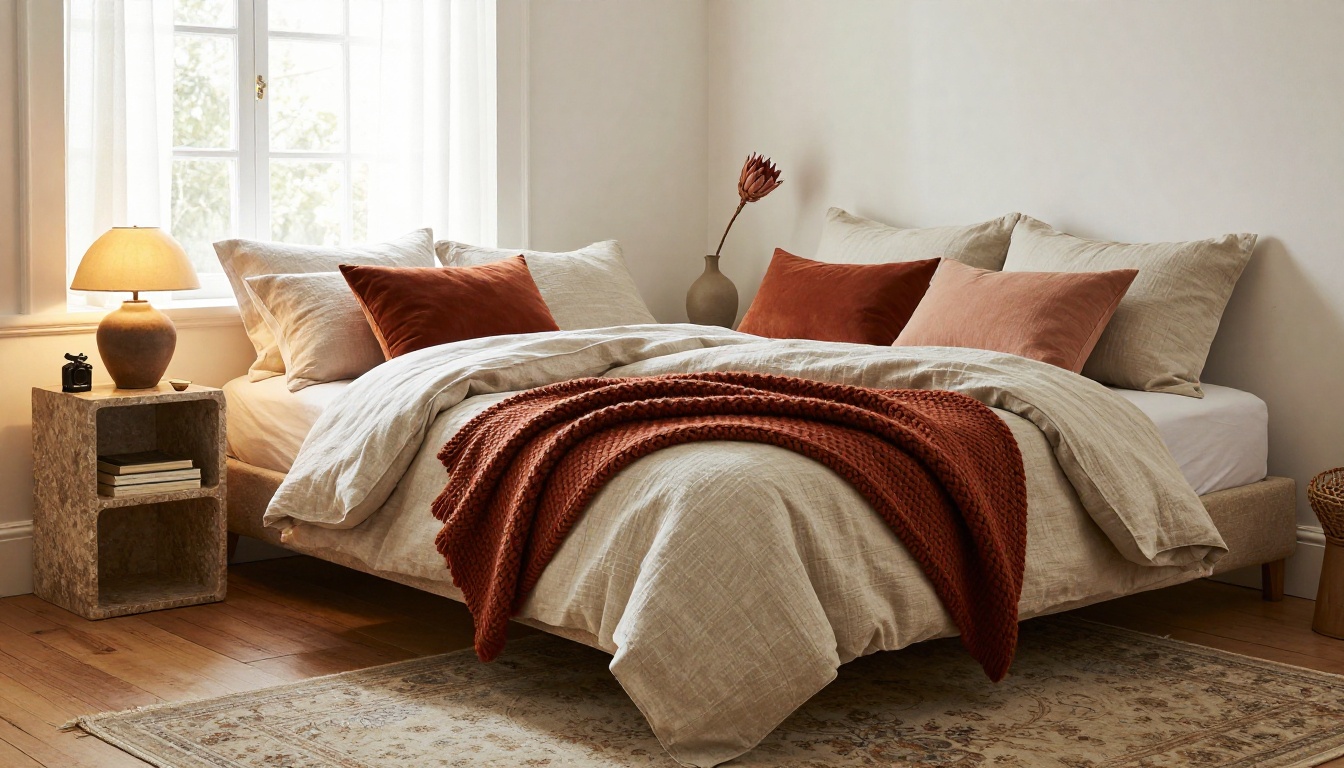
Bedroom pages in autumn catalogs consistently outperform any other room when the styling is right. The secret is layering. Show the bed made with the full collection, with the throw folded casually at the foot, pillowcases rumpled naturally, and the nightstand styled with a candle and a single bud vase.
✅ Shoot bedroom content in the morning. The quality of natural light at 8-10 AM in autumn creates the exact feeling of waking up in a warm, beautiful home that drives bedroom product purchases.
How to Build a Fall Catalog with Flipbooks AI
Once your photography is done and your catalog is designed as a PDF, Flipbooks AI converts it into a fully interactive digital catalog in minutes. Here's how the process works for home brands:
Sign up and import your catalog
Head to flipbooksai.com/account and create your account. No credit card is required for the free tier, and you can have your first flipbook live within ten minutes. Drag and drop your finished PDF directly into the Catalog Flipbook Creator. The converter handles multi-page PDFs of any size, preserving your typography, imagery, and layout exactly as designed. Page-turning animation is applied automatically.
Customize for your brand
This is where digital outperforms print. Once converted, you can:
- Apply your brand colors to the flipbook interface and navigation controls
- Set a custom thumbnail for social sharing previews
- Add a background audio track to play while customers browse (an autumn playlist works remarkably well for home brands)
- Embed video clips from product demonstrations directly into relevant pages
Set up sharing and embedding
The Embed Flipbook on Website tool generates a single line of code to paste into any website page or email template. Additional sharing options include:
- Direct link for social media and email campaigns
- Password protection for trade-only or wholesale customer access
- QR code generation for print-to-digital bridging on physical catalog inserts
Activate analytics and lead capture
On the Professional plan, analytics shows you exactly which pages customers spend the most time on, which products draw the most attention, and where drop-off happens. For autumn home brands, this data is invaluable for the following year's catalog planning. Lead generation forms can be embedded directly in the flipbook to capture customer information from readers who are actively engaged.
Plan feature comparison:
| Feature | Free | Standard | Professional |
|---|
| Flipbooks | 1 | Unlimited | Unlimited |
| Custom branding | No | Yes | Yes |
| Password protection | No | Yes | Yes |
| Analytics | No | No | Yes |
| Lead generation | No | No | Yes |
| Offline downloads | No | No | Yes |
| Watermark-free | No | Yes | Yes |
💡 Use the Digital Catalog Maker if you're starting without a print PDF. It includes templates optimized for home goods and lifestyle brands.
Autumn Catalog Dos and Don'ts
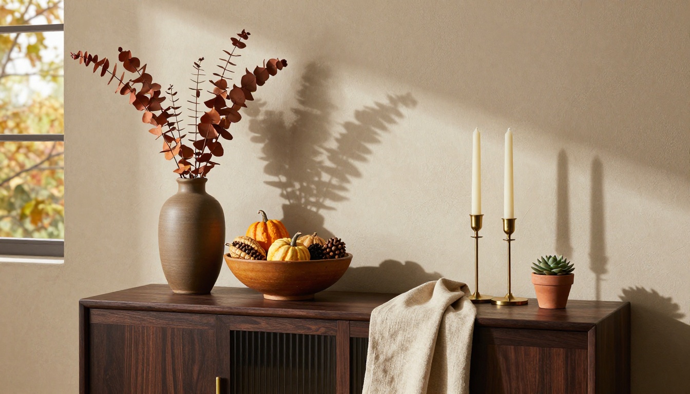
Three mistakes home brands consistently make
Even brands with strong product ranges make the same catalog errors in autumn:
1. Using summer photography with warm color filters
A product shot with harsh midday overhead light doesn't become autumn by adding an orange filter in Lightroom. Customers notice. The shadow direction, the quality of diffusion, and the color temperature of the light source are all visible, and when they're wrong, the catalog reads as inauthentic.
2. Ignoring the edit
Every catalog page should be edited with the same ruthlessness as a magazine spread. If a product isn't clearly the hero of its page, it doesn't belong on that page. Autumn catalogs that try to show too many products per spread lose the mood entirely.
3. Treating digital as an afterthought
Printing a physical catalog and uploading the PDF unchanged to your website is not a digital strategy. A digital autumn catalog should have interactive elements, embedded video where relevant, and sharing features that a static PDF file simply cannot deliver.
Digital vs. Print Catalogs for Fall Campaigns
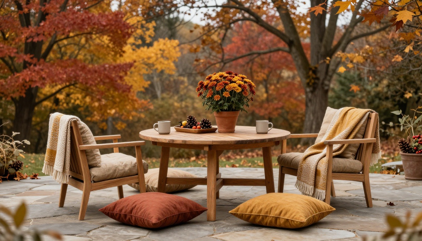
Home brands often ask whether to prioritize digital or print for their autumn campaigns. Both formats serve different purposes, and for most brands, both have a place.
| Consideration | Print Catalog | Digital Flipbook |
|---|
| Cost per unit | High (printing, shipping) | Near zero (hosting only) |
| Distribution reach | Limited by mailing list | Unlimited (link or embed) |
| Analytics | None | Full page-level data |
| Update flexibility | Fixed at print | Instant updates |
| Shareability | Word of mouth | Social, email, WhatsApp |
| Tactile experience | Yes | Simulated page-turn |
| Shelf life | Lasts in the home | Always current |
| Lead capture | None | Built-in forms (Pro plan) |
✅ Print a short run of high-quality physical catalogs for your best wholesale accounts and VIP customers. Use the digital flipbook as your mass-distribution vehicle, linking from all social channels, email campaigns, and your website homepage during the autumn season.
The Interactive Lookbook Designer is particularly effective for home brands that want to position their autumn catalog as a styled lookbook rather than a product list. The format tends to generate significantly higher interest on Instagram and Pinterest, especially in September and October when seasonal shopping intent peaks.
The Room-by-Room Catalog Sequence
How you order the pages of your autumn catalog affects conversion as much as the photography itself. The sequence that consistently performs for home brands:

- Opening spread (hero product or lifestyle scene, full-bleed)
- Brand story page (two to three sentences, autumn editorial photography)
- Living room spread (aspirational, lifestyle-first)
- Living room product detail pages (individual items with specs)
- Kitchen and dining spread
- Kitchen and dining product pages
- Bedroom spread
- Bedroom product pages
- Gift ideas section (curated collections, autumn gifting angle)
- Order information page (where to buy, sizing, care instructions)
This sequence mirrors how customers move through a home, creating a natural narrative arc through the catalog. It front-loads the highest-converting category (living room) while building anticipation through the sequence.
💡 Add a "Shop the Look" cross-reference on every product detail page, linking each item to two or three complementary products from other sections. In a digital flipbook, these become active hyperlinks. Flipbooks AI supports embedded links on any page of your catalog, making cross-selling effortless for customers who are already engaged.
Ready to Launch Your Autumn Catalog?
Autumn is a short window and the brands that move fastest capture the most of it. The ideas in this article work whether you're producing your first seasonal catalog or refining a process you've run for years: invest in the photography, commit to a tight color palette, organize by room rather than category, and convert everything to a digital format that your customers can actually share.
Get started for free on Flipbooks AI and have your autumn catalog live before the season peaks. If you're weighing which plan fits your volume, compare pricing options to see exactly what each tier includes. And if you're building more than just a catalog this season, browse all flipbook tools to find templates for lookbooks, gift publications, and product spotlights.



