A college viewbook has about thirty seconds to convince a seventeen-year-old that four years on your campus is worth the application fee. Most fail. They bury the good photos, stuff the middle with statistics nobody reads, and end with a generic "apply today" box. The best ones feel like a well-edited magazine, and more and more of them now live online as page-turning digital editions built with tools like Flipbooks AI. This article looks at what separates the strongest viewbooks from the forgettable ones, what admissions teams actually put inside, and how to produce one yourself.
What Is a College Viewbook?
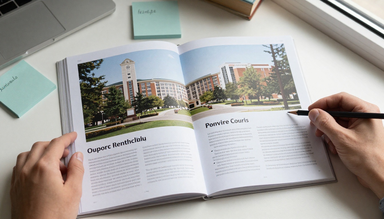
A viewbook is the flagship recruiting publication of a college or university. It is usually 32 to 64 pages, printed on heavy coated stock, and mailed to prospective students or handed out at campus visits and college fairs. Unlike a course catalog, it does not list every program. Unlike a website, it tells one curated story from the first page to the last.
Admissions teams use it for three jobs:
- Awareness: introduce a school to students who have never heard of it.
- Persuasion: help a shortlisted applicant picture themselves there.
- Reassurance: answer the questions parents ask quietly, such as cost, safety and job outcomes.
Related terms people search for include college brochure, admissions brochure, prospective student guide, campus view book, recruitment publication, enrollment marketing, digital viewbook and interactive college brochure. They all describe slightly different versions of the same idea.
Viewbook vs. Brochure vs. Catalog
| Format | Typical length | Main goal | Audience | Tone |
|---|
| Viewbook | 32 to 64 pages | Emotional pull and brand story | Prospective students and parents | Visual, personal |
| Brochure | 4 to 12 pages | Single program or event | Narrow audience | Direct, short |
| Course catalog | 200+ pages | Reference | Enrolled students and advisors | Formal |
| Postcard or mailer | 1 to 2 pages | Drive a click or visit | Cold audiences | Punchy |
💡 If your team keeps reusing catalog language in the viewbook, cut it. Students skim a viewbook. They read a catalog only when they have to.
Why Viewbooks Still Matter
Social media gets the attention, but the viewbook still earns its place. Families keep it on the kitchen table, mark up pages, and pass it between parents. A strong printed piece can sit in a house for months, while an Instagram ad lasts about two seconds.
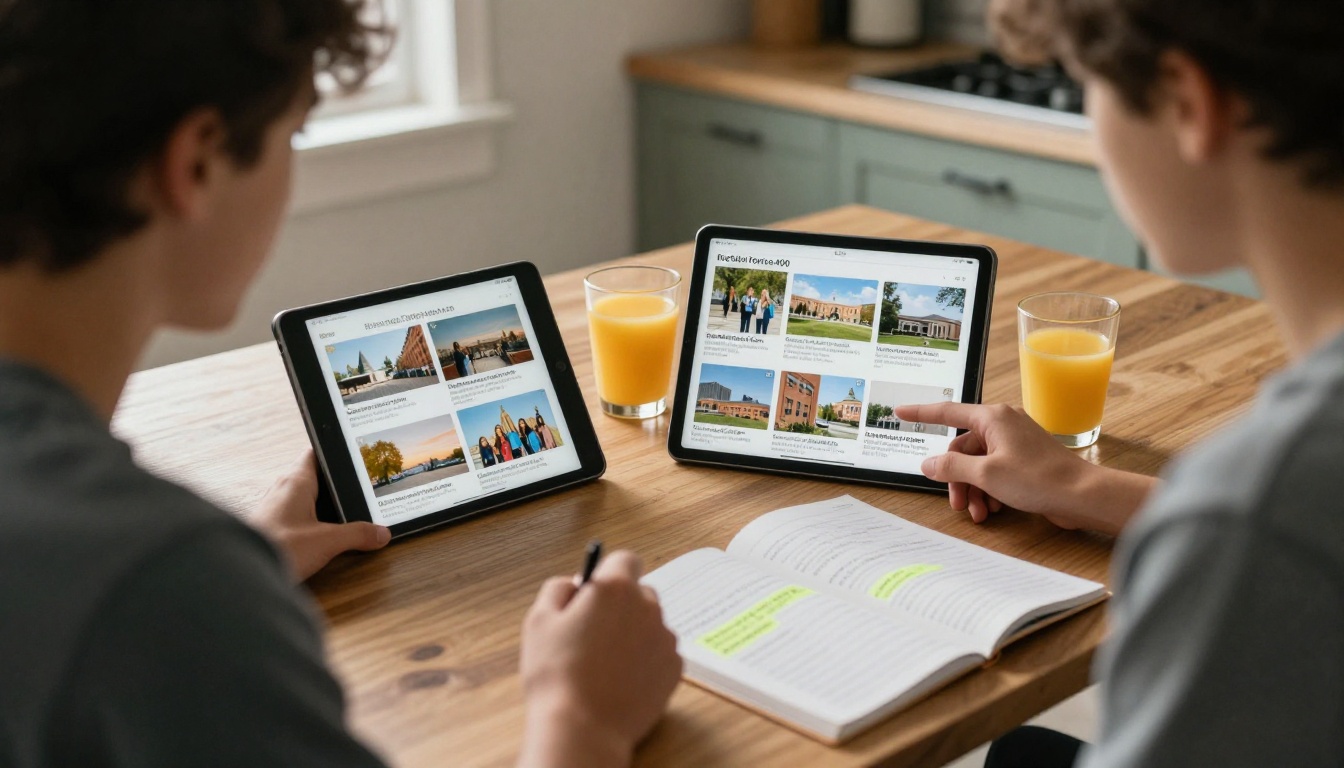
The stronger shift is that the viewbook is no longer only printed. Most admissions offices now publish a digital twin, because a PDF attachment is easy to ignore while a flipbook with real page-turn motion, embedded video and trackable links gets opened, shared and measured.
The Numbers Admissions Teams Care About
- Open rate: how many recipients actually view the publication.
- Time on page: which spreads hold attention and which get skipped.
- Click-through: how many readers reach the application or visit-scheduling link.
- Share rate: how often a parent forwards it to a partner, counselor or grandparent.
Printed copies cannot report any of that. Digital copies can, particularly on a plan with analytics. See the Flipbooks AI pricing plans for which tiers include reporting.
What Admissions Teams Put Inside
Open a dozen viewbooks side by side and the same skeleton appears. Teams differ in style, but the order of content is remarkably consistent, because it follows the questions a student asks as they get more interested.

The Opening Spread
The first two pages decide everything. Strong schools use one big photograph, one sentence of copy and plenty of white space. Weak schools open with a welcome letter from the president and a logo wall. Students rarely finish a letter. They do notice a photo of real people laughing outside a real building.
Academics
This section answers "What will I study?" without listing 140 majors. The best versions spotlight six to eight programs with a short story each: one professor, one project, one outcome. A tiny sidebar can point to the full program list online.
Student Life
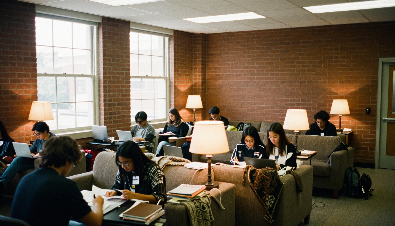
Clubs, housing, dining, athletics and weekend traditions. This is where photography matters most. Candid shots beat staged group portraits every time.

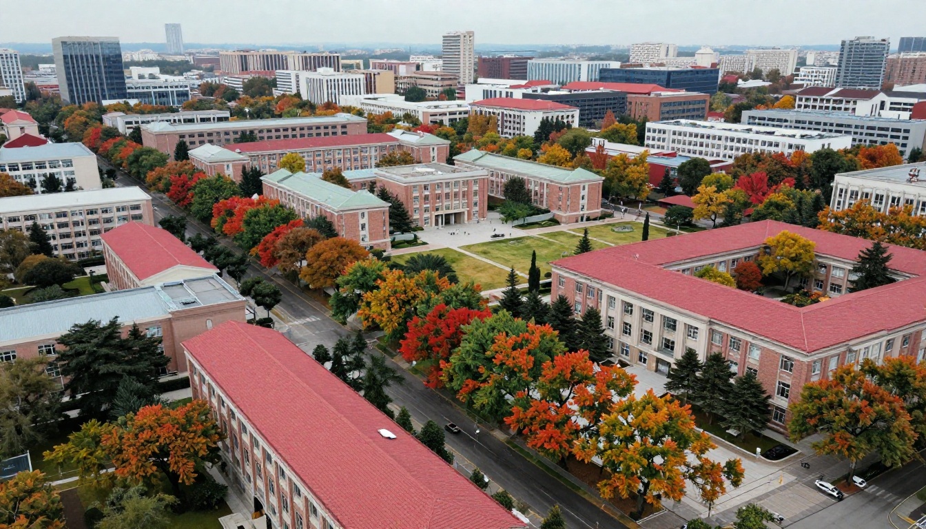
Campus and Location
A map, a few aerial or wide shots, and a clear answer to "What is the town like?" Urban campuses show transit and internships. Rural campuses show trails, quiet and community.
Outcomes and Cost
Parents turn here first. Winning viewbooks give straight numbers: average aid package, net price ranges, first-destination rates, median starting salaries and graduate school placement. They avoid fuzzy phrases like "excellent career prospects."
How to Apply
Deadlines, required materials, scholarships and a visit invitation. One clear call to action beats five competing ones.
Section Checklist
| Section | Typical pages | Must include | Common mistake |
|---|
| Opening spread | 2 | One hero photo, one line | Welcome letter wall of text |
| Academics | 6 to 10 | Student and faculty stories | Listing every major |
| Student life | 8 to 12 | Candid photos, traditions | Stock images |
| Campus and place | 4 to 6 | Map, aerial, local life | No sense of scale |
| Outcomes and cost | 4 to 6 | Real numbers | Vague claims |
| Apply and visit | 2 to 4 | Dates, link, contact | Too many actions |
✅ Best practice: write the outcomes page first. It forces every other section to support a claim you can prove.
The Best College Viewbooks, Ranked by Approach
No official ranking exists for viewbooks, so the list below is an editorial one. It groups the strongest publications by the design strategy that makes them work. Use it as inspiration, not a scoreboard.
| Rank | Approach | What it does well | Who should copy it |
|---|
| 1 | Magazine-style storytelling | Long-form student profiles, editorial layouts | Selective private colleges |
| 2 | Photo-first minimalism | Large images, almost no body copy | Schools with beautiful campuses |
| 3 | Data-forward outcomes | Clean charts and clear cost transparency | Public universities, career-focused schools |
| 4 | Interactive digital edition | Embedded video, hyperlinks, tracked clicks | Any school with a digital outreach budget |
| 5 | Modular insert system | One core book plus program inserts | Large universities with many colleges |
1. Magazine-Style Storytelling
These viewbooks read like a feature magazine. Each section opens with a single student's story, then widens to the facts. They tend to work because they treat the reader as an intelligent adult. Expect pull quotes, big drop caps and a strong typographic voice.
2. Photo-First Minimalism
A handful of words per page and photography carrying the load. This approach demands excellent images, and it falls apart with weak ones. Invest in a real photo shoot across seasons rather than recycling last year's files.
3. Data-Forward Outcomes
Clean infographics, plain-English tables and a firm stance on cost. Families value this honesty, especially at public institutions competing on value.
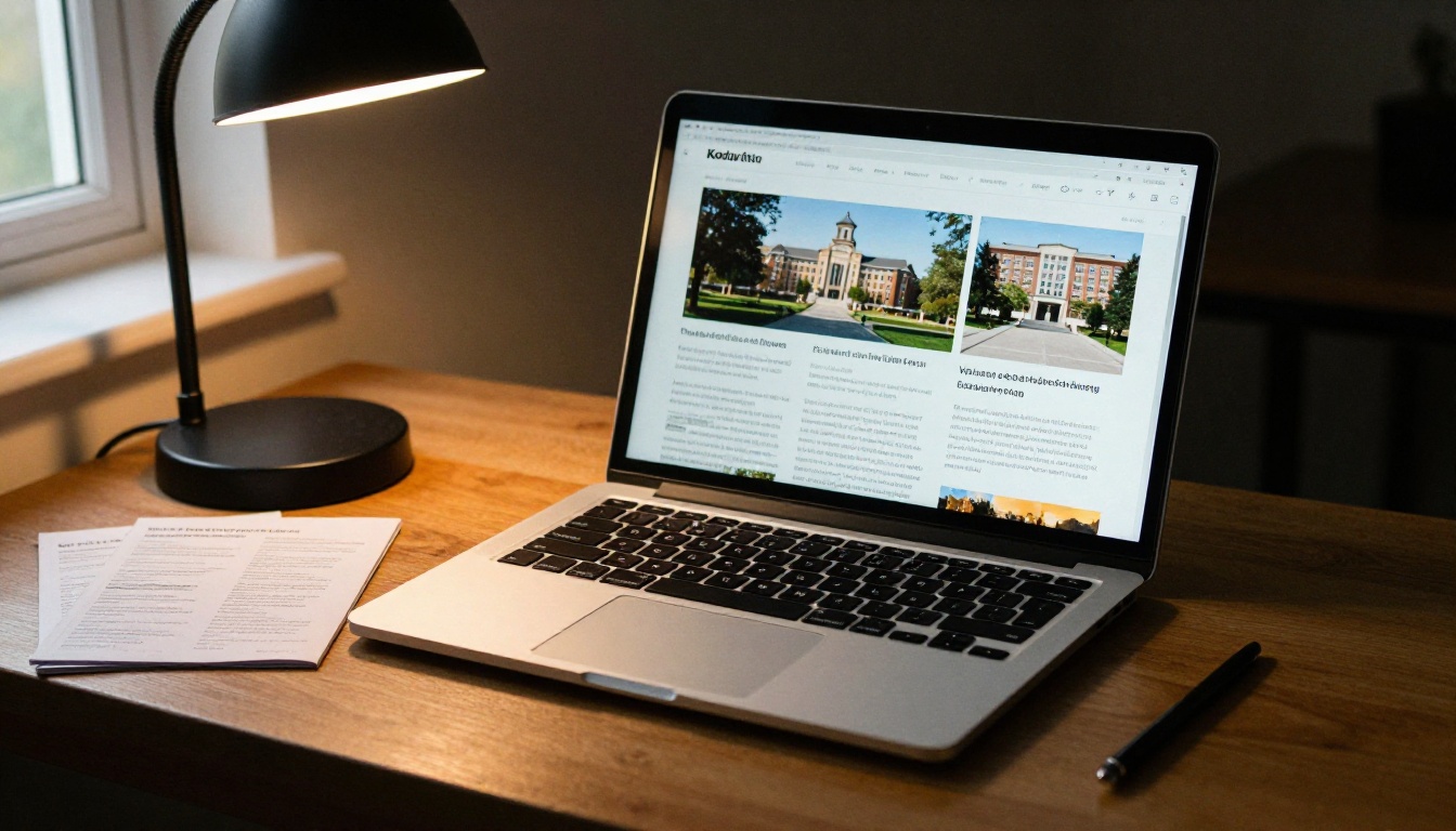
4. Interactive Digital Edition
The same book, but with embedded campus tour video, clickable program links and a scheduling button on every spread. This version is where analytics become possible and where the experience stops being a PDF and becomes a product.
5. Modular Insert System
One shared core with inserts for engineering, nursing, business and the arts. The sender picks the right insert for each student's stated interest, which makes the mail feel personal without printing hundreds of unique books.
Design Rules That Separate Good From Great
After you have the structure, the finish matters. These are the choices that show up again and again in the best examples.
- Use real people. Stock photography is easy to spot, and students spot it faster than anyone.
- Limit the type. Two typefaces, three sizes, one accent color tied to the school brand.
- Give every spread one job. If a page has to explain a program, introduce a professor and advertise a scholarship, split it.
- Write at an eighth-grade reading level. Short sentences read faster on phones and tablets.
- Show diversity honestly. Represent the actual student body, not an aspirational one.
- Plan the cost page for parents. Use simple tables and an example family scenario.
- End with one next step. Visit, apply or request more information. Pick one.
Photography Brief for the Shoot
| Shot type | Purpose | Best time of year |
|---|
| Wide campus exteriors | Set the place | Early autumn or late spring |
| Classroom and lab action | Show real learning in motion | Mid-semester |
| Dorm and dining candids | Reassure parents | Move-in week |
| Athletic and arts events | Show energy | Home game weekends |
| Portraits with faculty | Humanize academics | Any time, indoors |

Print vs. Digital Viewbooks
Most schools will keep both. The question is how to split the budget and effort.
| Factor | Printed viewbook | Digital flipbook viewbook |
|---|
| Cost per recipient | $3 to $12 including postage | Near zero after creation |
| Reach | Limited by mailing list | Unlimited via link or QR code |
| Updates | Reprint required | Edit and republish anytime |
| Tracking | None | Opens, time per page, clicks |
| Multimedia | Not possible | Video, audio, links |
| Tactile appeal | Strong | Moderate |
| Accessibility | Fixed type size | Zoom, mobile friendly |
The practical answer: mail a shorter printed teaser to high-priority prospects, and send the full digital edition to everyone else. Put a QR code on the printed piece that opens the flipbook.
⚠️ Do not email a heavy PDF. Large attachments get blocked or ignored. Share a link instead.
How to Create a Digital Viewbook with Flipbooks AI
If your design team already exports a print-ready PDF, you are most of the way there. Here is the process.
- Create your account. Sign up at Flipbooks AI. No credit card is needed to look around.
- Upload the PDF. Use the PDF to Flipbook Converter. Pages convert into a realistic page-turning book in seconds.
- Pick the right tool. For a viewbook, the Online Brochure Designer and Brochure Flipbook Maker fit best. If you also publish a school newsletter, the School Newsletter Creator uses the same workflow.
- Customize the look. Add your school colors, logo, background and page-turn effects. Flipbooks never carry a watermark.
- Add multimedia. Embed a campus tour video, an audio message from the dean or a student vlog on the relevant spread.
- Add links. Connect the cost page to your net price calculator and the final page to the application portal.
- Set privacy. Use password protection for admitted-student or scholarship editions.
- Share it. Copy the direct link, create a QR code for print, or follow the Embed Flipbook on Website instructions to place it on your admissions page.
- Measure. On the Professional plan, check analytics, lead capture and offline downloads to see which spreads work.
Features Worth Using
- ✅ No watermarks, ever
- ✅ Unlimited flipbooks on the Standard plan and above
- ✅ Password protection for private editions
- ✅ Analytics and lead generation on the Professional plan
- ✅ Offline downloads for campus fairs with poor Wi-Fi
- ✅ Embedded video and audio
- ✅ Mobile-responsive design
- ✅ Custom branding
Real-World Scenarios
- A small liberal arts college uploads its 48-page PDF, adds a campus video on page 6, and sends the link to 12,000 inquiries. Analytics reveal that the financial aid spread gets twice the time of any other, so the next print run moves it forward.
- A community college publishes separate flipbooks for nursing, welding and transfer pathways, then embeds each on the matching program page.
- A graduate school gates its scholarship edition behind a password included in the acceptance email.
- A high school counselor compiles links to multiple viewbooks and shares them with a class using a Digital Portfolio Creator style page.
Common Mistakes Admissions Teams Make
Treating the Viewbook as a Brag Sheet
Lists of awards and rankings feel defensive. Show a student result and let the facts speak.
Ignoring Mobile
Many teens open the digital edition on a phone. Tiny text in a two-column spread becomes unreadable. Test every page on a small screen before sending.
Hiding the Price
Parents will find the cost anyway. Putting it plainly earns trust.
Letting the Book Go Stale
A published date from three years ago on the cover signals a school that does not update. A digital edition makes refreshes cheap, so use that.
Skipping the Measurement
If you cannot say which page drives applications, you are guessing at the next redesign. Track behavior and adjust.
A Quick Launch Plan
| Week | Task | Owner |
|---|
| 1 | Audit last year's book and outcome data | Admissions lead |
| 2 | Shoot new photography | Photographer |
| 3 | Write copy and approve cost page | Writer and finance office |
| 4 | Layout and proofing | Designer |
| 5 | Print order and flipbook build | Print vendor and web team |
| 6 | Send, track and review | Admissions team |
💡 Publish the digital version first. You can fix typos in minutes, then send the final print file to the press with confidence.
Build Yours Today
The best college viewbooks are not the most expensive. They are clear, honest, beautifully photographed and easy to share. Whether you are an admissions director planning the next cycle or a designer asked to refresh the old book, the fastest improvement is a digital edition that can be measured and updated.
Ready to publish? Get started for free on Flipbooks AI, browse all available tools and templates to find the right fit, and compare pricing plans to choose what works for your school. When you are set to roll out analytics and lead capture, upgrade here.



