Open any brochure, menu or newsletter and your eyes decide in about two seconds whether to stay or leave. Photos and layout matter, but the font does most of the quiet work. The right typeface tells readers who you are before they read a single word, and the wrong one makes even great content feel cheap. This article shows the best fonts for brochures, menus and newsletters, how to pair them, and how to keep them sharp when you publish as a PDF or as an interactive flipbook with Flipbooks AI.
Why Font Choice Matters
Typography is not decoration. It controls reading speed, mood and trust. A law firm brochure set in a playful script feels risky. A kids' menu set in a stiff legal serif feels cold. Fonts carry personality, and readers pick it up instantly.
Three things change when you choose well:
- Speed: readers scan faster when body text has clear letter shapes and generous spacing.
- Trust: consistent, restrained type signals a brand that pays attention to detail.
- Action: prices, dates and buttons stand out when the type hierarchy is obvious.
💡 Pro tip: Limit every document to two font families. Use weight, size and color to create variety instead of adding a third typeface.
Serif, Sans Serif and Display Basics
Before picking names, you need to know the three families you will work with.
Serif Fonts
Serifs have small strokes at the ends of letters. They feel traditional, literary and warm. They work well for long paragraphs in printed brochures and newsletters, where the strokes guide the eye along each line.
Sans Serif Fonts
Sans serifs drop those strokes. They feel modern, clean and direct. They shine on screens, in headlines, in captions and in menus with short item descriptions.
Display and Script Fonts
Display faces are built for large sizes: logos, covers and section titles. Scripts add elegance but fall apart in small text. Use them sparingly, one short line at a time.
| Font family | Mood | Best for | Avoid for |
|---|
| Serif | Classic, trustworthy | Body text in print, long newsletters | Tiny captions on low resolution screens |
| Sans serif | Modern, clear | Headlines, menus, digital reading | Dense multi page legal text |
| Display | Bold, expressive | Covers, titles, logos | Paragraphs and prices |
| Script | Elegant, personal | One line accents, invitations | Anything under 18 pt |
Best Fonts for Brochures
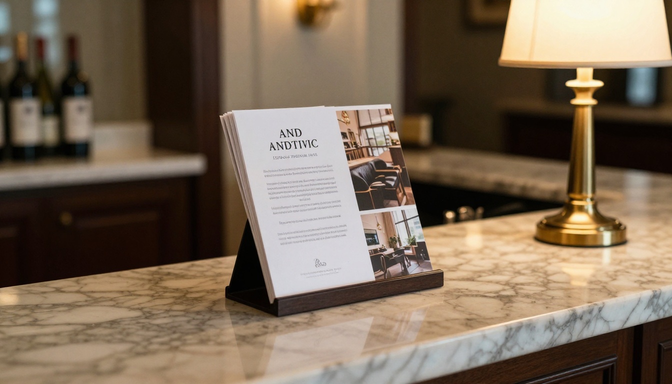
A brochure has to do two jobs: attract attention from a rack or inbox, then hold it long enough to sell. That means a confident headline font plus a calm, readable body font.
Safe Pairings That Sell
These combinations are free on Google Fonts and proven across many industries:
- Playfair Display + Source Sans 3: elegant headline with a friendly body. Great for hotels, spas and wedding venues.
- Montserrat + Merriweather: strong geometric headline with a sturdy serif body. Works for real estate and finance.
- Poppins + Lora: soft, rounded headlines with a literary body. Good for education and wellness.
- Oswald + Open Sans: compact, punchy headings with neutral body text. Useful for events, fitness and automotive.
Brochure Size Rules
- Headline: 28 to 42 pt for a tri fold panel.
- Subheading: 16 to 20 pt, bold or semibold.
- Body: 9.5 to 11 pt with 1.4 to 1.5 line spacing.
- Caption: 8 to 9 pt, never smaller.
Building a property or hotel brochure? The Hotel Brochure Designer and Real Estate Brochure Creator keep your chosen type crisp when the PDF becomes a page turning flipbook.
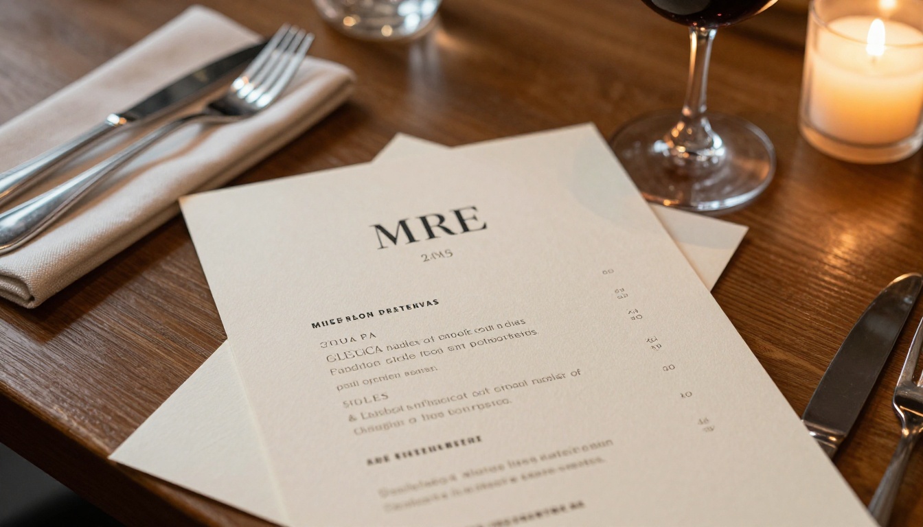
Menus are read in dim light, often in a hurry, by people holding a phone in the other hand. Legibility beats cleverness every time. The goal is that a guest finds the dish and the price in seconds.
Match the Font to the Cuisine
| Restaurant style | Headline font | Item and price font | Why it works |
|---|
| Fine dining | Cormorant Garamond | Lato | High contrast serif feels refined, sans serif keeps prices clear |
| Casual bistro | Bitter | Nunito | Slab serif feels hearty, rounded sans feels welcoming |
| Coffee shop | DM Serif Display | DM Sans | Warm and modern in one family |
| Street food | Bebas Neue | Roboto | Tall condensed capitals read fast on a busy board |
| Spa and wellness | Josefin Sans | Karla | Light geometric forms feel calm and airy |
Menu Rules Worth Following
- Keep dish names in bold or small caps and descriptions in regular weight.
- Align prices in a consistent column, or place them right after the description in a lighter weight.
- Avoid dollar signs when you can. Plain numbers look calmer.
- Never set item descriptions below 9 pt.
⚠️ Warning: Decorative scripts look lovely on a menu title and terrible on a list of allergens. Keep any safety information in a plain sans serif.
A digital menu removes reprinting costs. You can build one with the Restaurant Menu Creator or the Spa & Wellness Menu Creator, and update prices without touching the QR code on the table.
Best Fonts for Newsletters
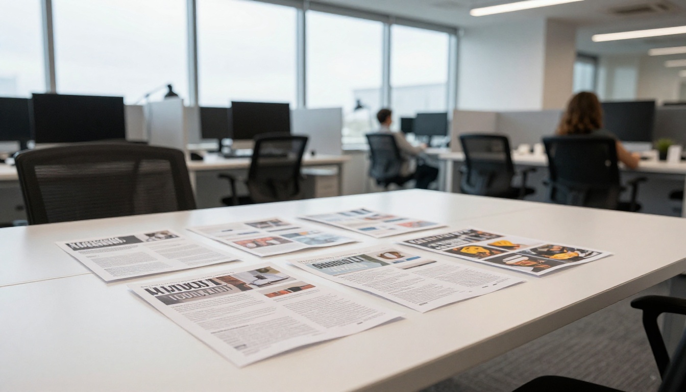
Newsletters live or die on reading comfort. Readers arrive with a coffee and give you a few minutes, so body text has to feel effortless across many paragraphs.
Print Newsletters
Serifs are the default choice for print. Georgia, Merriweather, Libre Baskerville and Crimson Pro all keep long columns easy on the eyes. Pair them with a sans serif such as Inter or Work Sans for section labels and captions.
Email and Digital Newsletters
Email clients ignore many custom fonts, so choose a stack with safe fallbacks. A reliable approach is to set headlines in a web font and body text in Georgia or Arial, so the layout holds up everywhere.
If your newsletter is long, turn it into a flipbook. The Newsletter Flipbook Publisher and School Newsletter Creator embed your original fonts, so what you designed is exactly what readers see.
Newsletter Size Rules
- Masthead: 36 to 60 pt, display or heavy serif.
- Article headline: 20 to 26 pt.
- Body: 10 to 11 pt in print, 16 to 18 px on screen.
- Line length: 45 to 75 characters per line.
Pairing Fonts Without Guesswork
Pairing is where most designs go wrong. The trick is contrast with a shared logic, not two fonts that almost match.
Three Reliable Pairing Rules
- Serif with sans serif. The contrast is obvious and pleasant.
- Same superfamily. Fonts like DM, IBM Plex and Noto come in serif and sans versions designed to match.
- Different roles. One font handles headings, another handles body. Never mix them within the same role.
Mistakes That Look Amateur
- Using two similar sans serifs that clash in a subtle, irritating way.
- Setting body text in a display font.
- Using more than three weights in one panel.
- Centering long paragraphs.
- Stretching or squeezing letters to fit a box.
Here is a quick check you can run on any draft:
| Test | Pass | Fail |
|---|
| Squint test | Headline, subhead and body are distinct blurs | Everything looks the same weight |
| Distance test | You can read the headline from 2 meters | Headline blends into the photo |
| Phone test | Body text is readable without zooming | You have to pinch to read prices |
| Grayscale test | Hierarchy survives without color | Only color separates sections |
Make Text Readable in Print and on Screen
Even a perfect font fails with poor contrast or tight spacing.
Contrast and Color
Dark text on a light background remains the easiest combination to read. Aim for a contrast ratio of at least 4.5 to 1 for body text. When you place text over a photo, add a soft overlay or move the text into a solid panel.
Spacing That Breathes
- Leading (line spacing): 120 to 150 percent of the font size.
- Tracking: slightly looser for small caps and all caps headings.
- Margins: at least 0.5 inch on print, more for trimmed brochures.
Licensing and Embedding
Always check whether a font is licensed for commercial print and for web or PDF embedding. Google Fonts and Fontshare are safe for most uses. Commercial foundries often charge separately for desktop, web and app licenses. When you export a PDF, embed fonts or convert them to outlines so nothing is replaced on someone else's device.
✅ Best practice: Export your PDF with fonts embedded, open it on a second computer, and check that every heading looks the same before you share it.
How to Publish Your Designs as a Flipbook
Once your fonts are chosen, you need a format that keeps them intact and lets people read comfortably on any device. Here is the quick way to do it with Flipbooks AI.
- Export your PDF. Use your design tool and make sure fonts are embedded. Choose high quality settings.
- Upload it. Go to the PDF to Flipbook Converter and drop in your file. Conversion takes moments and preserves every typeface.
- Customize. Add your logo, pick background colors and page flip effects, and embed videos or audio where they help.
- Share. Copy a direct link, or use the Embed Flipbook on Website option to place it on your site. Add password protection for private material.
- Measure. On the Professional plan, analytics and lead generation show which pages readers spend time on. See the pricing plans for details.
Why this works well for type focused designs:
- ✅ No watermarks, ever
- ✅ Mobile responsive pages that keep text sharp
- ✅ Offline downloads for readers without a connection
- ✅ Custom branding that keeps your look consistent
- ✅ Unlimited flipbooks on Standard plans and above
| Format | Font fidelity | Interactivity | Updates |
|---|
| Printed piece | Perfect, but fixed | None | Costly reprint |
| Plain PDF | Good if embedded | Basic links | Resend the file |
| Flipbook | Preserved from the PDF | Video, audio, links, analytics | Replace the file, same link |
Quick Checklist Before You Publish
Run through this list before sending anything to print or to your audience:
- Two font families at most, with a clear role for each.
- Body text at 9.5 pt or larger in print, 16 px or larger on screen.
- Headline, subheading and body are visibly different in size and weight.
- Prices, dates and phone numbers are in a plain, high contrast style.
- Fonts are licensed and embedded in the PDF.
- You tested the layout on a phone and on a second computer.
- Line length stays between 45 and 75 characters.
Real World Examples
- A boutique hotel sets its brochure headlines in Playfair Display and body copy in Source Sans 3, then publishes the PDF as a flipbook on its booking page.
- A bistro uses Bitter for dish names and Nunito for descriptions, and shares the menu by QR code so a price change takes minutes.
- A school sends a monthly newsletter in Merriweather with Inter captions, and parents read it on their phones without losing the layout.
Ready to Put Your Fonts to Work?
Good typography is a small investment with a large return. Pick two fonts with clear roles, respect size and spacing, test on real devices, and publish in a format that protects your design.
Ready to create your first flipbook? Get started for free on Flipbooks AI. Browse all available tools and templates to find the right fit for your brochure, menu or newsletter, or compare pricing plans to choose what works for you.



