Walk past any tourist information desk and you will see the same thing: hundreds of brochures, and only a few that people actually pick up. The best travel brochure designs from tourism boards and tour operators win that split-second decision with one strong photo, a clear promise and a layout that feels like a trip already started. Today those same designs also live online, and a platform like Flipbooks AI lets you turn a print PDF into a page-turning digital brochure in minutes.
This article breaks down what the strongest brochures do differently, how tourism boards and tour operators approach design in distinct ways, and how to build a version of your own that travelers can open on any phone.
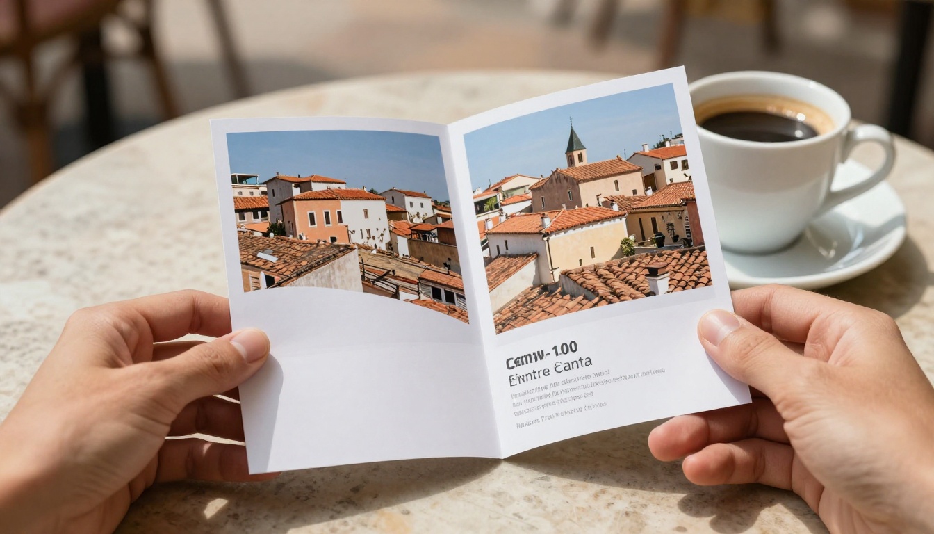
Why Travel Brochures Still Win
Search engines and social feeds get most of the attention, yet brochures keep a quiet advantage: they are tangible and browsable. A traveler can flip through twelve pages in under two minutes and leave with a mental picture of the whole destination. That kind of low-effort browsing is hard to reproduce with a website menu.
Digital brochures add something print never had: tracking, links and video. When you publish a brochure as a flipbook, the same layout that sits on a hotel lobby rack also works in an email, a QR code on a poster or a link in a social bio.
💡 Pro tip: Design the brochure once as a PDF, then use it everywhere. Print the PDF, and publish the same file as a brochure flipbook for online visitors.
The Two Jobs a Brochure Does
Every travel brochure has to do two things at once:
- Inspire: make someone want to go, using photography, mood and short copy.
- Inform: help someone decide how, when and how much, using maps, itineraries and prices.
Weak brochures lean too far in one direction. Pure inspiration with no practical details leaves readers excited but stuck. Pure information with no mood reads like a timetable. The designs below balance both.
Where Brochures Fit in the Booking Path
Most travelers move through three stages: dreaming, planning and booking. A brochure can serve all three, but only if the pages are ordered that way. Open with the dream, move into the plan, and close with the booking step.
What Tourism Boards Get Right
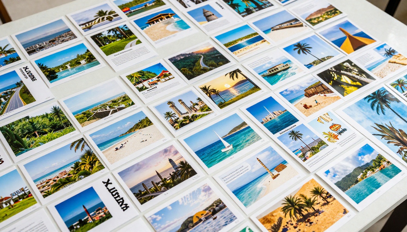
Tourism boards represent a whole region, which means they cannot sell one hotel or one tour. Their job is to make a place feel irresistible, then point readers toward the many businesses that serve it. The best boards solve this with strong visual systems.
One Hero Image Per Spread
The most effective board brochures give every spread a single dominant photograph, often bleeding to the edge of the page. Smaller supporting images sit in a clear grid. This avoids the cluttered collage look that makes cheap brochures feel like flyers.
Good hero images share a few traits:
- A clear subject, such as a harbor, a trail or a market street.
- Natural light, preferably early or late in the day.
- A human element for scale, like a walker or a cafe table.
- Space for a short headline without covering the focal point.
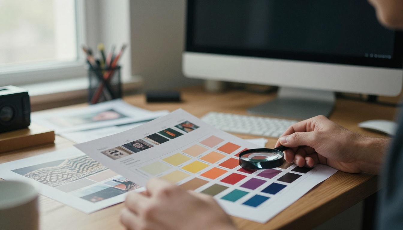
Regional Color Palettes
Smart boards pick a palette from the destination itself. A coastal region might use deep teal and sand. A mountain region might use pine green and slate. Using two or three colors consistently across headings, map pins and callout boxes makes the brochure feel designed rather than assembled.
Maps That Actually Help
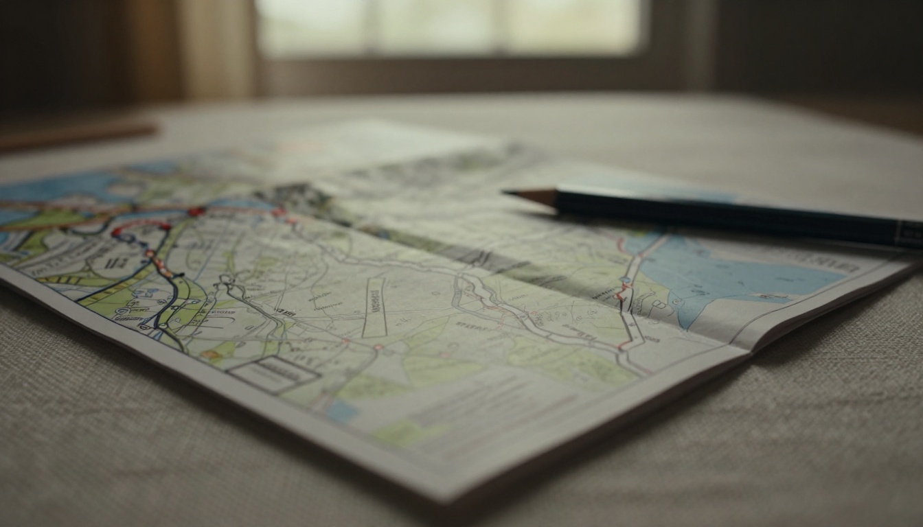
A map is the most-used page in many brochures. The best ones are simplified: a handful of labeled towns, color-coded routes, and icons for beaches, museums and trailheads. They skip tiny street names and focus on the decisions a visitor has to make.
✅ Best practice: Number the stops on the map and repeat those numbers on the pages that describe them. Readers can jump between map and story without hunting.
What Tour Operators Do Differently
Tour operators have a sharper goal: a booking. Their brochures are built around products, such as a seven-day coastal walk, a family safari or a food tour, and every page pushes the reader toward a specific departure.
Itinerary Pages That Sell
The best operator brochures present each trip as a short story with a day-by-day outline. A strong itinerary page includes a headline, a three-line summary, a small route map, a daily list and a price box. Photography supports each day rather than decorating the page.
A typical layout looks like this:
- Top third: a wide photo and trip name.
- Middle: day-by-day bullets with times and highlights.
- Right column: a price box, group size, difficulty level and a booking link.
Trust Signals
Operators know that travelers are spending real money on something they cannot test first. So the better brochures include small proof points: guide photos with first names, traveler quotes, safety certifications and years in operation. These details cost little to add and lift confidence.
Pricing Transparency
Brochures that hide the price tend to lose trust. The best designs show a clear starting price, what is included, and what is not. A simple two-column list does the job.

Side by Side: Boards vs. Operators
The two groups design for different goals, and it shows on the page. Here is how their typical approaches compare.
| Design Element | Tourism Boards | Tour Operators |
|---|
| Main goal | Inspire visits to a region | Drive bookings for specific trips |
| Front page | Single dramatic landscape | Hero photo plus trip name and price hint |
| Photography style | Wide, atmospheric, seasonal | People in action, experiences |
| Maps | Regional overview with highlights | Route-specific with daily stops |
| Text tone | Poetic, welcoming | Direct, practical, reassuring |
| Call to action | Visit website, request visitor pack | Book now, check dates, call or email |
| Typical length | 12 to 32 pages | 8 to 24 pages |
💡 Many successful brochures borrow from both columns. A board brochure with a clear booking page converts better, and an operator brochure with one atmospheric opening spread feels less like a sales sheet.
Ten Design Choices Behind the Best Layouts
After looking at dozens of examples, the strongest designs tend to share the same habits.
- A calm front page. One image, one short title, plenty of breathing room.
- A short welcome note. Two or three sentences on page two, written in a human voice.
- Consistent grids. Two or three column grids repeated across pages.
- Large, readable body text. Nothing smaller than 9 pt in print, and larger for mobile viewing.
- Captions that add information. "Sunrise at the north pier, best between May and August" beats "Harbor."
- Icons used sparingly. One icon style, used for beaches, hikes, food and family-friendly stops.
- Season guides. A small table showing the best months for each activity.
- Real photography. Authentic images of the place and the people who live there.
- One call to action per spread. Too many options dilute action.
- A back page that closes the loop. Contact details, a QR code and a short reminder of the promise made on the first page.
Photography and Copy That Pull Readers In
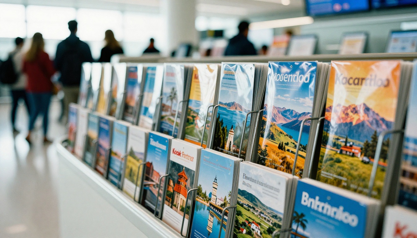
Photos do the first 80 percent of the selling, and words do the rest.
Shoot for Mood, Not Just Proof
A photo of a beach proves the beach exists. A photo of a couple sharing a picnic on that beach tells a story. The best brochures pick images that answer the question, "What will it feel like to be there?"
Write Short and Specific
Compare these two lines:
- Weak: "A wonderful destination with something for everyone."
- Strong: "Walk the cliff path at sunrise, then eat fresh sardines at a harbor stall for six euros."
Specific details signal that a real person knows the place. They also give the reader a concrete picture, which is what drives interest.
Headline Patterns That Work
- A promise: "Seven Days, Three Islands, No Rush"
- A question: "Where Do Locals Eat Lunch?"
- A number: "12 Villages Worth the Detour"
Print Meets Digital
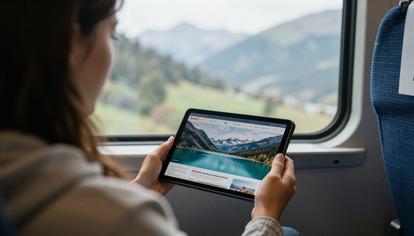
Printing brochures is expensive, and distribution is limited by geography. Digital publishing removes both limits. A flipbook version can be shared with a travel agent in another country in seconds, updated when prices change, and tracked so you know which pages get attention.
What Digital Adds
| Feature | Print Brochure | Flipbook Brochure |
|---|
| Reach | Local racks, events, mailings | Anywhere via link, QR code or embed |
| Updates | Reprint required | Replace the PDF, same link |
| Video and audio | Not possible | Embed clips and ambient sound |
| Analytics | Hard to measure | Page views and reader behavior |
| Lead capture | Paper forms | Built-in lead generation (Professional plan) |
| Cost per reader | Rises with print runs | Falls as readers grow |
| Mobile reading | Not applicable | Responsive page-turning |
A Realistic Example
Imagine a small tour operator that runs guided hikes in the Alps. They print 2,000 brochures each season for local hotels. By also publishing a flipbook, they reach travel agents abroad, add a short drone clip to the lake page, and track which itineraries get the most views. After a season, they move the most-viewed hike to the front of the print run.
How to Create a Travel Brochure With Flipbooks AI
If you already have a brochure PDF from InDesign, Canva or another tool, you are ten minutes away from a digital version. If you need a starting layout, the Travel Guide Flipbook tool and the Online Brochure Designer are good places to begin.
Step by Step
- Open your account. Go to Flipbooks AI and sign in or create a free account.
- Upload your PDF. Drag the brochure file into the uploader. The PDF to Flipbook Converter turns each page into a flippable spread, keeping text sharp and images crisp.
- Customize the look. Add your logo, set brand colors, choose a page-flip effect and pick a background that matches your front page.
- Add multimedia. Embed a short destination video, a looping ambient audio clip or links to booking pages on specific itinerary pages.
- Set sharing options. Copy a direct link, generate a QR code for print materials, or use the Embed Flipbook on Website tool to place it on your own pages. Add password protection if you are sharing a trade-only rate sheet.
- Turn on the Professional extras. Analytics, offline downloads and lead generation are part of the Professional plan. Check the pricing plans to see what fits.
✅ Good to know: There are no watermarks on your flipbooks, and the Standard plan and above includes unlimited flipbooks, so you can publish a separate brochure for each trip or season.
Feature Checklist for Travel Brands
- ✅ Mobile-responsive reading
- ✅ Custom branding and colors
- ✅ Embedded video and audio
- ✅ Password protection for partner-only content
- ✅ Offline downloads for travelers with poor signal
- ✅ Analytics on page views and reader behavior
Brochure Ideas for Different Travel Brands
Not every brand needs the same format. Here is how common use cases differ.
| Brand Type | Best Format | Suggested Page Count | Main Focus |
|---|
| City tourism board | Visitor magazine style | 24 to 32 | Neighborhoods, events, dining |
| Regional park authority | Trail and nature brochure | 12 to 16 | Maps, safety, wildlife |
| Adventure operator | Itinerary catalog | 16 to 24 | Trip details, difficulty, price |
| Luxury travel agency | Lookbook style | 20 to 28 | Photography, exclusivity |
| Hotel with local tours | Compact folded brochure | 6 to 8 | Rooms, activities, booking |
For hotels and resorts, the Hotel Brochure Designer is a natural fit. For editorial-style visitor magazines, the Magazine Flipbook Creator gives you more room for long features.
Common Mistakes to Avoid
⚠️ Watch out: These errors show up again and again in weak travel brochures.
- Stock photos that could be anywhere. If the image does not look like your destination, readers notice.
- Too much text per page. Break copy into short blocks with subheads.
- No clear next step. Every spread should lead somewhere: a web page, a phone number, a booking form.
- Out-of-date prices. This is where digital helps most. Update the PDF and the link stays the same.
- Tiny type on mobile. Test your flipbook on a phone before launch.
- Ignoring accessibility. Use strong color contrast and readable font sizes.
A Simple Planning Checklist
Before you send a brochure to print or publish it online, run through this list:
- Does the front page show one clear image and a short promise?
- Is there a welcome note on page two?
- Are maps simplified and numbered?
- Does every itinerary show price, duration and difficulty?
- Are captions informative?
- Is there one call to action per spread?
- Is contact information on the back page?
- Has the flipbook been tested on mobile?

Build Yours Today
The best travel brochure designs from tourism boards and tour operators share one trait: they respect the reader's time. They open with a feeling, back it up with useful details, and finish with an easy next step. Whether you represent a whole region or a single walking tour, the same principles apply.
Ready to put them to work? Get started for free on Flipbooks AI and publish your first brochure today. Browse all flipbook tools and templates to find the right starting point, and compare pricing plans to choose what works for your travel brand. When you are ready for analytics and lead capture, upgrade through your account and start seeing which pages turn readers into travelers.



