You spent months on your brand book. The logo rules are precise, the palette is tested, the tone of voice is documented. Then a sales rep sends a deck in the wrong blue, a partner stretches your logo, and a new hire asks where the "brand stuff" lives. The problem is rarely lazy teammates. In most cases, the brand book mistakes are baked into the document itself. A format that works well as a PDF for a design agency can be painful for a busy team, and tools like Flipbooks AI exist because static files get buried.
This article walks through the eight mistakes that make teams ignore brand rules, shows what each one looks like in real life, and gives you a fix you can apply this week.

Why Teams Skip Your Brand Book
Before fixing anything, it helps to see the pattern. People ignore rules when following them costs more effort than breaking them. A designer with a deadline will not read forty pages to find the minimum logo size. A regional manager will not email the brand team and wait two days for a hex code. They will guess, copy an old file, or eyeball it.
That means your brand book competes with the fastest alternative: whatever file is already on their desktop. To win, your document must be quicker to use than the shortcut.
💡 Pro tip: Time how long it takes a new employee to find your primary logo, the exact brand colors, and the approved email signature. If it takes longer than two minutes, your rules will be skipped.
The Hidden Cost of Ignored Rules
Inconsistent branding is not only a cosmetic problem. It creates measurable friction:
- Rework: designers fix off-brand files that were already sent to customers.
- Approval delays: every unclear rule becomes a Slack thread.
- Weaker recognition: customers see five versions of your company across five touchpoints.
- Lost trust: sloppy materials suggest a sloppy business.
Mistake 1: The Book Is Too Long
The most common failure is length. A 120 page manual feels thorough to the person who wrote it. To everyone else, it is a wall. Teams do not read brand books front to back. They look up one answer, and if they cannot find it fast, they leave.
What it looks like: long sections on brand history, mission statements repeated three times, and rules buried on page 74.
The fix: split your content into two layers.
- Quick reference (6 to 10 pages): logo, colors, fonts, tone, and the top five dos and don'ts.
- Deep reference: detailed specs for designers, printers, and agencies, linked from the quick layer.

Cut What Nobody Uses
Ask yourself of every page: has anyone ever needed this to finish a task? Brand story and philosophy are valuable for onboarding, but they belong in a short intro, not between the color specs and the logo rules.
Mistake 2: Rules Without Examples
"Use our logo with sufficient clear space" is a rule nobody can follow. "Keep clear space equal to the height of the letter O on all four sides" is a rule anyone can follow. Vague language forces people to interpret, and interpretation is how drift starts.
| Vague rule | Specific rule | Result |
|---|
| Use plenty of white space | Minimum 24 px or 8 mm margin around the logo | Consistent placement |
| Keep colors on brand | Primary blue #1F4FD8, accent #FFB703 only | No near-miss shades |
| Maintain a friendly tone | Short sentences, no jargon, address the reader as "you" | Predictable voice |
| Do not distort the logo | Scale proportionally, never stretch or rotate | No warped logos |
Every rule should come with a "yes" example and a "no" example side by side. People learn faster from a wrong version next to the right one than from a paragraph of explanation.
✅ Best practice: Show one correct and two incorrect uses for each logo rule. Label the incorrect ones with a short reason, such as "stretched" or "low contrast."
Mistake 3: No Practical Templates
A brand book that only describes how things should look leaves the hard work to the reader. A manager who needs a one-page flyer will not build it from specs. They will open an old flyer and edit it, carrying along every outdated detail.
What it looks like: a beautiful description of your layout grid, but no file anyone can open and use.
The fix: pair every major rule with a ready-made asset.
- Slide deck template with locked colors and fonts
- Email signature in a copy-ready format
- Social post frames for each channel
- A one-page flyer, a proposal cover layout, and a letterhead
- A downloadable logo pack with clear file names
When the easy path is also the correct path, compliance stops being a discipline problem.

Mistake 4: A Static PDF Nobody Can Search
PDFs are fine for printing. They are poor for daily use. They get downloaded once, renamed "Brand_FINAL_v3.pdf," and forgotten. Updates never reach people who saved their own copy, and mobile reading is clumsy.
Here is how the common formats compare for everyday team use:
| Format | Easy to update | Works on mobile | Trackable | Embeds on intranet |
|---|
| Email attachment PDF | No | Poor | No | No |
| Shared drive file | Partly | Poor | Limited | No |
| Slide deck | Yes | Fair | No | Limited |
| Interactive flipbook | Yes, one link | Excellent | Yes, with analytics | Yes |
A flipbook keeps the polished page-turning feel of a printed manual, while living at one link that always shows the latest version. If you want to see how that conversion works, try the PDF to Flipbook Converter.
Why One Link Beats Many Files
When the link never changes, you can pin it in Slack, add it to the email footer, and embed it in your intranet. Updates appear for everyone at once. That alone removes the "which version is current?" question.
Mistake 5: Ignoring Real Use Cases
Brand books are often written around ideal scenarios: a billboard, a launch video, a trade show booth. Your team's actual work is quieter. They write proposals, update LinkedIn banners, prepare webinar slides, and send invoices. If your book does not mention those, people assume the rules do not apply.
Build the book around tasks, not categories. Instead of a chapter called "Typography," try sections like:
- "Making a sales deck"
- "Posting on social media"
- "Writing an email to a customer"
- "Briefing an outside agency"
Each task page can reference the same underlying rules, but the reader finds them in the order they actually work.
A Quick Example
A regional sales manager needs a pitch for a local client. With a task-based page, they see the approved deck template, the three product images allowed, the tone to use, and the legal footer. Nothing is left to guess. Compare that with a typography chapter that tells them the heading font but not what to do with it.
Mistake 6: Nobody Owns It
Rules without an owner decay. Logos change, products launch, social channels appear, and the brand book stays frozen. After a year, people notice the book is out of date and stop trusting it. After two years, it is treated as a historical document.
The fix: assign a named owner and a review rhythm.
- Name one person responsible for the brand book.
- Schedule a quarterly review, even if the outcome is "no change."
- Add a visible "last updated" date on the first page.
- Create a simple way to submit questions, such as a shared inbox or a form.
- Log common questions and turn them into new pages.
| Task | Owner | Frequency |
|---|
| Update assets and templates | Design lead | Quarterly |
| Review wording and tone rules | Content lead | Twice a year |
| Collect team questions | Brand owner | Ongoing |
| Retire outdated pages | Brand owner | Annually |
⚠️ Warning: A brand book without a date and an owner is assumed to be abandoned, even if it is accurate.
Mistake 7: Rules Without Reasons
People follow rules they understand. "Never place the logo on a busy photo" sounds arbitrary. "Place the logo on a calm area of the photo, because it needs high contrast to stay readable at small sizes" gives people a principle they can apply to situations your book never imagined.
A short "why" line under each rule does three things:
- It builds trust that the rule has a purpose.
- It helps people make good decisions in gray areas.
- It reduces pushback from teams who feel the rules are about taste.

Allow Some Flexibility
Strict rules with no exceptions invite quiet rebellion. Define what is fixed (logo, primary colors, legal text) and what is flexible (photo choice, layout variation, secondary colors). When people know where they have freedom, they respect the boundaries around it.
Mistake 8: No Plan for Rollout
Publishing the book is not the same as launching it. Teams will not adopt something they were never introduced to. A single announcement email gets read by a third of the company and forgotten by lunch.
A simple rollout plan:
- Walkthrough: hold a 20 minute session showing the five rules that matter most.
- Onboarding: add the brand book link to every new hire checklist.
- Pin it: place the link where work happens, such as Slack, the intranet, and the email footer.
- Celebrate good work: share examples of materials that follow the rules well.
- Measure: check how often the book is opened and which pages are visited most.
How to Publish Your Brand Book as a Flipbook
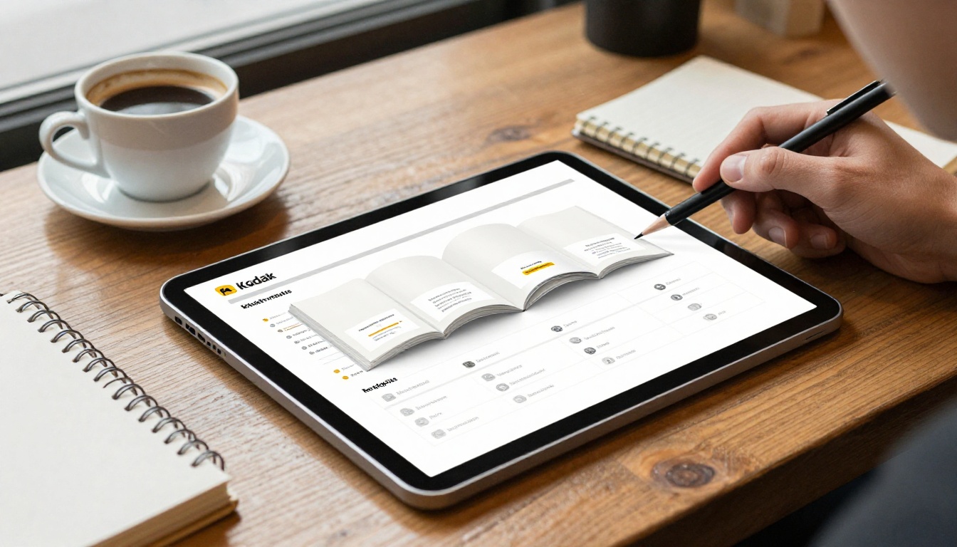
If your rules already exist as a PDF, you can turn them into something people actually open in a few minutes. Here is the process on Flipbooks AI:
- Create an account. Sign up here and open your dashboard.
- Upload your PDF. Drag in the brand book. Pages are converted into a page-turning flipbook automatically.
- Apply your branding. Set your colors, add your logo, and choose the page effects that fit your style. There are no watermarks.
- Add multimedia. Embed a short walkthrough video or audio note on the pages where a rule needs extra context.
- Set access. Use a direct link, an embed on your intranet (see Embed Flipbook on Website), or password protection for agency partners.
- Track usage. On the Professional plan, analytics show which pages are viewed, so you can improve the confusing ones. See the pricing plans for details.
- Update in place. Replace the file when rules change. The link stays the same.
💡 Pro tip: Use a separate flipbook for the quick reference and another for the deep reference. Link the two together so people start light and go deep only when needed.
Other Business Documents That Benefit
The same approach works for the documents around your brand book. A Training Manual Flipbook can onboard new hires, a Press Kit Designer keeps journalists on brand, and a Corporate Report Maker helps annual reports match your visual identity.
A Quick Audit Checklist
Use this table to score your current brand book. Give one point for each "yes."
| Question | Yes / No |
|---|
| Can someone find the logo in under 30 seconds? | |
| Does every rule include a right and wrong example? | |
| Are there templates people can open and use? | |
| Is there one link that always shows the latest version? | |
| Is there a named owner and a visible update date? | |
| Are pages organized around real tasks? | |
| Does each rule explain its reason? | |
| Was there a rollout, not just an announcement? | |
Scoring: 7 to 8 means your book works. 4 to 6 means fix the quick reference first. Below 4 means rebuild around the tasks people do every day.
Fix It This Week
You do not need a full redesign. Start with three moves:
- Cut your quick reference to under ten pages.
- Add right and wrong examples to your logo and color rules.
- Publish it as a single link people can open on any device.
Ready to try it? Get started for free on Flipbooks AI and turn your PDF into a brand book your team will open. Browse all flipbook tools to find the right layout, or compare pricing plans to pick the one that fits your team.



