Every company has the same quiet problem: the logo looks slightly different on the website, the invoice, the pitch deck and the Instagram banner. A brand book template fixes that by putting every decision about your identity in one place, so nobody has to guess. In this article you get the exact sections to include, sample values to copy, and a clean way to publish the result with Flipbooks AI so it opens like a real book on any screen.
Think of a brand book as the rulebook that lets five different people produce work that looks like it came from one hand. It does not need to be 80 pages. A tight 12 to 20 page document beats a sprawling one that nobody opens.
Why a Brand Book Matters
Inconsistency costs real money. Customers read a mismatched logo or a shifting tone as a sign that a company is careless. A brand book removes that friction before it starts.
Here is what a good one gives you:
- Faster onboarding. A new designer or freelancer reads 15 pages instead of asking 40 questions.
- Fewer revision rounds. The answer to "which blue?" is already written down.
- Stronger recognition. Repetition of the same colors, fonts and phrasing builds memory.
- Easier delegation. Founders stop being the approval bottleneck for every flyer.
💡 Pro tip: Write the brand book for the person who will use it on a busy Tuesday, not for a design award. Short rules, clear examples, no jargon.
Who Actually Needs One
Not only large agencies. A two person bakery with a printed menu, a freelancer with a portfolio and a SaaS startup with a pitch deck all benefit. If more than one person ever touches your visuals or your words, you need written rules.
What Goes Inside
The template below lists the sections in the order most readers look for them.
| Section | Purpose | Typical Length |
|---|
| Brand story and mission | Sets the tone for everything else | 1 page |
| Logo rules | Prevents misuse and distortion | 3 to 4 pages |
| Color palette | Gives exact values for print and screen | 2 pages |
| Typography | Defines fonts, sizes and hierarchy | 2 to 3 pages |
| Voice and tone | Keeps writing consistent | 2 pages |
| Imagery style | Sets photo direction | 2 pages |
| Applications | Shows the rules in real use | 2 to 4 pages |
| Contacts and file links | Tells people where to get assets | 1 page |
Logo Rules That Hold Up
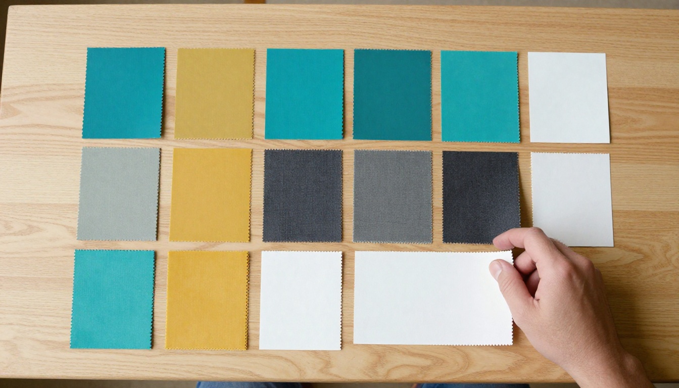
The logo section is where most misuse happens, so it deserves the most precision. State the rule, show the correct version and show the wrong one beside it.
Clear Space and Minimum Size
Define a protected zone around the logo. A common method is to use the height of one letter from the wordmark as the margin on all four sides. Then set a minimum size so the mark never becomes unreadable.
| Rule | Sample Value | Why It Helps |
|---|
| Clear space | Height of the letter "o" on every side | Keeps text and images away |
| Minimum print width | 25 mm | Preserves fine lines |
| Minimum screen width | 96 px | Stays sharp on small displays |
| Icon only version | Allowed below 40 px | Works as favicon and avatar |
Approved Versions
List every version you allow and when to use each:
- Primary horizontal logo for websites, documents and signage.
- Stacked logo for square spaces such as social profiles.
- Icon mark for app icons and small badges.
- One color black and white versions for stamps, receipts and embroidery.
Common Misuse
Show these as a grid of crossed out examples:
- Stretching or squashing the mark
- Rotating it or placing it on a tilted angle
- Adding shadows, outlines or gradients
- Recoloring it outside the palette
- Placing it on a busy photo with low contrast
⚠️ Warning: Always supply the logo as vector files (SVG or PDF) and PNG with transparency. If people only receive a JPG with a white box, they will paste that white box everywhere.
Colors With Exact Values
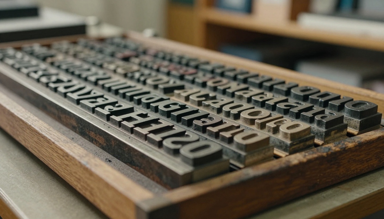
"A warm blue" is not a specification. Give every color a name, a HEX code for screens, RGB values, CMYK for print and a Pantone reference if you print on paper often.
Build the Palette in Three Layers
Keep it small. Most identities work with this structure:
- Primary colors (1 or 2): the ones people should recognize in a glance.
- Secondary colors (2 or 3): supporting shades for charts, buttons and illustrations.
- Neutrals (3): a dark text color, a mid gray and a soft background.
Here is a sample palette you can copy and adapt:
| Role | Name | HEX | RGB | CMYK |
|---|
| Primary | Deep Teal | #0F5C5C | 15, 92, 92 | 84, 0, 0, 64 |
| Primary | Warm Mustard | #E0A526 | 224, 165, 38 | 0, 26, 83, 12 |
| Secondary | Clay | #C4684A | 196, 104, 74 | 0, 47, 62, 23 |
| Neutral | Charcoal | #222B2E | 34, 43, 46 | 26, 6, 0, 82 |
| Neutral | Stone | #D9D6CF | 217, 214, 207 | 0, 1, 5, 15 |
| Neutral | Paper | #FAF8F3 | 250, 248, 243 | 0, 1, 3, 2 |
Accessibility Pairings
Add a short list of approved text and background pairs. Charcoal on Paper passes contrast checks easily. Mustard text on Stone does not, so mark it as forbidden. This one page saves hours of debate later.
✅ Best practice: Print one physical swatch card and compare it with the screen values. Monitors lie, and a quick check keeps packaging and flyers honest.
Fonts and Type Hierarchy

Two typefaces are enough. One for headlines, one for body text. A third is only worth adding if it serves a clear role, such as numbers in data tables.
Pairing Fonts Without Guesswork
The simplest pairing rule is contrast with harmony: pair a characterful headline face with a quiet, highly readable body face.
| Use Case | Headline Font | Body Font | Mood |
|---|
| Modern tech | Space Grotesk | Inter | Clean and sharp |
| Editorial | Playfair Display | Source Sans 3 | Elegant and warm |
| Friendly retail | Poppins | Open Sans | Approachable |
| Professional services | Merriweather | Lato | Trustworthy |
All of these are available as free web fonts, which matters for small teams that cannot buy licenses for every seat.
Hierarchy Rules
Write down sizes so every document feels related:
- H1: 40 px headline, bold, Charcoal
- H2: 28 px, semibold
- H3: 20 px, semibold
- Body: 16 px with 1.6 line height
- Caption: 13 px, Stone or mid gray
Add a fallback stack for situations where the chosen font fails to load, for example Arial or Georgia. Without a fallback, an email client may replace your carefully chosen face with something unpredictable.
Voice and Tone on Paper

Visual consistency gets the attention, but words carry as much weight. If your homepage sounds like a friendly neighbor and your support emails sound like a legal notice, readers feel the gap.
Define Voice in Three Adjectives
Pick three traits and define each with a "we are / we are not" pair:
| Trait | We Are | We Are Not |
|---|
| Clear | Direct and specific | Vague or full of buzzwords |
| Warm | Friendly and human | Chatty or overly casual |
| Confident | Calm and assured | Pushy or boastful |
Show Before and After Sentences
Abstract descriptions do not help a rushed writer. Examples do.
- Off brand: "We are thrilled to announce an innovative solution leveraging synergies."
- On brand: "We built a simpler way to share your catalog. Here is how it works."
Tone Shifts by Situation
Voice stays constant while tone flexes. A launch announcement can be upbeat. An outage notice should be calm and factual. A rejection email should be gentle and short. List five or six common situations with a one line tone note each.
💡 Pro tip: Add a short word list. Words you always use, words you avoid, and how to spell product names. It is the cheapest consistency tool you will ever write.
Imagery and Real Applications
Rules feel abstract until readers see them applied. Dedicate a few pages to real examples: a business card, a social post, a slide, a packaging label.
Photo Direction
Define the look of photography in plain terms: natural light or studio, warm or cool, candid or posed, how much empty space around the subject. Add three approved sample photos and three rejected ones.
Real World Examples
- A small shop keeps its sign, shopping bags and Instagram highlights in the same two colors, so a customer recognizes the brand from across the street.
- A consulting firm uses one serif headline font in proposals, invoices and slides so every document feels like part of one package.
- A freelancer sends clients a one page brand sheet with logo, palette and fonts, which cuts feedback emails in half.

How to Publish Your Brand Book as a Flipbook

A static PDF gets emailed once, saved in a forgotten folder and replaced by version 7 final FINAL. A flipbook is a living link: update the file and everyone sees the latest version. A page turning layout also feels like a real brand book, which makes the content easier to read.
Here is the process with Flipbooks AI:
- Create the document. Design your brand book in Canva, Figma, InDesign or Google Slides. Use a landscape or square page size and export as PDF at a high quality setting.
- Sign in. Create an account and open the dashboard.
- Upload the PDF. The PDF to Flipbook Converter turns each page into a turning page with smooth effects. A screenshot of this step would show the upload area with your file name and a progress bar.
- Customize. Add your logo, set the background to your Paper color, pick the page flip style and attach short video or audio clips, for example a 30 second welcome from the founder.
- Choose sharing options. Copy a direct link, use an embed code for an internal wiki or embed the flipbook on a website. Turn on password protection for brand books that include unreleased campaigns.
- Track and refine. On the Professional plan you get analytics showing which pages people open most, plus lead capture and offline downloads. See pricing plans for the exact limits.
| Feature | Why It Helps a Brand Book |
|---|
| No watermarks | Your identity stays clean and professional |
| Password protection | Keeps internal rules private |
| Mobile responsive | Works on a phone at a print shop or event |
| Embedded video and audio | Brings voice and motion examples to life |
| Offline downloads | Lets agencies work without a connection |
| Custom branding | The viewer itself matches your look |
✅ Best practice: Keep one master link in your onboarding email, your Slack channel header and your intranet. One source, many doors.
Pick the Right Tool for Your Version
Different teams need different formats. A few options from the tools directory:
Build It in One Afternoon

You do not need a month. Use this schedule:
| Time | Task | Output |
|---|
| 30 min | Write the story, mission and three voice traits | Page 1 and page 9 |
| 45 min | Collect logo files and write clear space rules | Pages 3 to 6 |
| 30 min | Fix the palette and test contrast | Pages 7 and 8 |
| 30 min | Choose fonts and set hierarchy | Pages 10 to 12 |
| 45 min | Add examples and photo direction | Pages 13 to 16 |
| 20 min | Export, upload and share | Live flipbook link |
Final Checklist Before You Share

Three Mistakes to Avoid
- Too long. If the book is 60 pages, people skim and miss the rules. Cut anything that does not change a decision.
- No examples. A rule without a picture gets interpreted five different ways.
- Never updated. Brands evolve. Review the book twice a year and note changes on the last page so everyone knows the latest version is live.
⚠️ Warning: Do not hide the book behind a request form that takes three days to answer. Easy access is the whole point.
Put Your Brand Book to Work
A clear brand book template saves time, protects your reputation and gives every new teammate a head start. Write the rules once, show them with real examples and publish them somewhere people will open.
Ready to turn your PDF into a page turning brand book? Get started for free on Flipbooks AI, browse all flipbook tools to find the right format, or compare pricing plans to choose what fits your team.



