Starting without a style sheet is like building a house without blueprints. You might get something standing, but the walls won't line up, the rooms will feel off, and you'll spend twice the time fixing problems that never needed to exist. A style sheet, built before a single element is placed on a canvas, is the decision that separates rushed, inconsistent work from polished, professional design. Whether you're creating a Flipbooks AI publication, a brand presentation, or a digital product, this single document will save you hours and make your output something you're actually proud to share.
What a Style Sheet Actually Is
Most people confuse style sheets with style guides. They're related, but not the same thing.
Style Sheet vs. Style Guide
A style guide is a broad document that covers brand philosophy, voice, tone, photography direction, and usage rules. A style sheet is leaner and more technical. It's the working reference that tells you, or your team, exactly which color codes, fonts, spacing values, and component rules to apply at any point in the project. Think of the style guide as the brand bible, and the style sheet as the cheat sheet you keep open while you work.
What Goes Inside a Style Sheet
A solid style sheet covers six core areas:
- Color palette: Primary, secondary, neutral, and semantic colors with exact hex codes
- Typography: Font families, weights, sizes, line heights, and letter spacing for each heading level and body text
- Spacing system: Base unit (often 4px or 8px) and a defined scale
- Iconography: Style, size, and stroke weight rules
- Component specs: Buttons, form inputs, cards, navigation bars with all states
- Grid and layout: Column count, gutter width, and margin rules
| Element | What to Define | Why It Matters |
|---|
| Colors | Hex codes, roles (primary/secondary/error) | Prevents color drift between assets |
| Typography | Font family, weight, size, line height | Keeps text readable and on-brand |
| Spacing | Base unit and scale | Creates visual rhythm and consistency |
| Components | States, sizes, border radius | Speeds up design and development |
| Grid | Columns, gutters, margins | Aligns layouts across breakpoints |
Why Starting Without One Is a Mistake
The real cost of skipping a style sheet is not obvious until you're three weeks into a project.
The Cost of Redesigning Mid-Project
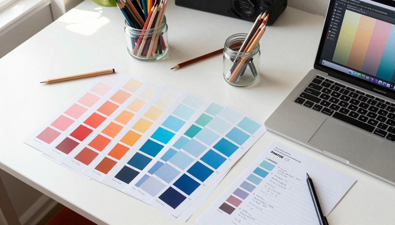
You pick a blue for your headers. Two days later, you pick a slightly different blue for a button. A week later, neither of those blues matches the one in the hero section. By the time you notice, you have six shades of blue scattered across forty artboards, and fixing it means touching every single one of them.
⚠️ Without a style sheet, visual inconsistency compounds. Every decision made without a reference creates a new problem to fix later.
This is not a hypothetical. It's the most common complaint from designers who skip this step. The rework is brutal, especially on multi-page documents like catalogs, reports, and flipbooks where a single color inconsistency spans dozens of pages.
When Teams Work Without Standards
Solo designers can sometimes get away with keeping standards in their head. Teams cannot. When two designers work on the same project without a shared style sheet, the output looks like it was produced by two different companies. This becomes immediately visible to clients, stakeholders, and users.

💡 Even if you're working alone, your future self is a different person. A style sheet you document today saves you hours of reverse-engineering your own decisions next month.
Build Your Color System First
Color is the loudest element in any design. It sets the mood, carries the brand identity, and guides the user's attention. Defined early, it becomes an asset. Chosen on the fly, it becomes chaos.
Primary, Secondary, and Neutral Palettes
Every color system needs at least three tiers:
- Primary: The brand's main color. Used for primary actions, headlines, and dominant visual elements.
- Secondary: A supporting color that complements the primary without competing with it.
- Neutral: Whites, grays, and off-whites for backgrounds, text, and structure.
Beyond those three, you also need semantic colors. These are functional:
- Success: Typically green, used for confirmations
- Warning: Typically amber or yellow
- Error: Typically red, used for form errors and alerts
- Info: Typically a light blue
How to Define Color Roles
Don't just pick colors. Assign them roles in your style sheet. Here's a simple structure:
| Token Name | Hex Value | Usage |
|---|
--color-primary | #1A56DB | Buttons, links, active states |
--color-primary-light | #E8F0FE | Hover backgrounds, tinted areas |
--color-secondary | #7C3AED | Accents, badges, highlights |
--color-neutral-100 | #F9FAFB | Page background |
--color-neutral-900 | #111827 | Primary text |
--color-success | #10B981 | Confirmation messages |
--color-error | #EF4444 | Form errors, alerts |
When you name colors by role instead of value, changing the palette later means updating one number, not hunting through every asset you've created.
Typography That Scales
Typography is where most style sheets fall apart. Designers pick one or two fonts but never define the full scale, leaving every heading and paragraph size up to gut feeling on the day.
Choosing Your Type Stack
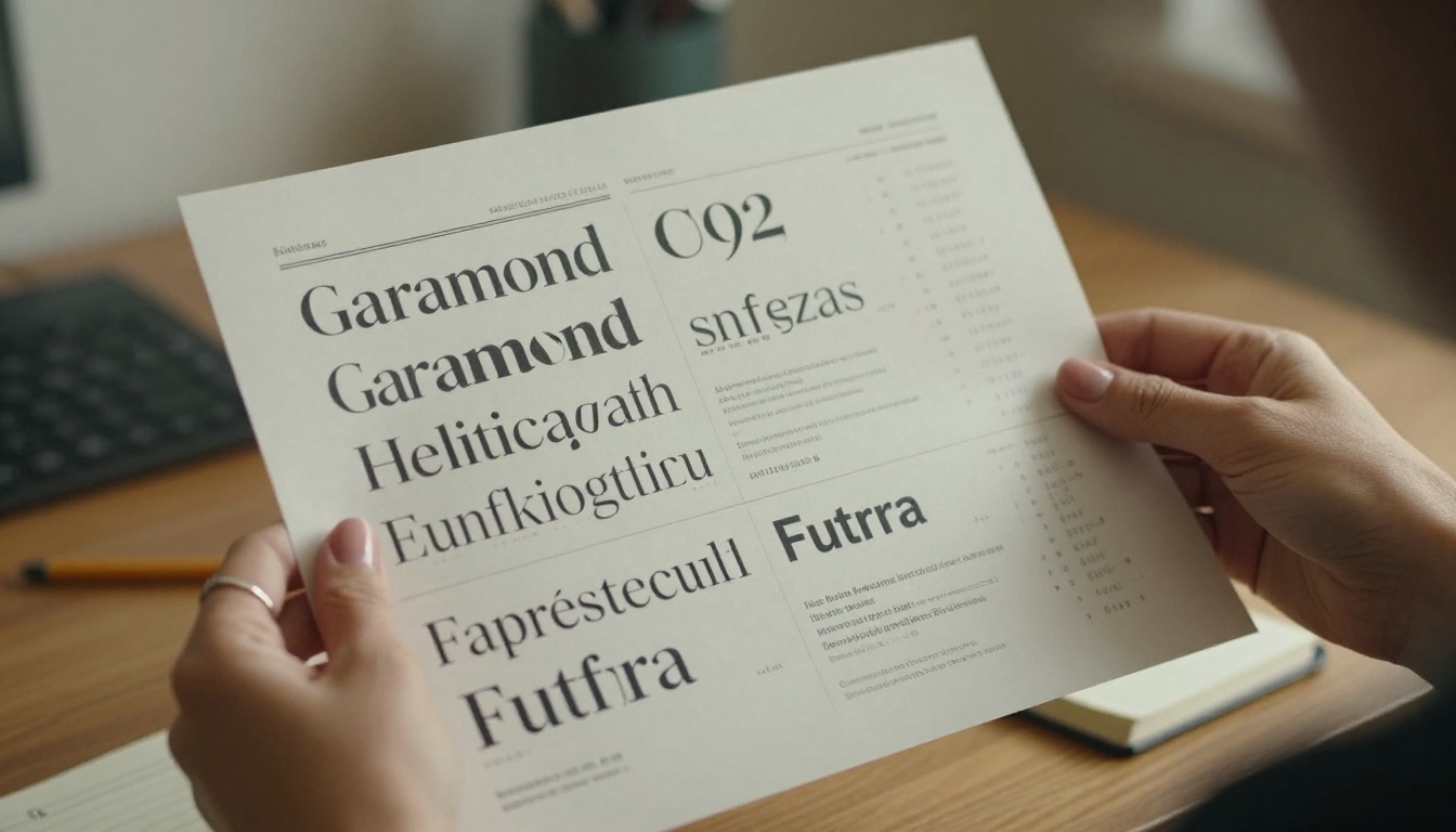
A type stack is the set of fonts you'll use across the project. Most projects need two, sometimes three:
- Display/Heading font: Used for H1 through H3 titles. Can be expressive and distinctive.
- Body font: Used for paragraphs, captions, and UI labels. Must be highly readable at small sizes.
- Mono font (optional): For code blocks, technical data, or structured information.
💡 For digital publications and flipbooks, stick to web-safe or Google Fonts that render consistently across devices and operating systems. Avoid obscure fonts that might not embed correctly in PDFs or digital formats.
Setting Size Ratios That Work
Instead of picking arbitrary sizes, use a type scale based on a ratio. The most common is the Major Third (1.25x multiplier):
| Level | Size | Weight | Line Height | Use Case |
|---|
| H1 | 48px | 700 | 1.2 | Page titles |
| H2 | 38px | 700 | 1.25 | Section headers |
| H3 | 30px | 600 | 1.3 | Sub-sections |
| H4 | 24px | 600 | 1.4 | Card titles |
| Body | 16px | 400 | 1.6 | Paragraphs |
| Caption | 13px | 400 | 1.5 | Image labels, footnotes |
Document every level. Not just the sizes, but the weight, line height, and letter spacing. These details look small but their absence makes text feel unprofessional at any scale.
Spacing, Grid, and Layout Rules
Spacing is invisible when done right and painfully obvious when done wrong. Inconsistent padding between cards, uneven margins around headings, and misaligned columns are all symptoms of the same problem: no spacing system.
The 8-Point Grid System
The most widely adopted spacing standard is the 8-point grid. Every margin, padding, gap, and size value is a multiple of 8:
8, 16, 24, 32, 40, 48, 64, 80, 96...
This system creates visual rhythm that the eye recognizes as intentional, even if the viewer can't name exactly why it feels polished. For tighter elements like icon padding or button height, a 4-point sub-grid works alongside it.

Consistent Margin and Padding
Document spacing at both the layout level and the component level:
- Layout margins: How much space sits between the content and the page edge
- Section spacing: The vertical gap between major sections
- Component padding: The internal space inside cards, buttons, and containers
- Gap: The space between items in a row or column
✅ Best practice: Keep section spacing at 64 to 96px on desktop, 40 to 64px on mobile. This creates clear visual separation without wasting space.
Components and States
A well-built style sheet defines not just what elements look like at rest, but how they behave in every state a user might encounter.
Buttons, Forms, and Navigation
Every interactive element needs at least four states documented:
- Default: The baseline appearance
- Hover: What changes when a cursor moves over it
- Active/Pressed: The moment of interaction
- Disabled: The non-interactive state
If you skip states, developers will invent them. Their invented states will rarely match the rest of your design.
Hover, Focus, and Disabled States
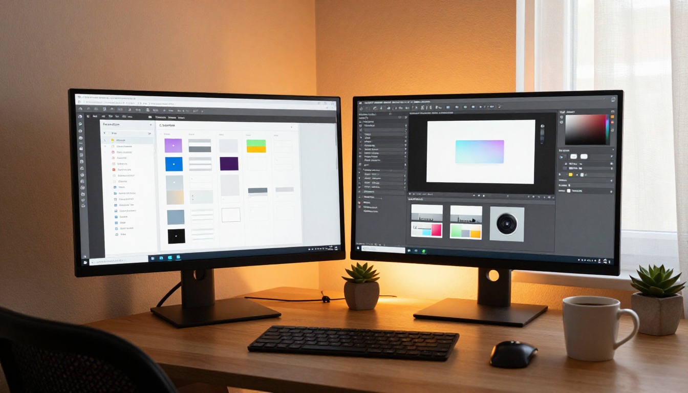
Focus states deserve special attention. They are critical for keyboard navigation and accessibility, yet consistently ignored in style sheets. Define a visible, on-brand focus ring color and document it explicitly.
| State | Visual Change | Example |
|---|
| Hover | Background lightens 10%, cursor changes | Button bg: --color-primary-light |
| Focus | 2px ring in brand color | Outline: 2px solid #1A56DB |
| Active | Background darkens 15% | Button bg: #1446B3 |
| Disabled | 40% opacity, cursor: not-allowed | opacity: 0.4 |
⚠️ Skipping focus states doesn't just hurt accessibility. It creates a broken experience for users who navigate your interface with a keyboard.
How to Apply Your Style Sheet in Flipbooks AI
A style sheet does its most visible work when you're producing publication-grade documents at scale. Whether you're building an interactive catalog, a digital annual report, or a branded newsletter, your style sheet is what keeps every page looking like it belongs to the same family.

Flipbooks AI makes it straightforward to take a style-consistent document and turn it into a professional interactive flipbook. Here's how your style sheet directly improves the final output.
Step 1: Design Your PDF to the Style Sheet
Before uploading anything, your PDF should already follow every rule in your style sheet: correct font stack, exact color codes, defined spacing. A document built to a style sheet will look intentional. One thrown together will look inconsistent regardless of how good the platform is.
Step 2: Upload to Flipbooks AI
- Create or log in to your account at flipbooksai.com/account
- Click New Flipbook and upload your PDF
- The platform converts it to an interactive flipbook with page-turning effects automatically, preserving your typography, color, and layout exactly
Step 3: Apply Branding Settings
After upload, go to the Customize panel to align the flipbook's interface with your style sheet:
- Set the primary color to your style sheet's exact hex value
- Apply your logo from brand assets
- Choose a background color that matches your neutral palette
- Set the font for UI elements if the platform allows overrides
💡 Match your flipbook's toolbar and accent color to your brand primary. This creates a seamless experience where the flipbook interface feels like an extension of the document, not a separate product.
Step 4: Configure Sharing and Privacy
Flipbooks AI gives you flexible sharing options that work with any distribution strategy:
- Direct link: Share immediately with anyone
- Embed code: Drop the flipbook into any website or blog with a single paste, using the Embed Flipbook on Website tool
- Password protection: Restrict access to private documents like internal reports or exclusive catalogs
- Lead generation (Professional plan): Collect viewer emails before they access the content
For high-value publications like press kits or lookbooks, the Press Kit Designer and Interactive Lookbook Designer give you a structured starting point built for brand consistency.
Step 5: Publish and Track Performance
The Professional plan includes analytics so you can see which pages readers spend the most time on, where they drop off, and how many unique viewers your flipbook has received. This data directly informs your next design decision. Browse what's included at the pricing page.
Real-World Use Cases for Style Sheets
A style sheet is not just a tool for web designers or app developers. It applies anywhere visual consistency matters.
| Industry | Document Type | Style Sheet Benefit |
|---|
| E-commerce | Product catalog | Consistent photo treatments, price tag formatting, grid alignment |
| Hospitality | Hotel brochure | Brand colors, image framing, typography across 20+ pages |
| Real estate | Property listings | Standardized layouts, font hierarchy, floor plan styling |
| Fashion | Lookbook | Model photography framing, color palette, spread compositions |
| Education | Course materials | Header hierarchy, callout styles, table formatting |
| Corporate | Annual report | Chart colors, caption sizing, section divider styles |
Every one of these documents is easier to produce, faster to revise, and more impressive to deliver when a style sheet is in place before the first page is touched.
For e-commerce teams, the Product Catalog Creator and Fashion Catalog Creator tools pair naturally with a strong style sheet. For hospitality brands, the Hotel Brochure Designer keeps brand presentation sharp across every property. Corporate teams can use the Annual Report Creator to produce on-brand documents in a fraction of the usual time.
The Version Control Problem No One Talks About
Here's a situation designers don't discuss enough: you finish a project, the client is happy, six months pass, and then they come back for an update. Without a style sheet, you have to reverse-engineer your own decisions. What shade of grey was that background? Was the body font 15px or 16px? Which blue was on the call-to-action?
With a style sheet on file, an update that would take days takes hours.
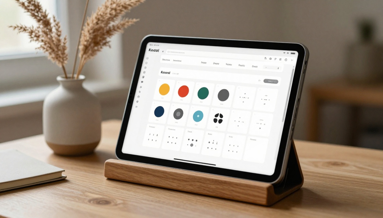
✅ Treat your style sheet like source code. Version it, date it, and keep a copy alongside every deliverable. When the client comes back for version 2, you'll thank yourself.
Building Your First Style Sheet: Practical Checklist
For those ready to start right now, here's a stripped-down checklist you can work through in under two hours:
Colors:
Typography:
Spacing:
Components:
Grid:

When this checklist is complete, you have something real. Not perfect, not final, but solid enough to start from without second-guessing every decision as you go.
Start Designing with a Foundation That Holds
A style sheet is not overhead. It's the fastest way to produce professional work, whether you're solo or on a team, whether you're designing one page or one hundred. It removes the low-value decisions from the process so you can focus on the work that actually requires creative thinking.
If your output includes interactive publications, catalogs, or digital documents, your style sheet becomes even more valuable. Tools like Flipbooks AI can take a well-designed PDF and make it interactive, engaging, and shareable in minutes. But the quality of what goes in determines the quality of what comes out.
Ready to put your style sheet to work? Get started for free and see how a consistent design foundation translates into publications worth sharing. Browse all flipbook tools to find the right format for your next project, or check all pricing plans to access analytics, lead generation, and unlimited publishing.