Every time you start a new document from scratch, you spend time that should already be in the bank. The designers and publishers who move fastest have built a page layout system they pull from on demand. A well-structured, reusable layout is not just a convenience; it is a production multiplier that makes every catalog, report, brochure, and publication you create consistent, professional, and fast to ship. Flipbooks AI makes this workflow even more powerful by letting you convert any PDF-based layout into an interactive, shareable flipbook in minutes.
Why Most Layouts Only Work Once
The "Custom-Every-Time" Trap
Most designers build layouts reactively. A client needs a brochure, so they open a blank document and start placing elements. The result looks great, but when the next project arrives, the process starts over. Margins shift. Fonts change. Column widths get eyeballed. The outcome is a library of documents that all look slightly different, even when they are supposed to represent the same brand.
This costs more than just time. It costs consistency, the invisible currency of professional publishing. When your annual report, product catalog, and sales presentation all have slightly different grid systems, the brand feels fragmented, even if every individual piece was well-designed on its own.
What Actually Makes a Layout Reusable
A reusable layout is not just a pretty template. It is a system built on three things:
- Fixed structural rules (column count, margin width, gutter spacing)
- Defined type scales (heading sizes, body size, line height ratios that hold regardless of content length)
- Locked color zones (which parts of the page carry which palette roles)
When those three elements are locked in, you can drop any content into the layout and it will work. The grid does the heavy lifting.
The Anatomy of a Reusable Page Layout
The Grid Is Your Foundation
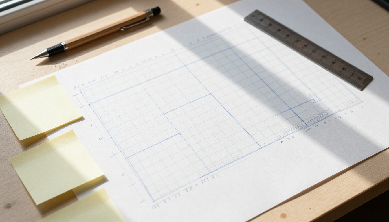
The grid is the invisible scaffolding that holds every page together. A 12-column grid is the most versatile starting point because it divides evenly into halves, thirds, and quarters. This gives you flexibility without chaos.
Your grid needs three measurements locked before anything else:
- Outer margin (breathing room between content and page edge): 15-20mm on print, 5-8% viewport width on screen
- Column gutter (space between columns): typically half your outer margin value
- Baseline grid (the vertical rhythm unit): usually your body text line-height value
When you define these once and never deviate, every page you build on this system feels like it belongs to the same family. Because it does.
💡 A 12-column grid is powerful precisely because it constrains you. Constraints accelerate decisions.
Typography That Never Breaks
Type is where reusable layouts most often fail. Designers pick fonts and sizes for one context, and those choices fall apart when applied to a different content type or a different screen size.
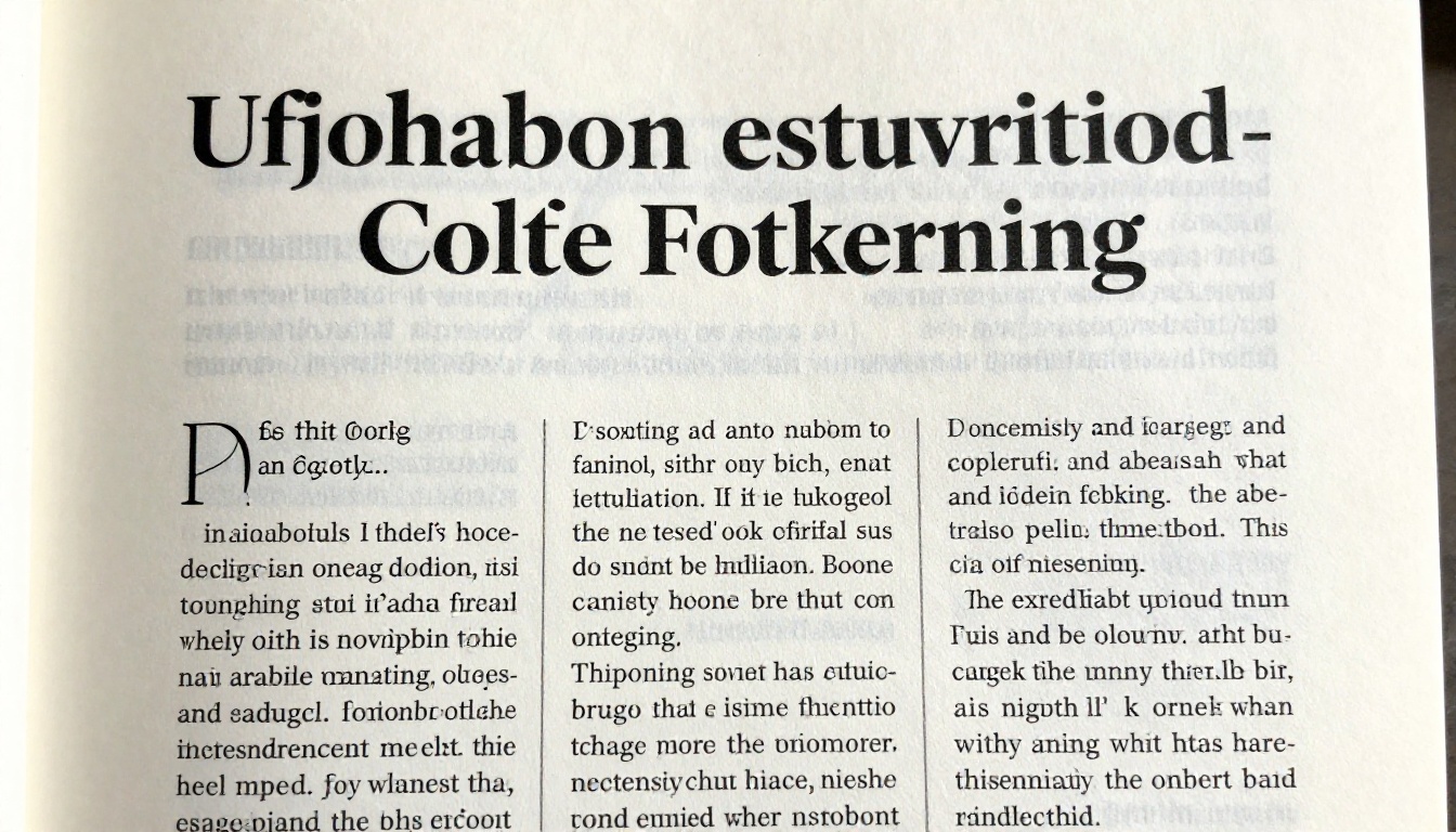
A robust type system for a reusable layout defines every level of the hierarchy before any content is placed:
| Type Role | Suggested Size | Weight | Line Height |
|---|
| H1 (Article Title) | 36-48px | Bold (700) | 1.1 |
| H2 (Section Header) | 24-30px | SemiBold (600) | 1.2 |
| H3 (Subsection) | 18-20px | Medium (500) | 1.3 |
| Body Copy | 15-16px | Regular (400) | 1.6 |
| Caption / Label | 12-13px | Regular (400) | 1.4 |
The rule: never define sizes in isolation. Define the ratio between sizes using a modular scale, and your type system will hold up across every document you create.
Color Zones, Not Color Chaos
Color in a reusable layout is not about which specific hex values you use. It is about assigning roles to color slots so that any palette you apply behaves predictably.
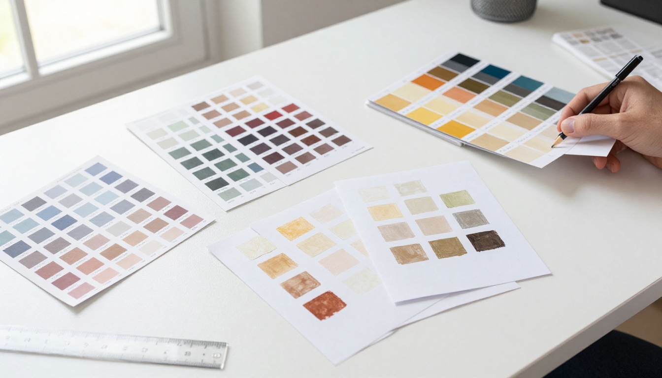
Define at minimum four color roles:
- Primary: Main brand color, used for headers and CTA elements
- Secondary: Supporting accent, used for dividers and subheadings
- Surface: Background fills (white, off-white, or light neutral)
- On-Surface: Primary text color (dark neutral, not pure black)
When you assign roles rather than hardcoding colors, you can swap an entire brand palette in minutes without breaking the layout structure.
⚠️ Never use pure #000000 black for body text. #1a1a1a or #222222 reads warmer and reduces eye fatigue on digital displays.
Five Layout Patterns Worth Saving
Once your grid, type, and color systems are defined, you need a set of reusable content patterns: arrangements of elements that solve common layout problems and can be dropped into any document.
The Split Column
Two equal columns side by side. Left: visual (image, chart, or icon). Right: text (headline, body copy, optional CTA). This pattern works for product features, team profiles, case studies, and comparison sections. It is the most versatile pattern in any layout library.
The Feature Block
A full-width horizontal band with a large image or color background filling the entire page width, overlaid with centered or offset text. Use this for chapter openers, section dividers, or high-impact statements. It creates visual rhythm in longer documents and signals to readers that something new is beginning.
The Data Row
A horizontal strip divided into three or four equal cells, each holding a single metric, icon, or stat. Use this for pricing comparisons, feature checklists, and important facts sections. It reads quickly, translates well to mobile, and is highly skimmable.
The Image-First Panel
A full-bleed image taking 60-70% of the page area, with a narrow text sidebar or a floating text box positioned over the lower third. This pattern suits portfolios, lookbooks, travel guides, and any content where the visual does most of the storytelling.
The Action Strip
A narrow full-width band in a contrasting color (your Primary or Secondary role), holding a single CTA line and a button or link. This is your workhorse for ending sections and pushing readers toward the next step. It should appear consistently throughout your document, not randomly.
How to Build Your Layout with Flipbooks AI
The most useful application of a reusable page layout is a system where you build the structure once, export it as a PDF, and convert it into an interactive flipbook that your audience can browse, embed, and share. Flipbooks AI makes this workflow direct and fast, with no watermarks and no rebuilding from scratch each time you publish.
Start with Your PDF Template
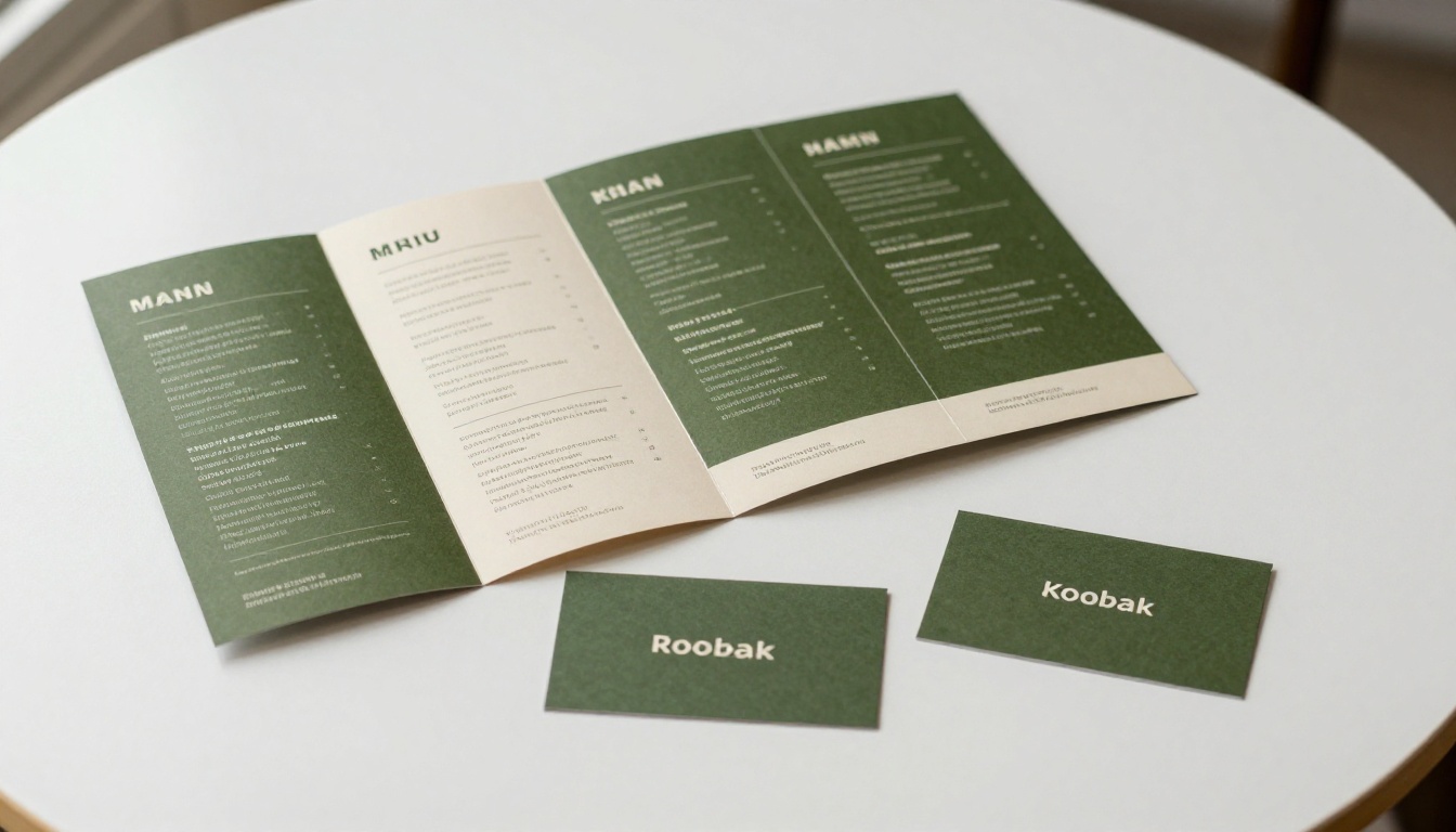
Build your master layout in any design tool that exports clean PDFs: Canva Pro, Adobe InDesign, Affinity Publisher, or even Google Slides with custom dimensions. Set up your grid, lock your type scale, assign your color roles, and save a blank master as your template file. Every future document inherits from this file. The discipline here is not picking the right tool; it is picking one and committing to the system inside it.
Upload and Convert in Seconds
Once your PDF is ready, head to Flipbooks AI and upload it directly. The platform converts your PDF pages into a fluid, page-turning flipbook with no degradation of your layout. The PDF to Flipbook Converter handles the entire process automatically, preserving your typography, spacing, and image quality.
✅ Your reusable layout pays double dividends here: a consistent PDF layout converts into a consistent flipbook with zero extra work on your end.
Apply Branding Once, Inherit Everywhere
Flipbooks AI lets you set custom branding at the account or publication level: logo position, background color, player controls theme, and loading screen appearance. Set this once, and every flipbook you publish from your reusable template inherits those brand settings automatically.

Save, Share, and Reuse
After publishing, your flipbook is instantly shareable via direct link, embed code, or QR code. For private content, enable password protection. For gated lead generation, the Professional plan adds lead capture forms that collect reader information before granting access. These features live at the platform level, not the layout level, meaning every document you publish from your reusable template can use them without extra configuration.
Tools that work perfectly with reusable layouts:
Layout Mistakes That Kill Reusability
A lot of layouts that start strong fall apart the moment someone tries to apply them to new content. Here are the most common failure points and how to prevent each one.

| Mistake | Why It Breaks Reusability | Fix |
|---|
| Hardcoded colors (hex values instead of roles) | Changing brand requires editing every element | Use color role variables or named layer styles |
| Custom spacing per section | No consistent vertical rhythm between uses | Lock baseline grid and use multiples of your unit |
| Font sizes set by eye | Inconsistent hierarchy across documents | Define a modular type scale and document it |
| Images placed at fixed pixel sizes | Breaks when content has different proportions | Define image frames by ratio (16:9, 4:3), not pixels |
| One layout file with no blank master | Every new document starts by deleting content | Maintain a separate, untouched blank template file |
| Section-specific styles without names | Cannot apply the same style to a new document | Name and export all styles from your design tool |
⚠️ The hardest habit to break: designing for the current project instead of designing for the system. Every local exception you make is future debt.
Comparing Layout Systems
Not all layout systems suit all publishing needs. Here is how the most common approaches compare when evaluated for reusability in a real production environment.
| System Type | Best For | Reusability | Learning Curve | Flipbook-Ready |
|---|
| Fixed column grid (12-col) | All document types | Very High | Low | Yes |
| Magazine-style modular grid | Long-form editorial | High | Medium | Yes |
| Free-form / artboard layout | One-off visuals | Very Low | Low | Partial |
| Template stack (card-based) | Short-form content | Medium | Very Low | Yes |
| CSS Grid (web-first) | Web-based publications | High | High | Via embed |
The fixed 12-column grid wins on reusability for most teams because it is the most predictable and the fastest to apply to new content without making fresh decisions each time. It is also the most forgiving when content length varies between documents.
When to Rebuild vs. When to Keep Going
Reusable layouts are not immortal. There are clear signals that a layout has stopped serving you and needs a rebuild, and clear signals that minor friction is normal and does not warrant starting over.
Rebuild when:
- The brand identity changes significantly (new typeface, new palette, new logo proportions)
- Content structure changes permanently, for example from single-page spreads to long-scroll documents
- The layout requires customization more than 30% of the time across recent projects
- Local exceptions have accumulated to the point where the template is no longer recognizable as a system
Keep going when:
- Minor content length variations require small tweaks (this is expected, not a failure)
- A new project type needs one additional pattern added to the existing library
- Seasonal or campaign-level color adjustments are needed (swap palette roles, not structure)
- A single document breaks the grid but 90% of others work cleanly
💡 Build a changelog for your layout. A single line per update ("v1.2: added full-bleed image panel pattern, March 2024") tells future-you exactly when and why things changed.
Start Building Your System Today
The gap between teams that ship fast and teams that struggle is rarely about talent. It is about infrastructure. A single afternoon spent building a proper reusable page layout, with a locked grid, a defined type scale, and role-based color slots, returns that time investment on every document you create from that point forward. The system compounds.

When your layout is ready, convert it into an interactive flipbook your clients, subscribers, and team can access anywhere. Get started for free on Flipbooks AI and see how fast a solid layout becomes a shareable, professional publication.
Browse all available tools and templates to find the right starting point for your specific publishing type, whether that is a product catalog, an annual report, or an interactive e-book. Compare pricing plans to choose the feature set that fits your workflow, and start publishing documents that look consistent every single time.