A car brochure has one job: make someone feel the drive before they ever sit behind the wheel. The best car brochure design examples from major automakers do that with a few pages of paper, a handful of photographs and a very disciplined grid. Whether you work at a dealership, run a small brand or just love print design, studying how the big names do it will sharpen your own work. And if you want to publish the result online, a tool like Flipbooks AI turns a finished PDF into a page-turning digital brochure in minutes.
This article breaks down the choices that separate forgettable brochures from the ones people keep on a shelf for years.
Why Car Brochures Still Matter
Car buying is a high-stakes, slow decision. Buyers research for weeks, compare trims, and often bring a brochure home to show a partner. That is why automakers still invest heavily in printed and digital catalogs even when the website is excellent.
A brochure works differently from a web page:
- It is a closed experience. No tabs, no pop-ups, no competitor ads.
- It sets the pace. The designer decides what you see first, second and last.
- It signals quality. Paper weight, finish and binding say something about the car before a single word is read.
- It travels. Brochures get shared, photographed and passed around.
💡 Pro tip: Treat the brochure as the quiet salesperson. If a spread cannot be understood in five seconds without a caption, simplify it.
What Major Automakers Do Differently
Looking across brands, a few patterns repeat. Each brand adapts them to its own personality, but the structure underneath is surprisingly consistent.
Premium Brands Sell Restraint
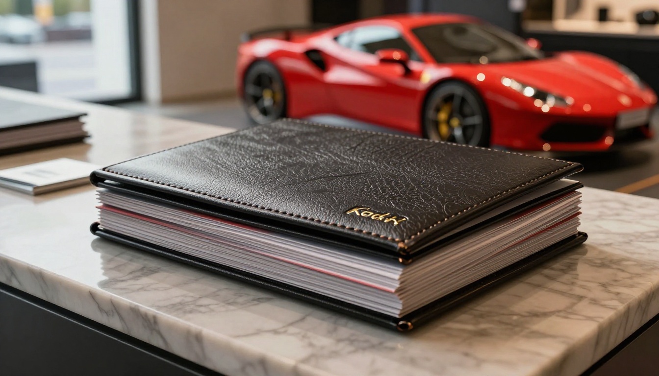
Luxury marques tend to use generous white space, large single photographs and short copy. A page might hold one image, one headline and nothing else. The message is simple: this car does not need to shout. Heavier paper stocks, matte lamination, foil details and embossed covers reinforce the same idea physically.
Mass-Market Brands Sell Clarity
Brands that sell to families and commuters lean toward practical information: seating layouts, cargo space, safety features and trim comparisons. Photography shows real-life situations such as school runs, road trips and loading groceries. The grid is denser, but it stays organized with clear icons and consistent headings.
Performance Brands Sell Emotion
Sports and performance brands use motion, low camera angles, dramatic light and tight crops on wheels, grilles and exhaust details. Typography is often bold and condensed. Spreads are built around a single feeling, usually speed or control, rather than a feature list.
Electric Brands Sell Simplicity
Newer electric-vehicle makers often skip the thick printed catalog and go for lean, digital-first documents. Fewer pages, fewer trims, large product photography and range, charging and software information front and center. The tone is calm and explanatory because the buyer is often new to the technology.
| Brand Approach | Typical Layout | Photography | Copy Style | Paper or Format |
|---|
| Premium | Wide margins, one idea per spread | Quiet, moody, large single shots | Short, confident | Heavy matte stock, special finishes |
| Mass market | Dense but organized grid | Real-life scenes, families, travel | Practical, friendly | Standard coated stock, many pages |
| Performance | Asymmetric, dynamic crops | Low angle, motion, details | Punchy, minimal | Glossy, bold color blocks |
| Electric | Clean, airy, modular | Studio and landscape hybrids | Explanatory, calm | Short PDF or digital first |
The Anatomy of a Great Car Brochure
Strip away the brand voice and most excellent car brochures follow the same skeleton.
1. The Opening Spread
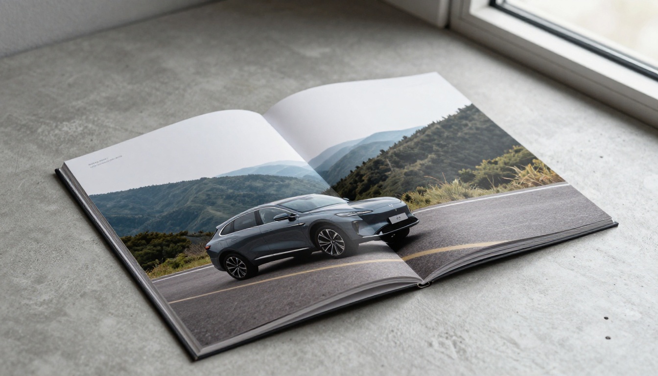
The first spread is a handshake. It usually shows the car in its best light, often in a landscape that matches the brand story: coastal road, mountain pass, quiet city street at dusk. Text is limited to a model name and one line.
2. The Story Section
Next comes a short narrative: who this car is for, what problem it solves, and what makes it distinct. Good brochures keep this to a page or two and use pull quotes or short paragraphs rather than long blocks.
3. Design and Interior
This is where material details earn their space. Close-ups of stitching, dashboard surfaces, seat textures and door panels let the buyer imagine the cabin. Photographers shoot these in natural, soft light to keep color accurate.
4. Technology and Safety
Features need structure. Smart brochures use icons plus one-line explanations, grouped into short categories like driver assistance, connectivity and comfort. Anything more detailed is pushed to the spec pages.
5. Trims, Colors and Options
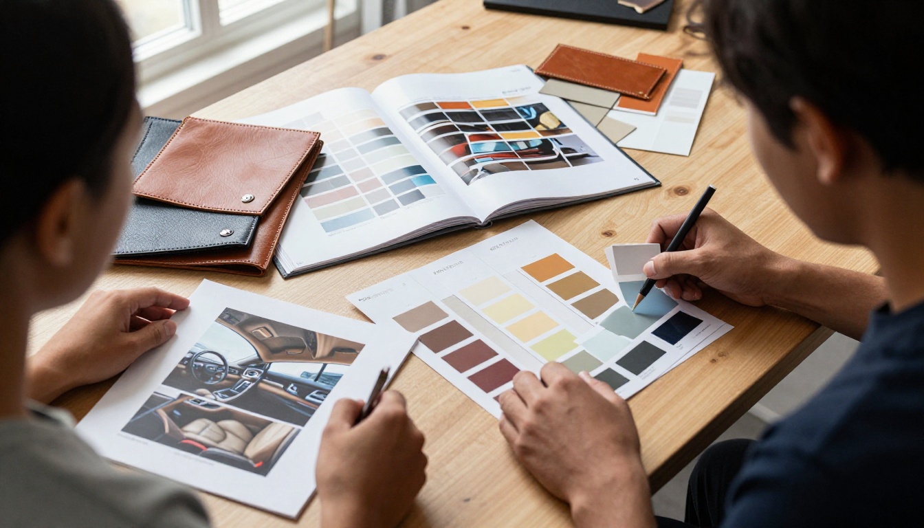
Here the buyer configures the car in their head. Color swatches, wheel options and trim ladders are usually shown as clean grids so differences are obvious at a glance.
6. Specifications
The back pages are for the numbers: dimensions, engine or battery details, weights, capacities. These pages are intentionally plain. Small type, strict alignment and a consistent table style make them easy to scan.
Photography Choices That Set the Tone
Nothing in a car brochure does more work than the photograph. Automakers often shoot on location with full crews, and the planning is meticulous.
- Golden hour light gives paint a warm, rich look and softens reflections.
- Low camera angles make vehicles look powerful and grounded.
- Environmental context tells the buyer where the car belongs: desert trails for trucks, tree-lined streets for compact cars.
- Detail shots of wheels, lamps, handles and materials communicate quality without words.
- Consistent color grading across all pages makes the brochure feel like one object.
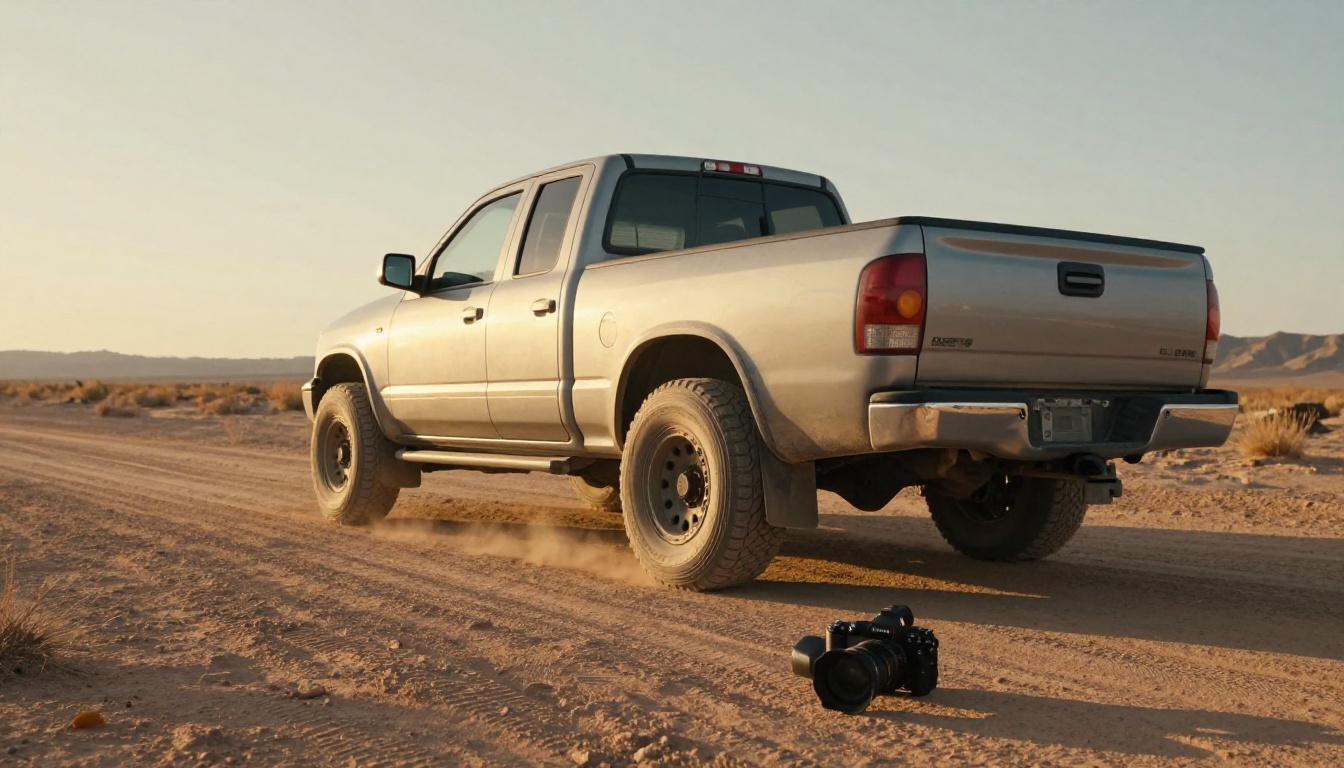
✅ Best practice: Decide the visual story before the shoot. Write a shot list with at least one hero image, three detail shots and two lifestyle scenes per model.
Typography Does Quiet Work
Most major automakers use one custom or carefully chosen typeface family and apply it with strict rules. Headlines are large and sparse. Body text is small but readable, with generous line spacing. Spec tables use a slightly condensed style to fit more data. If you cannot afford a custom typeface, pick one well-designed family and limit yourself to two weights.
Color Follows the Product
Brochure color palettes usually borrow from the car's paint options. A deep green model might lead to a dark green and warm neutral palette; a silver coupe might lead to cool greys and a single accent. This keeps photography and layout feeling like part of the same family.
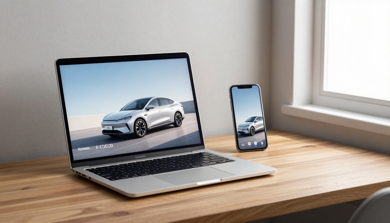
Many brands now publish both a printed brochure and an interactive digital version. Each format has strengths.
| Feature | Printed Brochure | Digital Flipbook |
|---|
| Production cost per copy | Higher, scales with quantity | Near zero after setup |
| Updating specs or pricing | Requires a reprint | Replace the file anytime |
| Tracking reader behavior | Not possible | Page views and time on page |
| Sharing | In person only | Link, email or embed |
| Video and audio | Not possible | Supported |
| Tactile quality | Excellent | Depends on screen |
| Accessibility on mobile | Not applicable | Responsive layout |
The smart strategy is rarely either/or. Print is ideal for showrooms and auto shows, while a digital version reaches buyers researching at night on a phone.
How to Create a Car Brochure Flipbook with Flipbooks AI
If you already have a designed PDF, you can publish an interactive version quickly. The Automotive Brochure generator and the PDF to Flipbook Converter are built for exactly this.
- Create your account. Go to Flipbooks AI and sign up. You can start without a credit card.
- Upload your PDF. Drag your brochure file into the uploader. Pages convert automatically into a flipbook that keeps your layout, fonts and photography sharp.
- Customize the viewer. Add your logo, choose background colors that match your brand, and pick a page-turn effect. Keep it subtle for a premium feel.
- Add multimedia. Embed a walkaround video on the opening spread or an audio clip of the engine on a performance page.
- Set sharing options. Copy a direct link for emails, generate an embed code for your website with the Embed Flipbook on Website tool, or enable password protection for dealer-only price lists.
- Track results. On the Professional plan, analytics show which pages hold attention and lead generation captures contact details before readers open the brochure. See pricing plans for details.
Other useful features include offline downloads, mobile-responsive viewing, custom branding and no watermarks, ever. Unlimited flipbooks are available from the Standard plan.
💡 Pro tip: Export your PDF at the final trim size with images at 150 to 200 DPI. That keeps the flipbook light and fast without visible quality loss.
Real-World Scenarios
Here are a few ways different teams use these ideas.
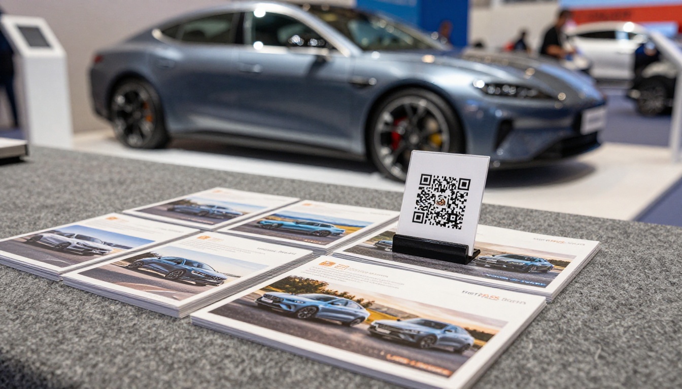
- A dealership group publishes one flipbook per model with current local offers, then swaps in a new PDF each month without changing the link on its website or QR codes.
- A small EV startup replaces a heavy printed catalog with a 12-page digital brochure that includes range charts and a charging explainer video.
- An aftermarket accessories brand builds a product catalog with the Product Catalog generator and shares it with installers through a password-protected link.
- A classic car restorer assembles a portfolio of finished builds using the Digital Portfolio Creator.
Mistakes to Avoid
Even large brands slip up. Watch for these common problems:
- Too many fonts. More than two families makes pages feel noisy.
- Cluttered spec pages. If everything is bold, nothing stands out.
- Inconsistent photography. Mixed color grading breaks the spell.
- Tiny text over images. Legibility drops fast over busy backgrounds.
- Outdated information. A brochure with last year's pricing damages trust. This is a strong argument for a digital version you can update.
⚠️ Warning: Always check legal footnotes and fuel or range disclaimers with your compliance team before publishing, especially for claims about efficiency or performance.
A Quick Checklist Before You Publish
| Check | Why It Matters |
|---|
| Opening spread shows one hero image | Sets tone in seconds |
| Every feature has a clear icon and one line | Keeps pages scannable |
| Spec tables share one consistent style | Easy comparison between trims |
| Color palette comes from the car's paint range | Visual harmony |
| Contact details and call to action on the back page | Gives readers a next step |
| Digital version tested on a phone | Most readers will open it there |
Your Next Brochure Starts Here
The brochures that stand out from major automakers are not complicated. They are disciplined: one idea per spread, honest photography, tidy typography and a structure that respects how people actually make decisions. Borrow those habits and your own brochure will feel more polished immediately.
Ready to publish yours? Get started for free on Flipbooks AI, browse all flipbook tools, or compare pricing plans to pick the right fit. When you are ready to go live, create your account and choose a plan.



