Pick a beautiful deep teal for your brand, spend hours refining it, then open it on your phone and watch it turn into something greenish-gray. Sound familiar? Colors behave differently across screens, and if you're creating digital publications, presentations, or flipbooks with Flipbooks AI, getting your palette right is the difference between a polished result and one that looks broken depending on who's viewing it.
Why Colors Shift Between Screens
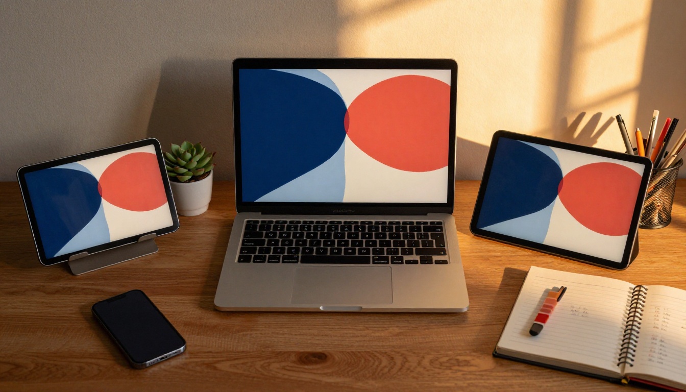
No two screens are identical. The manufacturing process, backlight type, display panel technology, and factory calibration all influence how a screen renders color. A color that looks vivid on an OLED iPhone may appear washed out on a budget Android device. A warm coral on your design laptop could skew orange-red on a television.
What Makes Screens Different
Three main factors control how a screen shows color:
- Panel technology: IPS, OLED, AMOLED, and TN panels all handle color, brightness, and contrast differently. OLED panels produce true blacks and highly saturated colors. IPS panels prioritize accuracy and wide viewing angles. TN panels are often cheaper but less accurate.
- Backlight and brightness: LCD screens use a backlight that can bleed into darker areas, shifting perceived color. Screens with higher peak brightness show the same hex code differently than dimmer ones.
- Factory calibration: Most consumer monitors and phones ship with pre-set color profiles that adjust white balance and saturation to appear more appealing on a store shelf. "Vivid" mode and "Natural" mode on the same phone show the same image completely differently.
The Role of Color Profiles
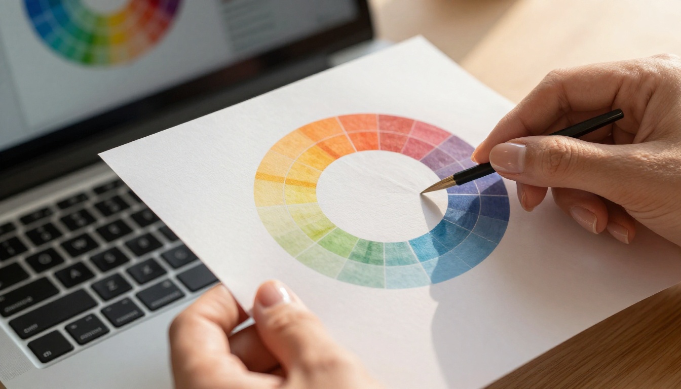
Color profiles like sRGB, Display P3, and Adobe RGB define the range of colors a device can show. When you design a digital asset, it's embedded with a color profile. If the viewing device uses a different profile and the browser or app doesn't convert between them properly, the colors shift.
| Color Profile | Color Gamut Coverage | Best For | Common Devices |
|---|
| sRGB | ~35% of visible spectrum | Web, digital publishing | Most monitors, older phones |
| Display P3 | ~45% of visible spectrum | High-end mobile, modern Macs | iPhones (2017+), iPad Pro, MacBook Pro |
| Adobe RGB | ~50% of visible spectrum | Professional print work | Pro photo monitors |
| Rec.2020 | ~75% of visible spectrum | HDR video and cinema | 4K HDR TVs, some Pro monitors |
For most digital publications and flipbooks, sRGB is your baseline. It's supported everywhere and will look acceptable across the widest range of devices.
The Color Spaces You Need to Know
Understanding color spaces isn't just for photographers and print designers. Anyone creating content that will be seen on multiple devices needs to work within the right color space from the start.
sRGB Is the Safe Zone
sRGB was defined in 1996 specifically for computer monitors and web content. Every modern device can display sRGB. When you stay within sRGB values, you avoid the most common cause of color shift: out-of-gamut colors being clipped or compressed by devices that can't show them.
The key practical rule: choose colors within the sRGB gamut and they will render consistently across roughly 95% of screens your audience uses.
💡 In design tools like Figma, Adobe XD, or Canva, set your document color profile to sRGB before building your palette. This prevents out-of-gamut colors from sneaking in.
P3 and HDR Screens
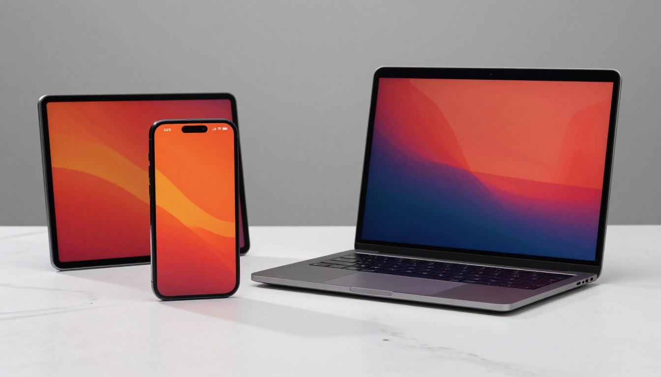
Apple devices from iPhone 7 onward use the Display P3 color space, which covers about 25% more colors than sRGB. Colors on a P3-capable screen look more vivid and saturated than on an sRGB screen, even with the same hex code.
If you design specifically for P3 displays and a user opens your content on an older laptop, your vibrant coral will look dull. If you design for sRGB and a P3 user opens it, the color will look accurate but not as vivid as it could be.
Recommendation: Design in sRGB, and if your platform supports P3, provide P3 variants of your hero images for those devices.
How to Build a Screen-Safe Color Palette
Building a palette that survives the journey from your design screen to your audience's devices takes a deliberate approach. Here's a practical process.
Start with Neutral Anchors
Before choosing your brand accent colors, lock in a set of neutral anchors: white, near-white, dark gray, and near-black. These tones are the least likely to shift across screens, and they create a stable foundation for your accent colors to sit against.
- White: Use
#FFFFFF (pure white) sparingly. On some screens it appears cold. #F8F8F8 or #FAF9F7 creates a warmer, softer feel.
- Near-black: Avoid pure black
#000000 for body text. It can look harsh on bright screens. #1A1A1A or #212121 reads as black but is gentler.
- Mid-gray: Use
#6B7280 or similar as a secondary text color. It holds contrast without feeling heavy.
Test Before You Commit
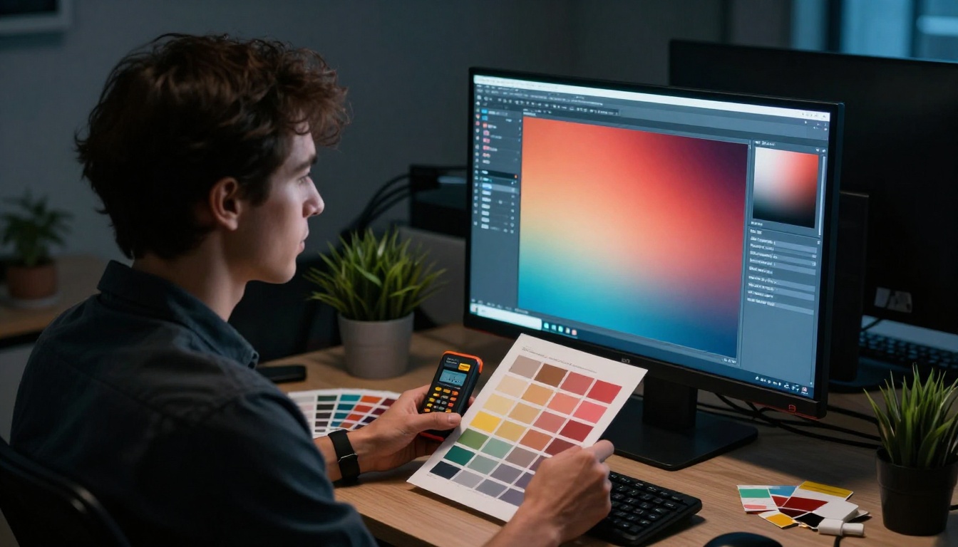
Never finalize a palette by looking at it on a single screen. The minimum testing setup before committing to a brand or publication palette:
- View on your primary design monitor
- View on a calibrated IPS monitor (or a color-accurate reference display)
- View on your phone with "Natural" or "Standard" color mode enabled
- View on an older Android device or budget tablet if your audience includes them
- Export the palette to a PDF and open it in a browser on different devices
⚠️ Avoid choosing saturated neon or fluorescent colors as primary palette colors. They are the hardest to render consistently and look wildly different between sRGB and P3 screens.
Avoid These Color Traps
Some categories of color are particularly risky for cross-device consistency:
Saturated single-channel colors: Pure #FF0000 red, #00FF00 green, or #0000FF blue hit the edge of the sRGB gamut. Any device that handles these imperfectly will show visible color shift.
Very dark saturated colors: Deep navy-blues and forest greens that are both dark and saturated often lose their hue on less-calibrated screens and appear nearly black.
Highly saturated warm tones: Bright oranges and vivid pinks in the #FF4500 to #FF69B4 range can shift red on screens with poor color accuracy.
Color Contrast and Accessibility
Choosing colors that look good isn't only about aesthetics. Contrast ratio determines whether your content is readable by everyone, including people with low vision or color blindness. And on screens with different brightness settings, contrast ratios shift right along with perceived colors.
WCAG Guidelines Simplified
The Web Content Accessibility Guidelines (WCAG) define contrast ratio thresholds for readable content. These rules apply directly to digital publications and flipbooks.
| WCAG Level | Minimum Contrast Ratio | For Text Size | Practical Use |
|---|
| AA (Standard) | 4.5:1 | Normal text (under 18pt) | Body text, captions, labels |
| AA (Standard) | 3:1 | Large text (18pt+ or 14pt bold) | Headings, pull quotes |
| AAA (Enhanced) | 7:1 | Normal text | Highest priority content |
| AAA (Enhanced) | 4.5:1 | Large text | Feature headings |
A practical read: white text on a medium-blue background may pass AA but fail AAA. That same combination on a phone with brightness at 30% may barely be readable at all.
Tools to Check Your Contrast
Before publishing any digital content, run your color combinations through a contrast checker:
- WebAIM Contrast Checker: Free, paste in hex codes, shows pass/fail for WCAG AA and AAA instantly
- Colour Contrast Analyser (desktop app by TPGi): Eyedropper tool to check contrast directly on screen
- Adobe Color Accessibility Tools: Built into Adobe Creative Suite, flags inaccessible color pairs automatically
- Figma A11y plugins: Several plugins in the Figma community check contrast in real-time as you design
✅ Aim for at least 5:1 contrast ratio for all body text in your publications. This gives a buffer above the 4.5:1 AA minimum and ensures readability on lower-quality screens.
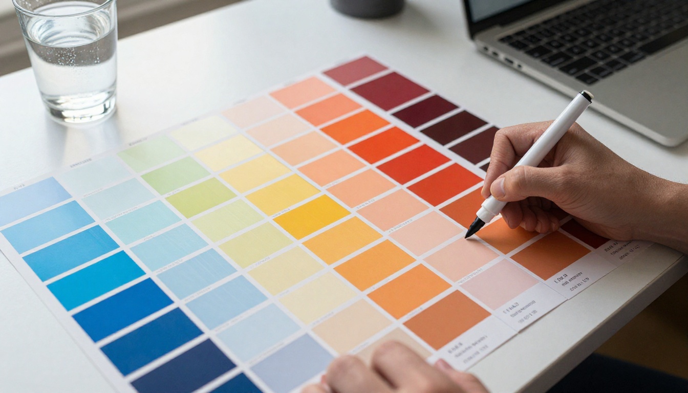
Some color families are simply more forgiving across diverse screens. Knowing which ones lets you build a reliable palette without sacrificing personality.
The Reliable Ones
These color types render predictably across the widest range of screens:
- Muted blues and teals: Colors like
#3B82F6, #0EA5E9, and #14B8A6 sit comfortably within the sRGB gamut and render consistently across virtually all modern displays.
- Warm neutrals: Creams, taupes, and warm grays from
#F5F0EB to #8B7D6B are inherently low-saturation and highly stable.
- Forest greens and sage: Colors from
#4A7C59 to #7D9E7B carry enough desaturation to survive poor calibration without losing their identity.
- Dusty roses and muted corals: Rather than vivid
#FF6B6B, opt for #E8927C or #C97B6D. The added brown keeps them within a reliable gamut range.
Colors to Use Carefully
| Color Type | Risk Level | Safer Alternative |
|---|
Pure saturated red #FF0000 | High | Crimson #DC2626 or brick #B91C1C |
Neon green #00FF00 | Very High | Olive #65A30D or emerald #059669 |
Electric blue #0000FF | High | Royal blue #3B82F6 or cobalt #1D4ED8 |
Hot pink #FF69B4 | High | Dusty rose #E879A8 or mauve #BE185D |
Vivid yellow #FFFF00 | Very High | Amber #F59E0B or gold #D97706 |
Neon orange #FF4500 | High | Terracotta #C2410C or sienna #92400E |

Applying Screen-Safe Colors in Your Flipbooks
When you create digital publications, product catalogs, or interactive brochures with Flipbooks AI, your color choices are amplified because the content is designed to be shared and opened on every kind of device imaginable.
Setting Your Brand Colors
Flipbooks AI lets you apply custom brand colors across your flipbooks, which means your palette choices follow every page. When setting up your brand colors:
- Open your flipbook project in the editor
- Navigate to Branding settings
- Input your primary, secondary, and accent colors using hex codes
- Preview the live render on the editor canvas before publishing
- Adjust if any color looks off against the page backgrounds
Use hex codes from your pre-tested, sRGB-safe palette. This way, the colors rendered in the flipbook engine match what you've already verified across devices.
Previewing Across Devices
Before sharing a flipbook publicly, use the built-in preview link to open it on at minimum two different devices. The Flipbooks AI responsive viewer renders on mobile, tablet, and desktop, but color accuracy depends on the viewing device.
A simple checklist before publishing:
Using Custom Themes for Consistent Results
Flipbooks AI supports custom themes that apply consistently across all pages of a flipbook. Building a screen-tested theme once and reusing it across multiple projects is far more reliable than applying colors manually per document.
For teams creating multiple catalogs, menus, or brochures, a shared theme built from a screen-safe palette saves significant rework. Whether you're using the Digital Catalog Maker, the Restaurant Menu Creator, or the Interactive Lookbook Designer, the same validated palette applies instantly across every publication.
Common Mistakes and How to Fix Them
Even experienced designers make color mistakes when working across screens. Here are the most frequent ones.
Designing Only on a High-End Monitor
A calibrated 27-inch 4K display makes colors look extraordinary. But most of your audience is not using one. If you design exclusively on premium hardware, your palette will be calibrated to that screen, not to the average device.
Fix: Use your main monitor for design work, but do a final review pass on a standard consumer laptop and your phone before publishing anything.
Using Screenshots for Color Matching
Taking a screenshot of a reference color to match it in your design is unreliable. Screenshots capture pixels as displayed by your screen, not as the color should be in the original color space.
Fix: Use official hex codes from brand guidelines or manually sample from the original source file, not from a screenshot.
Ignoring Dark Mode
An increasing number of users browse and read in dark mode. A palette designed only for a white background may appear harsh or clash badly in a dark-mode context.
Fix: Check that your accent and heading colors have sufficient contrast against both white (#FFFFFF) and dark (#121212) backgrounds. Test your flipbook in browser dark mode before publishing.

Not Converting Colors from Print
If you're adapting a printed catalog or brochure into a digital flipbook, the CMYK values from print will not look the same on screen. CMYK and RGB are fundamentally different color models, designed for entirely different output methods.
Fix: Never copy CMYK values directly into a hex color field. Use a conversion tool or, better still, rebuild your digital palette from scratch using the RGB equivalents of your intended colors, then verify them on screen.
Building a Cross-Device Testing Workflow
Rather than checking colors ad-hoc, build a repeatable process that runs every time you create a new publication.
Phase 1: Palette selection
- Choose colors within the sRGB gamut
- Run all text-background combinations through a WCAG contrast checker
- Identify any colors in the risky saturation range and replace them with safer alternatives
Phase 2: Document testing
- Export a test PDF with your palette applied
- Open it in Chrome and Safari (they behave differently with color profiles)
- View on phone in standard display mode
- View on a second device with different screen technology if available
Phase 3: Publication review
- Publish a draft version of your flipbook with a private link
- Open the share link on a different device from your design machine
- Check heading, body, and accent colors for any drift
- Adjust and republish if any colors shifted from your intent
✅ Running this three-phase check takes under 20 minutes and prevents the very real problem of a client seeing color-broken content on their phone the moment you share it with them.
Why This Matters for Digital Publications
A well-chosen, screen-tested color palette is invisible when it works and embarrassingly obvious when it doesn't. Your readers on iPhones, budget Androids, Windows laptops, and smart TVs should all see a cohesive, intentional design, not a color that accidentally shifted from brand blue to something purple.
For digital catalogs, menus, portfolios, and publications, color is one of the primary signals of professionalism. A product catalog with muddy, inconsistent colors suggests a brand that doesn't pay attention to detail. A flipbook with crisp, consistent colors throughout, on every device, builds the kind of trust that converts readers into customers.
The investment in building a cross-device safe palette is small. The payoff, in consistent, professional-looking content that holds up wherever it's viewed, is significant.
Ready to put a screen-tested palette to work? Create your first flipbook on Flipbooks AI and apply your color system across any type of publication. Browse all flipbook tools to find the right format for your project, and compare pricing plans to access the full set of branding and customization features.