A patient picks up a study leaflet in a clinic, reads the first sentence, sees "randomized, double-blind, placebo-controlled," and puts it back down. That moment costs research teams more enrolled participants than any budget cut ever will. Clinical trial recruitment brochures written in plain language fix the problem at the source: the words. And when you publish them as a page-turning digital flipbook with Flipbooks AI, the same brochure works on a waiting room tablet, a phone, and a printed handout.
This article shows you how to write the text, structure each page, check reading level, and publish a brochure that people finish.
Why Plain Language Wins Enrollment
Most adults read at roughly an eighth-grade level, and stress pushes that lower. A person weighing a medical decision is stressed. If your brochure demands extra effort, they will skip it.
Plain language is not "dumbing down." It means the reader gets the point on the first pass. Researchers, regulators, and review boards increasingly expect it, and the benefits are practical:
- More people finish reading. Short sentences hold attention.
- Fewer repeat questions. Coordinators spend less time re-explaining basics.
- Better informed consent later. People who grasp the study up front ask sharper questions at the consent visit.
- Wider reach. Caregivers, adult children, and non-native speakers can follow along.
💡 Pro tip: Imagine your reader is a smart neighbor who has never worked in healthcare. Write for them, not for your sponsor.
Who Actually Reads These Brochures
Three audiences open your brochure, and each wants something different.
| Reader | Main Question | What They Need on the Page |
|---|
| Patient | "Is this safe, and is it for me?" | Eligibility, time commitment, risks in everyday words |
| Caregiver or family | "Will this disrupt our life?" | Visit schedule, travel help, who to call |
| Referring clinician | "Is this worth mentioning?" | Study goal, criteria, contact route |
Plain Does Not Mean Vague
You still owe readers accurate facts. Plain language drops jargon, not detail. "You will have a blood draw at each visit, about two tablespoons" is plain and exact. "Venipuncture will occur periodically" is neither.
Swap Jargon for Everyday Words
Start with a word list. Keep it taped beside the screen while you draft.
| Instead of | Write |
|---|
| Participants will be randomized | A computer will pick your group by chance, like flipping a coin |
| Placebo | A pill with no medicine in it |
| Adverse event | Side effect or health problem |
| Eligibility criteria | Who can join |
| Informed consent | Your decision to join, after we explain everything |
| Double-blind | Neither you nor the study doctor will know which group you are in |
| Investigational drug | A medicine that is still being tested |
| Protocol | The study plan |
| Efficacy | How well the treatment works |
| Longitudinal follow-up | We will check in with you over time |
Five Sentence Rules That Work
- Keep sentences under 20 words. If you need a semicolon, you need two sentences.
- Use active voice. "The nurse will check your blood pressure" beats "Blood pressure will be checked."
- Say "you" and "we." It turns a notice into a conversation.
- Put the main point first. Lead with what the reader will do, then explain why.
- One idea per paragraph. Three lines is plenty.
⚠️ Warning: Never replace a risk with a softer word. "Some people feel sick to their stomach" is fine. "Mild discomfort" for a serious reaction is not.
Structure the Brochure Page by Page
A flipbook gives you a natural pacing tool: one idea per page. Use it. Here is a layout that works for most studies.

| Page | Heading Idea | Content |
|---|
| 1 | The study in one sentence | What condition, what is being tested |
| 2 | Why this study matters | The problem it tries to solve |
| 3 | Who can join | Three to five plain checkboxes |
| 4 | What happens, step by step | A visit timeline with icons |
| 5 | Time and travel | Hours per visit, number of visits, parking or ride help |
| 6 | Risks and benefits | Honest, balanced, specific |
| 7 | Your rights | Leave anytime, no penalty to your regular care |
| 8 | Costs and payment | What is covered, what is not |
| 9 | Common questions | Four to six short answers |
| 10 | How to reach us | Phone, text, email, QR code |
Page One Decides Everything
Open with the study purpose in one sentence a ten-year-old could repeat. For example: "We are testing whether a new daily pill helps people with type 2 diabetes keep their blood sugar steady." Then add a clear line: "Joining is your choice."
Show the Visit Timeline
People fear the unknown more than the needle. A simple timeline reduces that fear. Show Visit 1, Visit 2, and so on, with how long each takes and what happens. A short list works well:
- Screening visit (about 2 hours): Health questions, blood test, a quick physical check.
- Treatment weeks: Take the study medicine at home each day.
- Check-in visits (about 45 minutes): Weight, blood pressure, and a few questions.
- Final visit: A last check and a thank-you.
Be Specific About Risks and Benefits
Balanced writing builds trust. State likely side effects in order of how common they are. Then say plainly that the treatment may or may not help you, and that the results will help future patients with the same condition.
✅ Best practice: Use phrases like "about 1 in 10 people" instead of "common." Numbers beat adjectives.
Test Your Reading Level Before You Publish
Never trust your own ear. You know the study too well. Run objective checks, then run a human check.
Quick Readability Checks
| Method | What It Tells You | Target |
|---|
| Flesch-Kincaid grade level | Approximate school grade needed | Grade 6 to 8 |
| Flesch Reading Ease | How easy the text feels | 60 or higher |
| Average sentence length | Density of each line | Under 20 words |
| Teach-back test | Whether a person can repeat the main points | 4 of 5 points recalled |
| Community panel read | Whether the tone feels respectful | Positive feedback, no confusion |
Run a Teach-Back Session
Hand the draft to three people outside your team. Ask each to explain the study back to you in their own words. Where they stumble, rewrite. This single step catches more problems than any software score.
Include Patient Voices
If your institution has a patient advisory group, invite them early. They will spot a cold phrase in seconds. A short quote from a past participant, used with permission and approved by your review board, also adds warmth.
Design Choices That Support Plain Words
Words carry the message, but layout decides whether people keep reading.
- Font size: At least 12 point in print and a comfortable size on phones.
- Contrast: Dark text on a light background.
- White space: Leave room around headings and lists.
- Icons: Pair each step with a simple icon, not decoration.
- Photos: Real people in real settings, not stock models in lab coats.

Print and Digital Side by Side
Many sites still need paper for clinic racks. Many patients also want a link they can open at home or forward to a relative. Offering both is the safest path.
| Format | Strength | Weakness |
|---|
| Printed trifold | Easy to hand out, no device needed | Costly to reprint after edits |
| Static PDF | Simple to email | Awkward on phones, hard to track |
| Flipbook | Page-turn feel, mobile friendly, easy updates | Needs a link or QR code to reach people |
| Website page | Searchable | Less like a brochure, easy to skim past |
A flipbook gives you the best of both: the familiar page-by-page rhythm of a brochure and the speed of a link.
How to Create a Plain Language Brochure with Flipbooks AI
If your draft is ready, publishing takes minutes. The Brochure Flipbook Maker and the Online Brochure Designer suit this kind of project well.

Step-by-Step Setup
- Create an account. Go to Flipbooks AI and sign up.
- Upload your PDF. Export your brochure as a PDF from your design tool. The PDF to Flipbook Converter turns each PDF page into a flipbook page.
- Customize the look. Add your institution's colors and logo, choose a page-turn effect, and keep the background calm.
- Add multimedia. Embed a short welcome video from the principal investigator or an audio version for people who prefer listening. Both help low-literacy readers.
- Set sharing options. Copy the direct link, create a QR code for the clinic poster, or use the Embed Flipbook on Website tool for your study page.
- Protect it if needed. Use password protection when a version is meant only for referred patients or specific sites.
- Track what works. Analytics and lead generation are part of the Professional plan, listed on the pricing page.
💡 Pro tip: Offline downloads let patients keep the brochure on their phone and read it without a signal, handy in rural areas and hospital basements.
Features That Matter for Recruitment
- ✅ No watermarks, ever
- ✅ Mobile-responsive design
- ✅ Custom branding for each site or sponsor
- ✅ Embedded video and audio
- ✅ Password protection for private versions
- ✅ Analytics to see which pages hold attention (Professional plan)
Which Plan Fits Which Team
| Team Type | Typical Need | Likely Fit |
|---|
| Single-site investigator | One or two brochures | Entry plan |
| Academic department | Many studies, steady updates | Standard plan with unlimited flipbooks |
| Multi-site sponsor or CRO | Tracking, lead capture, multiple versions | Professional plan |
Compare the options on the pricing page.
Real-World Examples
A Community Health Fair
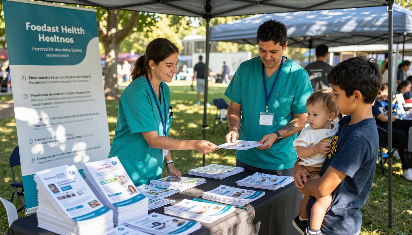
A cardiology clinic wanted to reach people who rarely visit specialists. The team put a QR code on a table at a neighborhood health fair. Visitors scanned it, flipped through a six-page brochure on their phones, and tapped a call button on the last page. Because the text was short and the page count low, people finished it standing in line.
A Clinic Front Desk
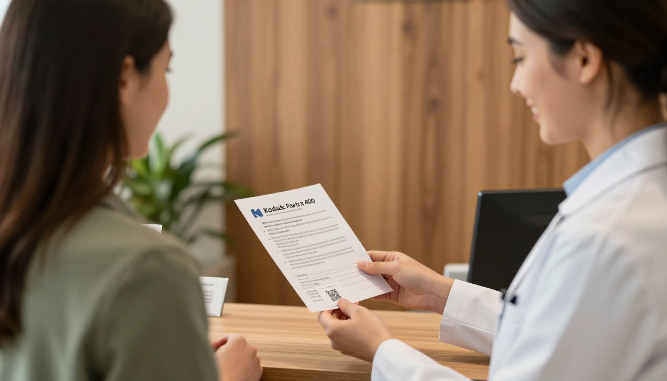
A diabetes clinic kept paper copies at reception and added a small card with a QR code. The receptionist could say, "Scan this and read it at home, then call us with any questions." Patients who did not feel rushed asked better questions at the next visit.
A Younger Audience on Mobile
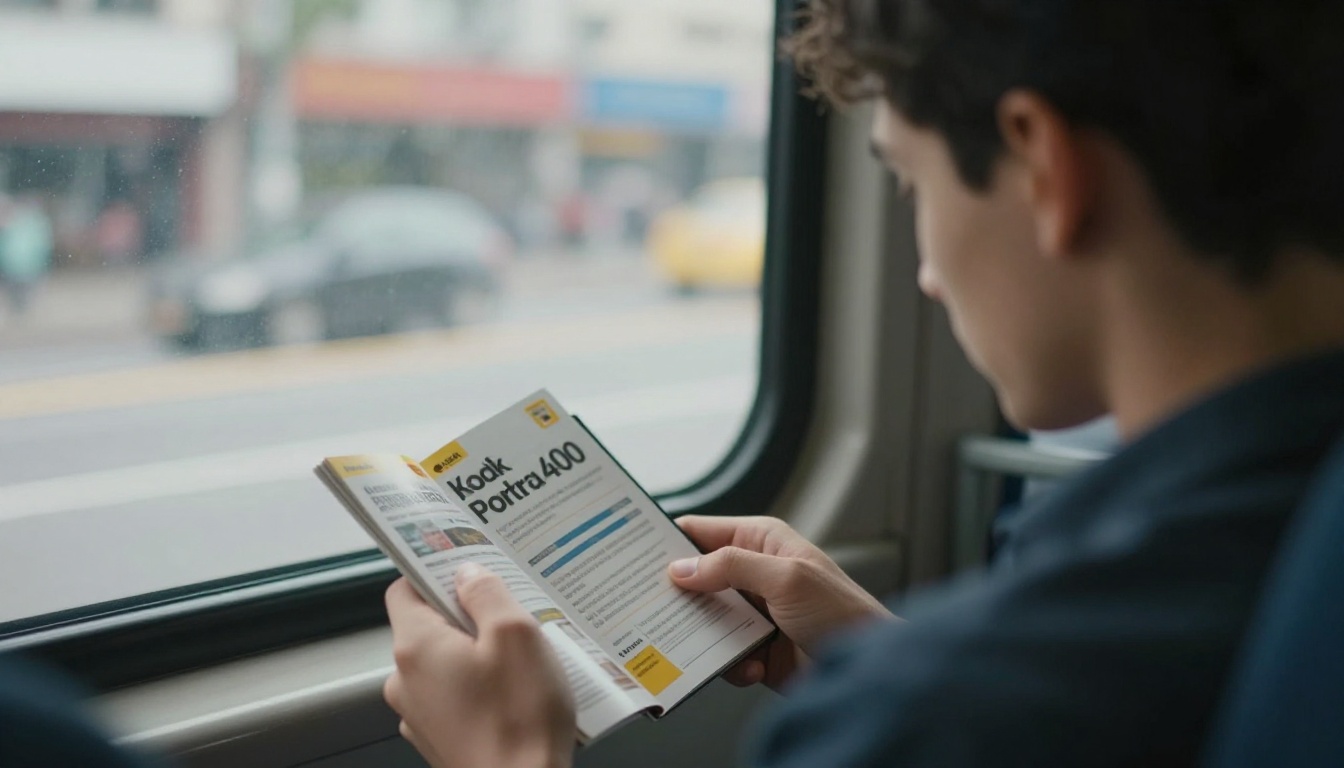
Studies for adults under 40 often rely on social posts and text links. A phone-first flipbook with large text, short pages, and a visible contact button fits how those readers browse during a commute.
Common Mistakes to Avoid
- Burying the contact info. Put phone, text, and email on the last page and repeat them on page one.
- Overpromising benefits. Never imply a guaranteed cure.
- Hiding the time commitment. Say how many visits and how long each lasts.
- Skipping the review board. Recruitment materials usually need approval before use. Check your local rules and submit the final text and layout.
- Using stock photos of models. Choose images that reflect your actual patients.
- Forgetting translations. Publish separate flipbooks for each language your community speaks, written fresh, not machine-pasted.
⚠️ Warning: Rules for recruitment materials differ by country, institution, and sponsor. Always confirm requirements with your review board and regulatory contact before you print or publish.
A Short Checklist Before Launch
- The first page states the study purpose in one sentence.
- Reading level scores at grade 8 or lower.
- Three outside readers passed the teach-back test.
- Risks are stated with numbers where possible.
- The visit timeline is visible and specific.
- Contact details appear twice.
- The review board has approved the final version.
- The flipbook opens correctly on a phone, a tablet, and a laptop.
Ready to Publish Yours?
Plain language earns trust, and a clean digital brochure puts that trust one tap away. Start with the draft you have, rewrite it with the word swaps above, and test it with real readers.
Then create your first flipbook on Flipbooks AI, browse the full list of flipbook tools, and compare pricing plans to pick the setup that suits your study team.



