A viewbook has about ten seconds to prove that your college is worth a campus visit. Most of them fail because the sections are in the wrong order, the page budget goes to stock photos, and the one thing a family needs, the real cost, is buried on page 31. This college viewbook template fixes that. It lists every section an admissions team needs, how much space each deserves, and how to publish the result as an interactive flipbook with Flipbooks AI so students can read it on a phone at 11 p.m. without pinching and zooming a PDF.
Whether you are rebuilding a 48-page print piece or starting from a blank file, the structure below works for small liberal arts colleges, large public universities, and community colleges alike.
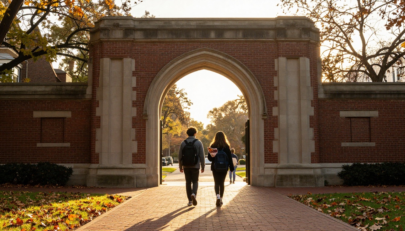
What a Viewbook Actually Does
A viewbook is not a catalog and it is not a course list. It is a persuasion document aimed at two readers at once: a 17-year-old deciding where they could belong, and a parent deciding whether it is affordable and safe. Every section should answer one question from one of those two readers.
Viewbook vs. Brochure vs. Prospectus
Teams often mix these formats, which is how you end up with a 90-page monster nobody finishes.
| Format | Typical Length | Main Job | Best Audience |
|---|
| Viewbook | 24 to 48 pages | Create emotional fit | Inquiry and prospect stage |
| Brochure | 4 to 12 pages | Promote one program or event | Targeted campaigns |
| Prospectus | 60 to 150 pages | List programs and requirements | Applicants and counselors |
If your goal is to move a student from "never heard of you" to "I want to visit," the viewbook is the right tool. Keep the detailed program tables for a prospectus.
Who Reads It and Where
Open rates on printed pieces are hard to measure, but digital viewbooks are not. Most first reads happen on mobile, often after a link arrives by email or text. That is the main reason to design for both formats from day one: a layout that works in print and in a PDF to flipbook converter gives you the best of each.
The 10 Sections Every Viewbook Needs
Here is the full template at a glance. Page counts assume a 40-page book. Scale them proportionally for shorter or longer pieces.
| # | Section | Pages | Question It Answers |
|---|
| 1 | Welcome and Cover Story | 2 | Why should I keep reading? |
| 2 | Table of Contents and Map | 2 | Where is everything? |
| 3 | Academics and Majors | 6 | What will I study? |
| 4 | Faculty and Classroom Life | 3 | Who will teach me? |
| 5 | Campus Life and Community | 6 | Will I belong here? |
| 6 | Housing and Dining | 3 | Where will I live and eat? |
| 7 | Outcomes and Careers | 4 | What happens after graduation? |
| 8 | Cost and Financial Aid | 4 | Can we afford it? |
| 9 | Admissions Steps and Dates | 3 | How do I apply? |
| 10 | Visit, Contact, and Next Steps | 2 | What do I do now? |
The remaining five pages go to full-bleed photography and short student quotes that break up the text.
💡 Pro tip: Print the table on one sheet and tape it to the wall. If a proposed page does not answer one of the ten questions, cut it or merge it.
Welcome and Cover Story
Open with one strong image and one sentence of purpose, not a presidential letter. Letters from leadership belong at the back or on a single side column. The first spread should make a reader feel something specific: curiosity, pride, relief.
A good opening line is concrete: "Classes average 18 students, and every first-year takes a seminar with a professor, not a teaching assistant." That does more work than "A tradition of excellence since 1887."
Table of Contents and Campus Map
A short contents page and an illustrated or photographic map orient parents who skim. In a flipbook, make each entry a clickable link to its page. It costs nothing and cuts frustration.
Academics, Faculty, and Classroom Life
This is the section where credibility is built. Prospective students want to see real work, not adjectives.

Show Majors Without Listing All of Them
Do not print 120 majors in a paragraph. Group them into six to eight clusters and show one flagship example in each. A student interested in biology will find the cluster on their own, and the full list can live on your website or in a linked appendix.
| Approach | Pros | Cons |
|---|
| Full alphabetical list | Complete reference | Dense, unreadable, no emotion |
| Clusters with one story each | Scannable, memorable | Needs editing discipline |
| Cluster plus QR or link to full list | Best balance | Requires digital follow-up |
The third option wins in nearly every test. Clusters give the story, and the link gives the detail.
Faculty Stories That Feel Human
Use three to five faculty profiles with a photo in the actual classroom or lab, a two-sentence quote, and one fact a student would care about, such as "She takes every advisee to dinner in the first month." Avoid headshots against gray backgrounds. They read like a directory.
Real Class Moments
Add a short "A Tuesday in Organic Chemistry" or "A Day in Studio Art" sidebar. A timeline of three to five moments is enough. It gives readers a mental picture of the daily experience.
✅ Best practice: Put numbers beside claims. "9:1 student to faculty ratio" is credible. "Small classes" is not.
Campus Life, Housing, and Dining
Families spend more time on these pages than admissions teams expect. A student is picturing their evenings and weekends, and a parent is picturing where their child sleeps.

Community Beats Amenities
A climbing wall photo shows an amenity. Four students laughing outside the library at dusk shows community. Lead with people and let facilities appear in the background. Use a short list of clubs, teams, and traditions, but pick the ones that are truly distinctive.
- Name three traditions only your campus has.
- Include one first-person quote per spread.
- Show the town, not just the quad.
- Mention transportation, since many families ask.
Housing and Dining Without the Brochure Tone
Show a real dorm room, not a staged one. Add a simple comparison so families can plan.
| Housing Type | Typical Room | Best For | Who Lives There |
|---|
| Traditional residence hall | Double, shared bath | Meeting people fast | First-year students |
| Suite style | 4 to 6 students, shared common room | Group living | Sophomores |
| Apartment | Private bedroom, kitchen | Independence | Juniors and seniors |

Dining deserves its own paragraph. Mention allergy support, vegetarian and halal options, and late-night hours. These details quietly answer questions parents would otherwise email you about.
The Place Itself
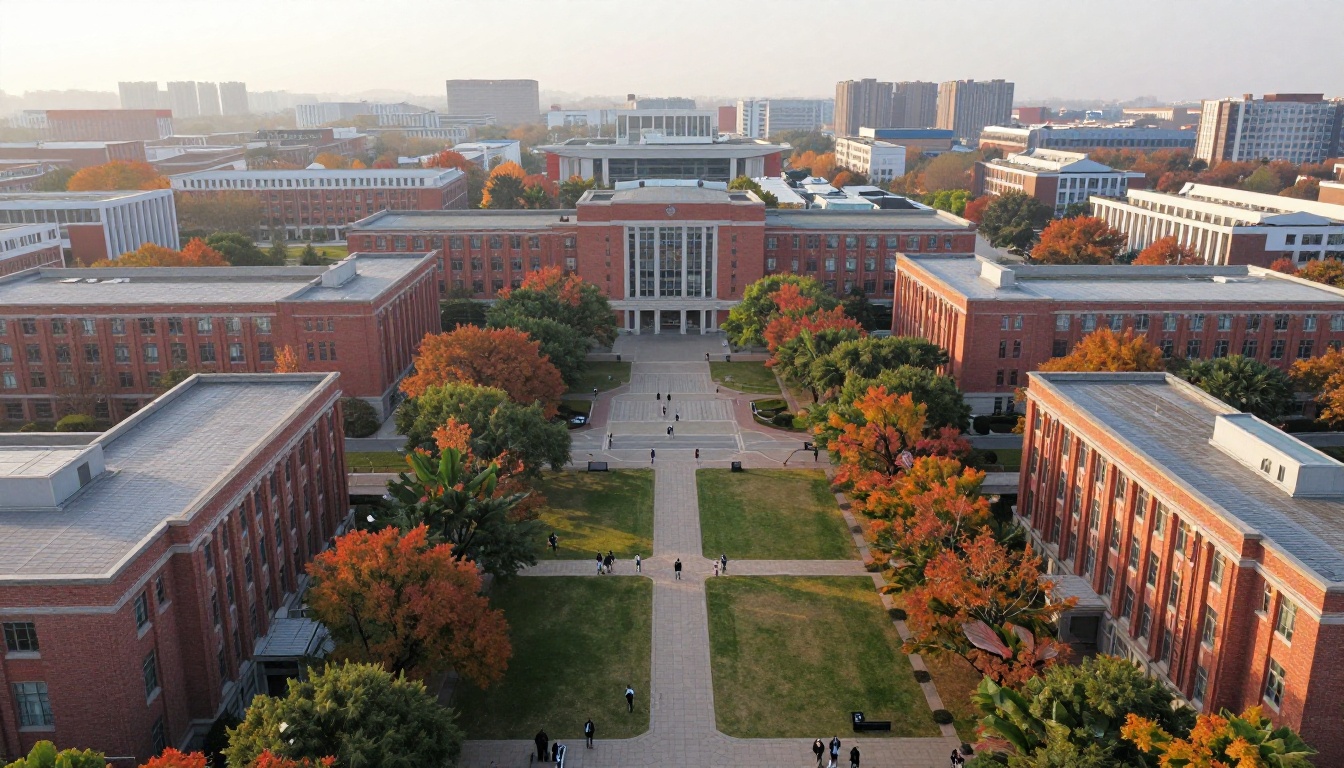
One aerial or wide shot of the campus belongs in the book, ideally near the map. It helps readers understand the scale at a glance.
Outcomes, Careers, and Proof
Outcomes are the section parents read twice. They want evidence that the investment leads somewhere.
Numbers That Earn Trust
Pick four to six outcome statistics and cite the year. For example: graduation rate within six years, percent employed or in graduate school within six months, median starting salary, internship participation, and graduate school acceptance rate for your top programs.
| Metric | How to Present It | Common Mistake |
|---|
| Graduation rate | Large number with a year | Hiding the source |
| Career outcomes | Percent plus employer logos or names | Vague "top companies" |
| Internships | Percent of students who complete one | Counting only paid ones without saying so |
| Alumni network | Size plus one specific example | Generic "strong network" |
⚠️ Warning: Do not round up. A parent who checks the figure against a federal database and finds a mismatch will distrust every other page.
Alumni Voices
Two or three short alumni stories, each with a job title and graduation year, do more than a page of statistics. Pick graduates from different majors and backgrounds so more readers see themselves.
Cost, Aid, and the Honest Page
The cost page is where most viewbooks lose trust. Families know the sticker price is only part of the story. Show them the rest.

Sticker Price vs. Real Price
Show tuition, fees, housing, and meals in a simple table, then show the average aid package beside it.
| Line Item | Example Annual Amount |
|---|
| Tuition and fees | $34,000 |
| Housing and meals | $13,500 |
| Average grant aid | $(21,000) |
| Average net price | $26,500 |
Replace these numbers with your own current figures. If you offer a net price calculator, link to it on this page. In a flipbook, that link is one tap away.
Scholarship and Deadline Clarity
List merit scholarships with thresholds, not teasers. State FAFSA and priority deadlines in a boxed callout so no one misses them.
💡 Pro tip: Add a "Questions families ask us" mini FAQ with four items: payment plans, work-study, outside scholarships, and appeals for more aid.
Admissions Steps and Next Actions
By now the reader is interested. This section removes friction.
A Four-Step Timeline
Use a visual timeline rather than paragraphs:
- Explore the campus online or in person.
- Submit your application with essay and transcripts.
- Complete financial aid forms before the priority date.
- Confirm your place by the reply deadline.
Add the exact dates for the current cycle and a note for transfer and international applicants.
Visit and Contact Page
End with one clear action: schedule a visit. Include a QR code or link, a phone number, a named counselor for each region, and a short line such as "Reply to any email and a real person answers." Skip the logo wall and the long legal footer.
Build It as a Flipbook
Print still matters, but a digital copy extends your reach and gives you data. The easiest path is to export the finished layout as a PDF and turn it into a page-turning flipbook.

How to Create a Viewbook with Flipbooks AI
- Create your account. Go to Flipbooks AI and sign up. No watermarks are ever added to your flipbooks.
- Upload the PDF. Drag your viewbook file into the converter. Pages are processed into a flipbook that keeps fonts and photos sharp.
- Customize. Add your school colors, logo, page-turn effect, and background. Embed a campus tour video or a student audio clip where it fits. The Online Brochure Designer and Brochure Flipbook Maker tools are good starting points.
- Set sharing options. Copy a direct link for email and text, or use the embed flipbook tool to place the book on your admissions page. Use password protection for drafts or for admitted-student editions.
- Turn on tracking. On the Professional plan, analytics show which pages get read, and lead capture can collect an email before the first page opens. Compare options on the pricing page.
The result is mobile-responsive, offline downloads are available for readers with weak connections, and you can update the book in minutes when deadlines or costs change.
| Feature | Printed Viewbook | PDF Download | Flipbook |
|---|
| Mobile reading | Not applicable | Poor, requires zoom | Smooth, responsive |
| Embedded video and audio | No | No | Yes |
| Page-level analytics | No | Download count only | Yes (Professional plan) |
| Update after publishing | Reprint | Re-send file | Instant |
| Cost per additional reader | High | Near zero | Near zero |
If you also publish school newsletters or event programs, the School Newsletter Creator and Course Material Publisher share the same workflow.
Layout Rules That Keep Pages Readable
Good structure fails when pages are crowded. Use these rules during design review.
Photography and White Space
- Use real students, not models, with natural light and varied angles.
- Keep one idea per spread.
- Leave at least 30 percent of each page empty.
- Limit body text to 80 words per page where possible.
Accessibility and Tone
- Use high-contrast text and a minimum 10 point body size in print.
- Add alt text to every image in the digital version.
- Write in the second person and in short sentences.
- Remove words nobody says out loud.
✅ Best practice: Ask three current first-year students to read a draft aloud. Mark every line they stumble over or smile at, then edit accordingly.
Your Launch Checklist
Before sending the file to print or publishing the flipbook, run this list.
- Does every section answer its one question?
- Are all costs, dates, and statistics current and sourced?
- Does each spread have one dominant photo and a clear focal point?
- Are all links and QR codes tested on a phone?
- Does the first page invite a visit, not just describe the school?
- Has someone outside admissions proofread it?
Ready to build your own? Get started for free on Flipbooks AI, browse all flipbook tools for brochures and school publications, or compare pricing plans to find the one that fits your admissions cycle. A viewbook built on these ten sections will give every prospective student a clearer reason to say yes to a visit.



