The first thing anyone sees is the cover. Before they read a single word, before they judge the quality of your research or ideas, they judge your cover. And they do it in under 50 milliseconds.
That's not an exaggeration. Attention research consistently shows that first visual impressions form in less than a tenth of a second. In a world of infinite content scrolling past on screens, your publication has roughly the time it takes to blink to either earn a click or disappear forever.
This isn't about aesthetics for aesthetics' sake. Cover design is a conversion problem. The cover is the single highest-leverage element in whether your audience actually reads what you've spent hours creating. A weak cover tanks the performance of even brilliant content. A strong one makes average content perform like exceptional content.
Whether you're designing digital catalogs, brochures, interactive flipbooks on Flipbooks AI, or anything in between, these rules apply universally. Nail them and your opens go up. Skip them and no amount of great writing inside will save you.
Why Covers Do the Heavy Lifting
Most creators spend 90% of their effort on content and 10% on presentation. The reality of how people actually consume digital publications demands the opposite ratio, at least at the cover level.
When someone scrolls through a library of digital documents, they're not reading. They're pattern matching. Their visual system is scanning for contrast, movement, faces, and color, all in fractions of seconds. The cover is your only tool to interrupt that pattern and redirect attention.
Think about how you choose a book in a bookstore. You look at spines, pull out the ones with interesting designs, flip them over, and then maybe read the description. The cover did the initial filtering. Online it's identical, just faster and with even more competition.
For digital publications specifically, the stakes are even higher. A printed magazine sitting on a newsstand gets passive exposure. A digital flipbook exists in a sea of competing content and needs to earn every single click.
💡 Pro tip: Before designing your cover, spend five minutes studying your competitors' covers. Notice what they all do the same. Then do something noticeably different within the same professional quality range.
The Visual Hierarchy Rule
Visual hierarchy is the intentional organization of design elements so the viewer's eye travels a specific, intended path. Done well, the viewer doesn't notice it. Done poorly, they feel confused and look away.
The fundamental principle is this: every cover needs exactly one primary focal point. Not two. Not three. One.
This is where most amateur cover designs fall apart. When everything fights for attention equally, nothing wins. The eye has no place to land, no clear entry point, and the brain files it under "confusing" within milliseconds.
The Three-Level Hierarchy
Structure your cover elements into three clear tiers:
Level 1: The Hero Element (occupies 40-60% of visual real estate)
This is the single dominant image, face, shape, or typographic statement that the eye sees first. It must be bold, clear, and unambiguous.
Level 2: The Supporting Element (occupies 20-30%)
This is usually the headline or a secondary visual that provides context for the hero. It answers "what is this about?"
Level 3: Peripheral Details (occupies 10-15%)
Dates, issue numbers, URLs, subtitles, or secondary text. These are for people who already decided to look closer.
| Hierarchy Level | Visual Weight | Role | Example |
|---|
| Hero Element | 40-60% | First impression, stop the scroll | Bold portrait, dominant image |
| Supporting Text | 20-30% | Context, "what is this" | Headline, edition name |
| Peripheral Detail | 10-15% | Confirmation for interested viewers | Issue number, date, website |
| Whitespace | 5-20% | Breathing room, signals quality | Clean margins, spacing |
The most critical mistake is treating all elements as equally important. If your logo, headline, image, subtitle, and tagline are all competing at the same visual weight, you have no hierarchy at all.
Color Psychology That Drives Clicks
Color is not decoration. Color is information. Before the brain processes any words or shapes, it processes color, and color carries immediate emotional and contextual signals that trigger automatic responses.
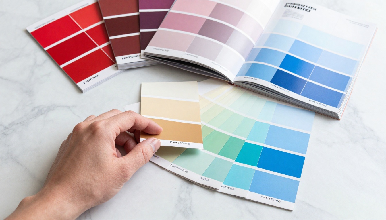
What Colors Signal to Viewers
Different hues carry distinct associations across most Western audiences:
- Deep Red: Urgency, passion, importance, authority
- Navy Blue: Trust, professionalism, reliability, depth
- Forest Green: Health, growth, calm, natural
- Warm Orange: Energy, creativity, approachability, warmth
- Rich Black: Luxury, sophistication, editorial authority
- Clean White: Simplicity, clarity, premium positioning
This doesn't mean you should mechanically pick colors based on a chart. It means you need to be aware of what your color palette is saying before a reader sees your headline.
Contrast Is Non-Negotiable
The single most important color rule is contrast. High contrast between your text and background. High contrast between your primary visual and the surrounding area. Without sufficient contrast, your cover reads as muddy and unprofessional from a distance, which is the only distance that matters.
⚠️ Warning: Test your cover at thumbnail size. Many digital publications are browsed through interfaces showing small preview images. If your cover doesn't read clearly at 150x100 pixels, it's not working.
Color Contrast in Practice
| Combination | Contrast Level | Recommended Use |
|---|
| Black text on white | Very High | Minimalist editorial, technical publications |
| White text on deep color | High | Bold, high-impact covers |
| Yellow on black | Very High | High visibility, strong statements |
| Gray on white | Low | Avoid for primary elements |
| Red on green | Medium | Avoid, problematic for color blindness |
| Navy on cream | High | Classic editorial, luxury positioning |
The 60-30-10 Rule
Professional designers often follow a split: 60% dominant color, 30% secondary color, 10% accent. This creates visual coherence without monotony. Your hero element should align with your accent color to make it pop against the dominant background.
Typography accounts for how your cover reads and whether the viewer can absorb the most critical information in a fraction of a second. Most cover typography fails not because the font choice is wrong, but because the sizing and spacing are timid.

Go Bigger Than Feels Comfortable
This is the rule that most first-time designers violate. Your headline should feel almost uncomfortably large when you're working on it in your design tool. When it's scaled down to viewing size, that "too big" becomes "perfectly bold."
The reason: most design work happens at 100% or larger scale on a monitor. The final viewing experience is often at a fraction of that size, whether on a mobile screen, a library thumbnail, or a preview card in an email.
💡 Pro tip: After designing your cover, step back two meters from your screen, or scale it to 25%. Can you read the headline? If not, it's not big enough.
Serif vs. Sans-Serif
The serif vs. sans-serif debate for covers is less about rules and more about tone:
Serif fonts (Times, Garamond, Playfair, Georgia) signal:
- Editorial authority
- Heritage and tradition
- Literary publications
- Luxury and premium positioning
Sans-serif fonts (Helvetica, Futura, Montserrat, Inter) signal:
- Modernity and clarity
- Technology and innovation
- Minimal and clean aesthetic
- Approachability
Many of the strongest covers use one of each: a bold sans-serif headline paired with an elegant serif sub-element, or vice versa. The contrast itself creates visual interest.
Typeface Discipline
Use a maximum of two typefaces on a cover. Using three or more creates visual noise that undermines the hierarchy you've built. Within those two typefaces, you can create variety through weight (bold, regular, light), size, and capitalization.
The 3-Second Rule in Practice
The 3-second rule is simple: your cover must communicate what this publication is and why someone should care within three seconds of first glance. If it can't do that, you're losing opens.
This means testing your cover with cold eyes. Show it to someone who hasn't seen your project. After three seconds, take it away. Ask them:
- What is this publication about?
- Who is it for?
- Would they click to see more?
If they can't answer the first two questions accurately, your visual hierarchy and typography aren't doing their job.
The STOP-CONTEXT-CARE Framework
Think of every cover as needing to accomplish three things in rapid sequence:
- STOP: The primary visual element interrupts the scan pattern (high contrast, bold focal point)
- CONTEXT: The headline tells the viewer what this is and what's inside
- CARE: A sub-element (sub-headline, compelling image detail, strong color) gives them a reason to want more
Most covers succeed at STOP and fail at CARE. They grab attention but give no compelling reason to follow through.

Fatal Cover Mistakes That Hurt Opens
Knowing what not to do is just as valuable as knowing what to do. These are the most common cover design mistakes that consistently drag down open rates.
Using Too Much Text
A cover is not a table of contents. Every line of text you add beyond your headline and sub-headline dilutes the visual impact of everything else. If your cover lists five features, three sections, a quote, and a tagline, none of them will be read.
Rule: If removing a text element doesn't make the cover feel empty, remove it.
No Clear Focal Point
As discussed in the hierarchy section, competing elements are the most common cover failure. Two faces of equal size. A headline at the same weight as a sub-headline. A logo that fights with the central image. Every one of these is a decision that costs you opens.
Generic Stock Photo Syndrome
A smiling businessperson shaking hands. A laptop on a desk. A lightbulb. These images are so overused they've become invisible. The viewer's brain filters them out as visual noise because they've seen the exact same image thousands of times.
Your cover photograph or illustration must feel specific, not generic. A candid moment. An unusual angle. A subject photographed with genuine intention. If it could appear on any publication in your industry, it shouldn't appear on yours.
Ignoring White Space
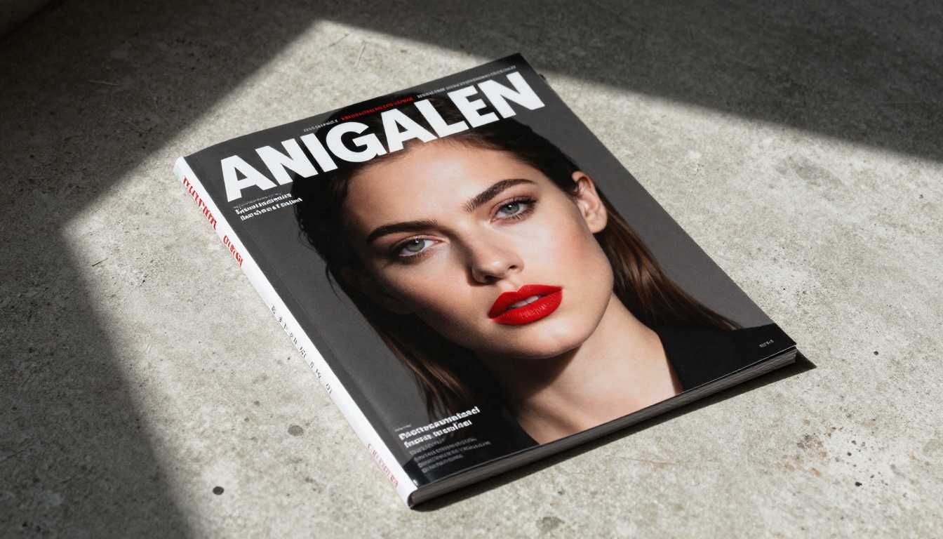
White space is not wasted space. It is the visual equivalent of silence in music: it makes everything around it louder. Publications that cram every pixel with content look desperate and low-quality. Publications with confident negative space look premium.
The most valuable digital publications, from major fashion magazines to annual reports, use white space as a signal of quality and authority.
✅ Best practice: Allow at least 10-15% of your cover to be breathing space. Don't fill every corner.
Inconsistency Across a Series
If you're creating multiple issues, editions, or volumes, each cover should be immediately recognizable as part of the same family. A consistent visual system (same typeface, same logo placement, same color logic) lets your audience identify your brand instantly across a library.
| Consistency Element | Why It Matters | How to Apply |
|---|
| Logo position | Brand recognition | Fix it to the same corner every issue |
| Primary typeface | Visual identity | Use the same headline font always |
| Color palette | Cohesion | Define 3-4 brand colors and stick to them |
| Image style | Aesthetic consistency | Photograph every cover the same way |
| Layout grid | Professional feel | Use the same underlying grid structure |
How to Build Stunning Flipbook Covers
Applying these principles to digital flipbooks adds another dimension: interactivity and screen optimization. When someone opens your digital publication on Flipbooks AI, the cover is the first page they see. It's your digital handshake.
Here's how to build a flipbook cover that performs:
Step 1: Start With Your Platform
Go to Flipbooks AI and create your account. If you already have one, log in and open a new project. Choose the template that matches your publication type, whether that's a magazine, catalog, brochure, annual report, or e-book.
Step 2: Design in Your Tool First
Do not design your cover directly in a PDF reader or document editor. Use a dedicated design tool (Adobe InDesign, Canva, Figma, Illustrator) where you have full control over typography, color, and layout. Apply all the hierarchy and contrast rules from this article before you export.
Set your design to the correct dimensions for digital viewing. Most screens are widescreen, so a 16:9 or A4 aspect ratio with high resolution will serve you well.
Step 3: Upload Your PDF
Once your design is complete, export it as a PDF with embedded fonts and high-quality image compression. Then upload it directly to Flipbooks AI. The platform converts it instantly into a professional interactive flipbook while preserving your exact typography and color work.
Step 4: Customize Your Branding
Inside Flipbooks AI, access the brand settings. You can:
- Set your brand colors so they match your cover palette
- Add your logo in the exact position you designed
- Remove watermarks entirely (available on all paid plans, with no watermarks ever)
- Set a custom domain if you want your publication URL to reflect your brand
Step 5: Set Sharing and Protection
Your cover is only powerful if people can reach it. Flipbooks AI gives you several distribution options:
- Direct link: A clean URL you can share anywhere
- Embed code: Drop your flipbook directly onto your website using the Embed Flipbook on Website tool
- Password protection: Lock premium content behind a password for subscribers
- Lead generation: Collect email addresses before granting access (available on the Professional plan via Flipbooks AI pricing)
Step 6: Analyze Performance
Once published, track how your cover actually performs. The Professional plan includes built-in analytics showing how long people spend on each page, including how many seconds they spend on the cover before moving forward. This is real data telling you whether your cover hierarchy is working.

Flipbooks AI Cover-Ready Tools
Depending on your publication type, these purpose-built tools on Flipbooks AI are worth using:
Optimizing for Mobile
Over half of all digital content is consumed on mobile devices. Your cover must work at phone screen dimensions as well as desktop. Flipbooks AI automatically renders your publication as mobile-responsive, but the design decisions you make will either reward or punish you on small screens.
Mobile cover rules:
- Your headline must be readable without zooming
- Your focal point must be visible in portrait orientation
- Avoid covers that rely on fine edge details that disappear at small scale
- Test by viewing the final flipbook on your phone before sharing
What Separates Forgettable From Irresistible
The publications that consistently get opened share a handful of common characteristics. Their covers are decisive. They make bold choices about hierarchy, color, and typography, then commit to those choices fully without hedging or cluttering.
They treat the cover as its own creative problem, separate from the content inside. The cover doesn't need to represent everything that's in the publication. It needs to create one strong, clear reason to look inside.
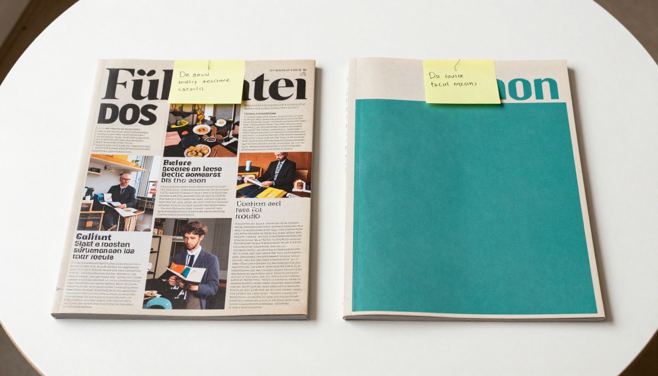
And they test. The best performing digital publications run real data against their design decisions. They compare two different cover versions. They track open rates across editions. They treat the cover as a living element that improves over time.
Apply these rules with intention, test what works for your specific audience, and iterate. Cover design isn't a one-time decision, it's an ongoing practice.
Ready to put these rules to work? Create your first flipbook on Flipbooks AI and build a cover that actually gets opened. Browse all the available publishing tools to find the right template for your publication type, or compare pricing plans to find the perfect fit for your workflow.