A visitor walks your space, nods at the plants, says "this is lovely," and then disappears. Sound familiar? Most coworking operators lose the majority of their tour leads in the three days after the walkthrough, and the reason is rarely the space itself. It is the leave-behind. A forgettable PDF or a crumpled paper trifold gives nobody a reason to come back. With a well-built digital brochure on Flipbooks AI, you can send a polished, page-turning follow-up the moment the tour ends, and see who opened it. This article shows exactly what to put inside, how to price it on the page, and how to turn a casual visit into a signed membership.

Why Tours Fail Without a Brochure
A tour is an emotional experience. The visitor feels the light, hears the buzz, and imagines themselves working there. But decisions about money happen later, at a kitchen table or in a team chat, when the feeling has faded. Your brochure is the only thing that carries the tour into that moment.
Here is what usually goes wrong:
- The visitor cannot remember which plan did what.
- The pricing lives on a website page that is buried or outdated.
- The follow-up email is plain text with no visuals.
- Nobody on the team knows whether the lead ever looked at the details.
💡 Pro tip: Treat the brochure as the second half of the tour. The walkthrough creates desire. The brochure removes doubt.
The Three Decision Makers
Most coworking buyers are not alone. A freelancer asks a partner. A founder asks a cofounder. An office manager asks a finance lead. Your brochure must work for people who never set foot in the building, which means photos, floor plans, and clear numbers matter more than adjectives.
What Visitors Ask After Leaving
Think of the texts you get after tours. They are almost always the same five questions: price, contract length, internet speed, guest policy, and parking or transit. Put those answers on the first four pages.
What to Put Inside Your Brochure
Resist the urge to describe everything. A brochure that tries to say it all ends up saying nothing. Build around the decision, not the building.
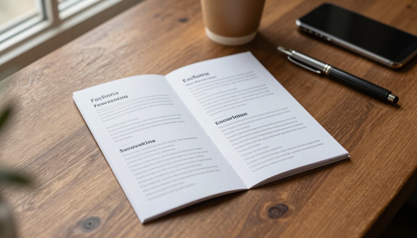
| Page | Content | Why It Matters |
|---|
| 1 | Cover photo and one-line promise | Sets the mood in two seconds |
| 2 | Who the space is for | Lets visitors self-qualify |
| 3 | Plans and prices | Answers the number one question |
| 4 | Amenities in plain language | Removes small objections |
| 5 | Floor plan and photo gallery | Helps remote decision makers |
| 6 | Member stories | Adds social proof |
| 7 | Community calendar | Shows life beyond the desk |
| 8 | Next step and booking link | Makes action easy |
Lead With a Specific Promise
"Premium workspace for modern professionals" says nothing. Compare it with "Quiet desks, fast fiber, and 24 hour access for people who ship work." The second version tells a freelancer exactly what they get.
Show Real Photos, Not Stock
Visitors have seen a thousand stock photos of laughing people around laptops. They trust shots of your actual kitchen, your actual phone booths, and your actual members. Use natural light and include imperfect, lived-in details.
Make Pricing Impossible to Misread
Present plans in a table with the same rows for each option. People compare in columns, so give them columns.
| Plan | Best For | Includes | Monthly Price |
|---|
| Day Pass | Trying the space | 1 day, Wi-Fi, coffee | Per visit |
| Flex Desk | Part-time freelancers | 10 days per month, lockers | Mid-range |
| Dedicated Desk | Daily workers | Own desk, 24/7 access | Higher |
| Private Office | Teams of 2 to 10 | Locked office, meeting hours | Premium |
⚠️ Warning: Never write "contact us for pricing" on a plan page. It reads as "expensive," and most visitors will not ask.
Design Choices That Build Trust
Design is not decoration here. It signals how well you run the place. A messy brochure suggests a messy kitchen.

Keep One Idea Per Page
Each page should answer one question. If a page needs a paragraph to explain itself, split it. White space is not wasted space, it is the visitor's thinking room.
Use Photography With Purpose
Match each image to a decision:
- Wide shots of the main floor show energy and capacity.
- Close-ups of desks and chairs prove comfort.
- Hallway and entrance views help visitors picture their commute and arrival.
- People shots show who they would sit next to.
Keep Text Short and Human
Write the way your best community manager talks. Short sentences. No jargon. "Bring a guest twice a month, free" beats "Complimentary visitor privileges are provisioned monthly."
Match the Brochure to Each Visitor Type
One brochure does not fit every lead. The smartest operators build a short core and swap a few pages depending on the person who toured.

| Visitor | What They Care About | Pages to Emphasize |
|---|
| Solo freelancer | Price, flexibility, community | Plans, events, member stories |
| Startup team | Privacy, meeting rooms, growth | Private offices, booking, add-ons |
| Remote employee | Quiet, internet, location | Phone booths, speed, transit |
| Corporate satellite team | Security, invoicing, contracts | Access control, terms, support |
A Real Scenario
A founder tours with two employees. Your manager notices they keep looking at the glass-walled offices. That evening, the follow-up brochure opens on the private office page, with a short note: "Here are the two offices that fit three people." The founder sees you listened. That small touch outperforms any discount.
Build It With Flipbooks AI
A digital flipbook beats a PDF attachment because it opens instantly in the browser, looks good on a phone, and gives you data. Here is how to build one in about twenty minutes.
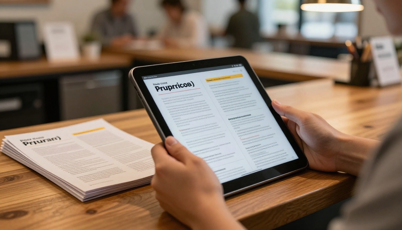
How to Create a Coworking Brochure With Flipbooks AI
- Create your account. Head to Flipbooks AI and sign up.
- Design the pages. Build your eight page layout in any design tool, or start from the Brochure Flipbook Maker or the Online Brochure Designer.
- Upload the PDF. Drop it into the PDF to Flipbook Converter. Pages turn like a real brochure, with no watermarks.
- Customize the look. Add your logo, brand colors, and page effects. Embed a short walkthrough video or ambient audio if you like.
- Set sharing options. Copy the direct link for emails, or use the Embed Flipbook on Website tool for your pricing page. Add a password for corporate proposals.
- Track the opens. With the Professional plan, use analytics and lead capture to see who read which pages. Compare pricing plans to pick the right tier.
✅ Best practice: Create one master brochure, then duplicate it for each segment. Changing two pages is faster than starting over.
Print Versus Digital
| Factor | Printed Trifold | PDF Attachment | Flipbooks AI Brochure |
|---|
| Cost per lead | Printing every time | Free | Free to share |
| Updates | Reprint required | Resend file | Instant, same link |
| Mobile experience | Not applicable | Awkward pinch and zoom | Smooth and responsive |
| Tracking | None | None | Page level data |
| Password protection | No | Limited | Yes |
Keep a small stack of printed copies for the front desk. Digital is the follow-up, paper is the handshake.
The 24 Hour Follow-Up Playbook
Timing matters more than polish. Leads cool fast, so build a routine your whole team can run.

Hour Zero: Before They Leave
Ask for their email while you stand together. Say, "I'll send you the plans we talked about in a few minutes." Then actually do it from your phone.
Hour Three: The Personal Note
Send the brochure link with two lines that reference something they said. Mention the quiet corner, the dog friendly policy, the meeting room they liked.
Day Two: The Soft Nudge
If analytics show they opened the pricing page but did not reply, send a short message: "Happy to hold a desk for you until Friday. Want me to?" A small deadline gives permission to decide.
Day Five: The Last Touch
Invite them to a free community event or a trial day. People who join a Thursday lunch convert at a much higher rate than people who only read a brochure.
| Timing | Action | Goal |
|---|
| Before leaving | Capture email | Permission to follow up |
| Within 3 hours | Send brochure link | Keep the memory warm |
| Day 2 | Check opens, nudge | Move on interest |
| Day 5 | Invite to event | Build belonging |
| Day 10 | Final friendly check | Close or release |
💡 Pro tip: Use the page level data. If a lead lingers on the phone booth page, mention quiet calls in your next message.
Common Mistakes to Avoid
Even good operators trip over the same few problems.
Mistake 1: Too Many Pages
Past twelve pages, completion drops. Aim for eight to ten.
Mistake 2: Hiding the Price
Buyers who cannot find a price assume the worst. Show it plainly.
Mistake 3: No Next Step
Every brochure needs a final page with one button: book a trial day, reserve a desk, or talk to a person. Do not offer five options.
Mistake 4: Outdated Content
A brochure that lists a closed meeting room or an old event schedule kills trust fast. With a flipbook, you update the file and the same link stays alive.
Mistake 5: Ignoring Mobile
More than half of your leads will open the link on a phone. Test every page on a small screen before you send it.
Use It Beyond Tours
Once you have a strong brochure, put it to work in more places.
- Website: Embed it on your plans page so visitors can browse before booking a tour.
- Local partnerships: Send it to nearby accountants, relocation agents, and startup programs.
- Corporate sales: Add a password protected version with team rates for HR and operations managers.
- Events: Share a link on a QR code at the front desk.
- Referrals: Give members a link they can forward to friends.
For related ideas, the Hotel Brochure Designer shows how hospitality teams present amenities, and the Sales Presentation tool works well for corporate pitches.
Measure What Matters
| Metric | What It Tells You | Action |
|---|
| Open rate | Whether the follow-up lands | Improve the subject line |
| Pages viewed | Which topics drive interest | Reorder pages |
| Time on pricing | Price sensitivity | Clarify plans or add a trial |
| Tour to member rate | Overall health | Test one change per month |
Turn Your Next Tour Into a Member
A great tour sells the feeling. A great brochure sells the decision. Build eight clear pages, show real prices, send the link within hours, and watch the data to time your follow-up.
Ready to build yours? Get started for free on Flipbooks AI, browse all flipbook tools to find the right template, or compare pricing plans to pick the tier with analytics and lead capture. Your next visitor is already on the calendar. Make sure they leave with something worth opening.



