Most online stores have a product grid. Far fewer have a digital product catalog that feels like a curated, page-by-page experience. The difference shows up in average order value, wholesale inquiries and how long people stay. Below are the digital product catalog examples worth copying, with the exact patterns behind them. Every layout here can be built in an afternoon with Flipbooks AI, starting from a plain PDF.
Why Catalogs Still Win
A store page shows one product at a time. A catalog shows a story: collections, pairings, seasons, price ladders. Shoppers who flip through pages see more items per visit, and buyers placing wholesale orders prefer a single file they can forward to a colleague.

What Shoppers Actually Want
Across the catalogs we reviewed, three needs came up again and again:
- Fast orientation: where am I, and what is on the next page?
- Clear prices: no clicking away to find a number.
- Proof: real photography, real dimensions, real materials.
Catalog vs Product Grid
| Feature | Product Grid | Digital Catalog |
|---|
| Storytelling | Minimal | Full page layouts |
| Shareable as one link | No | Yes |
| Works for wholesale buyers | Partly | Yes |
| Offline viewing | No | Yes, with downloads |
| Seasonal updates | Edit many pages | Swap one file |
💡 Keep your grid for search and checkout. Use the catalog for inspiration and bulk decisions. They work best together.
Fashion Catalog Examples
Fashion brands lead here because visuals carry the sale. The best ones feel like a magazine, not a spreadsheet.

Lookbook Style Opening
Strong fashion catalogs open with a full-bleed hero image, one line of text and nothing else. The second spread introduces the collection theme. Only on page three do prices appear.
Patterns worth copying:
- One outfit per spread, with each item tagged by name and price.
- Color swatches printed under each garment.
- A size chart page placed once, linked from every product page.
- A closing page with a single call to action.
If you sell apparel, the Fashion Catalog Creator and the Interactive Lookbook Designer are built for exactly this flow.
Seasonal Drops
Smart brands publish a new catalog per drop and keep the old one archived. This gives wholesale buyers a clean record and gives you a ready-made email asset each season.
Furniture and Home Examples
Furniture is a high-consideration purchase. People want dimensions, finishes and room context before they commit.

Room Scenes First, Specs Second
The best furniture catalogs show a styled room on the left page and a spec panel on the right. Each spec panel includes:
- Width, depth and height in both inches and centimeters
- Available fabrics or wood finishes with small swatch photos
- Lead time, stated plainly
- A price, or a price range per finish
A designer can browse a catalog like this on a tablet during a client meeting and quote on the spot. The Furniture Catalog Maker gives you page templates that follow this structure.
Home Decor on the Sofa
Decor shoppers browse at home, usually in the evening, usually on a tablet. Catalogs that perform well here use generous white space, large lifestyle photos and short, warm product names.

✅ Test your catalog on a tablet held in portrait and landscape. If text feels cramped in either, increase margins before you publish.
Photography That Sells
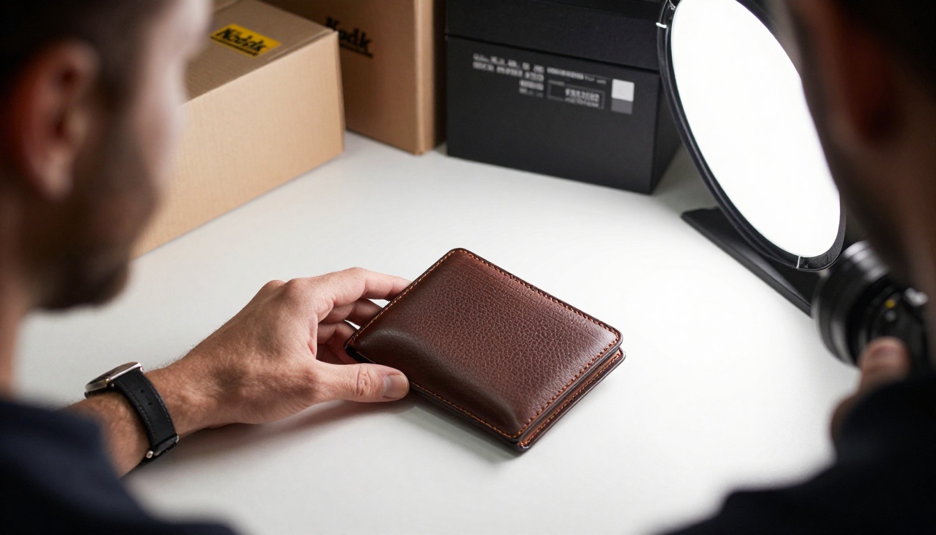
Layout gets attention, but photography closes the sale. Every strong catalog we studied used a consistent photo system.
A Simple Shot List
You do not need a studio. A window, a white board and a phone are enough if you stay consistent.
- Hero shot: the product alone on a neutral background.
- Context shot: the product in use or in a room.
- Detail shot: close-up of material, stitching or finish.
- Scale shot: a hand or familiar object for size.
Consistency Beats Quality
Mixed backgrounds and mixed lighting make a catalog look like a flea market. Pick one background color and one light direction, and hold them across every page. Shoppers read that consistency as reliability.
Photography Style Comparison
| Style | Best For | Risk |
|---|
| White background | Electronics, accessories | Can feel cold |
| Lifestyle scenes | Furniture, decor | Distracts from detail |
| Flat lay | Beauty, stationery | Hard to show scale |
| Model shots | Apparel, jewelry | Higher production cost |
Pricing and Layout Patterns
Prices are where many catalogs lose the buyer. Hiding them forces a click, and every click costs you readers.

Three Price Display Models
- Inline pricing: the price sits beside each product. Best for retail.
- Tiered pricing table: quantities and unit prices in a grid. Best for wholesale.
- Starting-at pricing: one base price with options listed below. Best for custom goods.
Wholesale Table Example
| Quantity | Unit Price | Discount |
|---|
| 1 to 11 | $24.00 | None |
| 12 to 47 | $21.50 | 10% |
| 48 to 143 | $19.00 | 21% |
| 144 and up | $17.00 | 29% |
For stores that change prices often, the Digital Price List Generator keeps a separate price page you can update without redesigning the whole catalog.
⚠️ Never print a price you cannot honor. If stock or cost changes weekly, state "prices valid through" with a date on the first page.
Page Flow That Works
A reliable page order for most stores:
- Cover with brand and season
- Short contents page with clickable sections
- Best sellers first
- Collections grouped by use or room
- Pricing or order page
- Contact and shipping details
Mobile and Sharing Examples
More than half of catalog views now happen on phones. A catalog built only for a desktop screen loses the majority of its audience.

Mobile Rules From Top Catalogs
- Text no smaller than the body size of a typical phone article
- One product focus per screen
- Tap targets for links at a comfortable thumb size
- Short page counts for impulse categories, longer for catalogs aimed at trade buyers
A flipbook is mobile-responsive by default, so the same file adapts to a phone, tablet or laptop. Check how it behaves with the PDF to Flipbook Converter before you share it widely.
Where Stores Share Catalogs
| Channel | How to Use It | Tip |
|---|
| Email | Link on a button | Use a preview image |
| Website | Embedded on a page | See embedding a flipbook |
| Social bio | Single catalog link | Update each season |
| Wholesale outreach | Password-protected link | Protect trade prices |
| In-store | QR code on counter | Offer offline download |
Craft and Small Shop Examples
Small makers often produce the best catalogs because they cannot rely on brand awareness. They have to earn trust on the page.

Tell the Maker Story
A pottery studio might open with a page about the clay, the kiln and the person at the wheel. Then each product page repeats one line of that story: "hand-thrown", "food-safe glaze", "made in small batches".
Add Care and Shipping Pages
Craft buyers worry about breakage and care. A single page covering care instructions and shipping packaging reduces support emails and builds confidence.
💡 Put a short "how it ships" photo next to the checkout link. Buyers who see careful packing hesitate less.
How to Build Yours With Flipbooks AI
If your catalog starts as a PDF from Canva, InDesign or Google Slides, you can publish it as an interactive flipbook in minutes. Here is the process.
- Open your account. Create an account on Flipbooks AI. No watermarks, ever.
- Upload the PDF. Drag your file in. Flipbooks AI converts every page into a flipping, zoomable spread. The Product Catalog Generator and the Digital Catalog Maker are good starting points.
- Customize the look. Add your logo, pick brand colors, choose a page-turn effect and set a background that suits your products.
- Add media. Embed product videos or background audio on the pages that benefit most.
- Choose sharing options. Copy a direct link, grab an embed code for your store, or switch on password protection for trade buyers.
- Track results. Analytics and lead generation are part of the Professional plan. See the pricing plans to compare tiers.
What to Check Before Publishing
- Every price is current
- Every link opens the right page
- The first page loads quickly on mobile
- File size stays reasonable for offline downloads
Plan Comparison for Stores
| Need | Standard | Professional |
|---|
| Unlimited flipbooks | Yes | Yes |
| No watermarks | Yes | Yes |
| Password protection | Yes | Yes |
| Analytics | Limited | Full |
| Lead generation | No | Yes |
You can also browse all flipbook tools to find templates for menus, brochures and portfolios if your store sells more than one type of product.
Common Mistakes to Avoid
Even good catalogs fail for predictable reasons.

Five Errors That Cost Sales
- Too many products per page. Three or four items per spread is plenty.
- No clickable contents. Readers give up when they cannot jump ahead.
- Outdated pages. An expired price or a sold-out product erodes trust fast.
- Tiny text. If you have to pinch to read it, most people leave.
- No next step. Every catalog needs a clear way to buy, order or ask a question.
How to Measure What Works
Review three numbers monthly: average pages viewed, the page where most readers stop, and clicks on your order links. If readers drop on page six, move your best sellers earlier or shorten that section.
✅ Update one thing per release. Changing layout, prices and photos all at once makes it impossible to know what helped.
Ready to Build Your Own?
You now have the patterns: lookbook openings for fashion, room scenes with spec panels for furniture, tiered tables for wholesale, consistent photography and mobile-first spacing. Pick the two that fit your store and apply them to your next catalog.
Ready to publish? Get started for free on Flipbooks AI, browse the tools and templates for your category, and compare pricing plans when you want analytics and lead capture.



