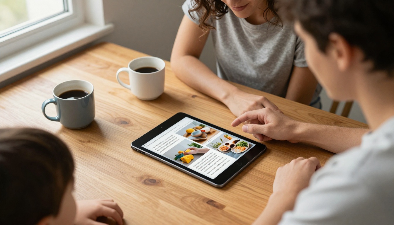
A page that looks elegant to you can look like a swarm of moving letters to someone with dyslexia. Roughly one in ten people read that way, which means every course pack, newsletter, handbook or catalog you publish probably reaches at least a few of them. The good news: the fixes are small, cheap and mostly about three choices, which are the font, the spacing and the colors. This article walks through each one with exact values, then shows how to apply them in a flipbook built on Flipbooks AI.
Why Dyslexia Friendly Design Matters
Dyslexia affects how the brain links written symbols to sounds. It has nothing to do with intelligence or effort. What it does change is how a reader experiences a page: letters can seem to swap places, lines can blur together, and bright white backgrounds can create a glare that makes tracking a line even harder.
💡 Pro tip: Design choices that help readers with dyslexia usually help everyone. Tired eyes, small phone screens and bad lighting all behave a bit like mild dyslexia.
Who Benefits From These Changes
The obvious audience is students, but the list is wider than most publishers expect.
- Children who are still building reading fluency
- Adults who hide their reading struggles at work
- Second language readers who decode slowly
- Older readers whose eyes tire faster
- Anyone on a phone reading on a commute
What Digital Gives You That Print Cannot
A printed worksheet is fixed. A flipbook is a digital publication, so you control the layout, you can keep pages light, and you can embed audio so a reader can hear a passage while following the words. Print also forces one background color on everybody, while digital lets you choose a calm one on purpose.
Fonts That Actually Help
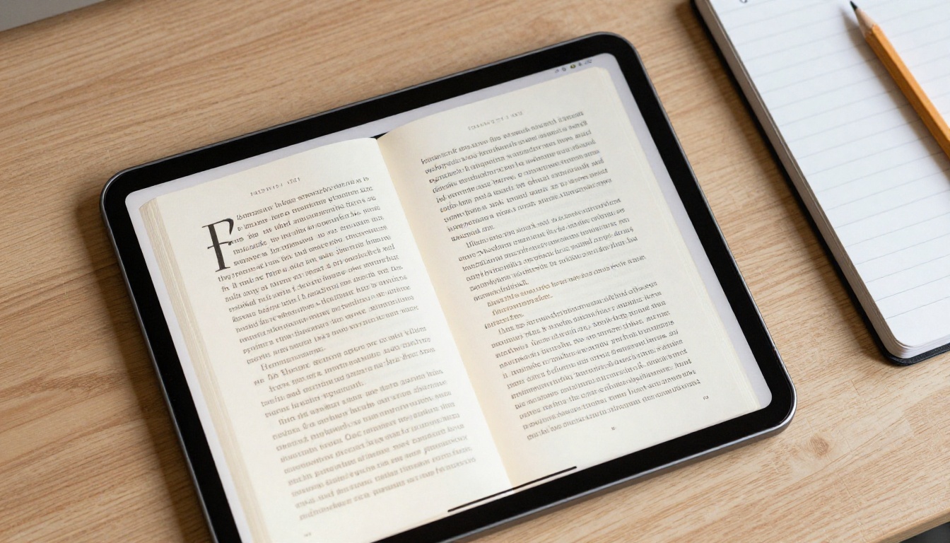
Font choice is the first thing people argue about. Specialized dyslexia fonts exist, and some readers love them. The research is mixed, though, and the safest advice is to pick a clean, familiar sans serif and then fix everything around it.
Traits of a Readable Typeface
Look for these features, whatever the font name is:
- Distinct letter shapes. The letters b, d, p and q should not look like mirror images of each other.
- Open counters. The holes in letters like a, e and g should be wide, not tight.
- Generous x height. Larger lowercase letters read more easily.
- Even stroke weight. Extreme thin and thick contrast makes letters flicker.
- No decorative flourishes. Script and ornate fonts are the hardest to decode.
Font Comparison Table
| Font style | Best for | Readability | Notes |
|---|
| Verdana | Body text | Very good | Wide letters, roomy spacing built in |
| Arial | Body text | Good | Safe default, but a and g can look cramped |
| Century Gothic | Short passages | Good | Round shapes, wide set |
| Open Dyslexic style fonts | Personal preference | Varies | Helps some readers, hurts others |
| Comic style fonts | Children | Good | Irregular shapes help tell letters apart |
| Times and other serif fonts | Avoid for body | Fair | Thin serifs can crowd together |
| Script fonts | Avoid entirely | Poor | Letters join and blur |
Size, Weight and Style Rules
- Use 12 to 14 pt for print and about 16 to 18 px equivalent for screens.
- Choose a regular or medium weight. Very light fonts fade, very bold ones fill in the counters.
- Skip long stretches of italics and ALL CAPS. Both remove the word shape that readers rely on.
- Use bold sparingly to mark the one phrase that matters in a paragraph.
- Never underline for emphasis. Underlines cut through the bottoms of letters.
⚠️ Warning: Do not mix more than two typefaces in one flipbook. A heading font and a body font are plenty.

Spacing Is Half the Battle
If the font is the voice, spacing is the pause between words. Crowded text is the number one complaint from readers with dyslexia, and it is the easiest thing to repair.
Line Spacing and Paragraph Gaps
Set line spacing to about 1.5 times the font size. Add a paragraph gap of roughly 2 times the font size so each block feels like a separate step. Short paragraphs of three to four lines work better than dense walls of text.
Letter and Word Spacing
Increase letter spacing slightly, around 0.12 times the font size, and word spacing to about 0.16 times the font size. This small push keeps letters from touching and lets the eye find word edges. These values match widely used accessibility guidelines, so you are not guessing.
Line Length and Alignment
- Keep lines to 50 to 70 characters. Longer lines make it easy to lose your place when jumping to the next row.
- Use left aligned, ragged right text. Justified text creates uneven gaps and "rivers" of white space.
- Avoid hyphenating words at line ends. Splitting a word across lines doubles the decoding work.
Spacing Settings at a Glance
| Setting | Recommended value | Common mistake |
|---|
| Line spacing | 1.5 times font size | Single spacing |
| Paragraph gap | 2 times font size | No gap at all |
| Letter spacing | 0.12 times font size | Default tight tracking |
| Word spacing | 0.16 times font size | Justified, uneven gaps |
| Line length | 50 to 70 characters | Full width lines on wide pages |
| Alignment | Left, ragged right | Justified |

Colors That Calm the Page
Pure black text on pure white paper is the highest possible contrast, and that is not always a kindness. For many readers it produces glare and a shimmering effect. Softer contrast often feels more comfortable.
Background Choices
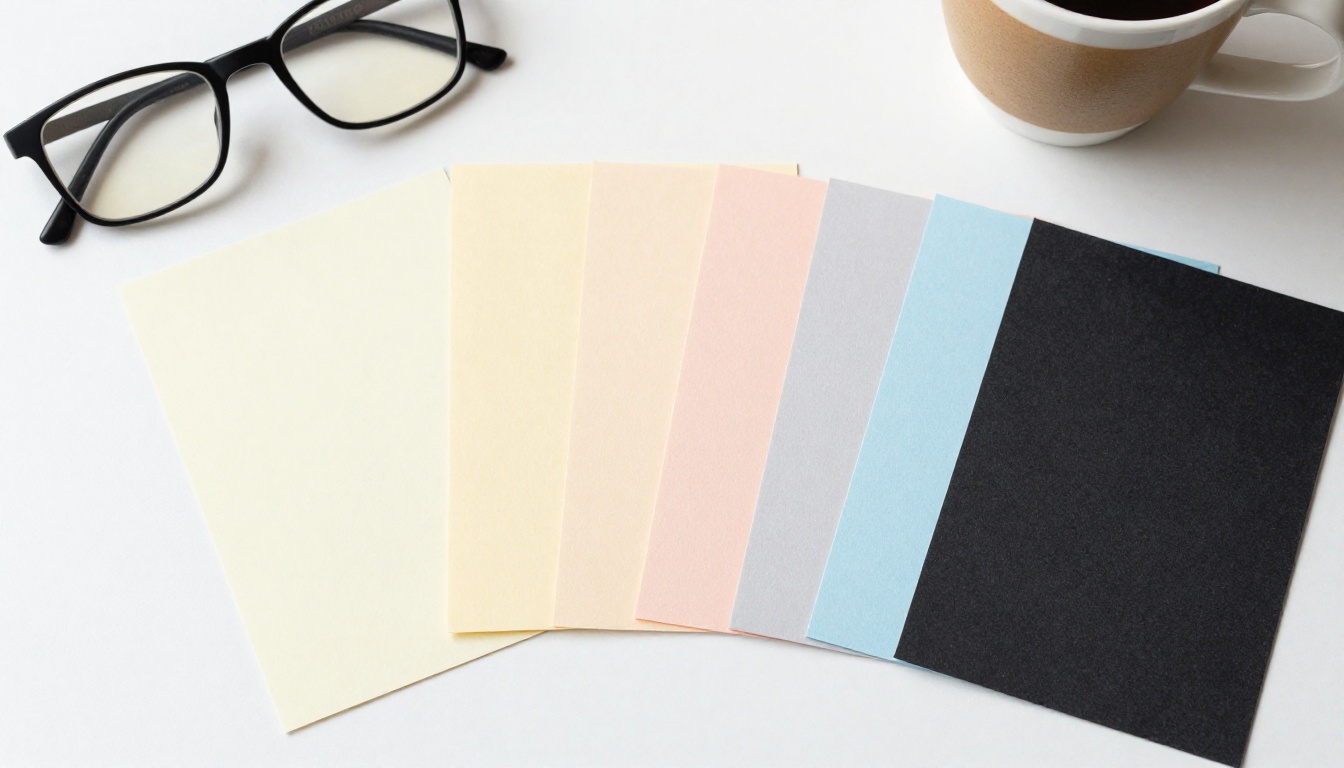
Try an off white such as cream, pale yellow or light peach. Some readers prefer a soft blue or green. There is no single winner, because preferences vary from person to person, which is why offering a choice is the best policy.
Text Colors
Use a dark charcoal or deep navy instead of pure black. Keep contrast strong enough to pass accessibility checks, with a ratio of at least 7 to 1 for body text where possible. Do not use red text on green, or low contrast gray on white.
Color Pairings Table
| Background | Text color | Feel | Good for |
|---|
| Cream | Charcoal | Warm, paper like | Long reading |
| Pale yellow | Dark navy | Bright but soft | Worksheets |
| Light peach | Dark brown | Gentle | Children |
| Soft blue | Near black | Cool and calm | Screens at night |
| Pure white | Pure black | Harsh glare | Avoid for body text |
| Dark gray | Light cream | Reduced glare | Optional dark mode |
✅ Best practice: Use color to organize, not to decorate. One accent color for headings and one for callouts is enough.
Page Structure That Reduces Strain
Typography is only part of it. How you arrange a page decides whether a reader feels invited or overwhelmed.
Chunk Your Content
Break information into small units with clear headings, short lists and plenty of white space. One idea per paragraph. A reader who finishes a chunk gets a small win, and small wins keep people reading.
Use Images With a Purpose
Pictures give the brain a second route to meaning. A photo next to a paragraph helps readers confirm what they just decoded. Choose images that illustrate the point, and keep text out of images because it cannot be resized or read aloud.
Add Audio and Video
Embedding narration lets a reader listen while following the words, which builds confidence without removing the text. Short clips can demonstrate a process that would take a page of dense steps. Flipbooks AI supports embedded video and audio, so this fits right into the page.
Layout Checklist
- Headings in a consistent style and size
- Bulleted lists instead of long sentences with commas
- Numbered steps for procedures
- Tables with clear borders and generous cell padding
- A contents page so readers can jump to sections
How to Build One in Flipbooks AI
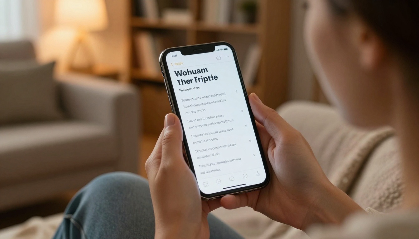
Here is a practical setup for a dyslexia friendly flipbook. The platform converts your PDF into a page turning publication, so most of the work happens before you upload.
Step by Step Setup
- Design the source file. In your word processor or design tool, set a sans serif font at 14 pt, line spacing at 1.5, left alignment and a cream page background.
- Export to PDF. Keep text as real text, not as flattened images, so screen readers and search work.
- Create an account. Sign up at Flipbooks AI and open the dashboard.
- Upload the PDF. The PDF to Flipbook Converter turns it into a responsive flipbook in moments.
- Customize the look. Pick a calm background color, use custom branding with restrained colors, and dial back page effects so the turn animation does not distract.
- Add audio or video. Attach narration to dense pages or short explainer clips to complex steps.
- Share it. Copy a direct link, or use the Embed Flipbook on Website option to place it inside your own page. Add password protection for private class material.
💡 Pro tip: Publish two versions when you can, one cream and one in a dark mode palette, and let readers pick the one that suits them.
Which Tool Fits Your Content
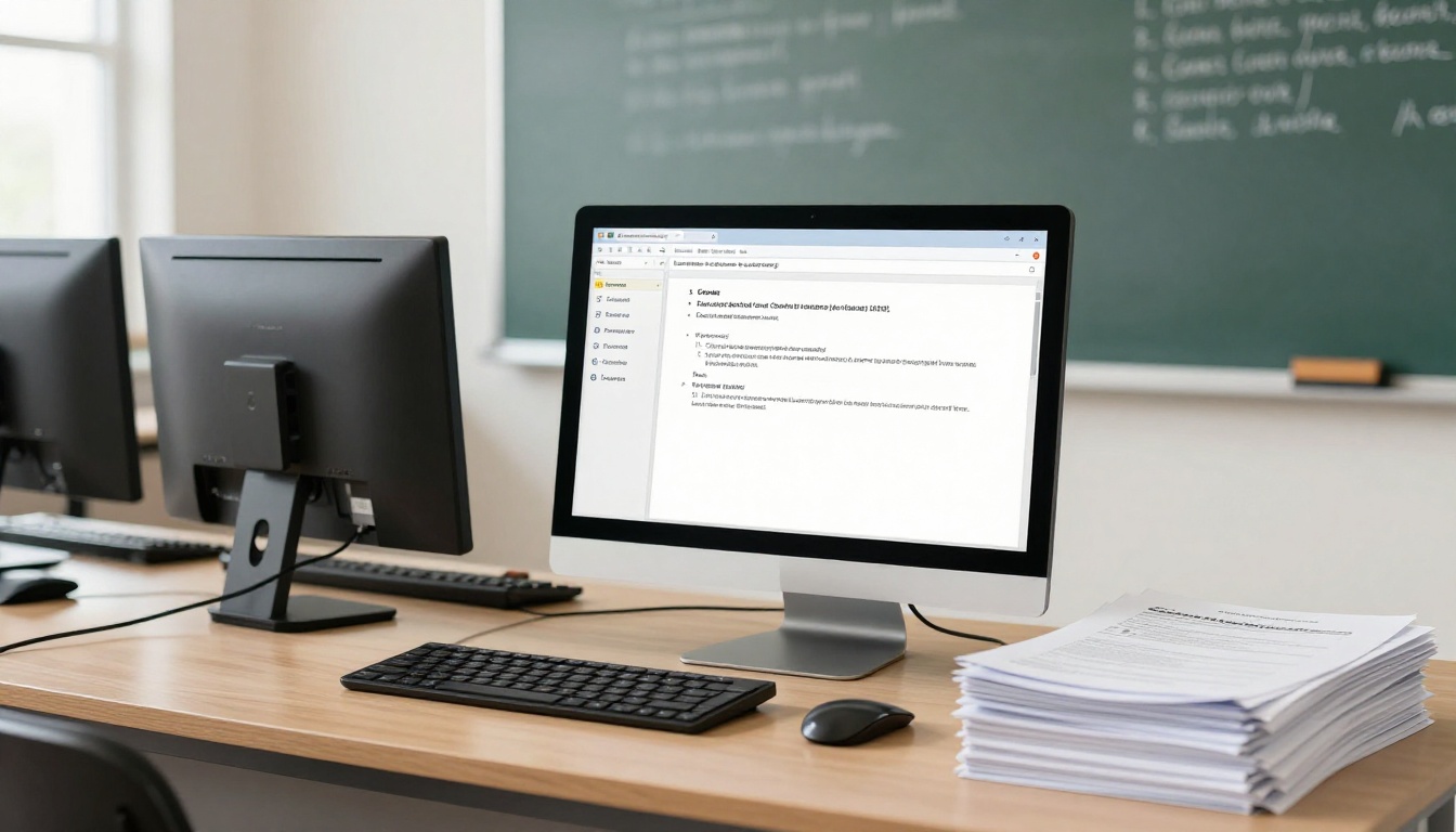
The Professional plan adds analytics, so you can see which pages readers abandon. That is a useful signal: a page with a high drop off rate is often too dense. Offline downloads also help readers who prefer to open the file on their own device, and there are never watermarks on your work. See the pricing plans for details.
Real World Examples
Abstract rules are easy to nod at and forget. Here is how they play out in practice.
A Primary School Reading Pack
A teacher converts a weekly reading pack into a flipbook. She switches from a serif font at 11 pt with tight lines to a sans serif at 14 pt with 1.5 line spacing on a cream background. Pages carry a single short story and one picture. Parents open it on a tablet at the kitchen table, and children point along the lines with a finger.
A Company Training Manual
An HR team publishes onboarding material. They replace long paragraphs with numbered steps and add a two minute video on each major task. A new hire with dyslexia no longer has to decode a ten page policy; they watch, then check the steps. Support questions drop because everyone, dyslexic or not, finds answers faster.
A University Course Syllabus
A lecturer builds the syllabus as a flipbook with a contents page, left aligned text and soft pale yellow pages. Students on the train read it on their phones without pinching and zooming, since the layout is responsive.

Common Mistakes to Avoid
Even well meaning publishers slip. Watch for these.
Five Frequent Errors
- Trusting a special font alone. A dyslexia font in a cramped layout still reads badly.
- Justifying text. It looks tidy and reads poorly.
- Using images of text. Readers cannot enlarge or listen to them.
- Choosing busy backgrounds. Photos behind text make letters swim.
- Skipping testing. Never assume. Ask real readers.
Test With Real People
Hand the flipbook to two or three readers with dyslexia and watch where they hesitate. Ask which background they prefer and whether any page feels heavy. Thirty minutes of feedback beats a week of guesses.
⚠️ Warning: Do not label content as "for dyslexic readers" in a way that singles anyone out. Make the default version accessible and let all readers benefit quietly.
Quick Audit Table
| Question | Pass | Fail |
|---|
| Is body text sans serif at 14 pt or more? | Yes | Serif, small |
| Is line spacing near 1.5? | Yes | Single spaced |
| Is text left aligned? | Yes | Justified |
| Is the background off white? | Yes | Pure white |
| Are paragraphs under five lines? | Yes | Walls of text |
| Is there audio or video support? | Yes | Text only |
Start Building Today
You do not need a redesign budget. Pick a clean sans serif, set the spacing to 1.5, switch to a cream background, shorten your paragraphs and add a bit of audio. Those five moves cover most of what readers with dyslexia ask for, and every reader benefits from them.
Ready to publish your first accessible flipbook? Create a free account on Flipbooks AI and upload your PDF. Browse all flipbook tools to find a template that matches your content, or compare pricing plans when you are ready for analytics and lead generation.