Ask anyone who has run a conference what attendees grab first at the registration desk, and the answer is always the same: the program. If the agenda is hard to read, the speakers feel anonymous and the sponsors are buried on the last page, the whole event feels less organized than it really is. This article gives you a working event program template built around those three pages, plus the exact order, word counts and layout choices that keep people reading. When it is ready, you can publish it as a digital flipbook with Flipbooks AI so the same program works on paper, on phones and in an email link.
Why the Program Still Matters
Apps and QR codes have not replaced the program. They have changed where it lives. Attendees still want one place that answers three questions: What is happening now? Who is speaking? Who made this possible?
A good program does three jobs at once:
- Orients people in the first ten seconds of opening it.
- Sells the event's value to first time visitors and returning guests.
- Pays for itself by giving sponsors visible, respectful placement.
💡 Pro tip: Treat the program as a product, not a leftover. Teams that draft it three weeks before the event, instead of three days, catch speaker changes and typos while they are still cheap to fix.
Print, Digital or Both
Most organizers now ship both versions. Print is handy at the door. Digital is where updates, links and videos live.
| Format | Best For | Weak Spot | Update Speed |
|---|
| Printed booklet | Registration desks, gala dinners | Cannot change after printing | Slow |
| Static PDF | Email attachments | Pinch and zoom on phones | Medium |
| Flipbook | Phones, websites, social links | Needs a short intro for new users | Fast |
A flipbook keeps the page turning feel of a booklet while loading fast on any device. We will get to the setup later in this article.
The Page Order That Works
Before you open a design tool, fix the sequence. This order suits most one to three day events, and it can be trimmed for a half day workshop.
- Cover page: event name, dates, venue, one strong photo.
- Welcome note: 120 words from the host or chair.
- Venue map and practical info: rooms, Wi-Fi, accessibility, help desk.
- Agenda at a glance: one page, whole event.
- Daily agenda pages: one spread per day.
- Speaker pages: photos, short bios, session titles.
- Sponsor pages: tiers, logos, short blurbs.
- Notes and contacts: blank lines, social handles, next event date.
- Back cover: thank you and a final sponsor logo strip.
Where Sponsors Should Go
Sponsors often ask for the front inside cover. You can offer it, but keep the agenda within two page turns of the cover. Attendees who cannot find the schedule quickly stop trusting the rest of the booklet.
Keep Page Counts Realistic
| Event Size | Suggested Pages | Agenda Pages | Speaker Pages | Sponsor Pages |
|---|
| Half day workshop | 8 to 12 | 1 | 2 to 3 | 1 to 2 |
| One day conference | 16 to 24 | 2 | 4 to 6 | 3 to 4 |
| Two or three day summit | 28 to 48 | 4 to 6 | 8 to 14 | 4 to 8 |
How to Build the Agenda Page
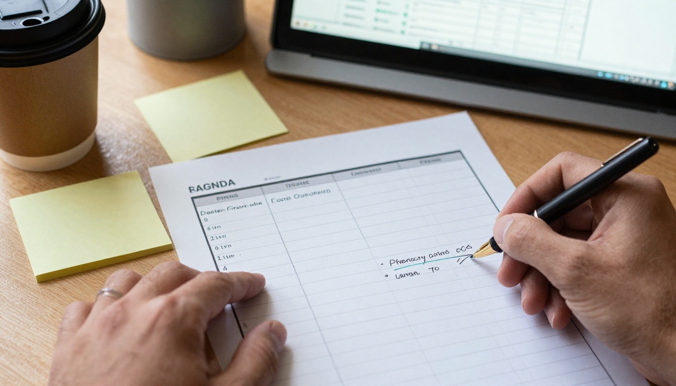
The agenda is the most opened page of any program. Design it for people who are standing, holding coffee and glancing for three seconds.
Use a Time Grid, Not Paragraphs
Start with time on the left, session title in the middle and room or track on the right. Bold the session title. Keep the speaker name in italics on a second line.
| Time | Session | Room |
|---|
| 08:30 | Registration and coffee | Main lobby |
| 09:15 | Opening remarks Host, Event Chair | Hall A |
| 10:00 | Opening talk: what changed this year Speaker name | Hall A |
| 11:00 | Break and sponsor visits | Expo floor |
| 11:30 | Breakout sessions (three tracks) | Rooms 1 to 3 |
| 13:00 | Lunch | Terrace |
| 14:30 | Panel: lessons from the field Four speakers | Hall A |
| 16:30 | Closing and prize draw | Hall A |
Rules for Agenda Copy
- One line per session title whenever possible. Move the description to the speaker page.
- Use 24 hour or 12 hour time, never both. Pick one and stay consistent.
- Color code tracks with a small marker, but never rely on color alone. Add a track letter too.
- Mark breaks clearly so attendees know when sponsors can expect traffic.
⚠️ Warning: Do not publish a time slot you are not sure about. A wrong room number printed on 800 copies is far more expensive than a gap labeled "To be confirmed."
Agenda at a Glance
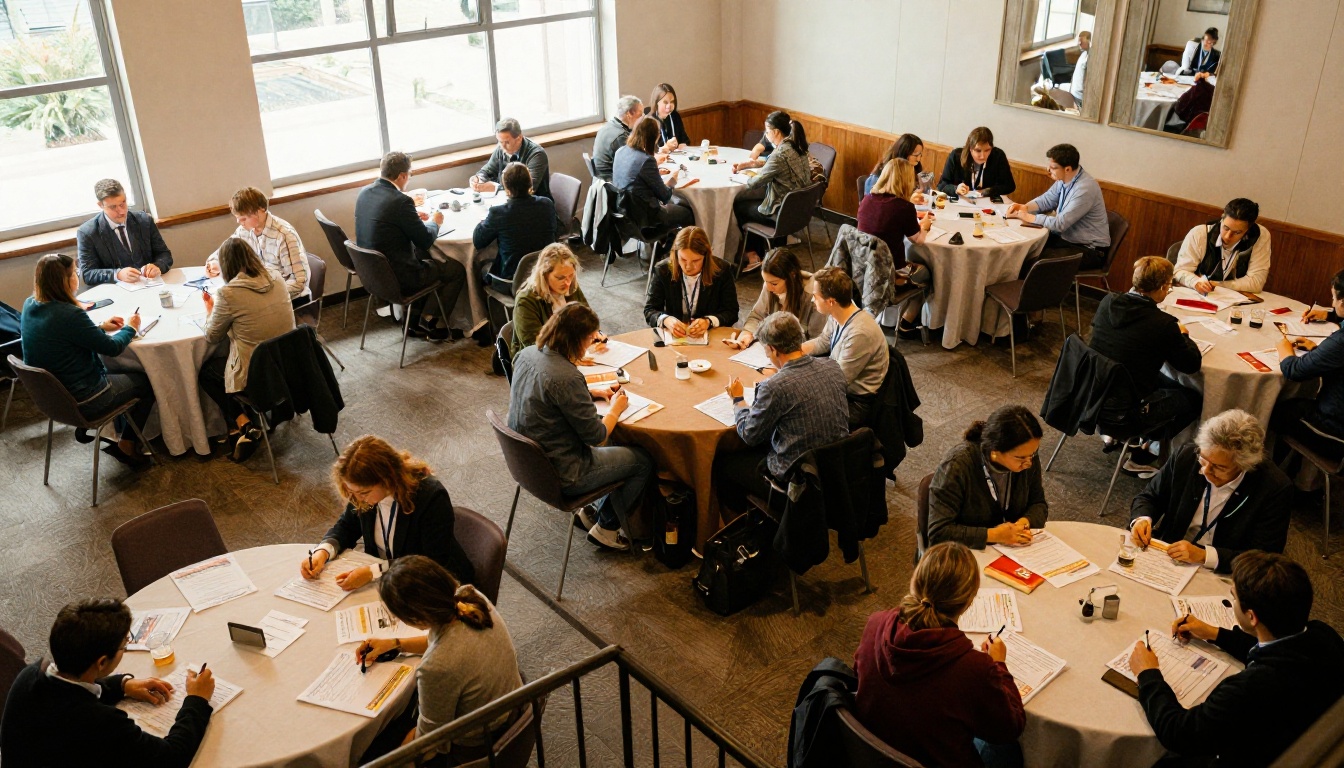
A single page showing every day in columns helps people plan. It is also the page most likely to be screenshotted and shared, so give it a clean title and your event hashtag.
Speaker Pages That People Read
Speaker pages fail when they turn into a wall of résumé lines. Attendees do not need a full career history. They need a reason to walk into that room.
The Four Part Bio
Each speaker entry should hold the same four elements:
- Photo: a clear headshot, same crop for everyone.
- Name and role: one line.
- Bio: 50 to 70 words, written in third person.
- Session: title, time and room.
Here is a sample of the bio style that works:
Maria Okafor, Head of Partnerships, Northline Logistics. Maria has spent twelve years building supplier networks across three continents. Her talk shows how one regional distributor cut onboarding time in half. She also hosts a monthly roundtable for operations leads.
Notice what is missing: awards lists, school names and every past employer. If someone wants those, add a link or a QR code.
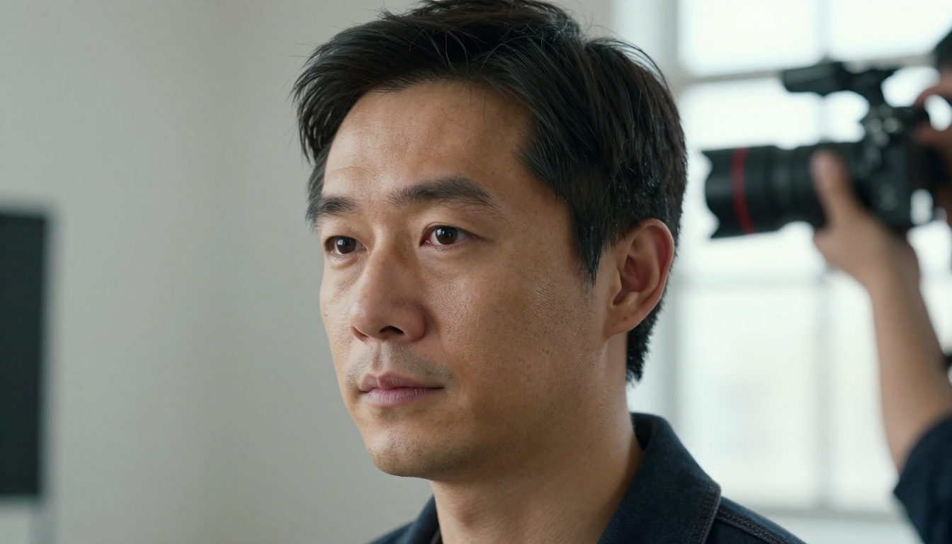
Photo Consistency Matters
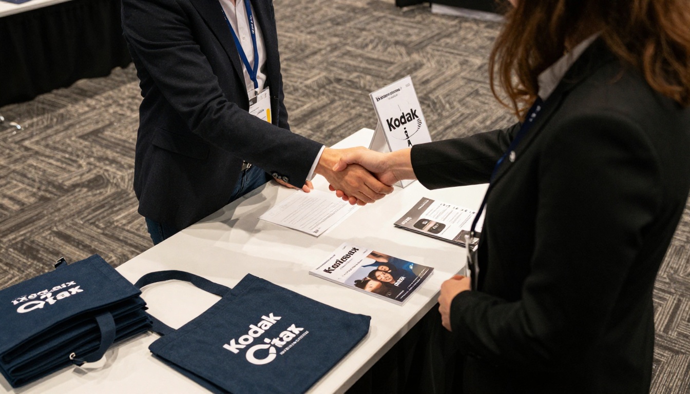
Mixed photo styles make a lineup look uneven. Ask every speaker for a square headshot at least 800 pixels wide. If you must use varied photos, crop them to the same shape and keep the face centered. A quick on site photo corner, like the one pictured above, saves a lot of last minute emails.
| Speaker Layout | Pros | Cons |
|---|
| Grid of 6 per page | Compact, easy to compare | Short bios only |
| 2 per page, large photo | Strong personality | Uses more pages |
| Featured spread plus grid | Highlights headliners | Needs clear hierarchy |
For most programs, a featured spread for two or three headliners followed by a grid for everyone else is the best balance.
Link Speakers to the Agenda
Add the session time next to each name on the speaker page, and the speaker name next to each session on the agenda. In a flipbook you can also add clickable links, so a tap on a name jumps to the bio.
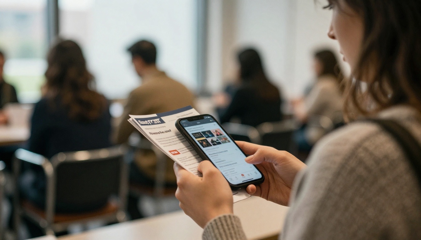
Sponsors pay for visibility, and the program is one of the few places where they can prove they got it. A thoughtful sponsor section also makes it easier to sell next year's packages.
Organize by Tier
Group logos by what each sponsor paid for, from the highest tier to the lowest. Size should match the tier, but never leave a smaller sponsor feeling like an afterthought.
| Tier | Typical Placement | Logo Size | Blurb Length |
|---|
| Title sponsor | Cover, welcome page, full page spread | Largest | 80 to 100 words |
| Gold | Half page | Large | 50 words |
| Silver | Shared page | Medium | 25 words |
| Community partners | Logo strip, back cover | Small | Name only |
What to Put in a Sponsor Blurb
- One sentence on what the company does.
- One sentence on why they support the event.
- A booth number or session time so attendees can act on it.
- A link or QR code to a landing page you can track.
Avoid copying their marketing paragraph word for word. A short, plain blurb reads as a recommendation. A long ad reads as clutter.
✅ Best practice: Send sponsors a proof of their page 10 days before the deadline. Ask them to confirm logo, blurb and link in writing. This avoids last minute reprints and "can you swap our logo" requests.
Reporting Back to Sponsors
A digital program can show how many people opened it and which pages got the most attention. That data makes your post event sponsor report concrete. With the Professional plan on Flipbooks AI, you get analytics and lead generation tools that help prove value.

Writing Rules and Design Basics
Word Budgets
Short copy keeps the program scannable. Use these limits as a starting point.
| Element | Target Length |
|---|
| Welcome note | 100 to 150 words |
| Session title | 8 words or fewer |
| Session description | 25 to 40 words |
| Speaker bio | 50 to 70 words |
| Sponsor blurb | 25 to 80 words |
Typography and Color
- Use two fonts at most: one for headings, one for body text.
- Keep body text at 9 to 11 points for print, larger for mobile.
- Choose three brand colors: a base, an accent and a neutral.
- Leave generous margins so a thumb or a staple does not hide content.
Accessibility Checklist
- Contrast ratio of at least 4.5 to 1 for text.
- Alt text for every photo in the digital version.
- Plain language, no jargon without a short explanation.
- A clear note on step free routes and quiet rooms.
💡 Pro tip: Print one page of the draft and hold it at arm's length. If you cannot spot the next session in three seconds, the layout needs more white space.
How to Create Your Event Program with Flipbooks AI
If your draft is a PDF, you can turn it into a flipbook in a few minutes. The Event Program Maker is built for exactly this job, and the PDF to Flipbook Converter handles the file conversion.
Step by Step Setup
- Start here: open Flipbooks AI and create an account if you do not have one.
- Upload your PDF: drag in the program file. Pages are converted automatically and keep their layout.
- Customize the look: add your logo, choose background colors, and pick a page turn effect that suits the mood of your event.
- Add media: place a welcome video from the host, or an audio clip from a headline speaker, directly on the page.
- Add links: link agenda rows to speaker pages, and sponsor logos to their landing pages.
- Set sharing options: copy a direct link, grab an embed code for your event site, or add password protection for a members only event.
- Publish and test: open the link on a phone, a tablet and a laptop before announcing it.
Pro Features Worth Using
| Feature | Why It Helps an Event | Plan |
|---|
| No watermarks | Looks professional for sponsors | All plans |
| Unlimited flipbooks | One per event, per day or per track | Standard and above |
| Password protection | Private or ticket holder only programs | Standard and above |
| Analytics | See which pages get opened | Professional |
| Lead generation | Capture emails before access | Professional |
| Offline downloads | Useful in venues with weak signal | Available |
See all pricing plans to pick the right level for your event calendar.
Real World Examples
A Regional Trade Show
A trade show with 60 exhibitors used a 32 page program. The agenda went on pages 4 and 5, and exhibitors were grouped by hall instead of alphabetically. Attendees found booths faster, and exhibitors reported more foot traffic on the first morning.
A Corporate Offsite
A company offsite for 150 employees skipped the sponsor pages and used that space for a team directory. The agenda was one fold out spread, and the digital version was shared by link before arrival. Fewer people asked the front desk where to go.
A Nonprofit Gala
A gala used the program to thank donors. Instead of tiers, it grouped supporters by giving level and added a short story about the cause on each page. The digital version was reused in the follow up email, with a donate link on the last page. For organizations that also publish yearly impact reports, the Non-Profit Annual Report tool is a natural companion.
Common Mistakes to Avoid
- Hiding the agenda behind sponsor ads and long welcome notes.
- Using different photo styles for speakers.
- Printing before sign off from every speaker and sponsor.
- Skipping a mobile test of the digital version.
- Forgetting a change log. If the schedule changes, tell attendees where to find the latest version.
- Cramming 12 point text into 8 point space to avoid cutting content.
A Simple Timeline to Follow
| Weeks Before | Task |
|---|
| 6 | Lock page order and ask for speaker bios and photos |
| 5 | Collect sponsor logos and blurbs |
| 4 | First draft, internal review |
| 3 | Send proofs to speakers and sponsors |
| 2 | Final edits, send to print, create flipbook |
| 1 | Test links, share the digital version with attendees |
| Event day | Share the latest link at the door with a QR code |
Ready to Build Yours
You now have the page order, the copy limits and the layout choices. The last step is to put them into a file and share it.
A clear agenda, speakers with real personality and sponsors who feel valued: that is the whole recipe. Build the template once, and every event after it gets easier.



