A fast food line lives or dies on one number: how long a customer takes to decide. Cooks can be quick and registers can be quick, but if people stand frozen in front of a wall of 60 items, every other speed gain disappears. The good news is that menu design is the cheapest speed upgrade you can make. You can test it in a week, and you can republish it in minutes with a tool like Flipbooks AI, which turns a PDF menu into a fast, mobile friendly digital page.
This article walks through the fast food menu design ideas that actually shorten ordering time: how people scan, how to group items, how to use photos and prices, and how to adapt the same menu for counters, drive-thrus, kiosks and phones.
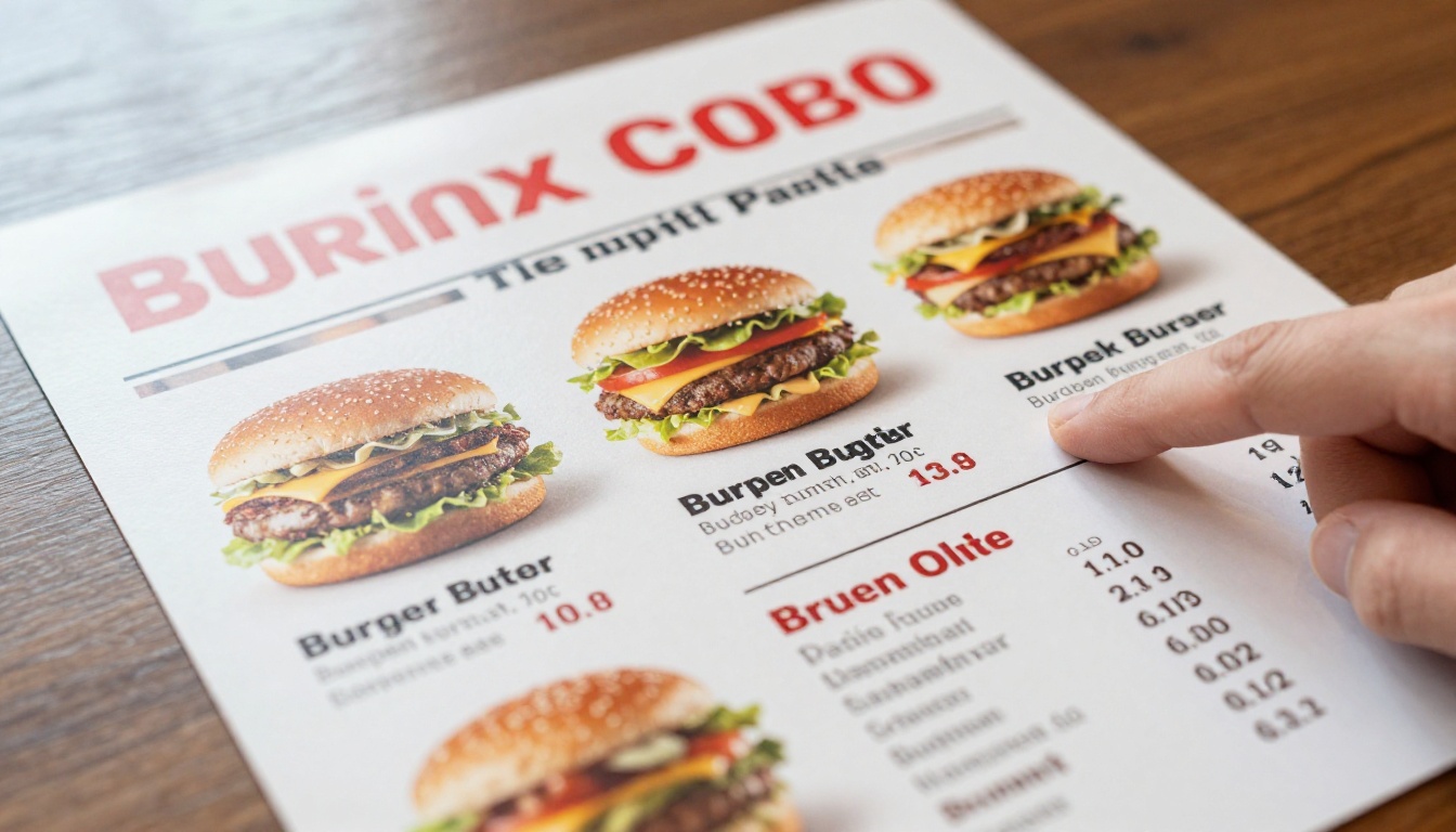
Ordering speed is not just about patience. A slow decision creates a chain reaction: the cashier waits, the queue grows, new arrivals see a long line and walk away, and the kitchen gets orders in bursts instead of a steady flow.
Think of it as a simple equation. If the average decision takes 40 seconds and you cut it to 25, a counter that served 90 customers an hour can serve closer to 110, without hiring anyone or buying equipment.
💡 Pro tip: Time a few real customers from the moment they look up at the menu to the moment they speak to the cashier. That is your baseline. Re-time after every menu change.
Decision Fatigue at the Counter
Customers in a fast food restaurant are hungry, hurried and often distracted by kids, phones or a car behind them. Too many choices produce one of two outcomes: they freeze, or they fall back on the same item they always order. Neither helps you sell a new product or upsell a combo.
Research on choice overload is consistent on one point: fewer, clearer options lead to faster and more confident decisions. Your job is to make the right choice feel obvious.
The Hidden Cost of a Slow Line
| Menu problem | What the customer does | Effect on service |
|---|
| Too many items | Freezes, asks questions | Longer register time |
| Unclear prices | Asks the cashier | Interruptions, errors |
| Hard to find combos | Orders items separately | Lower ticket, more taps |
| Tiny text | Steps closer, blocks others | Queue bunches up |
| No photos | Guesses, changes mind | Order corrections |
Nobody reads a fast food menu line by line. People scan in fast jumps, look for a familiar anchor, and stop when something matches what they want. Design for that behavior instead of fighting it.
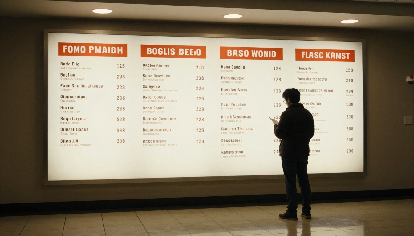
Use the Top Left and Center
Eyes land first on the top left and the visual center of a board. Put your most popular combo or best seller there. Place less urgent items, such as sides and desserts, lower down or to the right.
Limit Categories to Five or Six
A customer should be able to count your categories without effort. A common, effective set looks like this:
- Combos
- Burgers or sandwiches
- Chicken
- Sides
- Drinks
- Kids and desserts
If you have more than six, merge some of them. "Wraps" and "Salads" can sit under "Lighter Picks" without confusing anyone.
Keep Item Names Short
A name like "The Classic" beats "Our Signature Slow Cooked Hickory Smoked Classic Burger Deluxe". Put the extra detail in a small line below, and only when it changes the decision, such as spice level or allergens.
✅ Best practice: If a customer cannot read an item name in one glance from three meters away, shorten it.
Layout Ideas That Cut Decision Time
Layout is where most speed is won or lost. These ideas work on printed menus, wall boards and screens alike.
Group by Meal, Not by Ingredient
Customers think "I want a chicken meal", not "I want something from the fryer". Group items the way people order, and show the combo price right next to the single item so the saving is visible.
Use White Space on Purpose
Crowded boards feel slow before anyone reads them. Leave generous spacing between columns so each section reads as its own block. White space is not wasted space, it is the thing that makes the next block easy to find.
Highlight One Hero Item Per Section
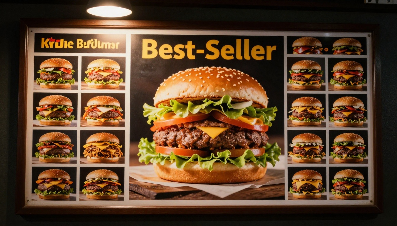
A larger photo or a thin border around one item in each section gives hesitant customers a default choice. Many will simply take it. That speeds up the line and lets you steer volume toward your higher margin products.
Layout Patterns Compared
| Layout | Best for | Speed impact | Watch out for |
|---|
| Single column list | Small menus under 15 items | High | Gets long fast |
| Three column grid | Counter boards | High | Needs strict alignment |
| Combo first panel | High volume chains | Very high | Singles can get buried |
| Photo tile grid | Kiosks and apps | Very high | Needs consistent photography |
| Dense text wall | Nobody | Low | Slows every customer |
Photos, Icons and Color
Visuals are processed far faster than text. A good photo tells the customer what the item is, how big it is and whether they want it, all before they read a word.
Photograph Real Food Consistently
Use the same angle, light and background across every item. A mismatched set of photos looks messy and makes the menu harder to scan. Natural side light, clean plates or paper wrap, and a slightly raised camera angle work well for burgers, wraps and sides.
⚠️ Warning: Do not show portions bigger than what you serve. It creates complaints at the counter and slows down the line while staff explain.
Use Color as a Wayfinding Tool
Assign one color to each category: red for burgers, yellow for fries and sides, blue for drinks. Customers learn the pattern within one visit. Keep text high contrast, dark on light or white on dark, and avoid thin fonts on photo backgrounds.
Add Small Icons for Quick Filters
Tiny icons for spicy, vegetarian or contains nuts let customers filter without asking a question. Each avoided question saves several seconds at the register.
Pricing Presentation That Moves People Along
Price confusion is a quiet speed killer. If a customer has to do math, they stop and think.
Drop the Currency Symbol and Decimals
A clean "9" or "9.5" reads faster than "$9.50". Many successful menus place a small, consistent price next to each item without dollar signs, which also feels less like spending.
Show Combo Savings Clearly
Present a combo as one number with the contents listed in a short line. Customers should never have to add up burger plus fries plus drink.
| Presentation | Example | Decision speed |
|---|
| Separate prices only | Burger 6, Fries 3, Drink 2 | Slow, requires math |
| Combo with savings tag | Burger Combo 9 (Save 2) | Fast |
| Three size tiers | Small 7, Medium 8, Large 9 | Fast, encourages upsell |
| Unlimited options list | Pick any sauce, any side | Slow, many choices |
Anchor with a Premium Option
Putting one higher priced combo at the top makes the middle option feel reasonable. This is a common retail pattern and it works on menus too, as long as the premium item is actually good.
Combos, Sizes and Upsells Without Friction
A well built combo section is the single most effective speed tool in a fast food restaurant. One decision replaces three.
Number Your Combos
"Number 3" is shorter than "Spicy Chicken Sandwich Combo". Numbered combos help in noisy drive-thrus and with customers who do not speak the local language fluently. Display the numbers large and consistent.
Default the Side and Drink
Set a default side and a default drink for each combo, and list swaps as a small line below. Most customers accept the default, which removes two decisions.
Make Upsizing a Single Question
"Make it large for 1?" is one yes or no question. A long list of add-ons slows the line and often reduces conversions.
A Simple Example
A burger chain trimmed a 48 item menu to 28 core items and numbered six combos. The cashiers reported fewer questions, customers decided faster, and the average ticket rose because the combo was the easiest thing to pick.
A speed focused menu has to work in several settings. The same content should be adapted, not just copied.
Counter Boards
Use big type, large photos and wide spacing. Assume the customer is three to five meters away and standing in a queue.
Drive-Thru Boards
Drive-thru customers read for only a few seconds. Show fewer items, lead with numbered combos, and keep the layout flat with no side panels. Seasonal specials should live in a single highlighted spot.
Kiosks and Self-Order Screens
Kiosks reward photo tiles, clear category tabs and a visible running total. Keep the first screen to six categories or fewer and put combos first.
Phones and QR Codes
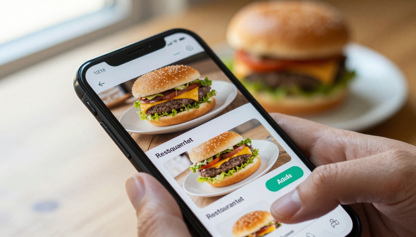
Many customers now read the menu on a phone while they wait or before they arrive. A mobile page needs fast loading, large tap targets and no pinching or zooming.
| Setting | Viewing time | Items shown | Best format |
|---|
| Counter board | 20 to 40 seconds | 20 to 30 | Large printed or digital board |
| Drive-thru | 10 to 20 seconds | 12 to 20 | Combo led board |
| Kiosk | Self-paced | Full menu in tabs | Photo tiles |
| Phone | Self-paced | Full menu | Mobile flipbook |
| Table or tray insert | Long | Full menu | Printed card with QR |
Kids, Families and Special Needs
Families are some of your slowest decision makers, and some of your highest spenders. A short, clearly marked kids section helps parents decide in one glance.
Put Kids Meals in a Fixed Spot
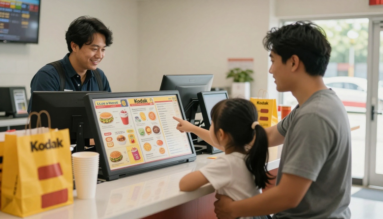
Always place kids items in the same location on every menu format. Parents learn where to look, and children can point at pictures.
Mark Allergens Simply
Small, consistent icons are better than a paragraph of fine print. Link to a fuller allergen page for customers who need details.
⚠️ Warning: Never hide allergen information to keep a layout tidy. Put the icon on the item and the detail one tap or one page away.
Printed boards are great at the counter, but a digital menu is the easiest way to serve phones, tables, delivery partners and QR codes. Because you can republish it in minutes, it is also the best place to test layout changes before you reprint anything.
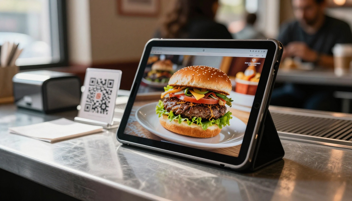
The Restaurant Menu Creator and Menu Flipbook Designer are built for exactly this. Here is the process, step by step.
Step 1: Create Your Account
Go to Flipbooks AI and create a free account. You can build your first menu without a credit card.
Step 2: Upload Your Menu PDF
Design your menu in any tool you like, export it as a PDF, and upload it. The PDF to Flipbook Converter turns each page into a smooth, page-turning flipbook that loads quickly on phones.
💡 Pro tip: Design the PDF in a mobile friendly size, such as a tall page with large type, so customers do not need to zoom.
Step 3: Customize Branding
Add your logo, brand colors and page effects so the menu matches your restaurant. Flipbooks AI includes custom branding with no watermarks, ever, which keeps the page clean for customers.
Step 4: Add Multimedia
Embed short videos or audio where it helps, such as a loop of your signature burger being assembled. Keep it brief so the page stays fast.
Step 5: Share Everywhere
You have several sharing options:
- A direct link for social media and delivery apps
- An embed code for your own site, see the Embed Flipbook on Website tool
- A QR code printed on trays, tables and windows
- Password protection for private menus such as staff or franchise versions
Step 6: Measure and Improve
On the Professional plan you get analytics and lead generation, so you can see which pages customers open and where they stop. Offline downloads are also available for locations with weak signal. Compare options on the pricing page.
| Feature | Why it helps a fast food menu |
|---|
| Mobile responsive design | Customers read comfortably on any phone |
| Instant republishing | Test a new layout the same day |
| QR code sharing | Order from the queue or the table |
| Password protection | Keep franchise or staff menus private |
| Analytics (Professional) | See where customers drop off |
| Embedded video and audio | Show items in motion without extra apps |
Design choices are hypotheses. The only way to know they work is to measure.
Three Simple Tests
- Timing test: Record decision time for 20 customers before and after a change.
- Question count: Ask staff to tally how many questions they get per shift about prices, contents and sizes.
- Mix report: Track whether combos, hero items and upsells grow or shrink after a layout change.
Change One Thing at a Time
Move the best seller, or change the combo layout, but not both at once. Otherwise you will not know what worked.
Common Mistakes to Avoid
- Adding items without removing any
- Using photos of different styles and lighting
- Printing prices in light gray on a photo
- Hiding combos at the bottom of the board
- Letting special offers cover half the screen
✅ Best practice: Review the menu every quarter. Remove the three slowest sellers and replace the space with white space or a stronger hero item.
Your Next Steps
A faster menu is a matter of a few clear decisions: fewer categories, combos first, clean prices, consistent photos and a layout that matches where the customer is standing. Start with one change this week, time it, and keep what works.
Ready to build your digital version? Get started for free on Flipbooks AI, browse all flipbook tools to find the right template, and compare pricing plans to pick the one that fits your restaurant.



