Why Flipbook Buttons Not Clickable on Mobile Happens (and How to Fix It)
When flipbook buttons stop responding on mobile devices, it's rarely a random glitch. This article breaks down the actual causes behind unresponsive touch events, iframe conflicts, z-index stacking issues, and browser-specific quirks, then walks through proven fixes to restore full interactivity across every phone and tablet.
You just shared your flipbook link with a client on mobile, and the next message is: "I can't click anything." It's one of the most common complaints with digital publications, and it almost always has a fixable root cause. The frustrating part is that everything looks perfect on desktop. Flipbooks AI is built with mobile-first interactivity, but when flipbook buttons are not clickable on mobile, the issue usually sits somewhere in the embedding setup, CSS layer, or browser behavior, not the flipbook itself.
What Actually Blocks Touches on Mobile
Desktop clicks and mobile taps are handled differently by browsers. A click event fires after the pointer goes down and up in the same spot. A tap on mobile goes through a more complex sequence: touchstart, touchmove (if you moved), touchend, and then a synthesized click event 300ms later in some older browsers.
When a flipbook is embedded in an iframe or loaded inside a container with certain CSS properties, that sequence gets broken. The tap registers but the event never reaches the button because something in the DOM is absorbing it.
The most frequent blockers fall into these categories:
pointer-events: none applied to the iframe or a parent container
z-index stacking where a transparent overlay sits on top of the flipbook
overflow: hidden on the parent clipping the touchable area
iframe sandbox restrictions blocking user interaction
300ms tap delay on older iOS Safari versions
Scroll-blocking wrappers that intercept touch events before they reach the flipbook
The Most Common Culprits
Your iframe has pointer-events disabled
This happens when a developer adds pointer-events: none to disable hover effects on desktop and forgets it also kills taps on mobile. Check the computed styles on your iframe element using Chrome DevTools mobile emulation.
/* This kills all touch interaction */
iframe.flipbook {
  pointer-events: none;
}

/* Fix: remove it or set to auto */
iframe.flipbook {
  pointer-events: auto;
}
A transparent overlay is blocking the flipbook
Some CMS themes and page builders add invisible divs on top of embedded content for tracking clicks or preventing right-click. On desktop these are barely noticeable. On mobile, they absorb every tap before it reaches your flipbook.
⚠️ Watch out for page builder overlays. Elementor, Divi, and WPBakery all have element wrapper divs that can cover iframe content on mobile viewports. Inspect your DOM in mobile mode and look for any absolutely positioned divs with width/height 100% sitting above the flipbook.
The iframe is too small on mobile
When an iframe renders at its original desktop size and then gets scaled down by CSS transform: scale(), the visual content shrinks but the clickable hit area does not move. You might see buttons but your taps are firing in the wrong coordinate space entirely.
The correct approach: use responsive width and height on the iframe itself.
<!-- Avoid this -->
<iframe width="1200" height="800" style="transform: scale(0.4);" src="..."></iframe>

<!-- Do this instead -->
<iframe style="width:100%; height:100%; min-height:500px; border:none;" src="..."></iframe>
iOS Safari's 300ms delay and double-tap zoom
On older iOS versions (pre-iOS 13), Safari added a 300ms delay to tap events to distinguish single taps from double-tap zoom. During that window, if your flipbook's button requires a fast response or if something intercepts the event, the tap fails silently.
Ensure your viewport meta tag disables double-tap zoom:
Not all mobile browsers handle embedded content the same way. The gap between Safari on iOS and Chrome on Android is wider than most people expect.
Browser
Common Flipbook Issue
Fix
iOS Safari
300ms tap delay, iframe scroll conflicts
Viewport meta + touch-action
Chrome Android
z-index stacking with floating CTAs
Remove overlay elements
Samsung Internet
Non-standard pointer event handling
Test explicitly, use touch events
Firefox Mobile
Iframe focus requirements before interaction
Ensure iframe loads fully before tapping
In-App Browsers (Instagram, TikTok)
Restricted iframe permissions
Use direct link instead of embed
💡 Pro tip: In-app browsers inside Instagram and TikTok have severely restricted iframe capabilities. If your audience is clicking flipbook links from social media, those buttons might never work inside the in-app browser. Direct users to open in Safari or Chrome using a banner prompt.
How to Diagnose the Problem Yourself
Before applying fixes blindly, narrow down where the block lives. Follow this sequence:
Open the flipbook at its direct URL on mobile (not through an embed). If buttons work here, the problem is in your embedding setup, not the flipbook itself.
Test in multiple browsers on the same device. If it fails in Safari but works in Chrome, it's a Safari-specific behavior.
Use Chrome DevTools device emulation on desktop to inspect computed styles on the iframe and its parents. Look for pointer-events, z-index, and overflow values.
Temporarily disable your page's CSS by turning off stylesheets one by one in DevTools. If buttons suddenly work, a CSS rule is the culprit.
Check the browser console for JavaScript errors that might indicate a conflicting script blocking event propagation.
Fixing Clickable Elements Step by Step
Step 1: Audit your embed code
Pull up the iframe embed code and check every attribute. The sandbox attribute can block interaction entirely:
<!-- This sandbox config blocks all interaction -->
<iframe sandbox="allow-scripts" src="..."></iframe>

<!-- You need allow-same-origin and allow-forms at minimum -->
<iframe sandbox="allow-scripts allow-same-origin allow-forms allow-popups" src="..."></iframe>
Step 2: Fix CSS stacking context issues
Look at every parent element of the iframe. If any has position: relative or position: absolute with a high z-index, check whether sibling elements with higher z-index values sit over the flipbook area.
/* Common culprit in WordPress themes */
.page-overlay {
  position: absolute;
  top: 0;
  left: 0;
  width: 100%;
  height: 100%;
  z-index: 999; /* This covers your flipbook */
}
The fix is either removing the overlay on mobile with a media query or lowering its z-index below the iframe's stacking context.
Step 3: Make the container responsive
Wrap your iframe in a responsive container that scales properly on mobile:
✅ Best practice: Set overflow: visible on the wrapper, not overflow: hidden. Clipping the overflow can cut the touchable boundary of your iframe even when the visual content appears fully visible.
Step 4: Handle scroll vs. tap conflicts
When a flipbook is embedded in a scrollable page, mobile browsers sometimes prioritize the page scroll gesture over the tap on an iframe element. This is especially common on iOS.
Add this to your iframe:
iframe {
  touch-action: pan-y; /* Allow vertical scroll but pass horizontal to iframe */
}
Or, for flipbooks that need full touch control:
iframe {
  touch-action: none; /* Pass all touch events to the iframe content */
}
Desktop vs. Mobile Rendering: What Changes
Understanding what renders differently on mobile helps you spot problems faster:
Element
Desktop Behavior
Mobile Behavior
Click events
Fires immediately
300ms delay (older browsers)
Hover states
Triggered on pointer movement
Not triggered at all
Fixed position overlays
Sit above content, ignored for clicks
Can block all touch targets
CSS transform: scale()
Visual + interactive area both scale
Visual scales, hit area stays original
iframe width="100%"
Fills container
May trigger horizontal scroll
z-index stacking
Predictable mouse event routing
Touch events can bleed through layers
How Flipbooks AI Handles Mobile Buttons
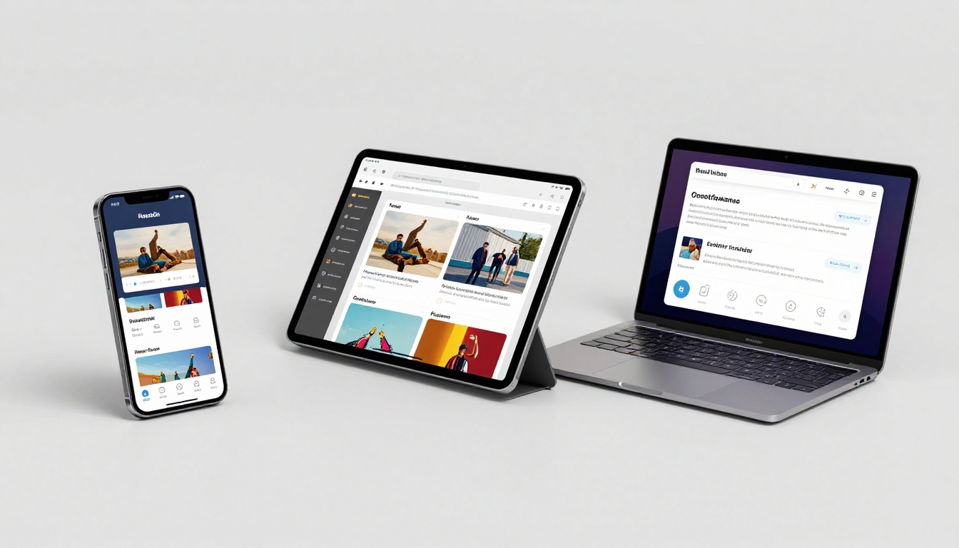
Flipbooks AI builds mobile responsiveness directly into every flipbook. When you create a flipbook through the platform, the output is tested across iOS Safari, Chrome for Android, and Samsung Internet. Navigation buttons, page turn controls, table-of-contents links, and embedded media triggers are all implemented using touch-native event handling rather than relying on mouse click simulation.
The platform uses touch-action declarations at the component level so scroll gestures and tap gestures do not conflict. It also avoids CSS transforms for scaling on mobile, using flexible layout instead.
Some specific behaviors worth knowing about Flipbooks AI:
Navigation arrows resize and reposition to stay within thumb reach on small screens
Page swipe gestures work alongside tap-to-navigate buttons without conflict
Embedded links in PDF content are converted to native touch targets automatically
Table of contents panels open without requiring hover state
Password-protected flipbooks work with mobile keyboard input without layout shifts
Setting Up a Mobile-Ready Flipbook on Flipbooks AI
If you are not yet using a platform built for this, here is how to get a fully functional mobile flipbook from scratch.
Step 1: Create your account
Go to flipbooksai.com/account and sign up. The free tier includes flipbook creation with full mobile support and no watermarks on any plan.
Step 2: Upload your PDF
On the dashboard, click "New Flipbook" and upload your PDF file. The PDF to Flipbook Converter processes your document and generates a mobile-optimized flipbook automatically. No manual resizing required.
Step 3: Customize for mobile
Inside the editor, check your flipbook on the built-in mobile preview. Adjust button sizes, navigation placement, and ensure embedded links in your PDF are set to open in a new tab so they do not break the flipbook session.
Step 4: Test interactive elements
Click each navigation button and any embedded links inside the mobile preview. The platform shows you exactly what a visitor on a phone will see. If something is not responding in preview, the editor lets you adjust touch target sizes directly.
Step 5: Choose your sharing method
For maximum mobile compatibility, use the direct link rather than the embed code when sharing on social media or through messaging apps. For websites, use the Embed Flipbook on Website tool, which generates responsive embed code with the correct CSS wrapper already included.
💡 Mobile vs. embed choice: Direct links always give the best mobile experience since the flipbook runs in its own browser tab without any parent page CSS interference. Embeds work well when you control the host page and can verify the CSS context.
When to Use a Direct Link vs. an Embed
This choice matters more on mobile than on desktop:
Scenario
Best Option
Why
Sharing on WhatsApp, iMessage
Direct link
In-app browsers have iframe restrictions
Embedding in WordPress site
Responsive embed code
Full control over CSS context
Email marketing campaigns
Direct link
Email clients strip iframes
Social media profiles
Direct link
Platform-specific browser limitations
Your own website or landing page
Embed with responsive wrapper
Better UX, stays on your page
Password-protected content
Direct link
Avoids iframe auth conflicts
Best Practices for Mobile-Ready Flipbooks
These are the things that separate consistently working flipbooks from the ones that generate support tickets:
Never use CSS transforms to scale an iframe. Use responsive width and height instead.
Test on real devices, not just emulators. DevTools emulation misses many iOS-specific quirks.
Set viewport meta on your host page correctly. A missing viewport meta breaks the entire touch coordinate system.
Use the platform's native sharing link for social media. Embeds inside in-app browsers fail more often than not.
Check your CMS theme for floating elements. Many themes add tracking divs or cookie banners that sit above embedded content.
Avoid sandbox restrictions on your iframe unless you have a specific security requirement. Overly restricted iframes block user interaction silently.
✅ Best practice: Always test your flipbook on an actual iPhone with Safari and an actual Android device with Chrome before considering it production-ready. No emulator fully replicates how iOS Safari handles iframe touch events.
What to Do When Nothing Works
If you have checked all of the above and buttons still do not respond, try these escalation steps:
Regenerate your embed code from the platform. A fresh embed sometimes resolves cached configuration issues.
Test on a blank page by creating a simple HTML file with just the iframe and nothing else. If it works there, your host page's CSS or scripts are the problem.
Try the direct link on the same device. If the direct link works but the embed does not, isolate the difference in CSS rules between the two contexts.
Disable all plugins and extensions on your host site temporarily. Caching plugins and security plugins sometimes modify iframe attributes.
Check whether the issue is specific to one flipbook or all of them. If one works and another does not, compare the PDF source, the settings, and the embed code side by side.
The Fix Is Almost Always in the Wrapper
After working through these cases repeatedly, the pattern is consistent: flipbook buttons not clickable on mobile almost always trace back to the embedding context, not the flipbook itself. A transparent overlay, a CSS pointer-events rule, an incorrectly configured sandbox attribute, or a scroll-intercepting wrapper are the real culprits the vast majority of the time.
The flipbook content is interactive by design. Your job as the person embedding it is to make sure the host environment does not get in the way.
If you want a mobile-ready flipbook that works out of the box without wrestling with CSS, get started with Flipbooks AI and let the platform handle the mobile layer for you. You can also browse pricing plans to find the right tier for your needs, or browse the full range of flipbook tools built for catalogs, menus, brochures, portfolios, and more.