You upload your perfectly designed PDF, hit publish, and then open your new flipbook online. Something feels off. The deep navy that anchored your brand now looks closer to gray-blue. The warm coral that popped in your mockup is now faded and dull. If your flipbook colors look different than your design, you are not imagining it, and you are not alone. This is one of the most common frustrations in digital publishing, and it has specific, fixable causes.
The good news: every color mismatch has a technical explanation, and most of them can be corrected in under 10 minutes. Whether you are publishing on Flipbooks AI or any other platform, this article walks through why colors shift and exactly what to do about it.
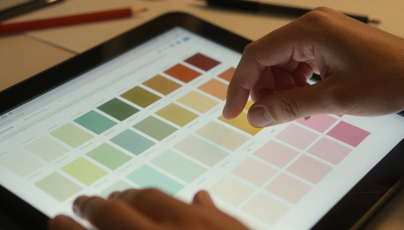
Why Colors Shift Between Design and Screen
The root of almost every color mismatch is this: your design tool and a web browser do not speak the same color language. When you design in Adobe Illustrator, InDesign, or even Canva, the software uses specific color models and profiles to represent colors internally. When that design is converted to a PDF and then rendered inside a browser as a flipbook, several translation steps happen. Each one is an opportunity for color to drift.
Three distinct phases exist where color can go wrong:
- The design phase: Color mode (RGB vs CMYK), working color space, and embedded ICC profiles all affect how colors are stored.
- The export phase: PDF export settings determine whether colors are converted, preserved, or flattened.
- The rendering phase: The browser and operating system's color management determines what actually appears on screen.
The RGB vs CMYK Problem
This is the single most common cause of color mismatch. CMYK (Cyan, Magenta, Yellow, Black) is the color model used for printing. It represents a smaller range of colors than what a screen can show. RGB (Red, Green, Blue) is what screens use.
When you design in CMYK (as print designers typically do) and then export to PDF, the PDF may contain CMYK color values. When a web browser encounters CMYK color data, it converts it to RGB using its own algorithm. That algorithm is rarely the same one your design software used. The result: colors shift.
⚠️ If your design was built in CMYK for a print project, always convert to RGB or sRGB before exporting for digital flipbook use.
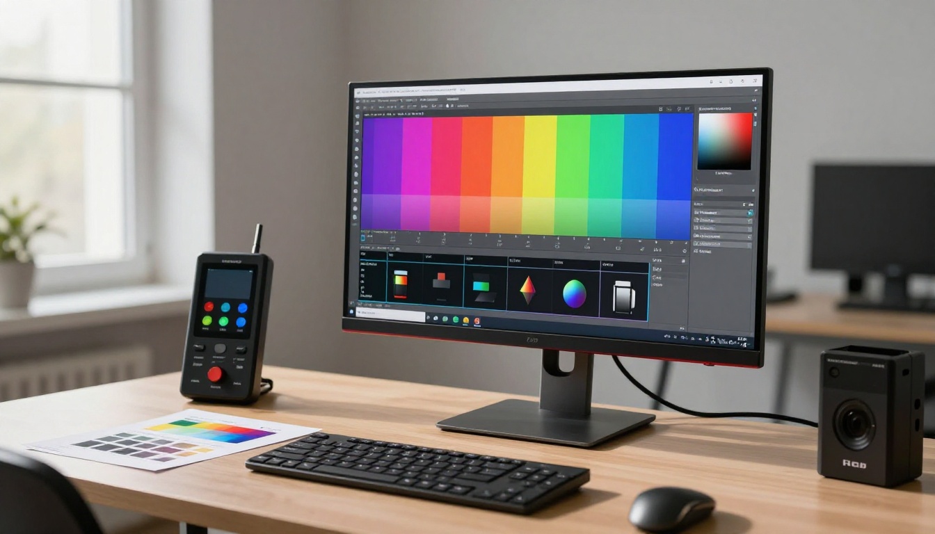
How Browsers Render Colors
Modern browsers are surprisingly inconsistent at color management. Some honor embedded ICC profiles in images and PDFs. Others ignore them entirely and assume everything is sRGB. When a browser encounters a color profile it does not recognize, it falls back to a generic conversion that rarely matches what you intended.
The operating system adds another layer. Windows, macOS, and mobile devices all have their own color rendering pipelines. A flipbook that looks perfect on your calibrated Mac may look washed out on a Windows laptop with a budget display.
💡 sRGB is the universal safe zone for digital content. It is the color space that virtually every browser, screen, and operating system handles consistently.
5 Root Causes of Color Mismatch
Knowing the specific cause of your mismatch lets you apply the right fix instead of guessing. Here are the five most common culprits.
1. Wrong Color Profile in PDF Export
When you export a PDF from design software, you choose (or your software chooses automatically) what happens to the embedded color profiles. If the wrong option is selected, colors will shift the moment the PDF is rendered in a browser.
Common mistakes:
- Exporting with "Convert to CMYK" when designing in RGB
- Leaving "Preserve Numbers" enabled without embedding the correct ICC profile
- Exporting to PDF/X-1a (a print standard that strips color profile data)
2. CMYK Source File
If your original design was built for print and uses CMYK values throughout, every color in your design is already outside the RGB color space. Some CMYK colors, particularly vivid cyans and purples, do not translate well to RGB and will always look slightly different on screen.
3. Embedded ICC Profile Mismatch
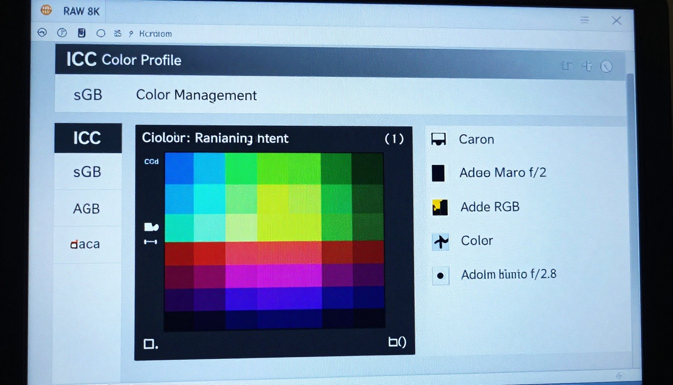
ICC profiles are small data packages embedded in images and PDFs that tell the rendering device how to interpret color data. If your design uses Adobe RGB (a wide-gamut color space) but the viewer's browser only supports sRGB rendering, colors will be compressed and appear less vivid.

4. Uncalibrated Monitor
Sometimes the problem is not the file at all. It is your screen. If you designed on an uncalibrated monitor, the colors you thought you were designing are not actually the colors in the file. When you view on a calibrated monitor or a client's screen, reality appears.
5. Image Compression Artifacts
PDFs often compress embedded images using JPEG compression, which can introduce subtle color shifts and banding. This is separate from color profile issues but compounds them, especially in gradients and soft shadows.
| Cause | Frequency | Difficulty to Fix | Fix Time |
|---|
| CMYK source file | Very common | Medium | 5-15 min |
| Wrong PDF export settings | Very common | Easy | 2-5 min |
| ICC profile mismatch | Common | Medium | 5-10 min |
| Uncalibrated monitor | Moderate | Hard | 30-60 min |
| JPEG compression artifacts | Moderate | Easy | 2-5 min |
How to Fix It in Your Design Software
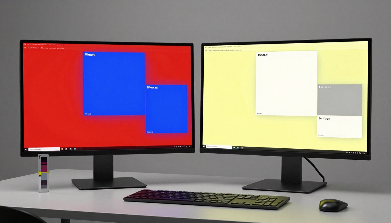
Adobe Illustrator and InDesign
These are the most powerful tools for color management, and also the most complex. Here is the exact workflow for color-accurate flipbook exports:
- Set Document Color Mode to RGB: In Illustrator, go to File > Document Color Mode > RGB Color. In InDesign, check your Swatches panel and make sure no swatch shows "CMYK" next to the color icon.
- Set your Working Color Space: Go to Edit > Color Settings. Set the RGB working space to sRGB IEC 61966-2.1. This is the web standard.
- Check all placed images: If you placed any CMYK images, select them and use Edit > Edit Colors > Convert to RGB.
- Export with correct settings: File > Export > Export As > PDF. In the export dialog, under "Output," set Color Conversion to "Convert to Destination" and Destination to sRGB IEC 61966-2.1. Set Profile Inclusion Policy to "Include Destination Profile."
✅ These four steps eliminate 90% of color shift issues for Illustrator and InDesign users.
Canva and Web-Based Tools
Canva designs are RGB-native by default, which is actually great for flipbook publishing. However, Canva's PDF export can still introduce issues.
- PDF Print vs PDF Standard: PDF Print uses higher quality but may embed different color profiles. For digital flipbooks, use PDF Standard or test both.
- Avoid "Flatten PDF": Some third-party Canva export tools flatten the PDF in ways that degrade color.
- Colors by Hex: If you are using brand colors, always define them by hex code in Canva rather than picking from palettes. Hex codes are inherently RGB and will transfer predictably.
Figma Color Accuracy
Figma operates entirely in sRGB, which means it is naturally aligned with web and screen rendering. However:
- Exported images: If you place external images in Figma with embedded ICC profiles, Figma may not honor those profiles during export.
- PDF export: Figma's built-in PDF export is basic. For flipbooks, export as high-resolution PNG or use a plugin that offers color-managed PDF export.
💡 Figma is inherently web-safe for color, making it one of the best tools for designing content destined for digital flipbooks.
How to Publish Color-Accurate Flipbooks
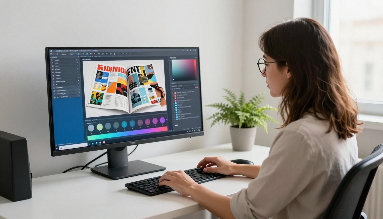
Upload the Right PDF
The single most impactful thing you can do is upload an sRGB-tagged PDF. When the flipbook platform receives an sRGB PDF, it renders it exactly as intended on virtually every screen without any conversion guesswork.
PDF checklist before upload:
Embedding vs. Converting Profiles
There is an important distinction between embedding a color profile and converting to it.
Embedding: The profile is included as metadata. The rendering device reads it and adjusts accordingly. This requires the viewer to support ICC profiles.
Converting: All color values in the document are mathematically translated to the target color space. The profile is no longer just metadata. This is the safer option for cross-device consistency.
For flipbooks viewed in browsers, converting to sRGB is almost always better than embedding and hoping the browser reads the profile correctly.
Comparing PDF Standards for Digital Use
| PDF Standard | Color Space Support | Best For | Flipbook Compatibility |
|---|
| PDF/X-1a | CMYK + Spot only | Print shops | Poor (strips ICC data) |
| PDF/X-3 | RGB + CMYK + ICC | Mixed use | Moderate |
| PDF/X-4 | Full ICC support, transparency | High-end print/digital | Good |
| PDF 1.4+ sRGB | sRGB | Digital publishing | Excellent |
| PDF/A | Archival, sRGB | Documents | Good |
⚠️ Never upload a PDF/X-1a for digital flipbook publishing. This format strips all ICC profile data and forces CMYK values that browsers will misinterpret.
Creating a Color-Accurate Flipbook on Flipbooks AI
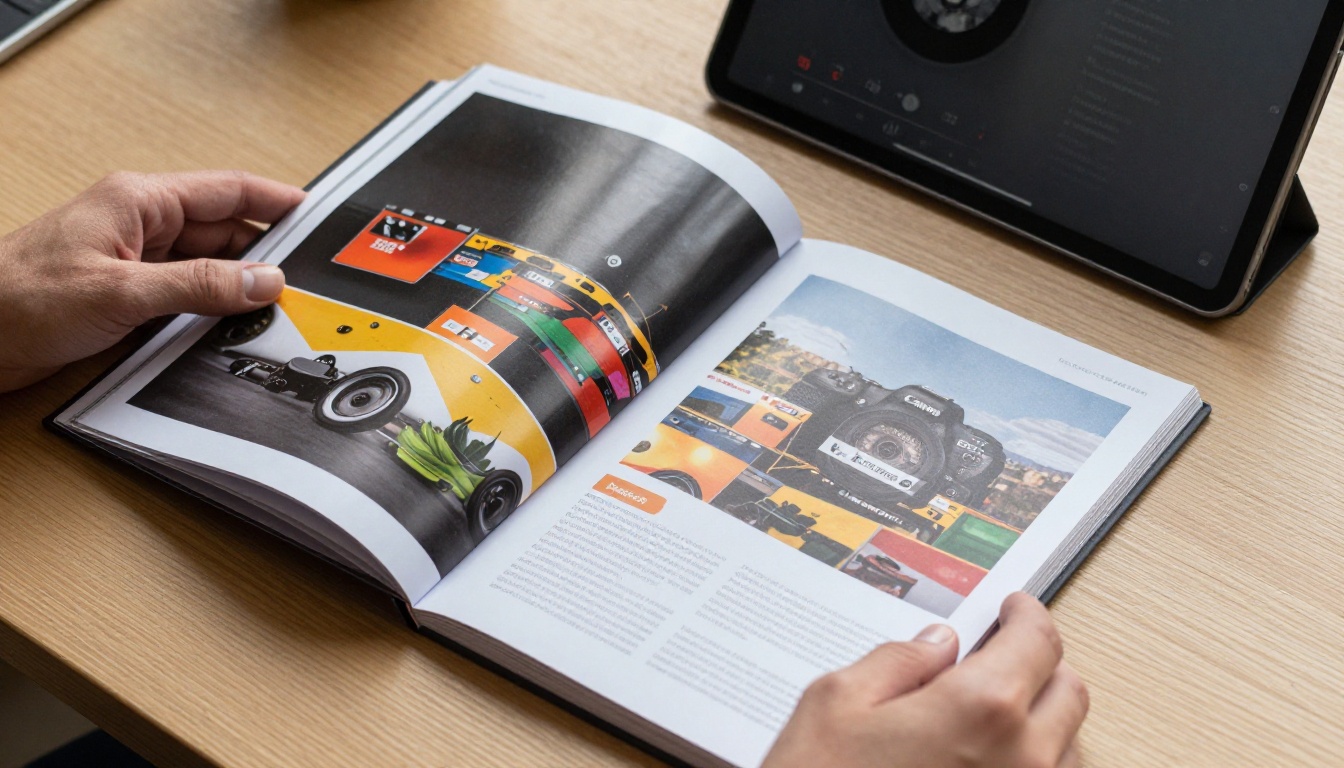
Flipbooks AI handles the rendering side as cleanly as possible, meaning the platform does not introduce its own color transformations. What you upload is what your viewers see. That puts the responsibility on the input file, which is the right place for it, because that is where you have full control.
Here is how to get perfect colors when using Flipbooks AI:
- Create an account at flipbooksai.com/account. The platform accepts PDF uploads directly.
- Prepare your PDF using the checklist above: RGB mode, sRGB color space, embedded sRGB profile, high-quality image compression.
- Upload your PDF: Drag and drop or browse to your file. The PDF to Flipbook Converter handles the conversion automatically.
- Preview your flipbook: Before sharing, open the preview in two different browsers and on a mobile device. If colors look consistent across all three, your file is clean.
- Check brand colors specifically: Look at your primary brand color in the flipbook against your brand color reference. If they match, you are done. If not, revisit your export settings.
- Apply custom branding: Flipbooks AI lets you set custom background colors, control colors, and branding elements. Match these to your exact hex codes for full consistency.
- Share or embed: Use embed options for websites, or share direct links. Both methods serve the same color-accurate file.
Available tools for specific content types:
What Flipbooks AI offers for color-sensitive work:
- ✅ No watermarks on any published content
- ✅ Mobile-responsive rendering preserves your color-accurate PDF
- ✅ Custom branding lets you control UI colors by exact hex values
- ✅ Unlimited flipbooks (Standard plan and above)
- ✅ Analytics available on Professional plan
Why Some Colors Will Always Look Different
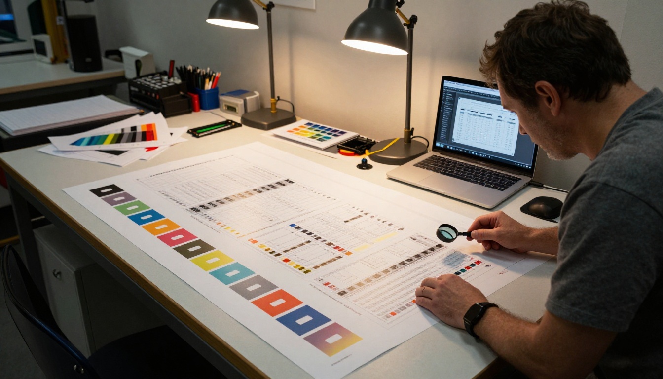
There is an honest truth about color management that design software companies and publishing platforms rarely say plainly: some colors simply cannot be reproduced accurately on every screen, ever.
The reasons are physical, not technical:
- Screen gamut limits: Budget laptop screens display roughly 60-70% of the sRGB color space. Professional monitors display 99-100%. A color that looks perfect on your studio monitor may look washed out on a viewer's budget laptop, not because anything is wrong with your file.
- Panel technology: OLED screens render colors differently than IPS LCD panels. Both are "correct" by their own standards but look different in practice.
- Ambient lighting: A screen viewed in a brightly lit room looks washed out compared to the same screen in a dark room. Color perception is relative to surroundings.
- CMYK-exclusive colors: Some printing inks, particularly vivid greens and certain oranges, fall outside the RGB color gamut entirely. They cannot be accurately represented on any screen. If your design relied on specific Pantone inks, the screen version will always be an approximation.
This does not mean you should give up on color accuracy. It means you should optimize for the largest audience: sRGB coverage on a calibrated display, then accept that extreme edge cases will always vary.
💡 Design your digital-first content in sRGB from the start. This ensures consistency for the majority of your audience while avoiding conversion-induced shifts.
| Design Tool | Default Color Mode | Flipbook-Safe? | Recommended Export |
|---|
| Adobe Illustrator | CMYK or RGB (your choice) | Yes, if set to RGB | PDF with sRGB conversion |
| Adobe InDesign | RGB recommended | Yes, if configured | PDF/X-4 or standard sRGB PDF |
| Canva | RGB | Yes | PDF Standard |
| Figma | sRGB | Yes | PDF or high-res PNG |
| Adobe Photoshop | RGB (sRGB default) | Yes | Save as sRGB |
| Microsoft Publisher | RGB | Mostly | PDF export (verify profile) |
| Google Slides | sRGB | Yes | PDF |
| Affinity Publisher | RGB or CMYK (your choice) | Yes, if RGB | PDF with sRGB intent |
Your Color Accuracy Checklist
Before publishing any flipbook, run through this checklist to catch color issues before your audience does:
In your design tool:
During PDF export:
After upload:
Get Your Flipbook Looking Exactly Right

Color mismatches between your design and your flipbook are frustrating precisely because they are invisible during the design phase. Everything looks right until you publish. Now that you know where the problem originates, you can fix it at the source rather than chasing symptoms.
The practical path forward: convert your files to sRGB before export, use the right PDF export settings for digital publishing, and test across multiple devices before sharing. If you have already published a flipbook with incorrect colors, re-export the corrected PDF and replace the file on the platform.
Ready to publish your next flipbook with colors that actually match your design? Create your account on Flipbooks AI and use the PDF to Flipbook Converter to upload a properly prepared file. Browse all available tools to find the right format for your content, from product catalogs to digital lookbooks. Compare pricing plans to choose what works for your publishing volume.
Your audience deserves to see exactly what you designed.



