Two brands, two opposite instincts, one shared result: catalogs people actually keep on the coffee table. IKEA fills pages with lived-in rooms and clear prices, while Muji removes almost everything until a single object can breathe. If you sell sofas, shelves or dining sets, you can borrow from both, and today you can publish the result as an interactive flipbook with Flipbooks AI instead of paying for print runs.
This article walks through the layout habits behind both catalogs, compares them side by side, and turns them into a practical build plan for your own furniture brand.
Why These Two Brands Work
IKEA and Muji look nothing alike, yet both solve the same problem: furniture is hard to imagine from a single product photo. A buyer needs scale, context and confidence about price, all within a few seconds of looking at a page.
IKEA answers with abundance. Every spread is a staged room, and every object inside it carries a name, a price and a short line of useful detail. Muji answers with restraint. Pages are quiet, the palette is neutral, and the product description reads like a calm fact sheet.
Here is the short version of what each one teaches:
- IKEA teaches context. Show the sofa in a living room, not on a white void.
- Muji teaches focus. Remove anything that does not help the buyer decide.
- Both teach consistency. Same grid, same type, same photo style on every page.
💡 You do not have to pick a side. The strongest furniture catalogs use IKEA-style room sets for inspiration pages and Muji-style product pages for decision pages.
Lesson One: Sell the Room First
The IKEA catalog is famous for its room sets. A reader opens a page and sees a complete kitchen, a child's bedroom or a home office. The products are almost secondary, which is exactly why they sell: the buyer is picturing their own life.
Build Scenes, Not Lineups
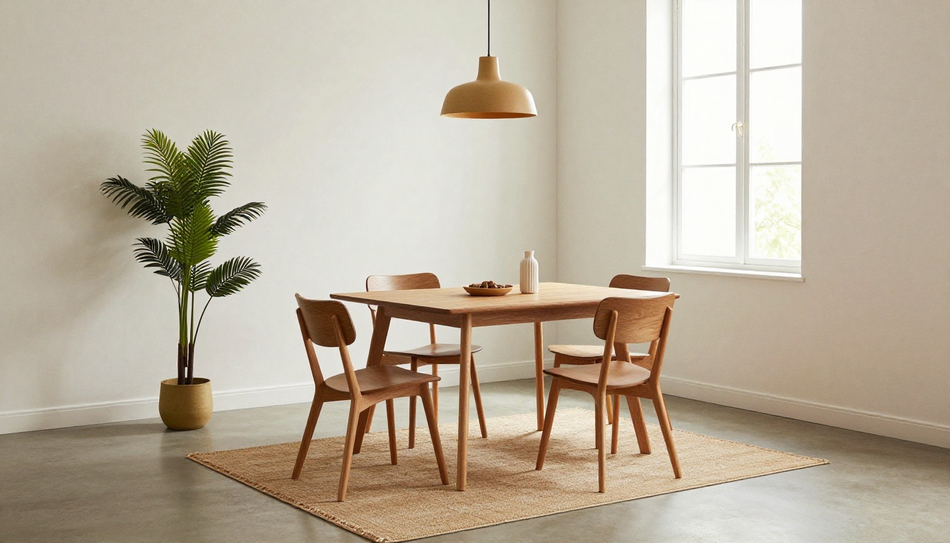
A lineup of ten chairs on white forces the reader to compare. A scene with one chair, one table and one lamp lets them imagine. Plan your catalog around moments:
- The small apartment living room.
- The shared kids' room.
- The work-from-home corner.
- The entryway that always gets cluttered.
Show Real Scale
Include a familiar object for size: a mug, a book stack, a plant. Buyers mentally measure against what they know. A sofa beside a coffee cup communicates more than a dimension label alone.
Tag Products Inside the Scene
IKEA numbers or names each item inside the photo. In a digital version, use clickable hotspots or small captions that link to the product page. That small detail turns an inspiration page into a shopping page.
Lesson Two: Let White Space Do the Selling
Muji pages feel calm because they leave a lot of nothing. One product, a wide margin and a short caption. The emptiness signals quality and keeps the eye on the object.

Practical Spacing Rules
- Keep at least 15 percent of every page empty.
- Limit each page to one hero product and up to three supporting items.
- Use a single typeface family with two weights.
- Choose one accent color and use it sparingly.
Muji-Style Captions
Muji writes captions like a label, not an advertisement. Compare these two approaches:
| Caption style | Example | Effect on reader |
|---|
| Hype-driven | "The ultimate sofa for your dream living room!" | Feels like an ad, invites doubt |
| Muji-style | "Three-seat sofa. Cotton-linen cover, washable. 190 cm wide." | Feels honest, easy to trust |
✅ Best practice: write captions that answer three questions, what is it, what is it made of, and how big is it.
Lesson Three: Price Clarity Beats Price Tricks
Both brands put prices where the eye expects them. IKEA makes the number large, and Muji keeps it small but always present. Neither hides cost behind a "contact us" wall.

Where to Place Prices
- Directly under the product name, never on a separate page.
- In the same position on every spread.
- With the currency symbol and no more than two decimals.
Show Variants Without Clutter
A sofa in four colors does not need four photos. Show one image and list the swatches as small color chips with the price range. This keeps pages light and answers the "does it come in grey" question immediately.
Lesson Four: Modular Thinking on the Page
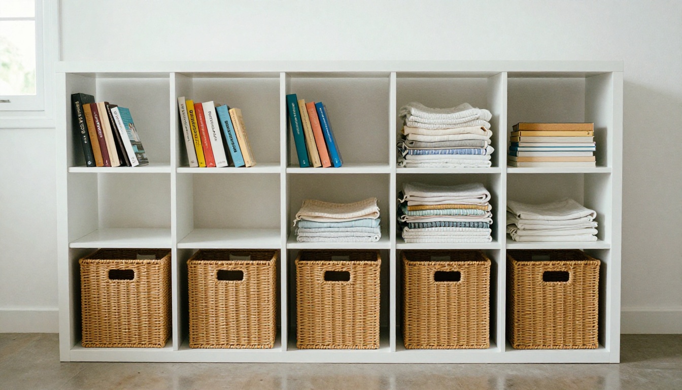
IKEA sells systems: shelves that grow, wardrobes that combine, sofas that rearrange. The catalog mirrors that idea by presenting a base unit and then showing add-ons.
A Simple Modular Page Template
- Large photo of the finished configuration.
- Base unit with price and size.
- A short row of add-ons with individual prices.
- A total for the shown combination.
That fourth step matters. Buyers love seeing "this whole setup costs X" because it lowers the fear of hidden extras.
Why Modular Pages Raise Order Value
When a reader sees a base unit plus three add-ons, the extras feel like natural next steps rather than upsells. It is the same psychology IKEA uses in its showrooms, translated to paper and screen.
Lesson Five: Explain Assembly Before They Ask
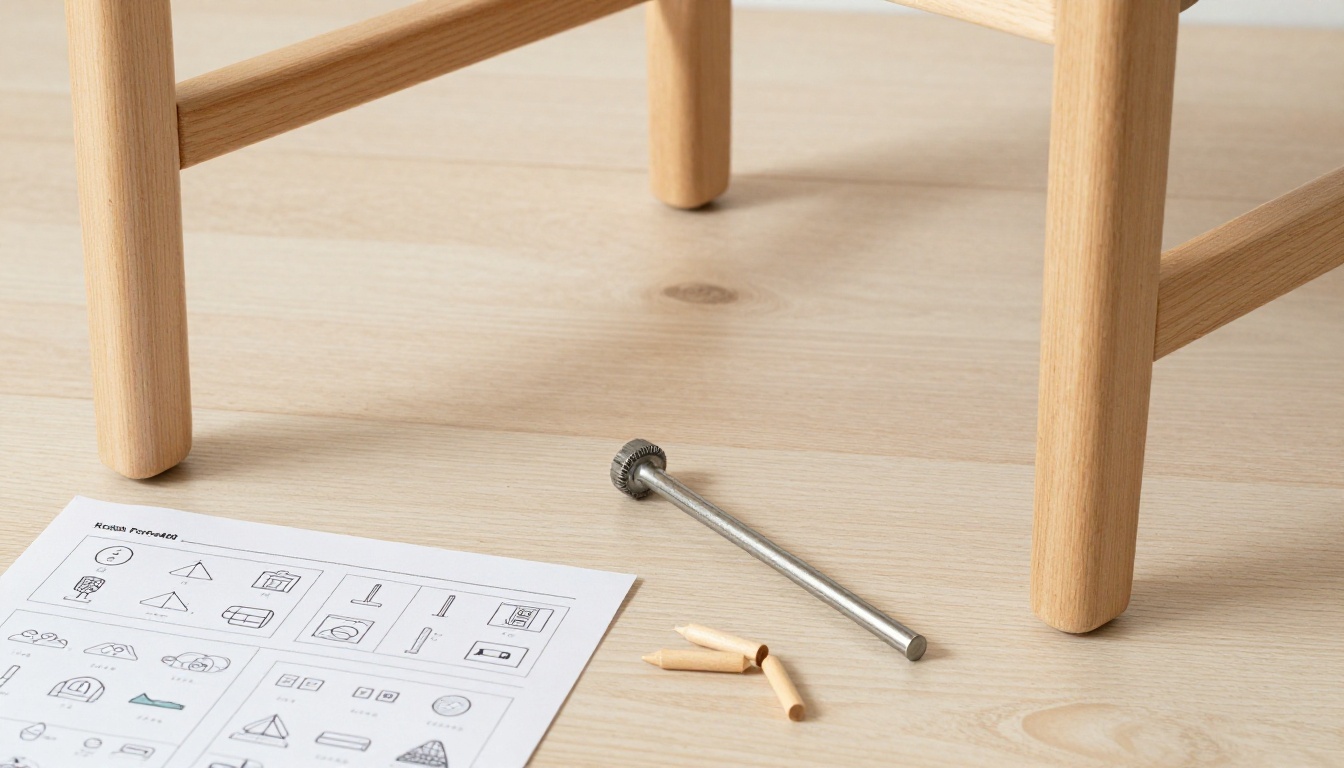
Flat-pack furniture comes with a worry: "Can I build this?" IKEA answers with wordless pictograms. You can answer the same worry inside your catalog.
Add a Small Assembly Strip
Under each product, include:
- Estimated build time (for example, 25 minutes).
- Number of people needed.
- Tools included or required.
This tiny strip removes a major objection and costs almost no space.
Link Out for Details
In a digital catalog you can embed a short assembly video or link a PDF manual. Flipbooks AI lets you embed videos and audio directly in the page, so the buyer never leaves the catalog.
Side-by-Side: What to Copy From Each
| Design element | IKEA approach | Muji approach | Best use in your catalog |
|---|
| Photography | Busy, lived-in room sets | Single product, neutral background | Rooms for inspiration, clean shots for details |
| Color palette | Bright, varied accents | Beige, white, grey, natural wood | Neutral base with one accent |
| Typography | Bold, friendly, large prices | Small, quiet, consistent | Bold prices, quiet descriptions |
| Product naming | Named items with codes | Plain descriptive names | Descriptive name plus code |
| Page density | High, many items | Low, few items | Mix by page purpose |
| Tone | Practical, playful | Calm, factual | Factual with light warmth |
Lesson Six: Photograph Like a Home, Not a Warehouse
The images in both catalogs share a rule: natural light, real materials, believable clutter. Nothing looks plastic.
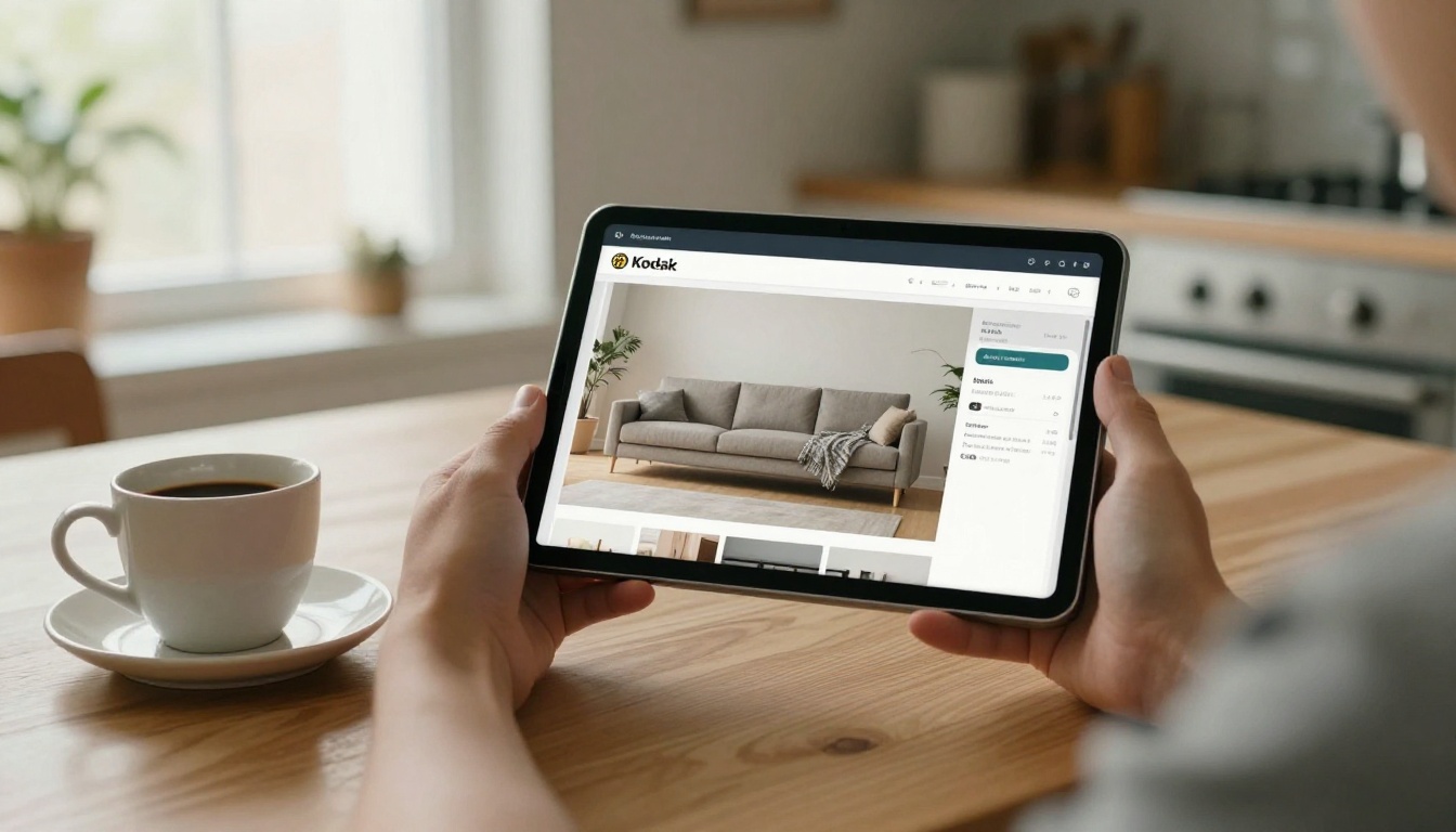
A Photography Checklist
- Shoot near large windows or use soft, diffused light.
- Show texture: linen weave, wood grain, matte metal.
- Use props that suggest daily life, such as a folded blanket or a stack of books.
- Keep the camera at human eye height for most room shots.
- Shoot at least one close-up of material per product.
Keep Style Consistent
Consistency is what makes a catalog feel like a brand. Pick one lighting direction, one color grade and one crop ratio, then apply them to every photo. Readers notice mismatched pictures even if they cannot say why.
Lesson Seven: Organize by How People Live
IKEA groups by room and Muji groups by function. Neither organizes by manufacturer or material, because shoppers do not think that way.

Suggested Chapter Structure
| Chapter | What it contains | Page style |
|---|
| Living | Sofas, tables, shelving | Room sets plus product detail |
| Sleeping | Beds, mattresses, bedside tables | Calm, Muji-like spreads |
| Working | Desks, chairs, storage | Modular layouts |
| Dining | Tables, chairs, lighting | Room sets with price tags |
| Storage | Boxes, racks, hooks | Dense grid, many items |
Add a clickable table of contents on page two so readers can jump to their room instantly. This is one of the biggest advantages of a digital format over print.
How to Build This Catalog With Flipbooks AI
If your furniture line is ready, here is a straightforward way to publish it. The Furniture Catalog Maker is built for exactly this job.

Step-by-Step Tutorial
- Create your account. Go to Flipbooks AI and sign up.
- Prepare your PDF. Export your layout from InDesign, Canva or any design tool at 150 to 300 dpi.
- Upload and convert. Drop the file into the PDF to Flipbook Converter. The pages become a page-turning flipbook in moments.
- Customize the look. Add your logo, choose background colors that match your palette, and set page-turn effects. A soft, subtle effect suits Muji-style catalogs, while a quicker flip suits IKEA-style ones.
- Add multimedia. Embed assembly videos, ambient audio or product demos.
- Link products. Place clickable areas over items so buyers can jump to your shop.
- Share. Copy the direct link, use an embed code on your site, or set a password for trade-only price lists.
Features Worth Using
- ✅ No watermarks, ever.
- ✅ Mobile-responsive design, so the catalog reads well on phones.
- ✅ Password protection for wholesale versions.
- ✅ Offline downloads for showroom visits with poor signal.
- ✅ Custom branding on every page.
💡 Professional plan users also get analytics and lead generation. You can see which room pages get the most views and capture emails from serious buyers. Compare options on the pricing page.
Common Mistakes to Avoid
Copying a famous brand can go wrong. Watch for these traps:
- Copying IKEA density without IKEA photography. Busy pages need excellent images or they look messy.
- Copying Muji emptiness without strong products. White space exposes weak design.
- Mixing too many fonts. Both brands are disciplined with type.
- Forgetting mobile. Over half of catalog views happen on phones, so test every page on a small screen.
- Hiding prices. Readers leave when they cannot find the cost.
A Quick Planning Table
Use this to decide how to allocate pages in a 40-page catalog:
| Page type | Pages | Inspired by | Purpose |
|---|
| Cover and welcome | 2 | Muji | Set the tone |
| Room set spreads | 12 | IKEA | Inspire |
| Product detail pages | 16 | Muji | Help decide |
| Modular system pages | 6 | IKEA | Raise order value |
| Care, delivery and returns | 2 | Both | Build trust |
| Contact and next steps | 2 | Muji | Convert |
Real-World Examples
A small sofa studio replaced a 60-page printed brochure with a 32-page flipbook. By cutting dense text and adopting Muji-style product pages, the team shortened the buying path and linked each sofa straight to checkout.
A regional kitchen retailer built IKEA-style room sets for six kitchen layouts, tagged each cabinet with a price and shared the catalog by email. Because the flipbook updates instantly, they swapped seasonal prices without reprinting anything.
An office furniture dealer protected a trade version with a password and a public version without prices, both from the same source file.
If your business sells in a related category, you may also like the Digital Catalog Maker and the Product Catalog Generator.
Your Next Step
Pick one lesson from this article and apply it to your next catalog page: a room set, a quiet product page or a modular price box. Then publish it and watch how readers respond.
Ready to build? Get started for free on Flipbooks AI, browse all flipbook tools, or compare pricing plans to pick the right fit for your furniture brand.



