Walk into almost any good hotel room and you will find a thick binder, a leather folder or a QR card that is supposed to answer every question a guest could have. Most of them fail. They are cluttered, outdated and nobody reads them. The best hotel compendium examples do the opposite: they are short where it counts, visual where it helps, and always current. This article breaks down what those winning examples have in common, so you can copy the structure and publish your own version with Flipbooks AI.
What a Hotel Compendium Really Is
A hotel compendium is the single document that collects everything a guest needs during a stay: Wi-Fi details, service hours, dining, spa, local tips, safety information and house rules. Some properties call it a directory, a room book or a welcome booklet. The name matters less than the job: remove friction before it becomes a phone call to the front desk.
Think of it as a quiet concierge that lives in the room. When it works, call volume drops, in-house sales rise and reviews mention how "easy" the stay felt.
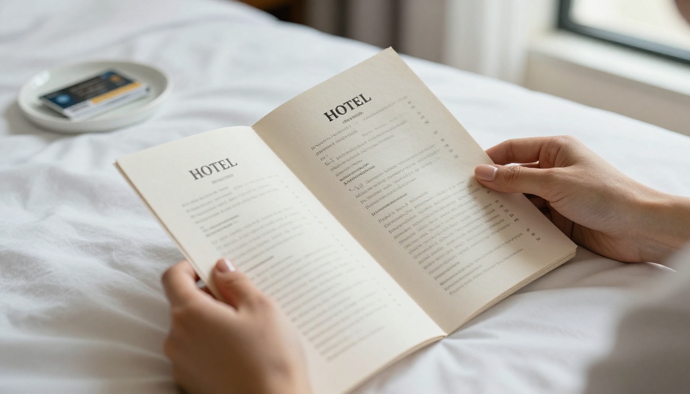
Print, Digital or Both
The strongest properties no longer pick one. A slim printed card points to a digital version that can be updated in minutes. Here is how the formats compare:
| Format | Update Speed | Cost per Room | Guest Preference | Best For |
|---|
| Printed binder | Slow (reprint) | High | Older guests | Luxury resorts with a heritage feel |
| PDF download | Medium | Low | Mixed | Small inns |
| Digital flipbook | Instant | Very low | Most guests | Hotels of any size |
| Hybrid (QR card + flipbook) | Instant | Low | Nearly everyone | Boutique and city hotels |
💡 Pro tip: Keep one printed page in the room: Wi-Fi, breakfast hours and the front desk extension. Everything else can live behind a QR code.
Who Reads It and When
Guests open the compendium at three moments: right after check-in, at breakfast time and late in the evening when they want something. Design for those three moments and the rest falls into place.
Example 1: The Welcome Spread
The best openers are two pages, not twenty. A short welcome from the general manager, a photograph of the property and a one-glance panel of essentials: Wi-Fi name and password, breakfast hours, checkout time, front desk number.
What to Copy
- A warm, short note of 60 words or fewer
- Wi-Fi details in large type, not buried on page 9
- A tiny map or floor diagram showing the elevator, gym and pool
- One photograph that signals the style of the hotel
What to Skip
- Long brand history
- Legal text on the first spread
- Stock photos that do not match your real rooms
Housekeeping, laundry, late checkout, extra pillows, airport transfers. Good compendiums list these as a simple table with the request method next to each one, so the guest never has to guess whom to call.
| Service | Hours | How to Request | Cost |
|---|
| Housekeeping | 8:00 to 17:00 | Door hanger or dial 2 | Free |
| Laundry | Same day before 10:00 | Dial 3 | Per item |
| Extra bedding | 24 hours | Dial 0 | Free |
| Airport transfer | 24 hours, book 12 hours ahead | Concierge | Fixed rate |
| Late checkout | Until 14:00 | Front desk | Varies |
✅ Best practice: Put prices where guests can see them. Hidden fees create complaints; visible ones create trust.
Make the Phone Numbers Tappable
In a digital version, every extension and email can be a tap-to-call or tap-to-write link. This one change turns a passive page into a working tool.
Example 3: Dining That Sells
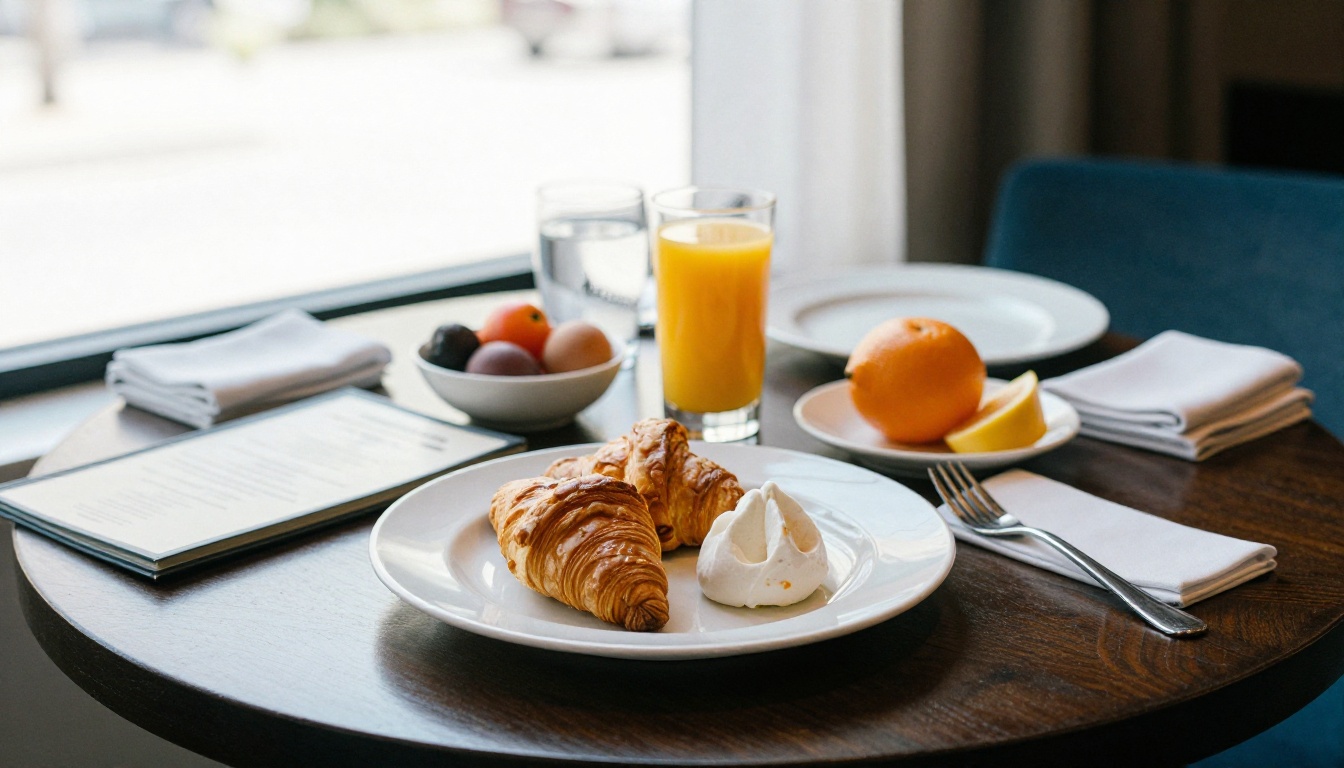
Room-service menus are the most opened pages in any compendium, so they deserve the best design. The examples worth copying use large food photography, short descriptions and clear dietary icons. Resist the urge to list 80 dishes. A tight menu of 20 to 30 items reads faster and sells better.
Layout Rules That Work
- Lead with the most profitable dishes, not the cheapest.
- Use one photograph per section, not per dish.
- Mark vegetarian, vegan and gluten-free options with small icons.
- State delivery times and the tray fee honestly.
- Add a QR link to the full restaurant menu for guests who want more.
If you want a head start, the Restaurant Menu Creator and the Menu Flipbook Designer turn a PDF menu into a page-turning experience guests can open from the room.
Example 4: The Spa and Wellness Section
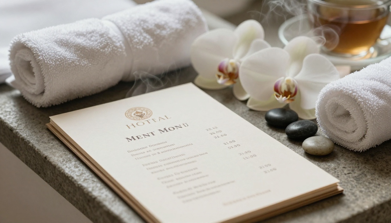
Spa pages work when they feel like the spa: calm, spacious and unhurried. Leave generous white space, use soft natural photography and group treatments by goal (relax, recover from travel, couple time) rather than by technical name.
| Section Element | Weak Version | Strong Version |
|---|
| Treatment title | "Hot Stone Therapy Session" | "Slow Evening Reset, 60 min" |
| Description | Three long sentences | One sentence plus duration |
| Booking | "Call the spa" | Tap to book, with live hours |
| Photography | Generic model smiling | Real treatment room, natural light |
The Spa & Wellness Menu tool is built for exactly this page, and it keeps your branding consistent with the rest of the compendium.
💡 Pro tip: Add a "most booked" tag to one treatment. Social proof works inside a booklet just as it does on a website.
Example 5: Local Tips Written Like a Friend
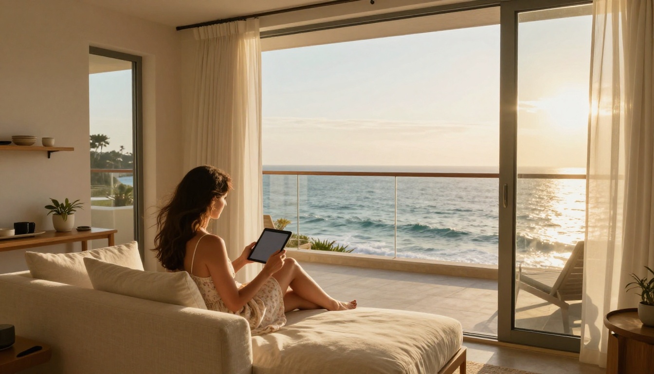
Generic "attractions" lists are filler. The examples guests screenshot are written in a human voice: "Best coffee within five minutes: turn left at the lobby, ask for the cortado." Staff picks, walking times and a small map beat a long list of landmarks every time.
A Simple Structure for Local Pages
- Eat: three places for three budgets
- Walk: one morning route and one sunset route
- See: two must-do spots and one hidden favorite
- Skip: one honest warning about a tourist trap
If your property is a destination in itself, a Travel Guide Flipbook can hold the whole neighborhood story, with photographs and routes.
Example 6: Safety and House Rules, Done Kindly
Nobody enjoys reading rules, yet they are required. The best compendiums keep them short, friendly and visual. Instead of a wall of text, they use icons and plain sentences: "Quiet hours start at 22:00. Thank you for sharing the building with neighbors."
Information That Must Be Easy to Find
| Topic | Where It Belongs | Format |
|---|
| Emergency exits | Back of the room door and page 2 | Floor diagram |
| Quiet hours | Welcome spread | One sentence |
| Smoking policy | House rules page | Icon plus text |
| Safe and minibar | Room amenities page | Photo with arrows |
| Medical help | Safety page | Phone numbers, tappable |
⚠️ Warning: Safety content changes with regulations. A digital version means you correct it once and every room is updated immediately.
How to Build Yours with Flipbooks AI
You do not need a design agency. A flipbook version of your compendium can be live in an afternoon. Here is the process.
Step-by-Step Tutorial
- Sign up. Create your account at Flipbooks AI.
- Prepare the PDF. Design the pages in Canva, InDesign or Word and export a PDF. The Hotel Brochure tool is a handy starting point.
- Upload and convert. Drop the file into the PDF to Flipbook Converter. Pages become a smooth page-turn booklet in seconds.
- Customize. Add your logo, brand colors and page effects. Embed a short welcome video of the lobby or the pool, plus ambient audio if it fits your style.
- Share. Copy the direct link, print it as a QR code for the nightstand, or use the Embed Flipbook on Website option to place it on your booking page.
- Protect when needed. Use password protection for staff-only manuals or for suites reserved for VIP guests.
- Measure. With the Professional plan, analytics show which pages guests open and where they stop, and lead generation captures emails from direct bookings. See the pricing plans for details.

Why Flipbooks Beat Plain PDFs
| Feature | PDF | Flipbooks AI |
|---|
| Page-turn feel | No | Yes |
| Mobile responsive | Poor | Yes |
| Watermarks | n/a | None, ever |
| Embedded video and audio | No | Yes |
| Password protection | Limited | Yes |
| Analytics | No | Professional plan |
| Offline download | Yes | Yes |
| Instant updates | No | Yes |
✅ Best practice: Keep the same link forever. Update the flipbook behind it and every printed QR code stays valid.
Example 7: The Mobile-First Nightstand Card
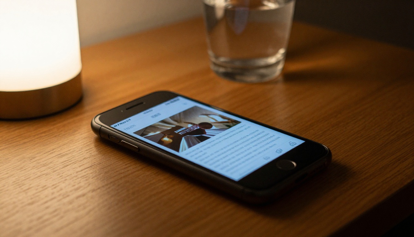
The newest trend among small hotels is the QR card on the nightstand. A single card, one scan, and the full compendium opens on the guest's phone. No app to download, no login, no friction.
Where to Place the QR Code
- Nightstand, so it is reachable from bed
- Desk, for work-related questions
- Bathroom mirror card for amenities
- Lobby and elevator, for arrivals
Because a flipbook is mobile responsive, text stays readable on small screens, and large buttons make taps easy. This is where hotels see the biggest drop in reception calls.
Example 8: Seasonal Add-Ons
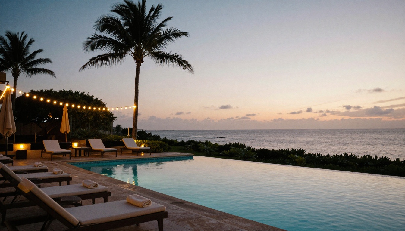
Pool hours in July are not pool hours in January. Great compendiums include a seasonal page that rotates: summer terrace events, winter holiday menus, spring tours. With printed binders, this means reprints. With a flipbook, it means one edit.
| Season | Page to Update | Typical Content |
|---|
| Spring | Events and tours | Garden walks, local festivals |
| Summer | Pool and terrace | Hours, cocktail menu, towels |
| Autumn | Dining | Harvest menu, wine tastings |
| Winter | Holiday offers | Special dinners, fireplace lounge |
Example 9: The Arrival Moment
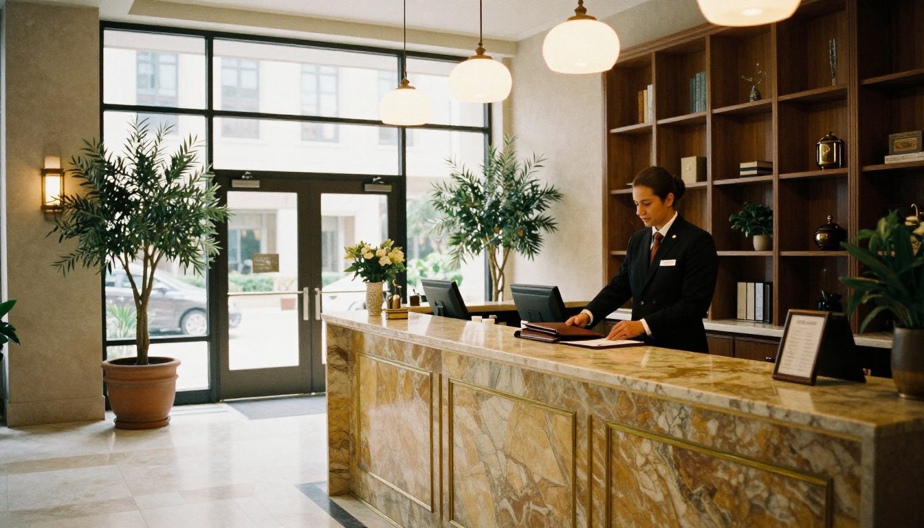
Some hotels place a printed welcome card at the lobby desk, and the same document opens in the lobby on a tablet. Staff can flip through it with guests during check-in, pointing to the spa and breakfast pages. It turns a routine handover into a small sales moment.
Check-In Script That Pairs With It
- Greet and confirm the booking.
- Open the compendium on the tablet to the welcome spread.
- Point to two highlights: breakfast and the evening event.
- Share the QR code for the room.
Common Mistakes to Avoid
Even the best layouts fall apart if these traps are ignored.
- Too many pages. Aim for 12 to 24 pages. If it needs more, split it into chapters with a clear table of contents.
- Tiny type. Body text under 11 pt is unreadable in dim rooms.
- Outdated content. One wrong breakfast time creates a bad review. Review monthly.
- No visual rhythm. Alternate full-image pages with text pages.
- Inconsistent branding. Use the same two fonts and three colors on every page.
⚠️ Warning: Never copy another hotel's photographs or text. Copy the structure, then fill it with your own property and your own voice.
Quick Checklist Before You Publish
| Item | Done? |
|---|
| Welcome note under 60 words | ☐ |
| Wi-Fi and key numbers on page 2 | ☐ |
| Services table with prices | ☐ |
| Dining with photos and dietary icons | ☐ |
| Spa page with booking link | ☐ |
| Local tips written by staff | ☐ |
| Safety page reviewed | ☐ |
| QR code tested on iOS and Android | ☐ |
| Analytics turned on | ☐ |
Start Building Your Own
The hotel compendium examples above share one idea: respect the guest's time. Short pages, honest information, beautiful photographs and a format that stays fresh. You can copy that structure today.
Ready to publish yours? Get started for free on Flipbooks AI, browse all flipbook tools for brochures, menus and travel books, or compare pricing plans to pick the one that fits your property.



