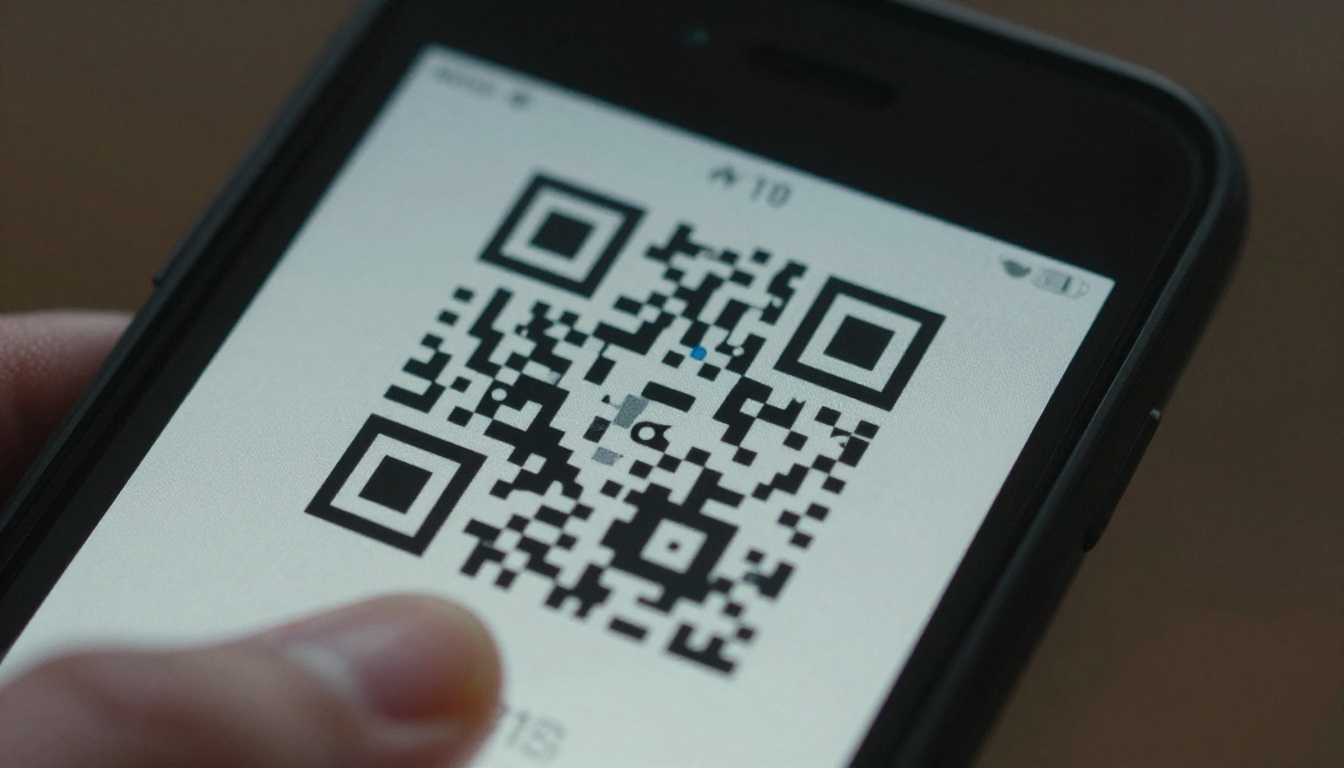
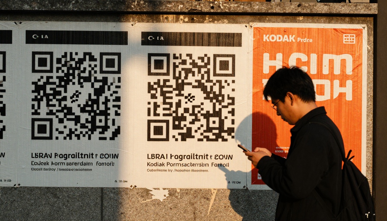
You designed a beautiful flyer, picked the perfect headline, dropped in a QR code, and then nobody scanned it. The usual culprit is not the offer or the layout. It is size. A code that is too small, too crowded or placed too far from the reader's eyes simply fails, and every failed scan is a lost lead. This article gives you exact measurements for flyers, posters and banners, the one rule behind them, and a short test routine. If you also want the scan to land on something better than a plain PDF, you can pair your print piece with an interactive page built on Flipbooks AI.
The Short Answer
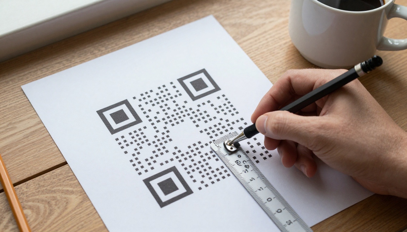
For most printed flyers, a QR code should be at least 2 x 2 cm (0.8 x 0.8 inches), and 2.5 to 3 cm is the comfortable range for an A5 or A4 handout. For posters, the size depends on how far people stand when they scan. That brings us to the rule that settles almost every sizing question.
The 10 to 1 Rule
Divide the expected scanning distance by ten. The result is the minimum width of the code.
- Reader holds a flyer at 30 cm: code width of 3 cm
- Reader stands 1 metre from a poster: code width of 10 cm
- Reader stands 3 metres from a window display: code width of 30 cm
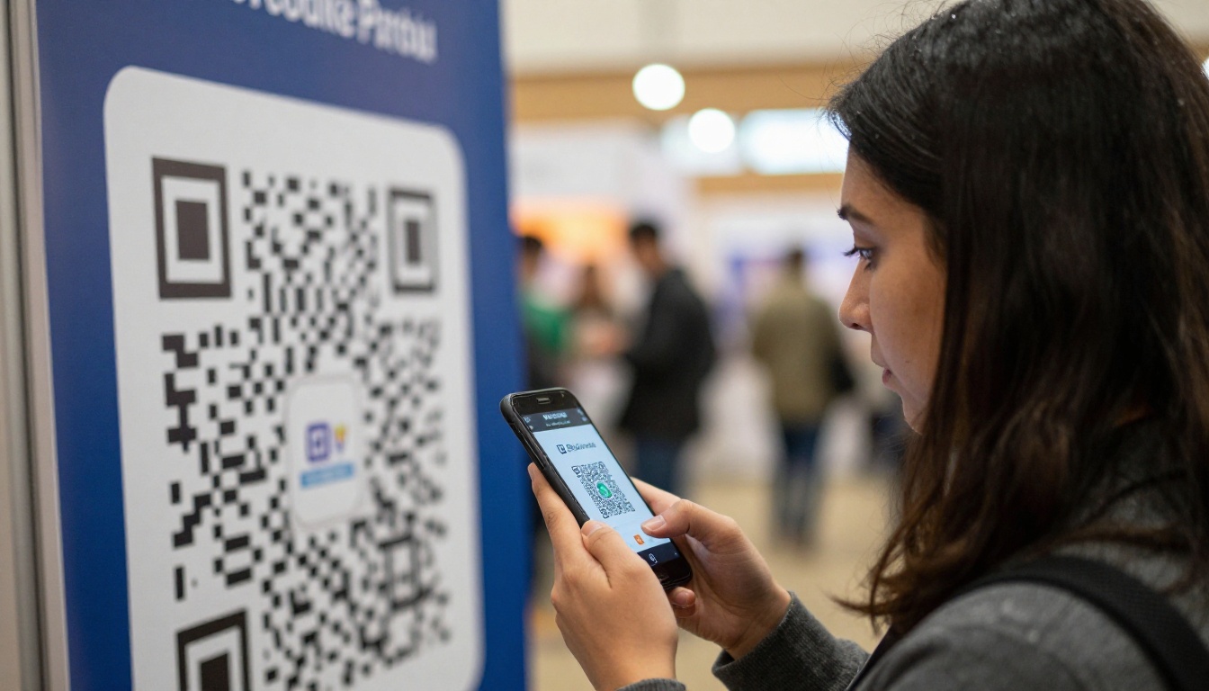
Phone cameras are good, but they need enough pixels per module (the little squares inside the code) to tell black from white. The farther the camera is, the fewer pixels each module gets, so the code must be physically larger.
💡 Pro tip: Think about where the reader's feet will be, not where the poster hangs. A poster above a counter is scanned from the queue, which is often two metres away.
Absolute Minimum Sizes
Smaller codes can work, but only under perfect conditions: a simple code, high contrast, matte paper and a steady hand. Treat these as floors, not targets.
| Print item | Absolute minimum | Recommended |
|---|
| Business card | 1.5 cm | 2 cm |
| Postcard or A6 flyer | 2 cm | 2.5 cm |
| A5 flyer | 2 cm | 3 cm |
| A4 flyer or brochure | 2.5 cm | 3.5 cm |
Here is the practical chart most designers want. It assumes a short URL, a standard black code on a white background and normal indoor lighting.
Flyers and Handouts
Flyers are held in the hand, so the distance is short, usually 25 to 40 cm. That is why 2.5 to 3.5 cm works. Do not be tempted to go bigger just because there is empty space. A huge code on a small flyer pushes out your message and can look like a coupon you do not want to scan.
Placement matters as much as size. Put the code in a bottom corner or at the end of the reading path, right after the call to action. Add a short instruction such as "Scan to see the menu" so people know what they get.
Posters and Banners
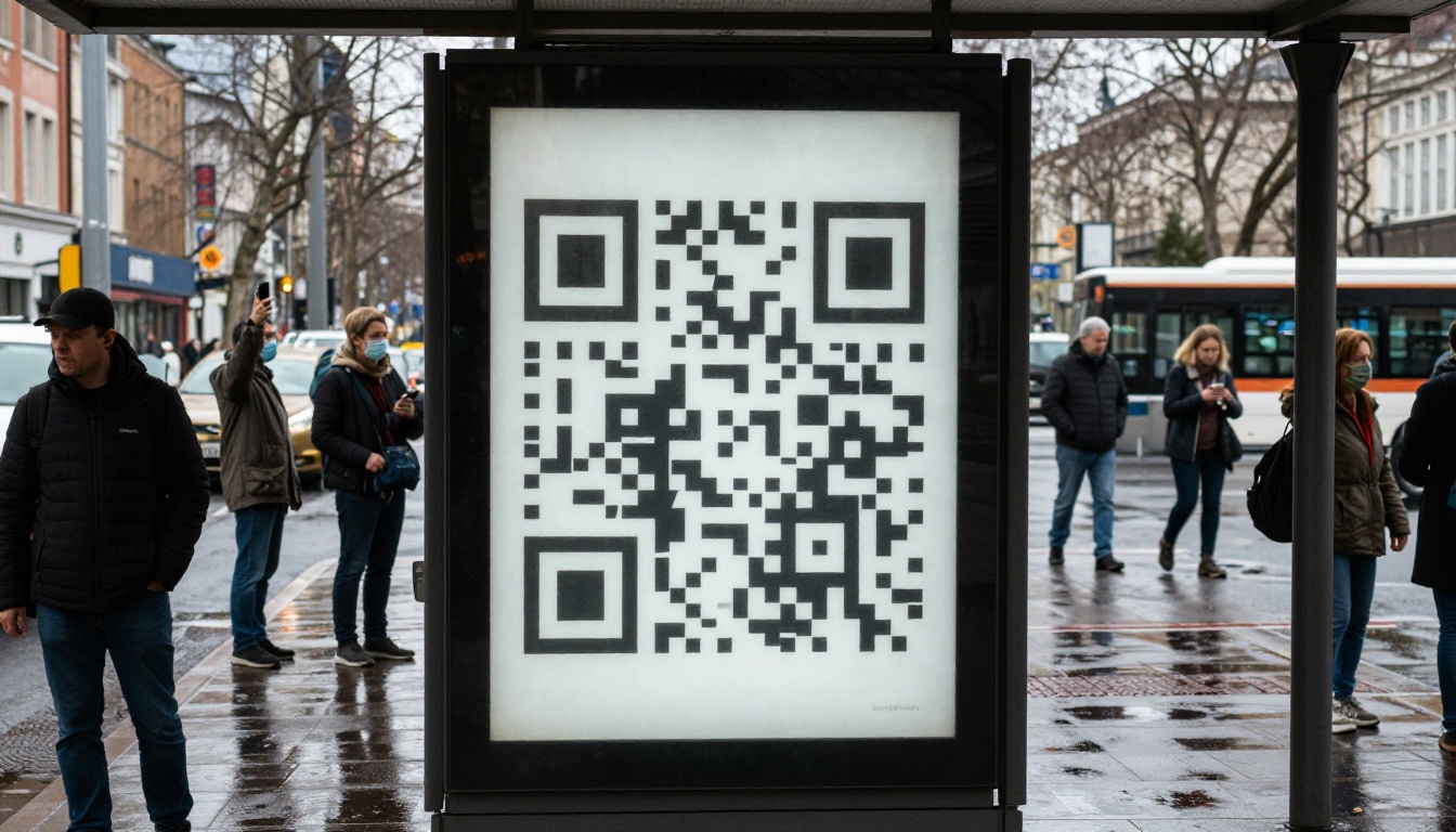
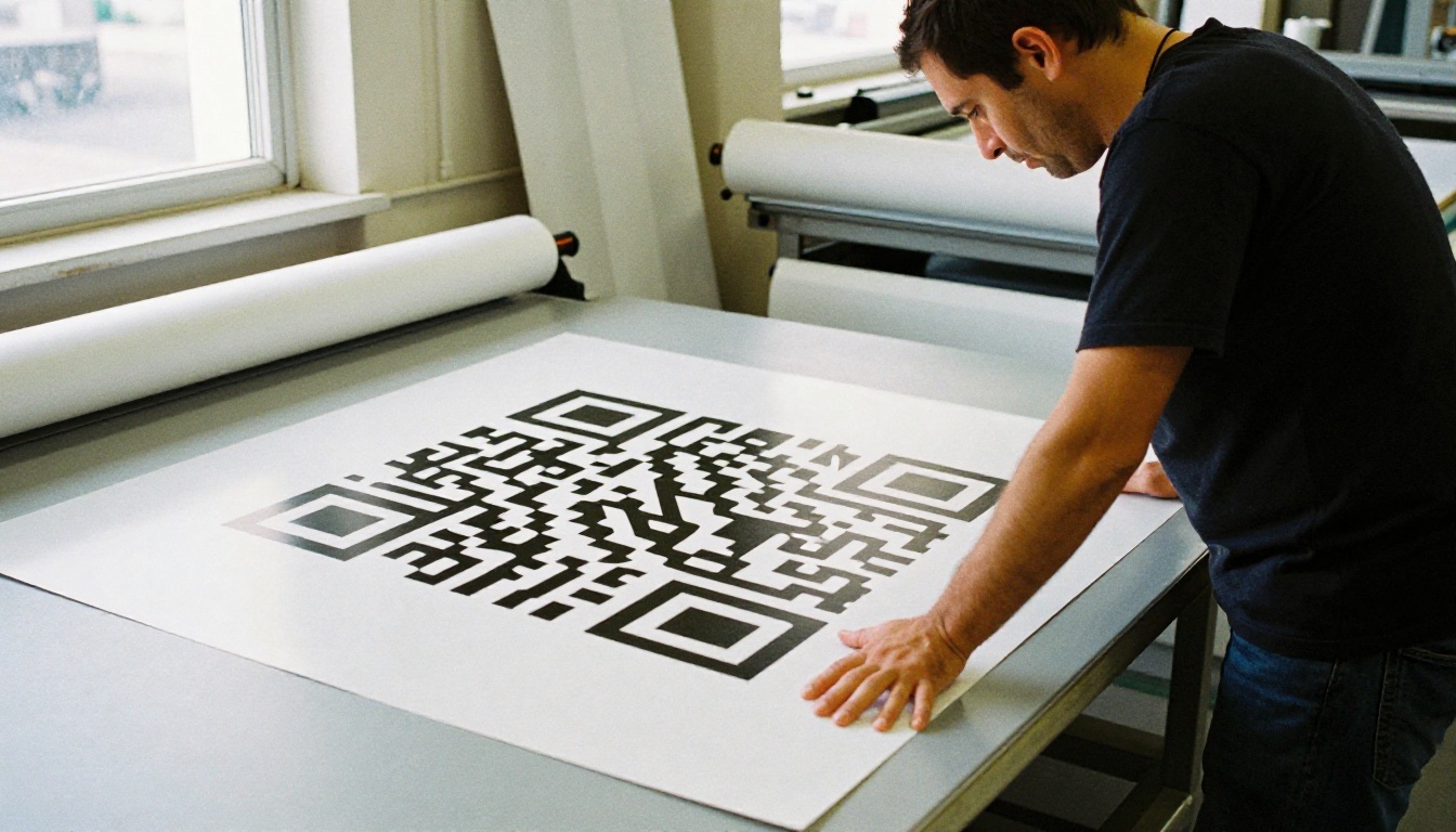
Posters are scanned from further away, and people tend to hesitate before walking closer. Use the 10 to 1 rule and round up.
| Poster size | Typical scan distance | Minimum code width | Safer choice |
|---|
| A3 (29.7 x 42 cm) | 0.5 to 1 m | 5 cm | 7 cm |
| A2 (42 x 59.4 cm) | 1 to 1.5 m | 8 cm | 12 cm |
| A1 (59.4 x 84.1 cm) | 1.5 to 2 m | 12 cm | 18 cm |
| Roll-up banner | 2 to 3 m | 20 cm | 25 cm |
| Shop window display | 3 to 5 m | 30 cm | 40 cm |
⚠️ Warning: Codes on moving vehicles, high billboards or anything people pass at speed rarely get scanned. If the audience cannot stop, put the web address in large type instead.
Why the Quiet Zone Matters
The quiet zone is the blank border around a QR code. The standard calls for at least four modules of empty space on every side. Designers often crop it to make a tidy box, and that is one of the most common reasons a code fails.
As a quick estimate, if your code is 3 cm wide and has about 30 modules across, each module is 1 mm, so you need roughly 4 mm of clear space all around. On posters, the same rule scales up.
Contrast and Colour
Dark code on a light background is the safest option. Phones can read inverted codes (light on dark), but some older scanners cannot. Here is how popular colour choices behave:
| Colour combination | Scan reliability | Notes |
|---|
| Black on white | Excellent | The default for a reason |
| Dark navy on cream | Very good | Keep contrast above 70% |
| Dark green on white | Good | Avoid mid tones |
| White on black | Fair | Test on older phones |
| Red on pink or yellow on white | Poor | Not enough contrast |
Density of Data
A code holding a long URL has more modules, which means each module is smaller at the same physical size. A short link produces a simpler, chunkier code that scans from further away. If your link is long, use a short redirect link or a landing page address that is easy to encode. A simple code at 3 cm will outperform a dense one at 4 cm.
Common Mistakes to Avoid
Most failed print runs come from the same handful of mistakes. Check this list before you export.
Glossy Paper Glare
Gloss lamination reflects light straight into a phone camera. A code that scans perfectly on screen can fail under shop lights. Choose matte or satin paper for codes whenever you can. If the poster must be glossy, place the code away from direct light sources and leave extra size margin.
Low Contrast Brand Colours
Brand palettes are lovely, but a pastel code on a photo background looks elegant and scans terribly. Keep the code on a solid light panel, even if that panel is small. Do not place a code over a busy photograph.
Stretching or Distorting the Code
Never resize a code non-proportionally. A rectangle is not a valid QR shape. Scale with the lock on, and export a vector file (SVG or PDF) so edges stay sharp at any size. A blurry raster code scaled up in a layout tool will lose its crisp edges at print resolution.
Hiding the Code in a Corner Nobody Sees
Size is useless if placement is wrong. Put the code at eye level on posters, roughly 120 to 160 cm from the floor, and never behind a counter or under a fold.
✅ Best practice: Add a short label, a brand mark in the margin (not inside the code), and the web address in plain text as a backup for people who cannot scan.
How to Test Before Printing
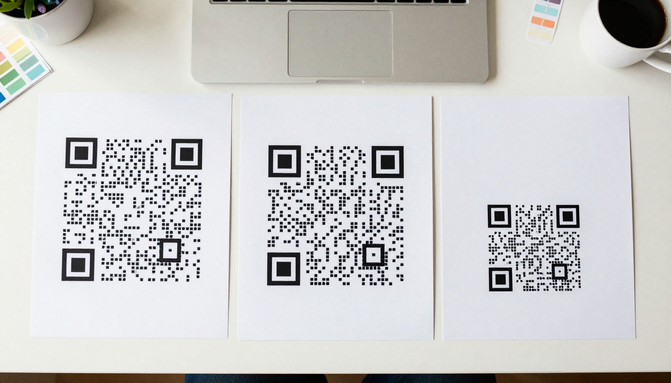
Printing 5,000 flyers with a broken code is an expensive lesson. Follow this routine first.
The Five Minute Test Checklist
- Print a proof at actual size on the same paper type you plan to use.
- Scan with at least three phones, including one older model and one budget Android.
- Scan from the real distance. Tape the proof to a wall and step back to the measured distance.
- Test in poor light, such as a dim corridor or under a warm bulb.
- Check the destination. Confirm the page loads quickly on mobile data, not only Wi-Fi.
Test on Multiple Phones
Different phones focus at different speeds. If all three scan in under two seconds, you are safe. If one hesitates, make the code a little bigger or simplify it. This tiny bit of extra work is usually the difference between a campaign that tracks and one that does not.
Make Scans Land on Something Better
A QR code is only a doorway. If it opens a clunky PDF that needs pinching and zooming, you lose people at the finish line. A mobile friendly flipbook opens fast, flips like a real brochure and keeps your branding intact. With Flipbooks AI, you can turn your brochure, menu or catalogue into an interactive page, then point your QR code at the share link.
This is useful for many print pieces:
How to Create a Flipbook for Your QR Code
- Sign up. Create an account on Flipbooks AI.
- Upload your PDF. Drag in the brochure, menu or catalogue. The PDF to Flipbook Converter turns each page into a flipping page, no watermarks, ever.
- Customise the look. Add your logo, brand colours, page effects, and embed videos or audio where they help.
- Choose sharing options. Copy a direct link, grab an embed code for your website, or add password protection for private content.
- Generate the QR code. Paste the share link into your QR generator, download an SVG, and place it on your flyer or poster at the size from the charts above.
- Track results. On the Professional plan, analytics and lead generation show how many readers opened the flipbook and which pages they spent time on.
💡 Pro tip: Keep the flipbook link short and stable. If you later update the flipbook, the same link and printed QR code keep working, so old flyers stay useful.
Share and Update Without Reprinting
Because the printed code points to a link, not a file, you can replace the flipbook content later. Offline downloads let readers save the brochure for later, and everything is mobile responsive, so the page looks right on any screen. Compare plans if you need unlimited flipbooks or custom branding for several campaigns.
Real World Examples
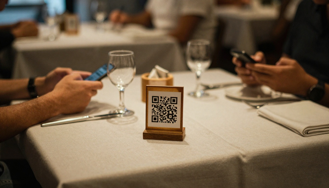
A Restaurant Table Card
A cafe prints a 10 x 15 cm table tent. Customers hold their phone about 35 cm away, so the owner picks a 3 cm code with a clean white panel and a matte finish. The code opens a flipbook menu. Scans work first time because the code is simple, high contrast and not near the glossy edge of the card.
A Trade Show Poster
An exhibitor prints an A1 poster that visitors view from about 1.5 metres. Using the 10 to 1 rule, they choose a 15 cm code, placed at chest height with a clear white border. The code opens a product catalogue flipbook, so visitors can browse and leave details later.
A Street Poster Wall
A band posts A2 posters on a busy street. Most people pass at walking speed, so the poster includes a 12 cm code at eye level plus the website in large type. Those who stop can scan and open the ticket page, and everyone else can still remember the address.
Quick Reference Summary
| If you remember one thing | Do this |
|---|
| Distance | Code width = scan distance divided by 10 |
| Minimum print size | 2 x 2 cm for flyers |
| Border | At least four modules of blank space |
| Colour | Dark on light, high contrast |
| Paper | Matte or satin over gloss |
| Testing | Three phones, real distance, real light |
Ready to Print?
Size your code with the 10 to 1 rule, keep the quiet zone clear, test on real phones, and then give scanners somewhere worth landing. Get started for free on Flipbooks AI, browse all flipbook tools to find a fit for your flyer or poster, and compare pricing plans to pick what works for you.