Typography decisions shape how readers experience every page of your flipbook. Whether you're publishing a product catalog, a corporate report, or a fashion lookbook on Flipbooks AI, the number of fonts you choose sets the tone for everything else. Get it right and your content feels polished, intentional, and effortless to read. Get it wrong and even great content starts to feel untrustworthy.
The short answer is two. Two fonts. That's almost always the correct number for a flipbook, and this article explains exactly why, when a third font is acceptable, and how to choose the right pair.
The Rule of Two and Why It Works
One Font for Headlines, One for Body
The two-font rule exists because it solves two problems simultaneously: hierarchy and harmony. Your heading font draws the eye and sets personality. Your body font does the quiet, essential work of making long paragraphs readable without effort.
When you assign one font to one role and stick to it across every page, readers stop noticing the typography, and that's exactly what you want. They stop thinking about the vessel and start absorbing the content.
Here's how the roles break down:
| Role | Font Type | Purpose | Example Fonts |
|---|
| Headlines (H1, H2) | Serif or Display | Personality, hierarchy, stopping power | Playfair Display, Merriweather |
| Body Text | Sans-Serif | Readability, neutrality, flow | Inter, Source Sans, Lato |
| Captions / Labels | Same body font, smaller | Consistency, clean structure | Same as body at 10-12px |
This table represents the cleanest possible font system for a flipbook. Two decisions. One at the top, one at the bottom. Every typographic choice flows from those two anchors.
When a Third Font Makes Sense
A third font is acceptable only when it serves a clearly different content type, not just a different visual mood. The most common valid use cases:
- A monospace font for code snippets in a technical manual or training document
- A script or display font used exclusively for pull quotes, never for running body text
- A completely separate brand font reserved for the cover page only, with the two-font system handling all interior pages
If you can't name the specific function a third font performs that neither of the first two can handle, you don't need it.
⚠️ Warning: A third font that "just looks nice" is almost always a distraction. If you find yourself adding a fourth or fifth font, you're designing with feelings rather than systems, and readers will feel that friction even if they can't name it.
More Than Two Fonts: What Actually Happens
The Visual Noise Problem
Every additional font introduces a new visual frequency into your flipbook. Two fonts create a clean signal: hierarchy. Three fonts can still work if managed carefully. But four or more fonts stop reading as variety and start reading as inconsistency.
Think of it this way: when a reader turns the page and encounters a typeface they haven't seen before in that document, their brain registers a question mark, even for a fraction of a second. If that happens repeatedly across a 30-page catalog, the reading experience becomes subconsciously tiring. Readers disengage faster. Pages feel busy even when the content itself is simple.
Why Brand Manuals Use Two Fonts
This isn't just a flipbook convention. Look at the typographic systems behind the world's most recognized brands:
| Brand | Heading Font | Body Font |
|---|
| Apple | SF Pro Display | SF Pro Text |
| The New York Times | NYT Cheltenham | NYT Karnak |
| Airbnb | Cereal Bold | Cereal Regular |
| Medium | Sohne Bold | Source Serif |
| Spotify | Circular Bold | Circular Regular |
Even when both fonts come from the same family (like Apple's SF Pro), they serve two separate roles. That principle scales directly to your flipbook. The brands spending the most on design research converge on the same answer: two.
Serif vs. Sans-Serif in Digital Flipbooks
How Screen Reading Changes Things
For decades, serif fonts were the default for printed books because the small strokes at the ends of letterforms help guide the eye across long lines of text. That logic made perfect sense for ink on paper.
On screens, the rules shift, and flipbooks are screen experiences first. Low to medium screen resolutions can make thin serif strokes appear slightly blurry or uneven at small sizes. This is why sans-serif fonts for body text are the safer, more contemporary choice for digital flipbooks.
💡 Pro tip: Reserve serif fonts for headlines at large display sizes where their elegance is fully visible. Use a clean sans-serif for any body text appearing smaller than 18px in your flipbook layout.
Which Font Styles Work Best
Not all fonts perform equally on screens. Geometric sans-serifs (built on circles and precise angles) look clean and modern. Humanist sans-serifs (with slightly curved strokes from calligraphic tradition) tend to feel warmer and more readable over long paragraphs.
| Font Category | Reading Experience | Best Used For |
|---|
| Geometric Sans (Futura, Montserrat) | Modern, structured | Covers, headlines, callout text |
| Humanist Sans (Inter, Gill Sans, Lato) | Warm, readable | Body text, captions, long paragraphs |
| Transitional Serif (Times, Georgia) | Classic, authoritative | Headers in formal or academic publications |
| Old Style Serif (Garamond, Palatino) | Elegant, literary | Premium editorial, luxury brand content |
| Display / Decorative (custom typefaces) | Expressive, distinctive | Cover pages and chapter openers only |

Font Pairings That Actually Work
High Contrast Pairings
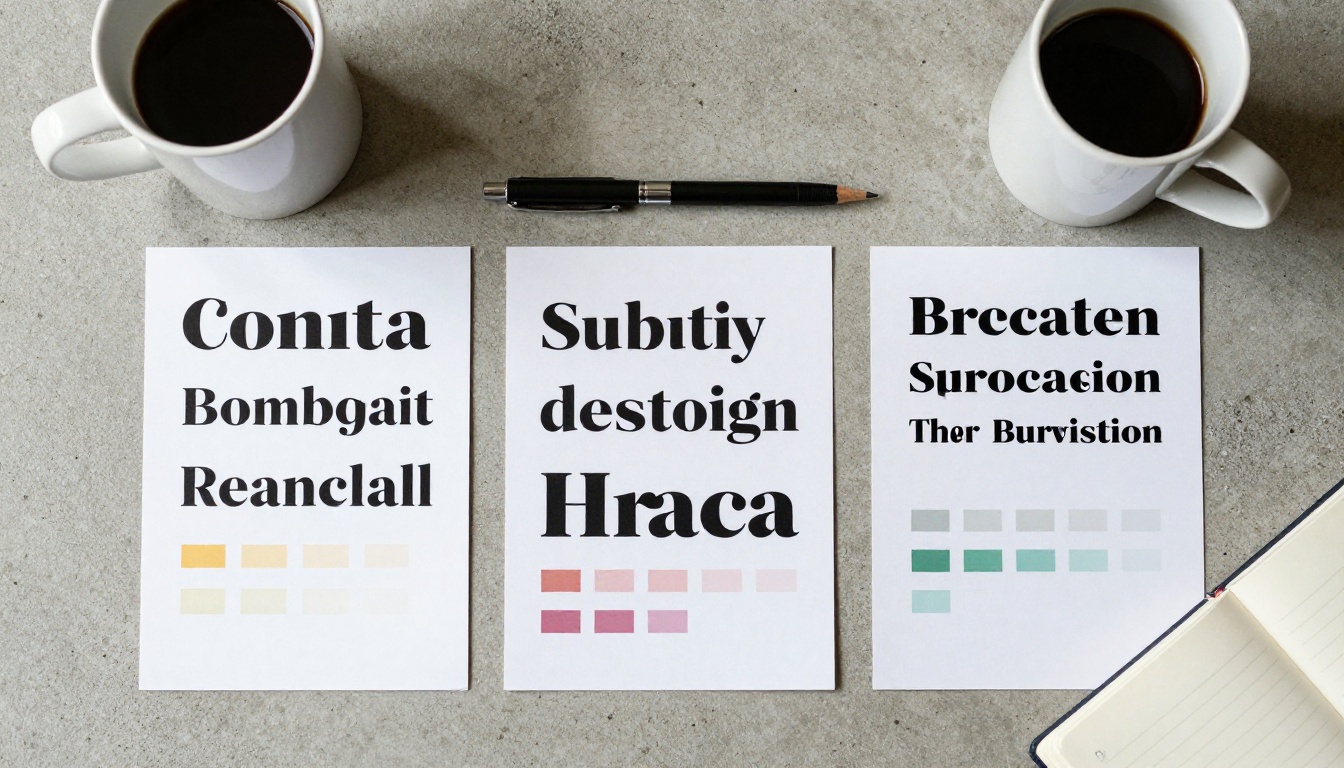
The most visually powerful font pairings combine high typographic contrast between heading and body fonts. This means pairing a serif with a sans-serif, or a heavy display font with a light, neutral body font. The contrast creates immediate hierarchy and makes reading effortless.
Strong contrast pairings for flipbooks:
- Playfair Display + Inter — Elegant and contemporary. Works beautifully for fashion lookbooks created with the Interactive Lookbook Designer.
- Merriweather + Source Sans — Slightly warmer feel with high readability. Ideal for long-form content published via the Interactive E-Book Publisher.
- Oswald + Lato — Bold structure with clean body readability. Effective for restaurant menus built with the Restaurant Menu Creator.
- Cormorant Garamond + Nunito Sans — Luxurious heading presence with approachable body text. Perfect for hotel brochures created through the Hotel Brochure Designer.
Same Family Variations
If you're unsure about pairing two different typefaces, use two weights or styles from the same font family. This approach is nearly impossible to get wrong because the designer already resolved the harmony for you.
- Montserrat Black (headlines) + Montserrat Regular (body)
- Raleway Bold (section headers) + Raleway Light (paragraphs)
- Work Sans SemiBold (callouts) + Work Sans Regular (content)
The typographic contrast comes from weight and size rather than typeface difference. It's cleaner, faster to set up, and scales perfectly across the high page counts typical in annual reports and corporate documents built with the Annual Report Creator.
Font Size and Spacing for Flipbooks
Body Text Size That Reads Well
Font size on screen follows different rules from print. In print, 10-11pt body text is standard. On a screen displayed as a flipbook, your body text needs more room to breathe.
| Content Type | Recommended Font Size | Line Height |
|---|
| Body paragraphs | 15-17px | 1.6 to 1.75x |
| Subheadings (H3) | 20-24px | 1.3x |
| Section headers (H2) | 28-36px | 1.2x |
| Chapter titles (H1) | 42-60px | 1.1x |
| Captions / labels | 11-13px | 1.4x |
These sizes ensure text remains readable across devices, from desktop browsers to mobile screens, which is especially important when your flipbook is embedded on a website via the Embed Flipbook on Website tool.
Line Spacing That Reads Well
Line spacing (also called leading) is the invisible variable that separates professional typography from amateur layouts. Too tight and the lines bleed into each other. Too loose and the eye struggles to track back to the next line.
For body text in flipbooks, 1.6 to 1.75 times the font size is the industry sweet spot. That means if your body text is 16px, your line height should sit between 25.6px and 28px.
💡 Pro tip: When in doubt, add more space rather than less. Generous spacing consistently tests better for comprehension and perceived quality, especially on mobile screens where text is compressed into a narrower column.
3 Common Font Mistakes in Flipbooks
Decorative Fonts in Body Text
The number one typographic mistake in flipbooks is using a decorative or script font for anything other than a large display headline. Script fonts at small sizes are nearly unreadable on screens. Yet it's common to see entire event programs, recipe books, and spa menus built with script fonts in the body text.
The Recipe Book Flipbook and Spa & Wellness Menu tools are popular for businesses that naturally lean toward ornate aesthetics. The correct approach: use a script font for the cover title and chapter headings only, then switch to a clean sans-serif the moment you're writing ingredient lists, treatment descriptions, or pricing.
Ignoring Contrast Between Fonts
Pairing two similar fonts, such as two geometric sans-serifs at similar weights, produces what designers call a "silent conflict." The fonts are different enough that they don't harmonize, but not different enough to create clear visual hierarchy. The result looks indecisive rather than refined.
Pick fonts with genuine contrast: different classification (serif vs. sans-serif), different weight distribution, or meaningfully different personality (structured vs. humanist, compact vs. wide).
Using Too Many Font Weights
Weight variety within a single font family can be powerful, but using five or six different weights across a flipbook creates just as much visual noise as using five different typefaces. Stick to a maximum of three weights per font: Regular, SemiBold, and Bold. Everything else can be handled with size adjustments.

How to Apply Your Font System in Flipbooks AI
Flipbooks AI handles typography through the source PDF, so getting your font system right before upload ensures it renders perfectly on every device. Here's how to apply a clean two-font system from start to finish.
Step 1: Choose your pair before opening your layout tool
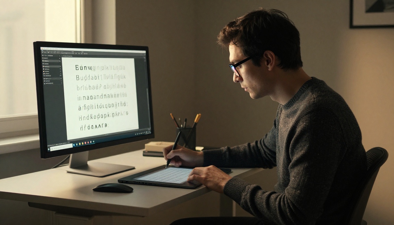
Pick your heading font and body font as the very first design decision. Embed both fonts in your layout application (Adobe InDesign, Canva, or similar) and set up text styles for H1, H2, H3, body, and caption before writing a single word of content.
Step 2: Upload your PDF to Flipbooks AI
Go to Flipbooks AI and create a new flipbook. Upload your PDF with fonts embedded. The platform converts it instantly while preserving your font rendering across all pages.
Step 3: Apply custom branding settings
Inside the editor, access the branding panel to confirm your typography choices are consistent with your brand colors and overall visual identity. Adjust any global settings that affect text appearance.
Step 4: Preview across devices
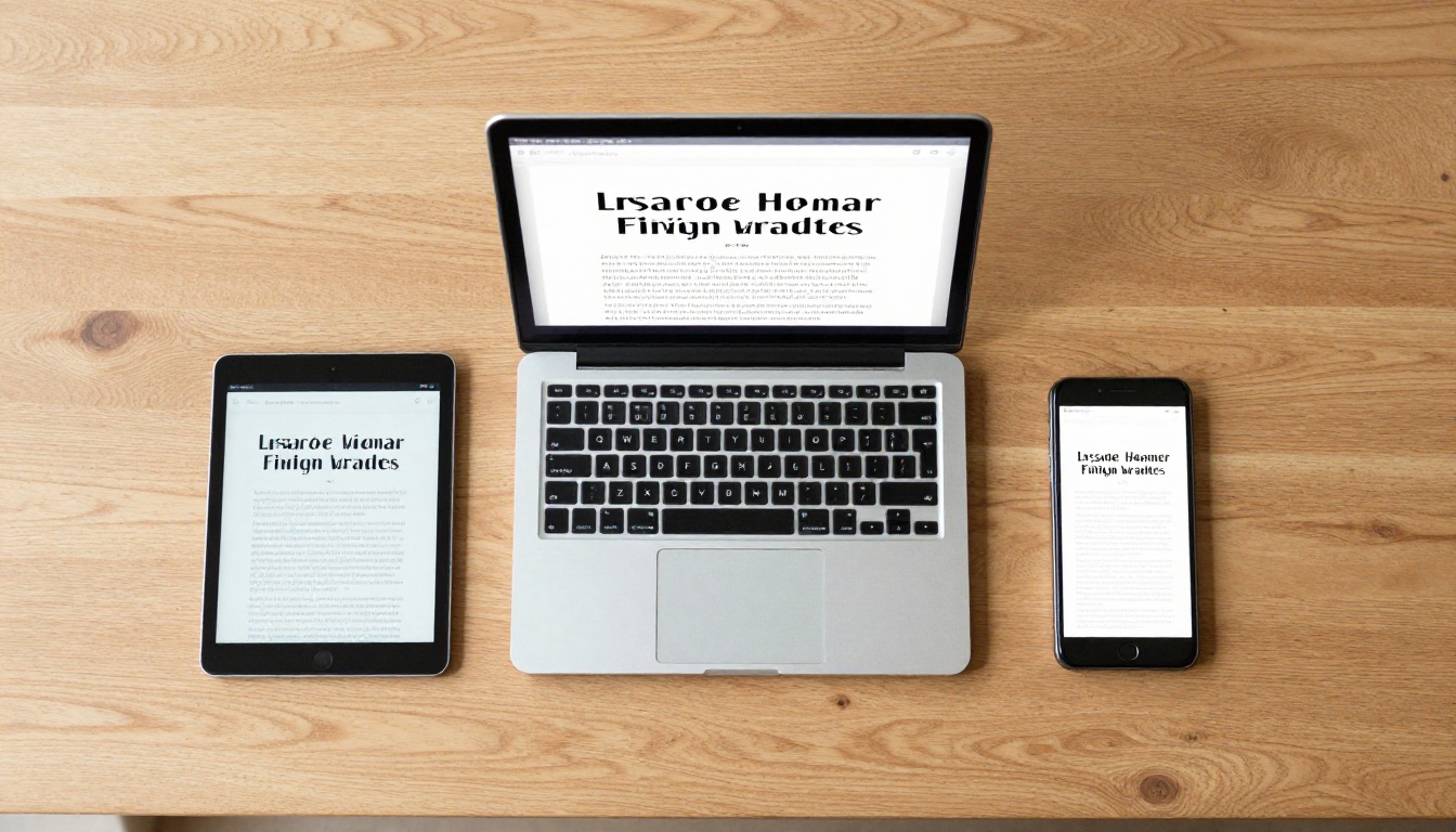
Use the built-in preview to check your flipbook on desktop, tablet, and mobile views. Verify that your heading font remains legible at large display sizes and your body font stays crisp and readable at smaller sizes across all breakpoints.
Step 5: Add interactive elements
Embed links, videos, and audio where relevant. Interactive elements layer on top of your typography, so your font system should be fully finalized before adding any interactivity.
Step 6: Share or embed
Use the sharing panel to generate a direct link, copy an embed code, or set password protection for private content. If you're on the Professional plan, activate lead generation and analytics to track exactly how readers interact with each page of your flipbook.
✅ Best practice: Always preview your flipbook in a private browser tab at mobile width before sharing. Check at least three pages of dense body text to confirm readability at smaller screen sizes.
Building a Typography System for Your Brand
Consistent Font Usage Across Pages
A two-font system only works when applied with discipline. Your H2 heading font should be identical on page 3 and page 47. Your body font size and line height should be uniform throughout. Your caption style should match across every image in the document.
The fastest way to erode a flipbook's credibility is typographic inconsistency. One page with a slightly different heading weight, one caption set two pixels larger than the others, and the polished feeling starts to break down.
If you publish multiple flipbooks for the same brand, such as catalogs, menus, portfolios, and newsletters, document your font choices in a simple internal style sheet:
- Heading font: name, weight, size range, line height
- Body font: name, weight, size, line height
- Caption style: name, size, color hex code
- Accent weight (if any): weight only, specific use case documented
This style sheet ensures every new document created with tools like the Digital Portfolio Creator or School Newsletter Creator uses the same typographic DNA, building a consistent brand presence across every published piece.
Font Color and Contrast
Font selection isn't only about typeface and size. Color contrast determines whether your text is readable or invisible. For body text on light backgrounds, use near-black (#1a1a1a or #222222) rather than pure black (#000000), which can feel overly harsh on screen. For text on dark backgrounds, use near-white (#f5f5f5) rather than pure white.
WCAG accessibility guidelines recommend a contrast ratio of at least 4.5:1 for body text and 3:1 for large headings. Run your color combinations through a contrast checker before finalizing your layout.

How Many Fonts Across Different Flipbook Types
Not all flipbooks have the same typographic needs. Here's how the two-font rule applies in practice across the most common document types:
| Flipbook Type | Heading Font Style | Body Font Style | Third Font? |
|---|
| Product Catalog | Bold Geometric Sans | Humanist Sans | No |
| Fashion Lookbook | Elegant Serif | Light Sans-Serif | Sometimes (script for pull quotes only) |
| Restaurant Menu | Display or Script | Humanist Sans | No |
| Annual Report | Transitional Serif | Clean Sans | No |
| E-Book / Training Manual | Bold Sans or Serif | Humanist Sans | Monospace for code only |
| Wedding Album | Script (cover only) | Classic Serif | No |
| Sales Presentation | Bold Sans | Regular Sans | No |
| Course Material | SemiBold Sans | Regular Sans | No |
As the table shows, the answer is almost always two fonts. The wedding album is the closest exception: a script for the cover title and a classic serif for interior text can work because the occasion demands that level of ornamentation. Even then, the interior body text remains a single consistent typeface throughout.
What to Do Right Now
Typography is one of those elements that seems like a small detail until you're looking at a flipbook where it went wrong. Two fonts, chosen carefully and applied consistently, will elevate any flipbook from functional to genuinely professional.
The first step is simple: choose your font pair before you open your layout tool. Decide on your heading font and your body font as the very first design decision, not as an afterthought. Then apply them without exception from cover to last page.
Ready to put a solid font system into a real flipbook? Get started for free on Flipbooks AI and convert your first PDF in minutes. Browse all flipbook tools to find the template that fits your content type, and check the pricing plans if you need analytics, lead generation, or offline downloads for your audience.



