You spent hours on the layout, picked a palette that matches your brand, and exported the PDF. Then a colleague opens it on a phone outside and says the gray captions are invisible. That is a contrast problem, and it is one of the most common reasons a good flipbook loses readers. The fix takes minutes once you know how to measure it. If you publish with Flipbooks AI, you can run these checks on your source PDF before you convert it, and again on the live flipbook afterward.
This article shows you exactly how to check color contrast on flipbook pages: what the numbers mean, which free tools to use, how to test text over photos, and how to repair pages that fail.
Why Contrast Matters
Contrast is the difference in brightness between text and the color behind it. A flipbook is read in far more conditions than a printed brochure: on a laptop in a dim room, on a phone under direct sun, on a tablet with the brightness turned down to save battery. Each of those conditions removes some of your contrast, so a page that looks fine on your calibrated monitor can fail in the real world.

Good contrast helps in three ways:
- Readability: people finish pages they can read without effort.
- Accessibility: roughly one in twelve men and one in two hundred women have some form of color vision deficiency, and many more readers have low vision or tired eyes.
- Legal and procurement requirements: many public sector and corporate buyers require content that meets WCAG, the Web Content Accessibility Guidelines.
💡 If a page is hard to read when you squint at it from arm's length, it will be hard to read for a large share of your audience. Treat that squint test as your first, free check.
How Contrast Ratio Works
WCAG expresses contrast as a ratio from 1:1 (identical colors, no contrast) to 21:1 (black on white). The formula compares the relative luminance of the two colors. You never need to calculate it by hand, but you should know the targets.
| Content type | WCAG AA minimum | WCAG AAA target |
|---|
| Body text (under 18pt) | 4.5:1 | 7:1 |
| Large text (18pt or 14pt bold and up) | 3:1 | 4.5:1 |
| Icons and UI parts (buttons, links) | 3:1 | 3:1 |
| Decorative elements, logos | No requirement | No requirement |
For most flipbooks, aim for AA on everything and AAA on body text. Body copy is where readers spend their time, so it earns the highest bar.
What Counts as Large Text
Large text is 18 point (about 24 pixels) or 14 point bold (about 18.5 pixels). Headings and pull quotes usually qualify. Captions, footnotes, table cells and page numbers almost never do, and those are the elements that fail most often.
Ratios You Should Memorize
A few reference points help you judge a palette at a glance:
- Black on white: 21:1
- Dark navy (#1F2A44) on cream (#FAF6EC): about 13:1
- Medium gray (#767676) on white: 4.5:1, the lowest gray that passes AA
- Light gray (#AAAAAA) on white: about 2.3:1, a fail
- White on bright orange (#FF8C00): about 2.3:1, a fail
You do not need paid software. These options cover every scenario you will meet.
| Tool | Best for | Cost | Works on images |
|---|
| WebAIM Contrast Checker | Quick two color tests with hex codes | Free | No |
| Colour Contrast Analyser (desktop) | Picking colors from anywhere on screen | Free | Yes, with the eyedropper |
| Chrome DevTools color picker | Live flipbook pages in the browser | Free | Partly |
| Figma plugins (Stark, A11y) | Designing pages before export | Free tiers | Yes |
| Adobe Acrobat Accessibility Checker | Source PDFs | Included with Acrobat Pro | Limited |
The Eyedropper Method
The Colour Contrast Analyser is the most useful of the group because it lets you sample the foreground and background directly from your screen. Open your PDF or live flipbook, click the foreground eyedropper on a text character, click the background eyedropper on the area behind it, and read the ratio. It also shows pass or fail for each WCAG level.
The Browser Method
For a published flipbook, right click on the text, choose Inspect, and click the color swatch in the styles panel. Chrome and Edge show the contrast ratio right inside the picker, along with a line marking where AA and AAA thresholds fall. Drag the picker until the ratio passes and note the resulting hex code.
A Step by Step Contrast Check
Use this routine on every flipbook, and keep it short enough that you will actually do it.
- List your text and background pairs. Body text on page color, headings on page color, captions, links, buttons, page numbers, and any text on colored boxes.
- Collect the hex codes. Pull them from your design file or sample them with the eyedropper.
- Test each pair. Enter the hex codes in a checker and record the ratio.
- Compare to the target. Body text needs 4.5:1 or better. Large text and icons need 3:1.
- Fix failures at the source. Darken the text or lighten the background in the design file, not in the flipbook.
- Re-export and recheck on the live flipbook. Compression and color profiles can shift colors slightly.

✅ Build a one page palette sheet for your brand listing every approved text and background pair with its ratio. New pages then inherit tested combinations instead of starting from scratch.
Common Failures and Fixes
After auditing many flipbooks, the same few problems show up again and again.
Light Gray Text
Designers love soft gray captions because they look refined. They also tend to land around 2.5:1. Move to a gray at or below #595959 on white and you gain a pass at 7:1.
Text on Photos
A photo has no single background color, so a single check is not enough. See the next section for the right approach.
Colored Text on Colored Boxes
Blue on green, red on purple, and orange on yellow can look vivid and still fail. Brightness matters more than hue, so compare lightness, not color names.
Thin Fonts at Small Sizes
A hairline weight lowers effective contrast because the strokes anti-alias into the background. If your font has a regular or medium weight, use it for body copy.

Testing Text Over Images
Cover pages, lookbooks and magazines often place headlines over photography. Here is how to keep them readable.
- Sample the lightest and darkest pixels behind the text. The worst case sets your ratio.
- Check the text color against both. If either fails, adjust.
- Add a semi transparent dark or light overlay behind the text, usually 40 to 60 percent opacity.
- Or move the text to a calmer region of the photo, such as sky, wall or shadow.
- Or place the text on a solid panel with padding.
| Approach | Effort | Visual impact | Reliability |
|---|
| Overlay gradient | Low | Moderate | High |
| Solid text panel | Low | High, a clear block | Very high |
| Moving the text | Medium | None | Depends on the photo |
| Re-cropping the photo | Medium | Can improve composition | Medium |
⚠️ Do not trust a check on a single sampled pixel. A headline that passes on a dark area of the photo may fail on the bright area beside it.
Testing on Real Devices
Numbers tell you the potential, and devices tell you the reality. Run a quick device test once the contrast ratios pass.
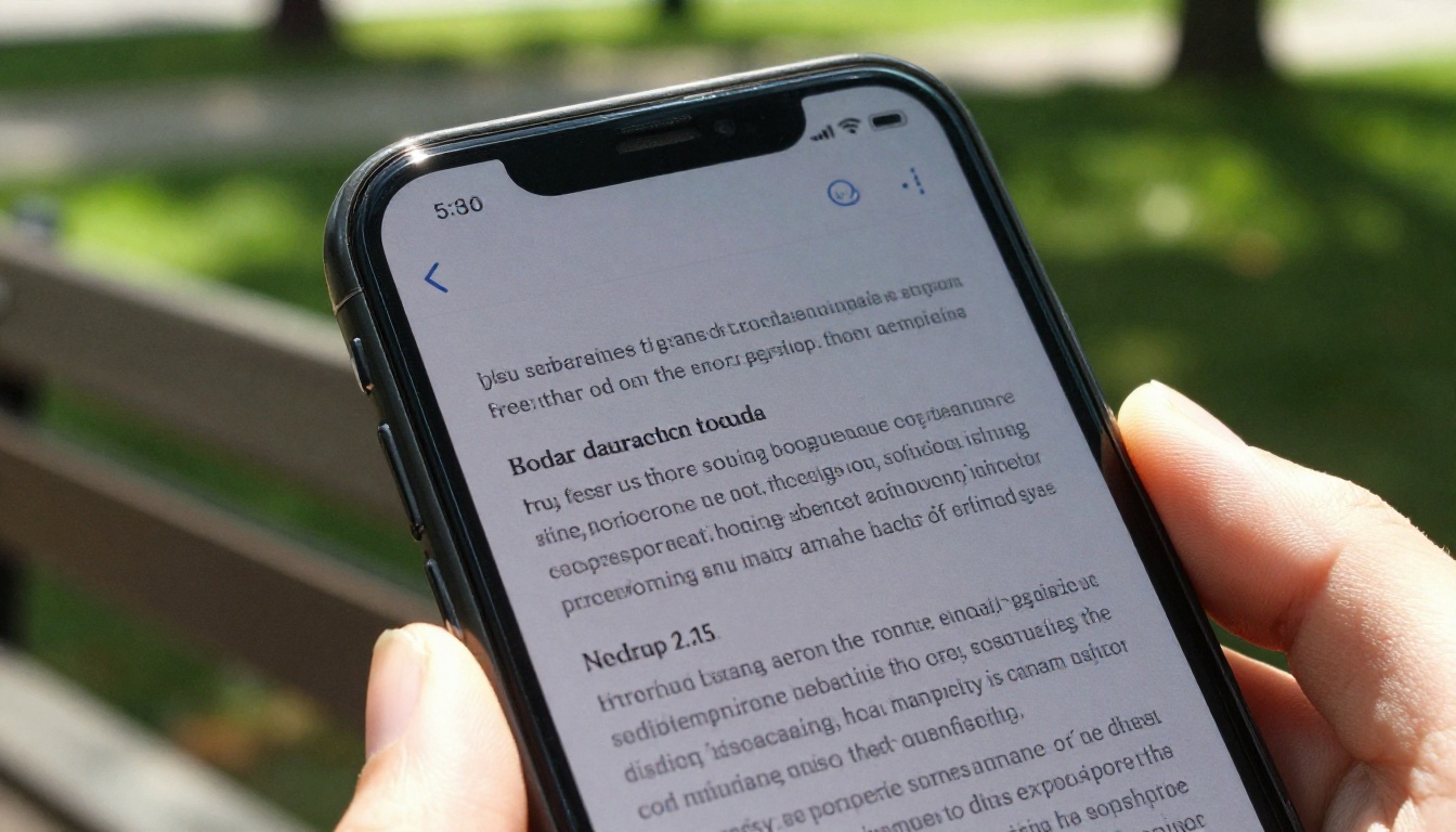
- Phone outdoors: sunlight washes out mid tones first, so thin gray text disappears.
- Dark mode and low brightness: drop the screen to 30 percent and look again.
- Grayscale mode: switch your device to grayscale to see whether hierarchy still works without hue.
- Color blindness simulators: Chrome DevTools has a rendering panel that simulates protanopia, deuteranopia and tritanopia.
- Print preview: if readers might print pages, preview in black and white.
A fast test with two colleagues is worth more than an hour of tweaking alone, because fresh eyes spot problems that you have stopped seeing.
Real World Examples
Contrast issues look different from one flipbook type to the next.
- Restaurant menus: gold text on a dark photo of food often fails on the dishes' highlights. A solid dark panel behind prices fixes it. A Restaurant Menu Creator workflow makes a good fit for testing that.
- Real estate brochures: white text over bright sky photos is a classic problem. Add an overlay or move the caption to the interior shots.
- Product catalogs: pale gray SKU numbers and prices vanish on phones. Darken them and enlarge the price. See the Product Catalog tool for layout ideas.
- Annual reports: pastel chart colors need a 3:1 check against the page, and labels need their own check. A Corporate Report Maker project benefits from this most.
- Portfolios: minimal white pages with silver captions look elegant and read poorly.

Fixing Contrast With Flipbooks AI
Flipbooks AI converts your PDF into a page turning flipbook, so the most reliable place to fix contrast is in the source file. Here is the workflow that avoids rework.
- Check the PDF first. Open it, sample your text and background pairs, and note any ratio below 4.5:1.
- Fix the design file. Adjust colors in your layout tool and re-export the PDF.
- Upload to Flipbooks AI. Go to Flipbooks AI, create an account, and upload the PDF with the PDF to Flipbook Converter.
- Customize the viewer. Set your branding and choose viewer colors for the background and toolbar. Pick a dark or light background that contrasts with your page edges so pages stand out.
- Preview on phone and desktop. The flipbook is mobile responsive, so test both.
- Share carefully. Use direct links, or embed the flipbook with the Embed Flipbook on Website tool, and add password protection for private content.
- Review analytics. On the Professional plan, analytics show which pages readers leave. Pages with sudden drop off are good candidates for a contrast recheck. See the pricing plans for details.
💡 Flipbooks AI never adds watermarks, so your pages keep the exact colors you designed. There is no overlay competing with your text.
| Stage | What to check | Where |
|---|
| Design file | Text and background pairs | Figma, InDesign, Canva |
| Exported PDF | Colors survived export | Colour Contrast Analyser |
| Live flipbook | Viewer background, toolbar, links | Browser DevTools |
| Real devices | Sunlight, low brightness | Phone and tablet |
Mistakes to Avoid
- Checking only headings. Body text and captions fail more often.
- Relying on color alone. Links should also be underlined or bold.
- Ignoring hover and focus states. Buttons need 3:1 in every state.
- Trusting a screen with a color tint. Night mode filters change what you see.
- Skipping the recheck after export. Compression can shift colors by a few points.

A Quick Contrast Checklist
Print this and tape it next to your monitor.
- Body text is 4.5:1 or higher, ideally 7:1.
- Headings and large text are 3:1 or higher.
- Captions and page numbers pass 4.5:1.
- Text over photos has an overlay, panel or calm background.
- Links are distinguishable without color alone.
- Buttons and icons meet 3:1.
- The flipbook is tested on a phone in bright light.
- A color blindness simulation shows no lost information.
Make Every Page Readable
Contrast checking is a ten minute habit with an outsized payoff: more readers finish your pages, more of them can use them, and your brand looks careful rather than careless. Start with the palette sheet, test the pairs that matter, and recheck the live version.
Ready to publish? Get started for free on Flipbooks AI, browse all flipbook tools to find the right template, and compare plans to pick the features that suit your project.