Every school year, someone says, "We should make a class magazine," and then nobody knows where to begin. The good news: you already own the tool. Google Slides is free, runs in any browser, and lets thirty students edit the same file at once. If you want to design a class magazine in Google Slides, you only need a smart page setup, a handful of reusable layouts, and a way to share the finished pages. This article walks through each step, and at the end shows how to turn the deck into a page-turning flipbook with Flipbooks AI.

Why Slides Works for Magazines
Slides was built for presentations, but a magazine page is just a rectangle with text and pictures on it. That is exactly what a slide is. Compared with desktop publishing software, Slides has three big advantages for a classroom:
- Real-time teamwork. Every student works on their own page at the same time, and the teacher can comment directly on the draft.
- Zero cost and zero installs. It runs on school Chromebooks, tablets and home laptops.
- Version history. If someone deletes a page by accident, you restore it in two clicks.
The trade-off is that Slides has no built-in print layout engine, so you have to set up the pages yourself. That is what the next sections do.
| Feature | Google Slides | Desktop publishing software | Canva-style editors |
|---|
| Cost | Free with a school account | Paid license | Free tier with limits |
| Simultaneous editing | Excellent | Poor | Good |
| Custom page size | Yes | Yes | Yes (often paid) |
| Time to pick up | A few minutes | Weeks | An hour |
| Export to PDF | Yes | Yes | Yes |
💡 Pro tip: Ask students to use their school account, not a personal one. Sharing permissions are far easier to manage inside one domain.
Plan the Magazine First
Before anyone opens a laptop, spend one lesson on paper. A magazine without a plan turns into a pile of unrelated slides.
Pick a Theme and a Name
A theme gives every article a reason to exist. Good classroom themes are narrow and fun: "Our Town in 10 Places," "Science Gone Wrong," "A Year in Room 12." The name should be short enough to fit on a front page in a large font.
Build a Page Map
Sketch the whole issue as small boxes on one sheet of paper. A solid first issue for a class of 25 usually has 16 to 24 pages. Decide which page is the front page, which is the contents page, where the long features go, and where the short items such as polls, jokes or puzzles fit.
Assign Roles
Real magazines have editors, writers, photographers and designers. Copy that structure:
- Editor in chief: keeps the deadline and approves every page.
- Section editors: each owns four or five pages.
- Writers: produce the text.
- Photographers and illustrators: supply the images.
- Proofreaders: check spelling and captions before publishing.
Set Up the Page Size
This single step separates a magazine from a slideshow. Open a new presentation, then go to File > Page setup > Custom.
Choose the Right Dimensions
| Format | Page size (inches) | Best for |
|---|
| Standard magazine | 8.5 x 11 | Printing at home or school |
| A4 portrait | 8.27 x 11.69 | Schools outside North America |
| Digital square | 10 x 10 | Screen-only reading |
| Widescreen spread | 16 x 9 (default) | Flipbooks and tablets |
If you plan to print, use portrait 8.5 x 11 or A4. If the magazine will only be read on screens, the default widescreen works, and a two-page spread feels natural on a laptop.
Set Margins With Ruler Lines
Slides lets you add straight alignment lines from the View menu. Add one about half an inch from every edge, plus one down the center to create two columns. Tell students that text and faces stay inside the lines. Only background colors and photos may bleed to the edge.
⚠️ Warning: Changing the page size after students start building forces text boxes to resize and images to stretch. Lock the size on day one.
Build Reusable Layouts
Here is where the real time savings come from. Instead of letting each student invent a page from nothing, build five layouts in the Theme builder (Slide > Edit theme) and let everyone pick from them.
The Five Layouts Every Issue Needs
- Front page: a full-bleed photo, a large title at the top, and room for three short headlines.
- Feature opener: one big image on top, a headline, and a two-column text area below.
- Text page: three columns with a pull quote placeholder.
- Photo spread: one large image and a short caption strip.
- Short items page: four small boxes for polls, quotes, riddles or student shout-outs.
Name the Layouts Clearly
Rename each layout so students can find it fast, for example "Feature Opener" or "Photo Spread." Then in the shared deck, a student clicks Layout in the toolbar and chooses the right one. The placeholders keep fonts, spacing and margins consistent without extra effort.
| Layout | Text boxes | Image slots | Typical page count |
|---|
| Front page | 3 | 1 | 1 |
| Feature opener | 2 | 1 | 4 to 6 |
| Text page | 3 | 0 | 4 to 6 |
| Photo spread | 1 | 1 | 3 to 4 |
| Short items | 4 | 0 to 2 | 2 to 3 |

Choose Fonts and Colors
Good typography is what makes a student project look professional. Limit yourself to two fonts and three colors.
A Simple Font System
- Headlines: one bold serif such as Playfair Display or Merriweather.
- Body text: one clean sans-serif such as Open Sans or Lato, at 11 to 12 points for print.
- Captions: the same sans-serif, smaller and in italics.
Both families are built into Slides under More fonts, so nothing needs to be installed.
A Three-Color Palette
Pick one main color, one accent, and one neutral. Write the hex codes on the board so everyone uses exactly the same shades. In Slides, choose Custom under the fill color and paste the code. Then save the colors in the theme so they appear in every palette menu.
✅ Best practice: Keep body text dark gray, not pure black, on a white or cream page. It looks softer and reads more easily.
Write and Place the Content
With layouts ready, students fill them in. A few rules keep pages tidy.
Keep Articles Short
Most pages hold 150 to 250 words. A student who needs more should spread the story across two pages with the same headline and a "continued" line.
Use Real Photos
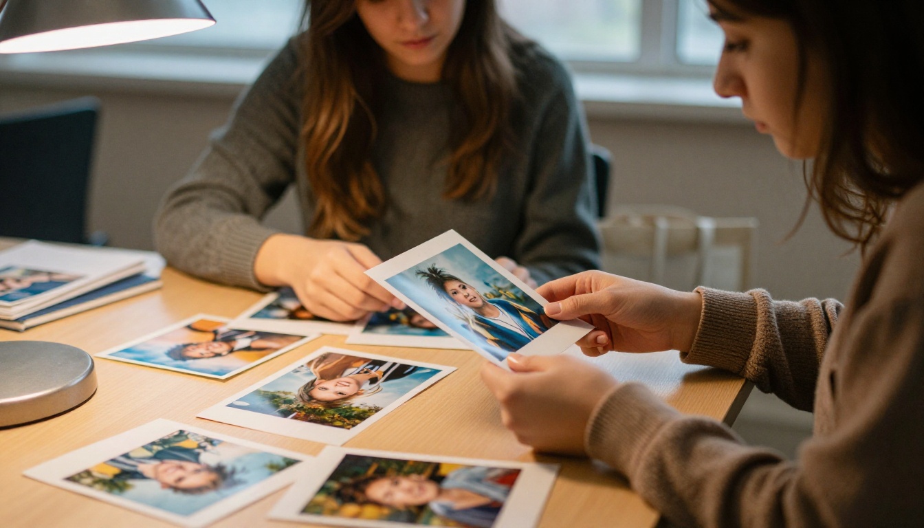
Photos taken by classmates beat stock images every time. A phone camera in good window light is more than enough. Teach students to shoot in landscape and portrait so they have options for every layout.
- Hold the phone steady and tap to focus.
- Shoot near a window rather than using flash.
- Take at least five shots of each subject.
- Always ask permission before photographing a classmate.
Write Captions That Add Information
A caption should say who, where and why it matters, not repeat what is obvious in the picture.
Share the Work Across the Class
Slides handles group work well when you set some ground rules.
Use One Shared Deck
Create one shared file and give Editor access to the section editors and Commenter access to everyone else. Each student claims a page number in a sign-up sheet. Never allow two people to edit the same slide.
Review With Comments
Use Insert > Comment to leave feedback on a specific text box. Ask reviewers to tag the author with an @mention so notifications reach the right person. Resolve each comment once the fix is made.
A Realistic Timeline
| Week | Task | Owner |
|---|
| 1 | Theme, page map, roles | Whole class |
| 2 | Layouts and style rules | Editor and designers |
| 3 | Writing and photography | Writers and photographers |
| 4 | Page building | Section editors |
| 5 | Proofreading and fixes | Proofreaders |
| 6 | Export and publish | Editor in chief |

Export the Finished Magazine
When every page is approved, go to File > Download > PDF Document (.pdf). Open the PDF and scroll through it once to check that fonts, images and margins survived the export.
Print or Screen?
A printed copy is nice for the school library and parents' night. A PDF is easy to email, but a long PDF is not a pleasant reading experience on a phone. Pages scroll like a document, nothing feels like a magazine, and you get no idea who actually opened it. That is where a flipbook helps.
Turn the PDF Into a Flipbook
A flipbook gives readers a real page-turning experience in the browser, on desktop and mobile. Here is how to publish your class magazine with Flipbooks AI.
Step-by-Step Tutorial
- Create an account. Go to Flipbooks AI and sign up. You can start with a free plan.
- Upload your PDF. Drag the exported file into the PDF to Flipbook Converter. Conversion takes a short while, and every page keeps its layout.
- Customize the look. Pick a background color that matches your magazine palette, choose the page-turn effect, and add your school logo. Nothing is stamped on your pages, because there are no watermarks, ever.
- Add multimedia. Drop in a short video of the class or an audio clip of an interview. Embedded videos and audio make a digital issue feel alive.
- Share it. Copy the direct link for parents, use the embed code to place the magazine on the school website (see the Embed Flipbook on Website tool), or lock it with a password if it should only reach families.
- Track readers. On the Professional plan, analytics show how many people opened the issue and which pages they read longest. Compare options on the pricing page.
If your school publishes regularly, the Magazine Flipbook Creator and the School Newsletter Creator are built for exactly that rhythm. For a yearly issue that doubles as a memory book, try the Yearbook Flipbook Maker.

PDF Versus Flipbook
| Feature | Plain PDF | Flipbook |
|---|
| Page-turn feel | No | Yes |
| Mobile friendly | Pinch and zoom | Responsive |
| Embed on a website | Awkward | One snippet |
| Password protection | Limited | Built in |
| Reader analytics | None | Professional plan |
| Offline download | Yes | Yes |
💡 Pro tip: Export the PDF at the page size you set on day one. A flipbook shows pages exactly as designed, so a clean source file makes a clean magazine.
Common Mistakes to Avoid
Teachers who run this project every year tend to report the same problems:
- Too many fonts. Five fonts look like a ransom note. Stick to two.
- Tiny text. Anything under 10 points is hard to read in print.
- Low-quality photos. Blurry images are the fastest way to lose a reader.
- No proofreading. One typo in a headline is the only thing people remember.
- Late page size changes. See the warning above.
- Wall-to-wall text. Break long stories with subheads, pull quotes and photos.

Real-World Classroom Examples
A middle school English class builds a quarterly "Room 8 Review" with poems, book reviews and a student comic. Each term has a new editor, so everyone gets a turn.
A high school journalism club turns its Slides issue into a flipbook and embeds it on the school site, then checks analytics to see which stories parents opened.
A primary school teacher runs a single-page-per-child magazine called "All About Me," printed for open day and shared by link with relatives abroad.
A university study group gathers research summaries into a short digital issue for a course project, locked with a password for the professor and classmates only.

Quick Checklist Before Publishing
- Page size is the same on every slide.
- Every page uses one of the five layouts.
- Only two fonts and three colors appear.
- All photos are sharp and permission was given.
- Captions and names are spelled correctly.
- Page numbers and the contents page match.
- The PDF has been opened and checked end to end.
Ready to Publish Your Issue?
A class magazine is a small project with a big payoff: students practice writing, design and teamwork, and the finished issue is something they are proud to show off. Build the pages in Google Slides, export a clean PDF, and give it the page-turning finish it deserves.
Ready to create your first flipbook? Get started for free on Flipbooks AI. Browse all the tools and templates to find the right fit for your class, and compare the pricing plans when you want analytics and lead capture.



