Inline Embed or Lightbox Popup: Which Flipbook Embed Works Better?
Inline embed or lightbox popup: which flipbook embed works better for your website? This article compares page speed, mobile behavior, SEO, accessibility, and conversions, then shows real use cases and how to set up either option in minutes.
You have a flipbook ready, and now a small decision is about to shape how people read it: do you place it right in the page, or tuck it behind a button that opens a popup? Both options work, but they behave very differently on real websites. If you publish with Flipbooks AI, you can choose either one in seconds, so the better question is which one fits your page, your audience, and your goal.
This article puts the two side by side. You will see how each option affects speed, mobile reading, search visibility, accessibility, and conversions, followed by concrete examples and a short setup routine.
What Each Option Actually Does
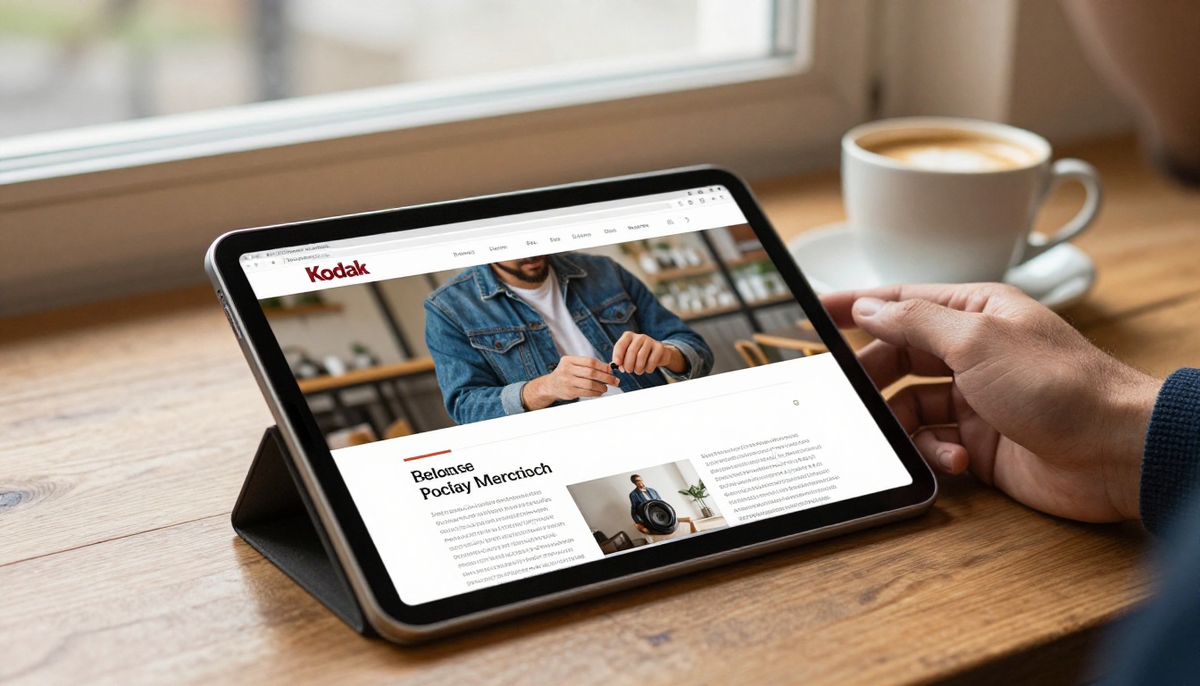
An inline embed places the flipbook directly inside your page layout, usually through an iframe. The reader sees the first page as soon as the section scrolls into view. No click is needed, and the flipbook behaves like any other block of content, such as an image or a video.
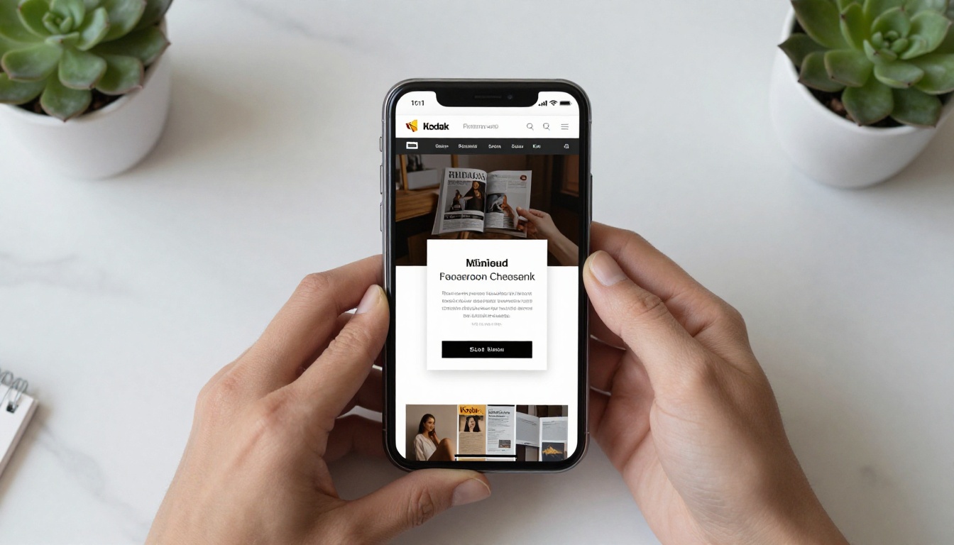
A lightbox popup shows a trigger first: a thumbnail, a button, or a text link. When the visitor clicks it, a layer opens above the page, dims the background, and displays the flipbook in a focused view. Closing it returns the visitor to exactly where they were.
The Core Difference in One Sentence
Inline says "read this here, now." Lightbox says "open this when you want it." Everything else in this comparison grows out of that single difference.
A Quick Mental Picture
Think of a shop window versus a shop door. An inline embed is the window: the product is visible from the street. A lightbox is the door: the visitor chooses to step in, and once inside, nothing else competes for attention.
Inline Embed: Strengths and Weak Spots
Inline works best when the flipbook is the content, not a side attraction. A digital magazine issue, a recipe book, or a training manual often deserves a full spot on the page.
Where Inline Wins
Zero friction: the reader starts flipping without a click.
Context stays visible: headings, text, and navigation remain around the flipbook.
Easy to measure: scroll depth and time on page tie directly to the content.
Natural for long pages: it sits between paragraphs like any other media block.
Where Inline Struggles
It costs page weight. The iframe loads with the page unless you delay it.
Small screens squeeze it. A two page spread inside a narrow column gets cramped.
It competes with surrounding elements. Sticky headers, chat widgets, and banners can crowd it.
💡 Pro tip: If you use inline, give the container a fixed aspect ratio such as 4:3 or 16:9. This prevents layout shift while the iframe loads, which protects your Core Web Vitals score.
Lightbox Popup: Strengths and Weak Spots
A lightbox suits pages where the flipbook supports a bigger story. Think of a product page that links to a spec sheet, a landing page that offers a brochure, or a blog post that points to a downloadable catalog.
Where Lightbox Wins
Faster first load: nothing heavy loads until the click.
Larger reading area: the popup can use nearly the full viewport.
Focus: the dimmed background removes distractions.
Tidy layouts: one thumbnail takes the space of one image, so a page can hold several flipbooks.
Where Lightbox Struggles
It needs a click. Some visitors never open it.
Popups raise suspicion. Many people close overlays by reflex, especially after aggressive marketing popups.
Weaker visibility for search. Content hidden behind a trigger is easier for crawlers to ignore.
⚠️ Warning: Never open a lightbox automatically on page load. Search engines can treat intrusive interstitials on mobile as a poor experience, and visitors tend to leave.
Side by Side Comparison
The table below summarizes how the two approaches compare across the factors that matter most.
Factor
Inline Embed
Lightbox Popup
Initial page weight
Higher (loads with page)
Lower (loads on click)
Clicks before reading
0
1
Reading area on desktop
Limited by column width
Near full screen
Reading area on mobile
Cramped in narrow columns
Full screen friendly
Context around content
Always visible
Hidden while open
Several flipbooks per page
Heavy
Light
Best for
Primary content
Supporting content
Risk
Slower pages
Ignored trigger
No row declares a universal winner. Inline takes the points for frictionless reading, and lightbox takes them for speed and screen space.
How Each Option Affects Page Speed
Speed matters because slow pages lose readers before they see anything. An inline embed adds an iframe request during the initial load. A modern flipbook viewer is optimized, yet it still downloads scripts, fonts, and the first pages.
Lightbox avoids that cost until the click. For a page with three or four flipbooks, this difference grows quickly.
Lazy Loading Closes the Gap
You can reduce inline cost with one attribute. Adding loading="lazy" to the iframe tells the browser to wait until the embed approaches the viewport. For a flipbook placed below the fold, that gives you most of the lightbox speed benefit while keeping the inline experience.
More than half of web visits come from phones, so this section may settle your choice. On a narrow screen, an inline flipbook shares width with page margins. A two page spread shrinks until text becomes hard to read, so the viewer usually switches to single page mode.
A lightbox gives the viewer the whole screen. Tapping to open, pinching to zoom, and swiping to turn pages feel closer to a native app.
A Practical Mobile Rule
If your flipbook has small text (catalogs, price lists, reports), prefer lightbox or a fullscreen button on mobile.
If your flipbook is image driven (lookbooks, portfolios, photo albums), inline holds up well even on phones.
Flipbooks AI uses mobile responsive viewers, so either option adapts to the device. The layout decision is still yours to make.
SEO and Accessibility Considerations
Search engines read your page text, not the pages inside an iframe. That means neither option adds ranking text by itself. What counts is the writing around the flipbook.
For inline, surround the embed with a descriptive heading and a short summary. For lightbox, make the trigger meaningful: a thumbnail with proper alt text and a link label such as "Open the spring catalog" rather than "Click here."
Accessibility Checklist
Give the iframe a clear title attribute.
Make sure the lightbox trigger works with keyboard focus (Tab and Enter).
Allow the popup to close with the Escape button and a visible close icon.
Return focus to the trigger after closing.
Keep sufficient contrast on the overlay and controls.
✅ Best practice: Always add a plain text link to the flipbook beside either option. It serves visitors whose scripts are blocked and gives crawlers a direct path to the flipbook page.
Conversions: Which One Gets More Action?
Conversion depends on what you want the visitor to do. If the goal is reading time, inline usually wins because there is no gate. If the goal is lead capture or a click to a purchase, a lightbox thumbnail can work like a call to action: it names an offer, the visitor opts in with a click, and the focused view keeps attention on the pages.
With the Professional plan on Flipbooks AI, you can add lead generation forms and view analytics, so you can test both variants and compare real numbers instead of guessing.
A Simple Test Plan
Pick one landing page with steady traffic.
Run the inline version for two weeks.
Switch to the lightbox version for the next two weeks.
Compare opens, average pages read, and form submissions.
Keep the winner.
Real World Examples
Examples make the choice concrete. These scenarios show how different teams might decide.
Use Case
Better Option
Reason
Restaurant menu on a homepage
Lightbox
Visitors want a quick look, then back to booking
Magazine issue on a publisher site
Inline
The issue is the main content
Real estate brochure on a listing page
Lightbox
Photos and text already fill the page
Course material on a school portal
Inline
Students read it in context with lessons
Product catalog in a blog post
Lightbox
The post is the story, the catalog is the offer
Photography portfolio
Inline
Large images benefit from immediate display
Restaurants and Spas
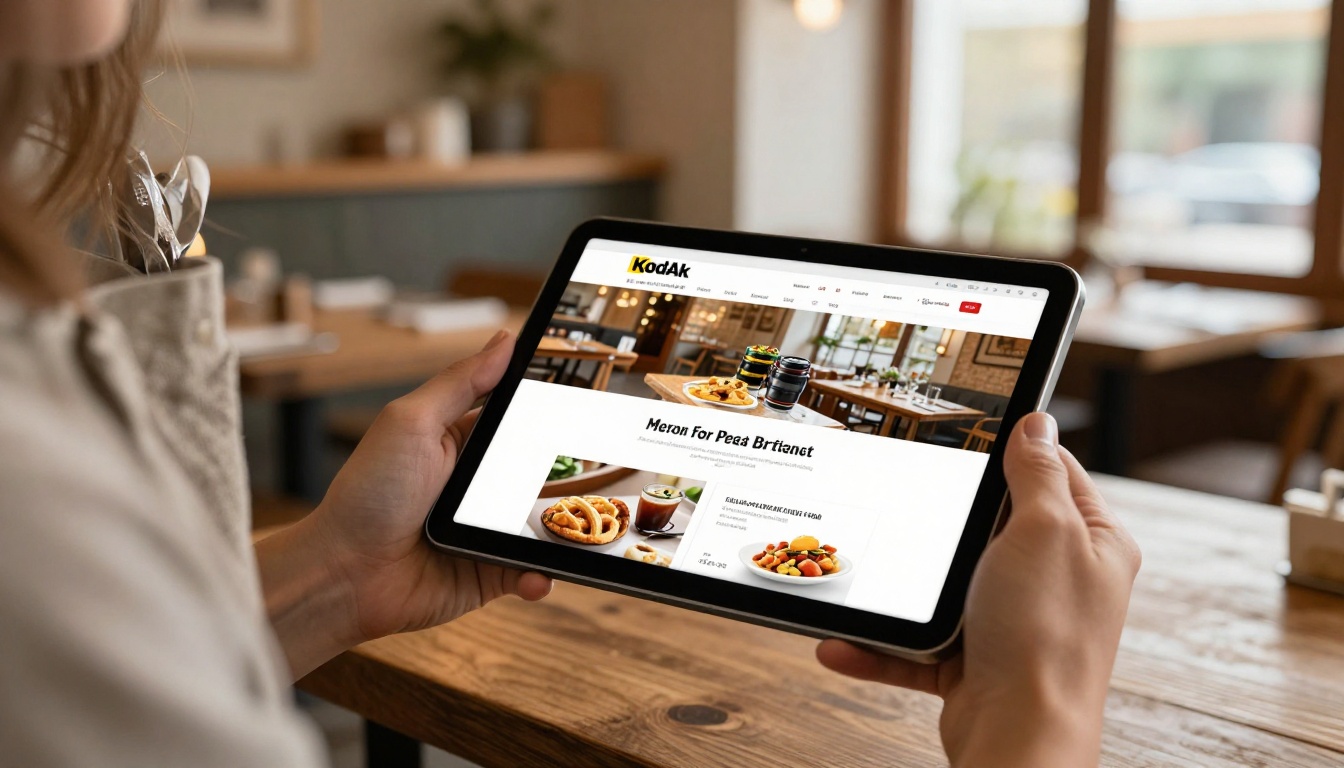
A restaurant can add a button labeled "View menu" that opens a lightbox. Diners check a dish, close the popup, and book a table without leaving the page. The Restaurant Menu Creator and Spa & Wellness Menu tools produce flipbooks that fit this pattern well.
Real Estate Agents
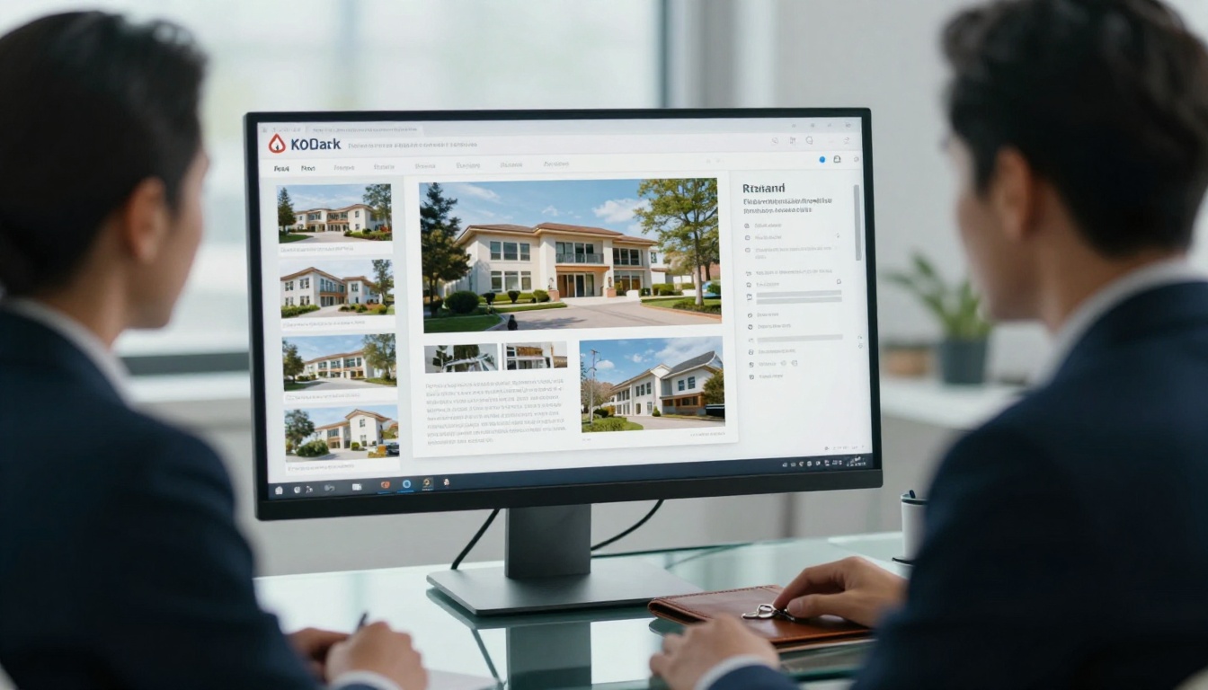
Agents often have listing pages packed with photos, maps, and contact buttons. A lightbox keeps that page clean while still offering a full brochure. A Real Estate Brochure flipbook opens with one click and prints nicely if the client downloads it.
Schools and Training Teams
A teacher posting lesson packets benefits from inline placement: students scroll, read, and flip without extra steps. The Course Material Publisher and Training Manual Flipbook tools suit that setup.
Hybrid Approach: Use Both
You are not limited to one choice. Many sites combine the two:
Show an inline preview of the first spread near the top of the page.
Add a fullscreen or popup button for readers who want more room.
On mobile, swap the inline embed for a thumbnail that opens a lightbox.
This hybrid pattern gives search friendly context, a quick look for casual visitors, and an immersive view for committed readers.
💡 Pro tip: Use CSS media queries or your page builder's device visibility settings to show the inline embed on desktop and the lightbox trigger on phones. Both can point to the same flipbook link, so analytics stay unified.
How to Embed a Flipbook with Flipbooks AI
The setup takes only a few minutes whichever option you choose. The steps below follow the typical flow.
Step 1: Create Your Account
Head to Flipbooks AI and sign up. Plans are listed on the pricing page, and unlimited flipbooks arrive with the Standard plan and above. No watermarks appear on your flipbooks.
Step 2: Upload Your PDF
Use the PDF to Flipbook Converter to upload your file. The platform converts each page into a flipbook with realistic page turning, and conversion usually finishes within moments.
Step 3: Customize the Look
Set your custom branding, background color, logo, and page effects. You can also add embedded video and audio where it helps the reader. Remember that a lighter background suits inline placement, while a darker one pairs well with a lightbox.
Step 4: Choose Your Sharing Method
Open the share panel of your flipbook.
Copy the embed code for inline placement, or copy the direct link to use behind a popup trigger.
Add password protection if the content is private.
Paste the code into your page builder, CMS, or HTML editor.
On the Professional plan you can switch on analytics, lead generation forms, and offline downloads. Analytics show which placement draws more readers, and lead forms turn that reading into contacts.
Common Mistakes to Avoid
Embedding a huge flipbook above the fold. It slows the first view. Use lazy loading or a lightbox.
Opening a popup uninvited. Always wait for a click.
Forgetting a fallback link. Some visitors block scripts.
Ignoring mobile. Test on a real phone before publishing.
Using vague trigger text. "Click here" tells nobody anything.
Skipping measurement. Without analytics, you are guessing.
Decision Cheat Sheet
If your priority is...
Choose
Fastest possible page
Lightbox
Maximum reading time
Inline
Small text on phones
Lightbox
Image heavy storytelling
Inline
Lead capture offer
Lightbox
Content that must rank in context
Inline with text around it
Several flipbooks on one page
Lightbox
Not sure yet
Hybrid, then test
Pick One and Publish Today
Neither option is better in every case. Inline embed wins when the flipbook is the main attraction and you want readers flipping instantly. Lightbox popup wins when speed, screen space, and a clean layout come first. When you cannot decide, show an inline preview on desktop, a lightbox on mobile, and let your analytics settle the debate.
Ready to try it? Get started for free on Flipbooks AI, browse all flipbook tools to find a template for your content, or compare pricing plans to see which one includes the analytics you need. You can finish your first embed before your coffee gets cold.