Most brands post carousels on instinct. They pick ten photos, add a caption, hit share, and hope. The numbers tell a different story: carousels consistently out-earn single images on saves, time spent and repeat views, and small choices like slide count or the first frame swing results by double digits. This article pulls together the Instagram carousel statistics worth knowing, explains what is behind them, and shows how to turn your best carousels into assets that last longer than a feed cycle, for example as a flipbook built on Flipbooks AI.
💡 A note on the numbers: Benchmarks vary by industry, account size and year. The figures below are commonly reported ranges from social media studies and platform commentary, so treat them as directional and test against your own account insights.
Why Carousels Beat Single Posts

Across most published benchmark studies, carousels land at the top of the format ranking for interaction rate. Reported averages usually put them roughly 1.4 times above single-image posts and often ahead of Reels for saves and shares on educational content.
Three mechanics explain it:
- More time on the post. Every swipe is a signal. The viewer chose to continue.
- A second chance to appear. When someone scrolls past a carousel without swiping, Instagram often shows it again starting at slide two or three.
- Built-in storytelling. A sequence lets you set up a problem, show proof, and end with a call to action.
The Re-Serve Effect
Many marketers report that the second impression of a carousel, often opening on a different slide, performs as well as the first. That means slide two should work as a standalone hook, not just a continuation.
Saves Are the New Currency
Saves signal that content is worth returning to. Carousels with checklists, frameworks or comparisons collect far more saves than lifestyle photos. If your goal is long-term reach, design for the save.
Here is a simplified view of typical relative performance. Absolute numbers shift, but the ordering is stable in most reports.
| Format | Typical Interaction Rate | Strongest Signal | Best Use |
|---|
| Carousel | Highest on most accounts | Saves and swipes | Education, product stories, comparisons |
| Reel | High reach, lower depth | Views and shares | Discovery, trends, personality |
| Single image | Lowest of the three | Likes | Announcements, quotes, simple visuals |
| Story | Short lived | Replies and taps | Behind the scenes, polls |
✅ Best practice: Use Reels to attract new people and carousels to convert them into followers who stick around.
Slide Count: How Many Is Right

Instagram now allows up to 20 slides per carousel. More room does not mean more results.
The 5 to 10 Sweet Spot
Most analyses show interaction peaking between five and ten slides. Below five, there is not enough reason to swipe. Above ten, drop-off climbs and fewer people reach the final call to action.
When Longer Works
Long carousels of 15 or more slides perform when they function like a mini publication: step-by-step tutorials, lookbooks, trend reports. In these cases the viewer expects depth.
| Slide Count | Typical Outcome | Recommended For |
|---|
| 2 to 4 | Quick views, few saves | Before and after, simple announcements |
| 5 to 10 | Highest swipe-through and saves | Tips, product stories, comparisons |
| 11 to 15 | Strong saves, falling completion | Tutorials, checklists |
| 16 to 20 | Niche, high intent audience only | Lookbooks, mini reports |
The First Slide Decides Everything
Industry data suggests that a large share of viewers never swipe at all. The first frame carries most of the weight.
What Strong Opening Slides Share
- A single clear promise in under ten words
- High contrast between text and background
- A visible swipe cue such as an arrow or a "1/7" indicator
- A face or a recognizable product, not a stock-looking graphic
What Weak Opening Slides Share
- Tiny text that is unreadable on a phone
- Logos taking more space than the message
- Vague titles like "Some thoughts" or "New post"
⚠️ Warning: Do not bury the best idea on slide six. If viewers do not reach it, it does not exist.
Timing and Frequency Statistics

Posting time studies disagree, which is itself a lesson: your audience matters more than any universal rule. Still, some patterns recur.
- Weekdays late morning and early evening tend to show the strongest interaction for B2B and professional brands.
- Weekend mornings often work better for lifestyle, food and travel.
- Two to four carousels per week is a frequent recommendation. More than that can fatigue your audience unless each post is distinct.
Consistency Beats Perfect Timing
A steady rhythm trains your followers to expect you. Pick three slots a week, track results for a month, and adjust from your own insights rather than a generic chart.
| Brand Type | Starting Window to Test | Weekly Frequency |
|---|
| B2B and SaaS | Tue to Thu, 11am and 6pm | 2 to 3 |
| Retail and fashion | Thu to Sat, evenings | 3 to 4 |
| Food and hospitality | Weekends, mornings | 3 to 4 |
| Education and coaching | Mon to Wed, mornings | 2 to 3 |
Design Choices Backed by Data
Text Size and Density
Phones are small. Most high performers keep to one idea per slide, with headlines large enough to read at arm's length. Dense paragraphs on slides get swiped past, or worse, abandoned.
Consistent Visual Identity
Brands that keep colors, fonts and layouts steady across slides report better recognition and follower growth. Consistency tells viewers the next slide belongs to the same story.
Real Photography Over Stock
Authentic photos of real people, products and spaces draw more saves than generic graphics. A boutique showing its actual shelves will beat a polished but anonymous template.

Captions Still Matter
Captions feed search and give context. Short captions with a clear question or next step tend to produce more comments, while long captions suit educational carousels where readers want depth.
Instagram increasingly behaves like a search engine. Reported advice from the platform itself favors descriptive keywords in captions and alt text over long hashtag lists.
- Use three to five relevant hashtags rather than thirty
- Put your main topic phrase in the first line of the caption
- Add alt text describing each slide
- Name your account and profile with the terms customers actually search for
💡 Pro tip: Treat your carousel like a mini landing page. A clear title, a clear promise and a clear next step.
What To Measure After Posting

Likes are the weakest metric. Focus on signals that predict growth.
| Metric | What It Tells You | Healthy Direction |
|---|
| Saves | Content is worth keeping | Rising week over week |
| Shares | Content is worth sending | Rising, especially via DMs |
| Swipe-through rate | Opening slide works | Above your own average |
| Reach from non-followers | Discovery potential | Growing over time |
| Profile visits and follows | Brand interest | Tied to specific posts |
| Link clicks and DMs | Real business intent | Rising steadily |
A Simple Review Routine
- Export insights for your last ten carousels.
- Sort by saves, then by shares.
- Note slide count, opening slide style and topic for the top three.
- Repeat what worked, retire what did not.
- Test one variable per post: the hook, the slide count or the call to action.
Give Your Best Carousels a Second Life

Here is the gap the statistics reveal. A carousel lives in the feed for a few days, then fades. The strongest ones, the tutorials, lookbooks and checklists, deserve a permanent home where customers can find them, share them and read them on any device.
That is where a flipbook comes in. Turn the slides into a PDF, upload it, and you get a page-turning publication with your own branding, no watermarks, and a link you can place in your bio, newsletter or website.
How to Turn a Carousel Into a Flipbook
- Export your carousel slides as images and combine them into a PDF. Any design tool works.
- Create your free account on Flipbooks AI.
- Upload the PDF with the PDF to Flipbook Converter. Pages become a smooth flipbook within moments.
- Customize colors, background and branding so it matches your feed.
- Add multimedia such as embedded video or audio for extra depth.
- Share with a direct link, or use the Embed Flipbook on Website option to place it on your own pages.
- Protect private editions with a password when the content is for clients or members.
✅ Best practice: Put the flipbook link in your Instagram bio and mention it on the last slide: "Get the full version, link in bio."
Which Tool Fits Which Carousel
Professional plan users can also see how readers behave inside each flipbook, including analytics and lead generation. That closes a loop Instagram cannot: who actually read the whole thing, and who left an email. See the pricing plans for what each tier includes.
Real-World Examples

A boutique retailer posts an eight-slide carousel of new arrivals each Thursday. At the end of the season, the best slides become a flipbook lookbook sent to wholesale buyers and linked from the shop's profile.
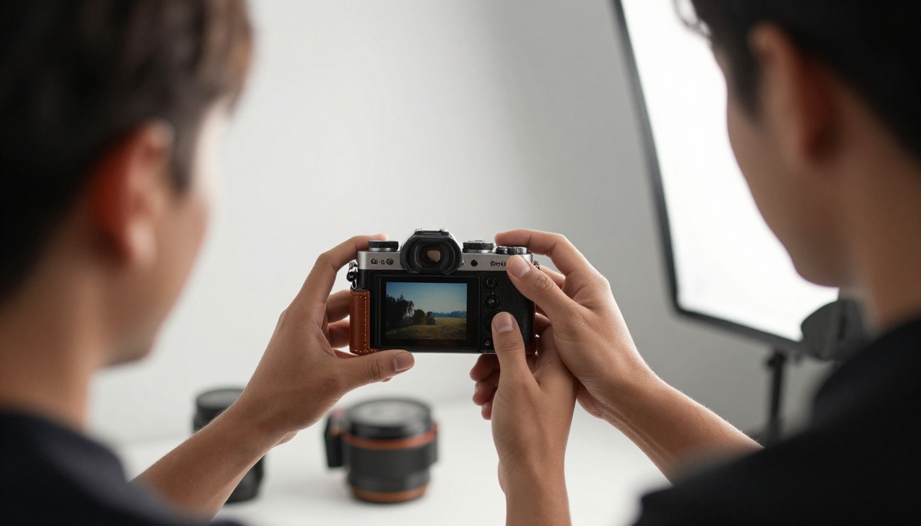
A photographer shares a ten-slide carousel from a recent shoot, then compiles the strongest series into a photography portfolio flipbook for prospective clients who prefer a single, polished link.
A B2B consultant posts a seven-slide framework carousel that earns many saves. The expanded version, with extra charts and templates, becomes a gated flipbook used to collect leads.
Common Mistakes To Avoid
- Posting without a hook. The first slide must justify the second.
- Cramming ten ideas on one slide. One idea per slide.
- Ignoring the last slide. It should carry a single clear next step.
- Switching style every post. Consistency builds recognition.
- Chasing generic posting times. Test with your own audience.
- Letting great content disappear. Repurpose winners into lasting formats.
Your Pre-Posting Checklist
Run through this before every carousel goes live:
- Does slide one make a promise in under ten words?
- Is the slide count between five and ten, unless depth demands more?
- Is every slide readable on a small phone screen?
- Does each slide carry one idea?
- Is the caption keyword-rich, with three to five relevant hashtags?
- Does the final slide state a clear next step?
- Is alt text added to each image?
- Do you have a plan to repurpose it if it performs?
Turn Your Next Carousel Into Something Lasting

The statistics point in one direction: tight sequences of five to ten slides, a sharp first frame, real photography and steady posting win saves and shares. Pair that with a smart habit of repurposing your best work, and every carousel stops being a one-week post and becomes a lasting asset.
Ready to build your first flipbook? Get started for free on Flipbooks AI, browse all flipbook tools to find the right format, or compare pricing plans to pick what suits your brand.



