A flat PDF sent as an email attachment is not a magazine, it is a file. The best interactive digital magazines feel like an issue you want to hold: pages that turn, photos that fill the screen, links that go somewhere useful, and a rhythm that makes you keep going. If you want to build one yourself, Flipbooks AI turns a finished PDF into a page-turning issue in minutes. Before you do, it pays to look at what actually works.
This article walks through seven interactive digital magazine examples worth studying. Rather than naming brands and guessing at their internal choices, each example is an archetype you will recognize from your own reading: the travel quarterly, the food issue, the fashion lookbook, and more. For each one you get the layout decisions behind it, the interactive touches that earn their place, and what you can borrow tomorrow.
💡 Pro tip: Open three digital magazines you enjoy before you design anything. Write down the first thing you notice on each page. That list is your real style guide.
What Makes a Magazine Interactive
Interactive does not mean busy. It means the reader can do something besides scroll. A page turn that feels physical, a link on a product photo, an embedded video that plays in place, a table of contents that jumps to the right spread. Each of these is a small promise to the reader: your attention will be rewarded.
The Three Layers of Interaction
Think of interactivity in layers, from lightest to heaviest:
- Navigation layer: clickable table of contents, page thumbnails, search, and zoom.
- Content layer: embedded video, audio, image galleries, and in-page links.
- Action layer: buy buttons, lead forms, downloads, and shareable links.
Most strong issues use all three, but they lean on the first layer hardest. If readers cannot find their way around, nothing else matters.
Why Page Turns Still Matter
A page-turn animation looks like a detail, yet it does real work. It tells the reader where they are in the issue, it paces the reading, and it gives a two-page spread room to breathe. That is why a flipbook format remains popular for magazines even after years of scrolling feeds. You can see the same principle at work in the Magazine Flipbook Creator, built around spreads rather than endless scroll.

Seven Examples Worth Studying
Here is the short version before the detail. Every example below solves a different problem.
| Example type | Core strength | Best interactive feature | Main risk |
|---|
| Travel quarterly | Immersive photography | Full-bleed galleries and maps | Heavy file size |
| Food and recipe issue | Practical utility | Step-by-step video in place | Cluttered ingredient lists |
| Fashion lookbook | Visual desire | Shoppable hotspots | Too many links per page |
| Photography showcase | Image quality | Zoom and caption pop-ups | Slow loading |
| Corporate member magazine | Trust and clarity | Clickable contents, downloads | Dull design |
| Education and campus issue | Scannability | Embedded quizzes and links | Wall-of-text pages |
| Independent culture zine | Personality | Audio and handmade layouts | Weak navigation |
1. The Travel Quarterly
A travel quarterly lives or dies on its opening spread. The strongest ones lead with a single photograph that runs across both pages, a short headline set in generous white space, and nothing else. No sidebar, no banner, no pop-up.
What to borrow:
- One idea per spread. A place, a person, a meal. Never all three.
- Captions that tell a story, not just a location name.
- A map page halfway through the issue, with links to each article.
The trade-off is weight. Full-bleed photography makes for big files, so compress images before export and test on a phone over mobile data.
2. The Food and Recipe Issue
Food magazines are practical, which makes them ideal for interactivity. A recipe page can hold a short clip of the technique, a printable ingredient list, and a link to the next recipe in the same menu. Readers do not scroll past a recipe, they use it, often with flour on their hands, so tap targets need to be large.
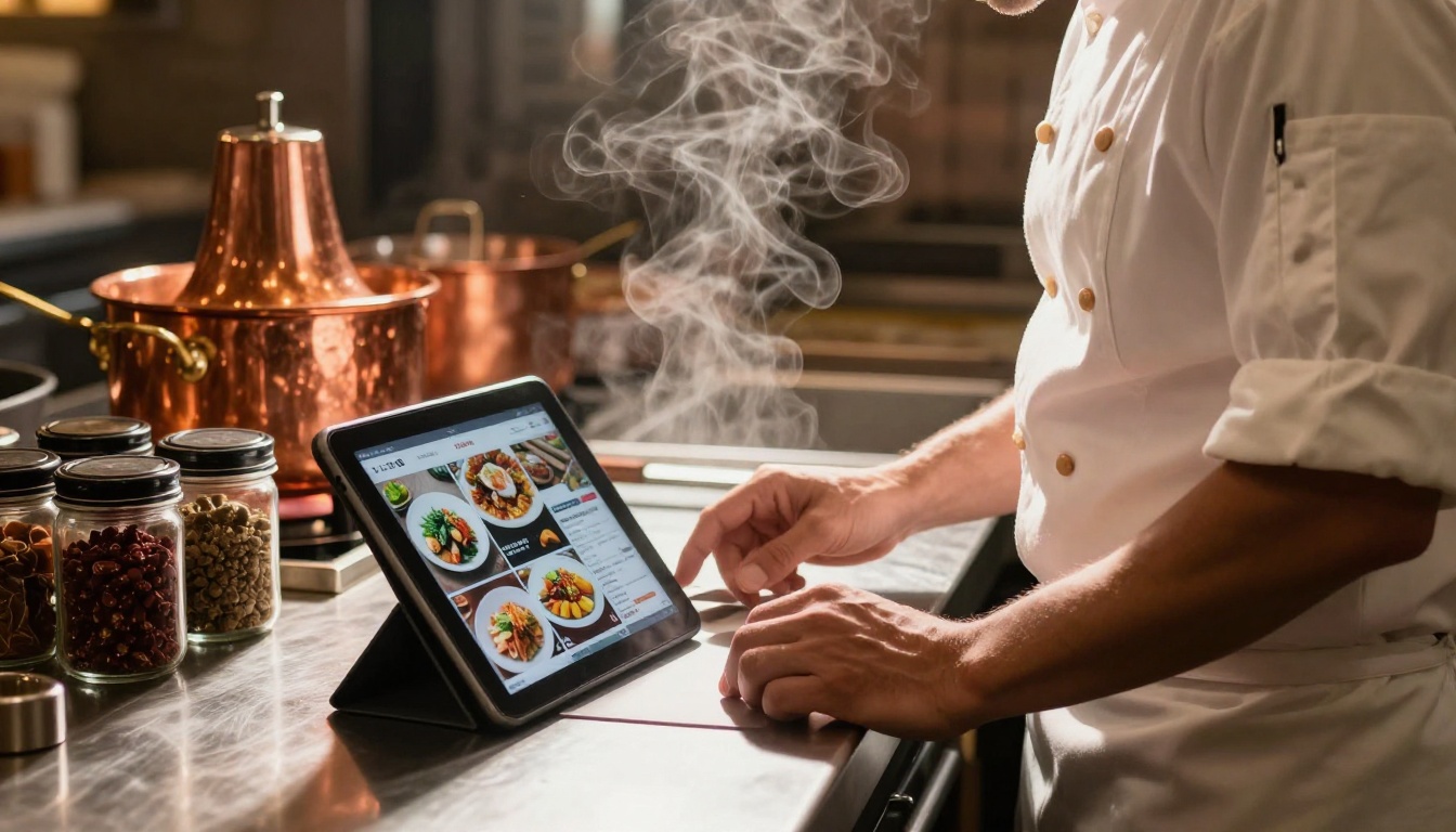
A restaurant group could publish a seasonal issue this way, pairing chef profiles with recipes and a link straight to a booking page. If menus are your focus, the Recipe Book Flipbook and the Restaurant Menu Creator follow the same pattern.
3. The Fashion Lookbook
Fashion is the clearest case for the action layer. Each look sits on a large photograph, with small hotspots on the jacket, the shoes, the bag. Tap, and a card shows the price and a buy link. The craft is restraint: two or three hotspots per page, never ten.
The format sits close to a catalog, so if you sell what you show, the Interactive Lookbook Designer is a natural starting point.
4. The Photography Showcase
A photography issue should be almost silent. Large images, small type, and a zoom function that lets the reader lean in on texture. The best examples use a consistent margin and a single typeface so the photographs do all the talking.
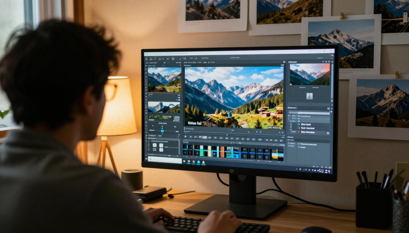
✅ Best practice: Export images at twice the display size so zoom stays sharp, then check the result on a phone, not just a monitor.
5. The Corporate Member Magazine
This is the least glamorous example and the one most worth copying if you work in an organization. Associations, clubs, and companies publish member magazines to keep people informed and loyal. The winning versions have a clickable table of contents, short articles, a letter from the editor with a real face, and downloadable resources on the final pages.
Readers here are busy. Give them a way in and a way out in under a minute. For reports and similar material, the Corporate Report Maker uses the same logic.
6. The Education and Campus Issue
Schools and universities publish newsletters that nobody finishes. The good ones break content into small blocks: a headline, two sentences, a link. They add embedded videos of events and quick links to forms. If you run a school, the School Newsletter Creator supports this approach.

7. The Independent Culture Zine
Zines break rules on purpose. Handmade collage, odd type, audio interviews you can play on the page. What they lack in polish they make up in voice. The lesson is not to copy the chaos but the confidence: a clear point of view makes readers forgive rough edges, as long as navigation stays simple.
Different goals call for different formats. This table matches common goals to the format that fits.
| Your goal | Best format | Pages | Interactive elements to add |
|---|
| Sell products | Fashion lookbook or catalog | 12 to 40 | Hotspots, buy links |
| Build a brand story | Travel or culture quarterly | 24 to 60 | Video, galleries, maps |
| Keep members informed | Member magazine | 16 to 32 | Contents, downloads |
| Share a portfolio | Photography showcase | 20 to 48 | Zoom, captions |
| Teach or inform | Education issue | 12 to 28 | Links, embedded video |
Print Versus Digital: What Changes
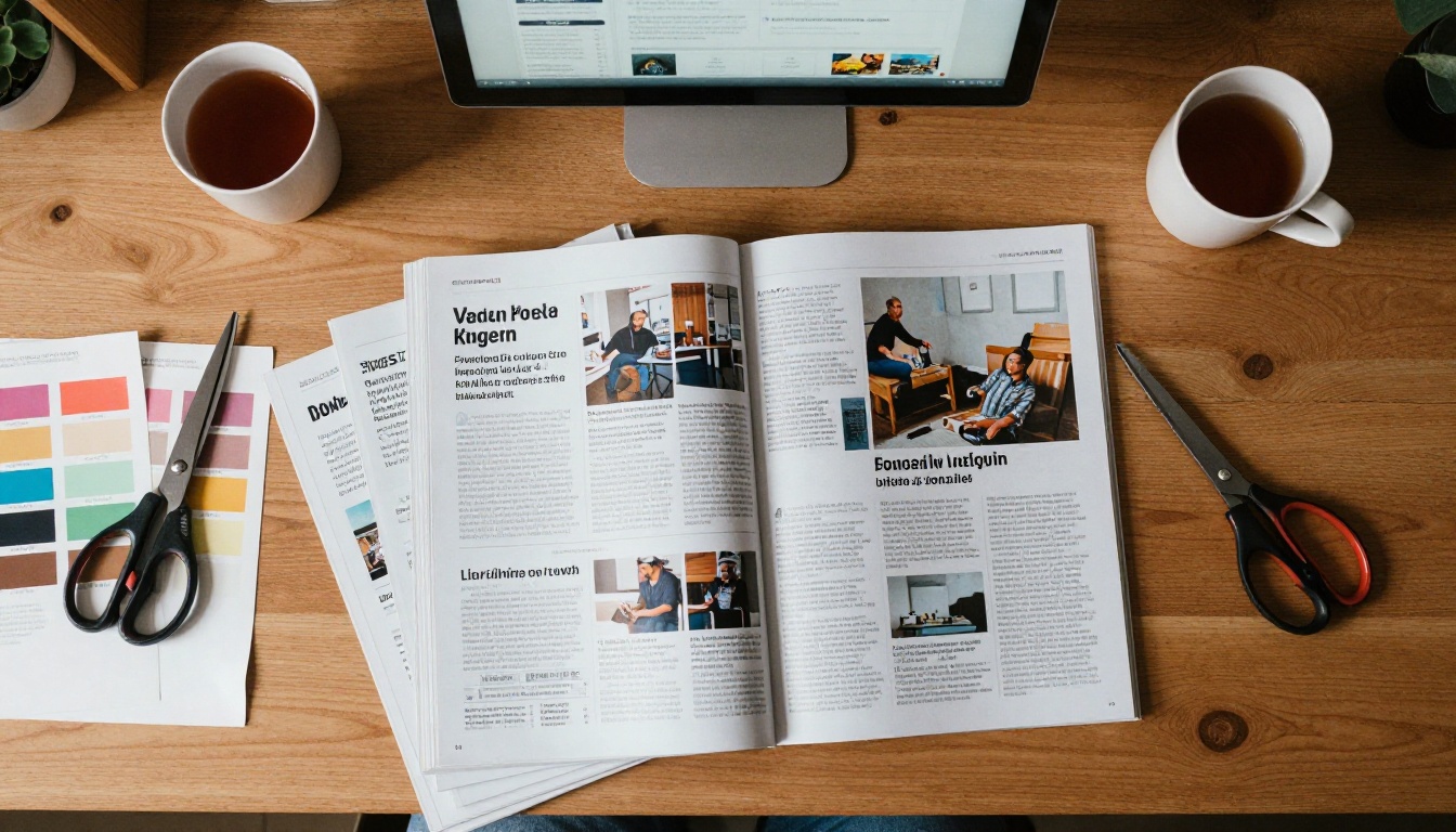
A digital issue is not a print issue on a screen. The differences are practical:
- Reading distance changes. Phone readers hold the device closer, so body text can be a little larger than print.
- Attention is shorter. Break long features with a pull quote or an image every few paragraphs.
- Links replace footnotes. Point readers to sources directly instead of listing them at the end.
- Analytics exist. You can see which pages people read, which print never offered.
Design Rules the Best Issues Share
Studying the seven types above, the same habits keep appearing. They are worth writing on a sticky note.
Pick One Typeface Pair
One serif for headlines and one clean sans for body text is enough. Strong issues rarely use more than two families, and they use weight and size for hierarchy instead.
Leave Space on Purpose
White space is not wasted space. It guides the eye and signals quality. If a page feels crowded, remove the least important element rather than shrinking everything.
Make Every Link Obvious
Readers should never wonder what is clickable. Use a consistent style for links, buttons, and hotspots, and keep tap targets large enough for a thumb.
Keep the Pace Varied
An issue needs a rhythm: a big image spread, then a text-heavy page, then a list, then a quiet pause. Variation keeps readers moving.
⚠️ Warning: Do not stack video on every page. Autoplay media slows loading, annoys readers, and drains phone batteries. Use it where motion adds meaning.
How to Create Your Own Issue
Once you have picked an example to follow, building the issue is quick. Here is the process using Flipbooks AI.
Step 1: Prepare Your PDF
Design your pages in whatever tool you already use and export a single PDF. Keep spreads in mind: if you want two-page layouts, make sure page one is a standalone cover page and the rest are paired.
Step 2: Upload and Convert
Upload the file with the PDF to Flipbook Converter. Conversion keeps your fonts and images intact, and the result is a mobile-responsive page-turning issue with no watermark.
Step 3: Customize the Look
Add your branding, choose background colors, and pick page effects. Then add multimedia: embed a video or an audio clip right on the page where it belongs, and place links over product photos or article teasers.
Step 4: Choose How to Share
You have several options:
- Direct link for email and social posts.
- Embed code to place the issue on your own site, which the Embed Flipbook on Website tool explains.
- Password protection for members-only or private issues.
- Offline download for readers on the move.
Step 5: Add Extra Features
On the Professional plan you get analytics and lead generation, so you can see which pages hold attention and collect emails from readers who want the next issue. Compare pricing plans to see which tier fits your publishing schedule. Unlimited flipbooks are included from the Standard plan up.

Common Mistakes to Avoid
Even good ideas fail on small errors. Watch for these:
| Mistake | What goes wrong | Quick fix |
|---|
| Huge image files | Slow loading, readers leave | Compress to web quality before export |
| No contents page | Readers get lost | Add a clickable contents on page two |
| Tiny text | Unreadable on phones | Use at least 14 point body copy |
| Too many hotspots | Page feels like an ad | Limit to two or three per page |
| No clear next step | Readers finish and leave | End with one obvious link or form |
A few extra habits help too:
- Test on a real phone before publishing, every time.
- Write headlines for scanning, short and specific.
- Update the issue if a link breaks. A digital magazine can be fixed after release, so use that.
Where Readers Actually Find Magazines
Not every reader arrives through your email list. Some find an issue through search, some through a shared link, and some browsing a shelf or a café table and later looking up the digital version. That is why a clean, memorable URL and a strong first page matter more than any single feature.
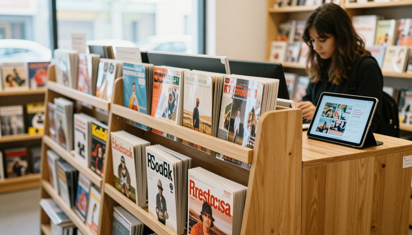
Many publishers pair print and digital: the printed issue sits in a shop or waiting room, with a short link or code on the back page that opens the digital edition, where videos and extra galleries live. Small publishers can do the same on a tight budget.
Build Your Next Issue Today
The seven examples above share one trait: each one respects the reader's time. Pick the type closest to your goal, borrow two or three habits from it, and publish a small first issue instead of waiting for a perfect one. You can always improve the next one.
Ready to turn your PDF into a page-turning issue? Get started for free on Flipbooks AI, browse all flipbook tools and templates, or compare pricing plans to pick the right tier. If you publish on a regular schedule, the E-Magazine Publishing Tool is built for exactly that.



