A 6 millimeter stud earring photographed badly looks like a speck of dust. The same stud, shot well and placed on the right page, looks like something worth paying for. That gap is what this article is about, and every idea below is meant to close it. Whether you sell fine diamonds, silver hoops or handmade beaded bracelets, the format you publish in matters as much as the camera. A digital catalog built with Flipbooks AI lets you give tiny pieces full-bleed pages, tight crops and page-turn pacing that a static PDF never delivers.
Why Small Jewelry Disappears on the Page
Jewelry is the only product category where the item is often smaller than the thumbnail of the photo that sells it. A sofa fills a frame without effort. A pendant has to be coaxed into one.
Three things usually go wrong:
- The piece is shot too wide. The photographer includes the whole table, so the jewelry occupies 8% of the frame.
- There is no scale cue. Shoppers cannot tell whether a ring is dainty or chunky, so they hesitate.
- The layout is crowded. Twelve items per page means every item fights for attention, and tiny ones lose.
Fixing these three problems does more than any new product line. It is cheaper than buying bigger stones, too.
💡 Pro tip: Open your current catalog and squint at it. If you cannot tell which item is the hero on each page within one second, your small pieces are being swallowed.
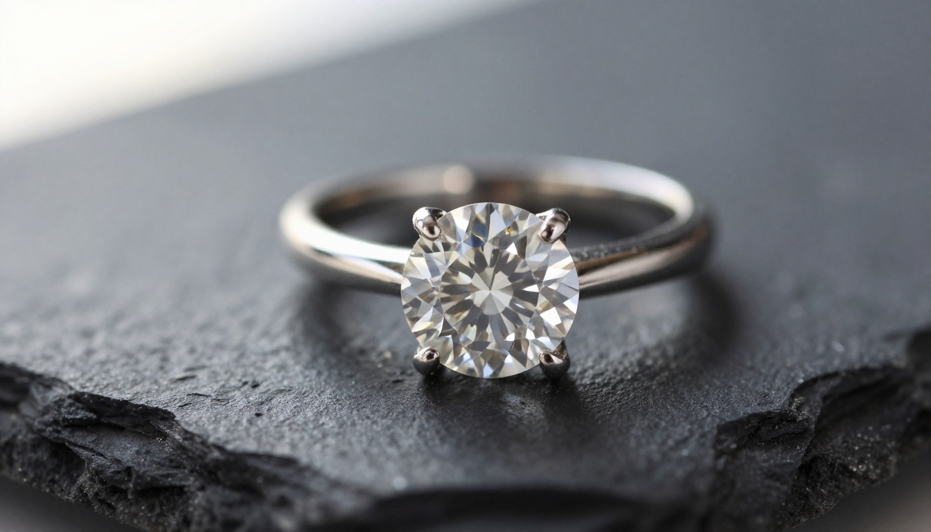
Idea 1: Shoot Macro and Fill the Frame
The fastest way to make a small piece look big is to let it fill the picture. A macro lens in the 90mm to 105mm range lets you get within centimeters of the subject and still keep the background soft.
Crop Tighter Than Feels Safe
Most beginners leave a generous margin. Cut it in half. A ring should take up 60% to 70% of the frame, and an earring stud can go even higher. Crop into the prongs, the clasp or the chain links. Texture reads as quality.
Use a Narrow Depth of Field on Purpose
Shoot around f/4 to f/5.6 for stones and f/2.8 for chains and pearls. Sharp focus on the most beautiful facet, soft falloff everywhere else. The softness tells the eye where to land.
Keep Backgrounds Quiet
Slate, marble, linen and seamless gray all work. Busy patterns make a small subject feel even smaller by comparison.
| Piece | Suggested Lens | Aperture | Frame Fill |
|---|
| Solitaire ring | 100mm macro | f/4 | 65% |
| Stud earrings | 100mm macro | f/5.6 | 70% |
| Fine chain necklace | 90mm macro | f/2.8 | 50% with drape |
| Pearl drops | 70mm | f/3.5 | 55% |
| Charm bracelet | 85mm | f/4 | 60% |
Idea 2: Add a Scale Cue Shoppers Trust
Showing a piece large is only half the job. If the shopper cannot calibrate size, they will assume the worst. A scale cue lets you shoot big and stay honest at the same time.
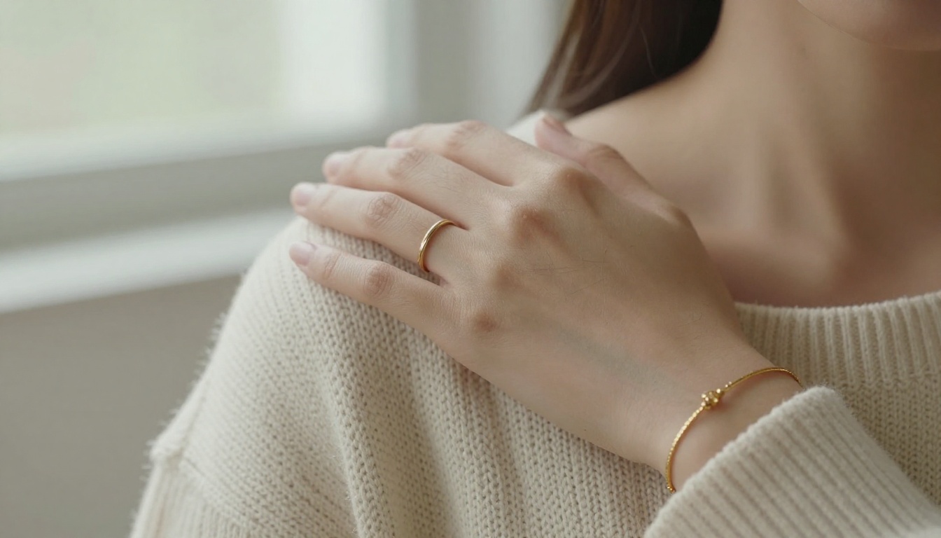
Put It on Skin
A hand, an earlobe or a collarbone is the most trusted size reference in jewelry. Real skin texture and fine hairs add credibility, and warm tones make metal look richer.
Use a Simple Ruler Graphic
A thin, minimal measurement line beside the piece, labeled in millimeters, answers the question before it is asked. Keep it small and elegant so it does not fight the photo.
Pair With Familiar Objects
A coin, a pearl button or a sewing needle can anchor size in a flat lay. Pick one object per catalog and reuse it so readers learn the reference.
✅ Best practice: Show the same piece twice. One macro page for desire, one worn page for size. Place them as a spread so both are visible at once.
Idea 3: Build Pages Around One Hero
Small pieces gain stature when they get space. A page with one earring and a lot of quiet area feels luxurious. A page with twelve feels like a clearance rack.
The 1 + 3 Layout
Use one large hero image occupying two thirds of the page. Underneath, place three small detail shots: the clasp, the back, the stone from the side. Readers get a story instead of a grid.
The Single Piece Spread
For your best sellers, give the left page to a full-bleed macro and the right page to specifications and a worn photo. Flipbook page-turn animation makes this feel like opening a jewelry box.
Keep a Rhythm
Alternate dense pages with quiet ones. After a three-item page, give the reader one with a single piece and white space.
| Layout | Items per Page | Best For | Effect on Small Pieces |
|---|
| Single hero | 1 | Signature rings, statement studs | Maximum presence |
| 1 + 3 detail | 1 hero, 3 crops | Collections with story | Strong, narrative |
| Two-up pair | 2 | Matching sets | Balanced |
| Grid of six | 6 | Best seller index pages | Weak, use sparingly |
| Full-bleed lifestyle | 1 with context | Brand mood pages | Emotional lift |
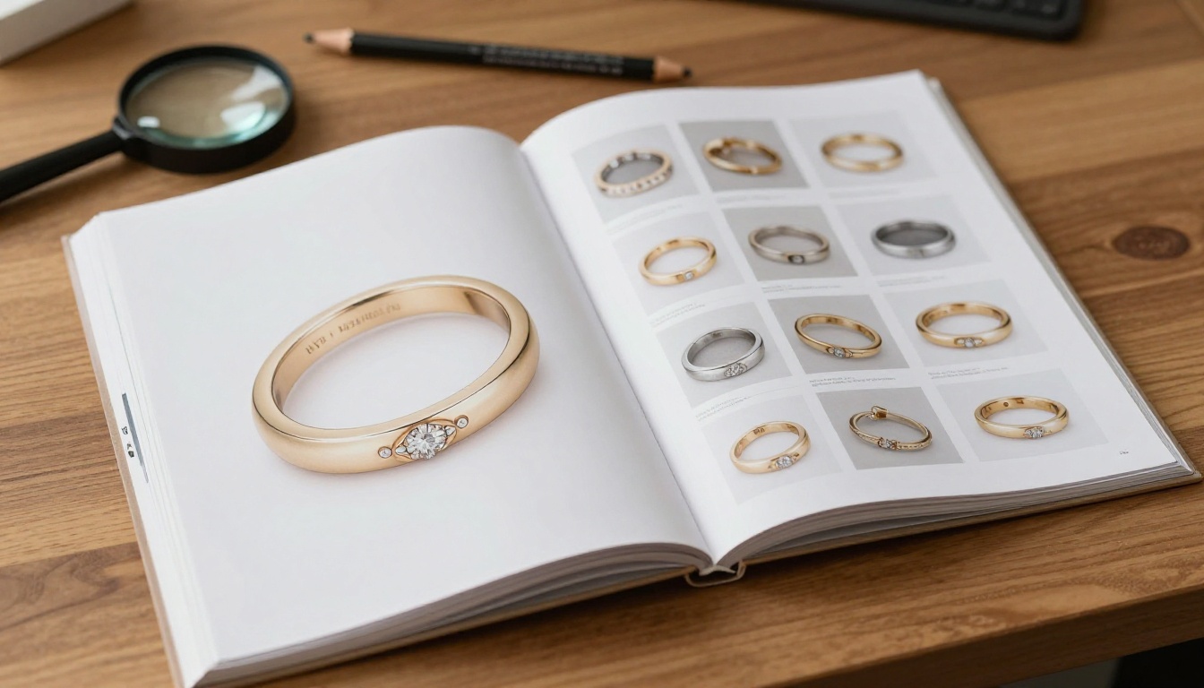
Idea 4: Use Risers, Angles and Height
Small things look larger when they are lifted. Tiny acrylic risers, wax putty and clear stands let you shoot earrings and pendants at eye level instead of looking down at them.
Shoot Low
A low camera angle makes the subject appear taller and more monumental. Three pearl drop earrings on staggered risers read like a small skyline.
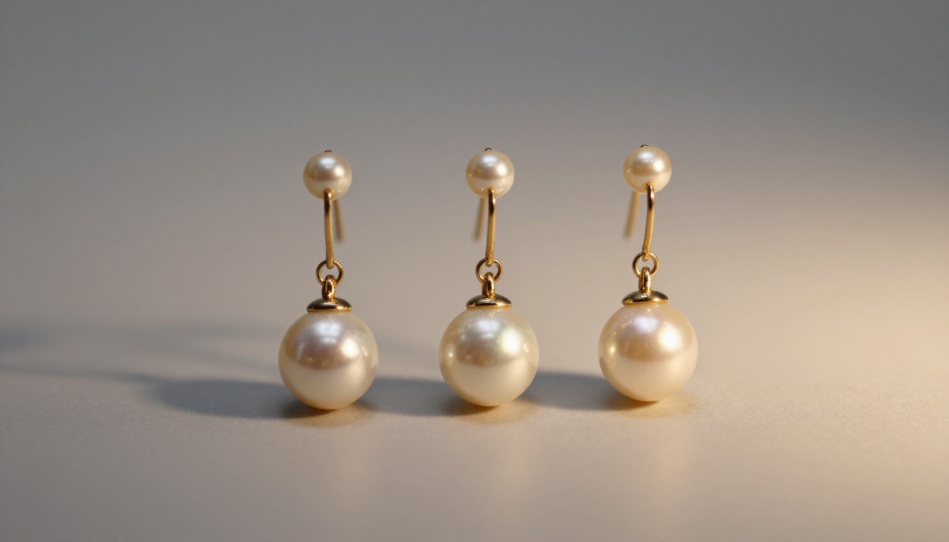
Stagger Heights in Sets
When showing a set, vary the height of each piece. The eye climbs the arrangement and spends more time on the page, which is exactly what you want.
Hide the Support
Remove stands in editing or place them behind the piece. A visible clamp breaks the illusion.
Idea 5: Control the Light Around Tiny Stones
Light does the heavy lifting in jewelry. A small diamond can look like glass or like fire depending on what is reflected into it.
Build a Simple Light Tent
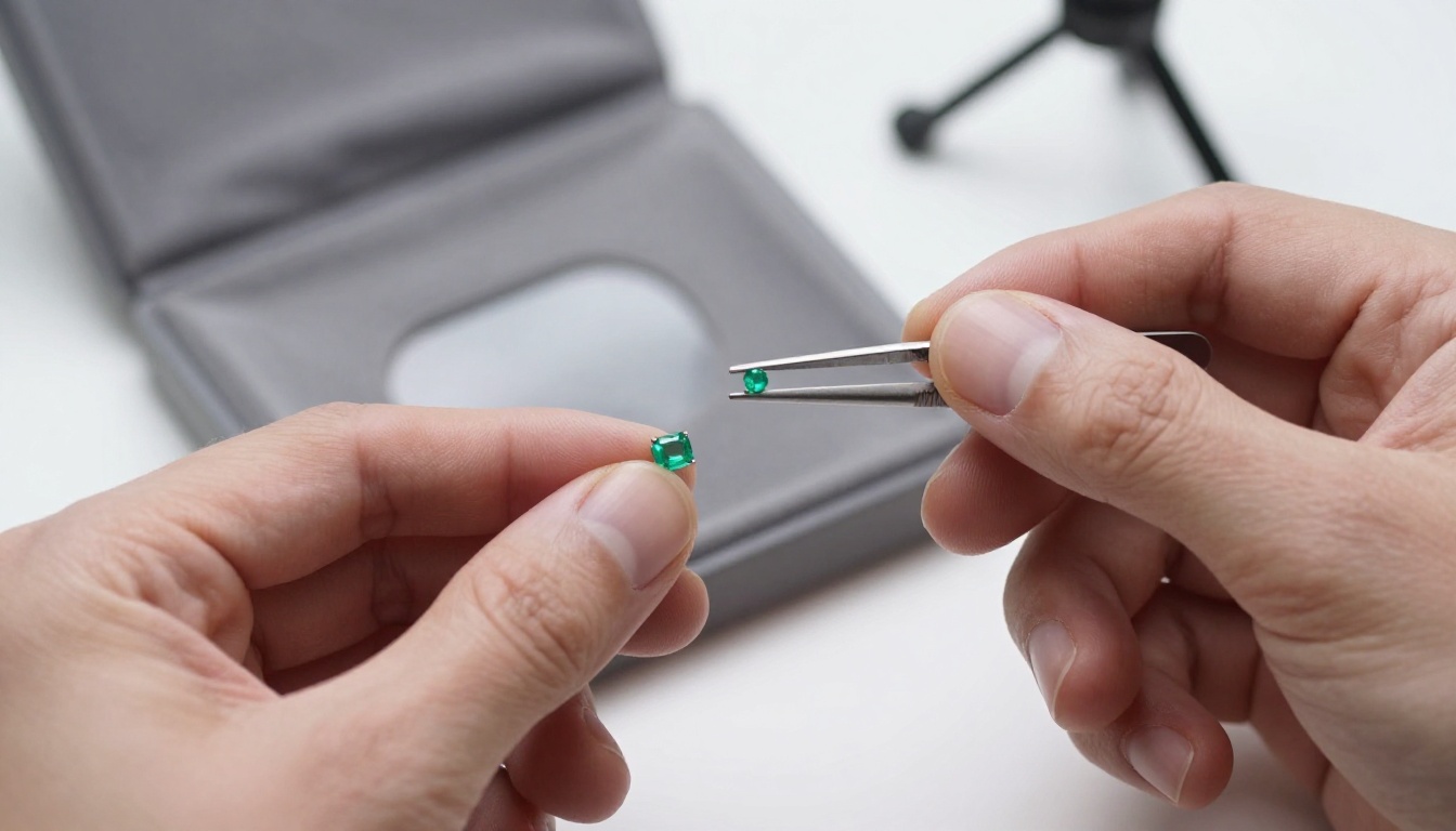
A white fabric tent with a soft box on each side removes harsh reflections from polished gold. Add a small white card on one side and a black card on the other to shape contrast in the metal.
Aim for Sparkle, Not Glare
Diamonds need a few small, sharp light sources to show fire. Colored stones prefer broad, soft light that reveals saturation. Shoot the same piece both ways when unsure and compare.
Clean Everything
At macro scale, every fingerprint looks like a canyon. Use gloves, a blower brush and a microfiber cloth between every shot.
⚠️ Warning: Heavy retouching that changes stone size or color invites returns and bad reviews. Clean dust, never alter the product.
Idea 6: Give Context With Lifestyle Pages
Lifestyle photography tells shoppers how a piece feels in daily life. It also adds scale in a way that is emotional instead of technical.
Place Jewelry in a Scene
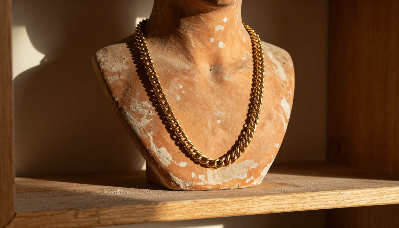
A layered gold necklace over a sculpture on a sunlit shelf says "gift for yourself." A stack of rings next to a coffee cup says "everyday." Choose scenes that match your customer, not your own taste.
Tell a Collection Story
Group pieces by mood: Morning, Evening, Wedding. A theme gives small pieces a shared identity, and shoppers tend to buy more than one item from a story they like.
Bridal Pages Deserve Their Own Space
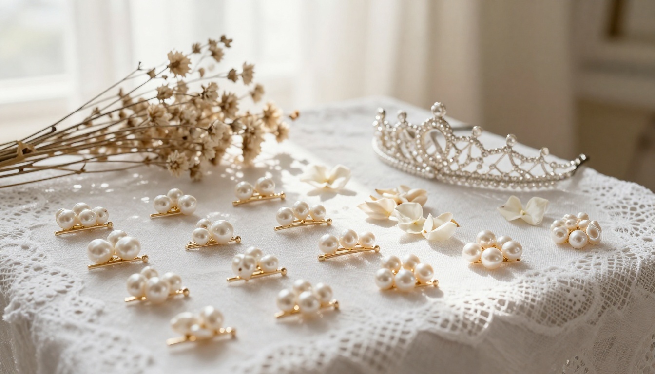
Bridal buyers browse slowly and compare carefully. Dedicate pages to pearl pins, delicate tiaras and thin bands, with generous white space.
Idea 7: Write Short Captions That Add Size and Feel
Photos do the heavy work, but a short caption closes the sale. For small pieces, captions should answer three questions in under 20 words:
- How big is it, in millimeters?
- What is it made of?
- How does it feel to wear?
Example: "6 mm lab diamond studs in 14k gold. Light enough to forget you are wearing them."
Avoid vague praise like "stunning" and "perfect." Specific beats generic every time.
| Weak Caption | Stronger Caption |
|---|
| Beautiful pearl earrings | 8 mm freshwater pearl drops on a 25 mm gold hook |
| Elegant ring | 2 mm band in recycled silver, sits flat under a watch |
| Lovely pendant | 12 mm teardrop on a 45 cm chain, rests below the collarbone |
Idea 8: Design for Screens First
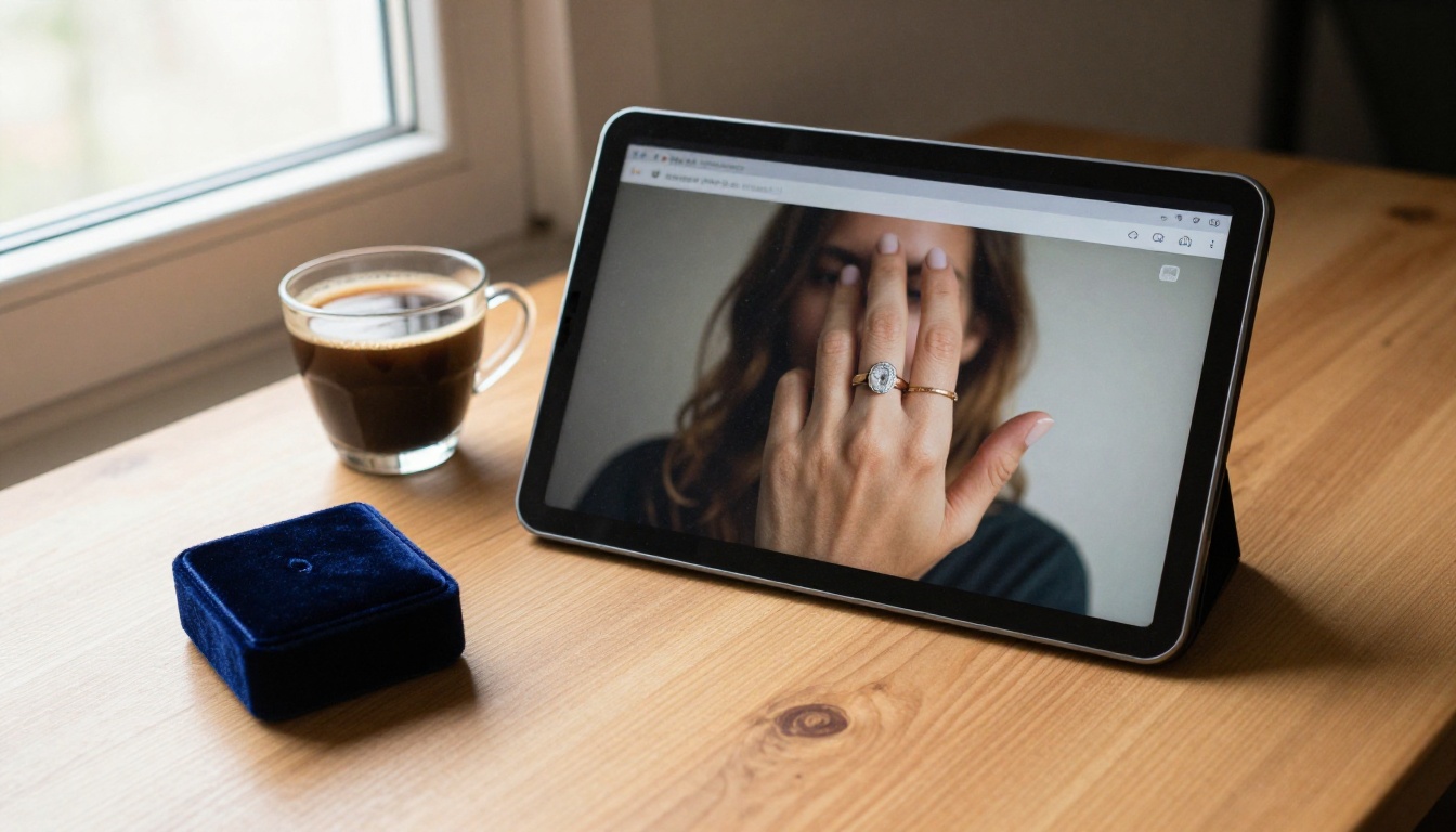
Most shoppers will meet your catalog on a phone. On a six inch display, a 6 mm stud is a rumor unless you plan for it.
Make Zoom Part of the Design
Large source images let readers pinch in on stones and clasps. A flipbook preserves image quality at high zoom, so detail stays crisp instead of turning to mush.
Keep Text Readable
Spec lines should be at least the size of body text on mobile. If you need a magnifier to read the metal type, the page has failed.
Offer a Direct Path to Buy
Links from a page to the product listing shorten the route from desire to cart. Pair this with analytics so you can see which pages hold attention.
How to Build a Jewelry Flipbook Catalog
If your goal is a catalog that treats tiny pieces like stars, a flipbook gives you the most control. Here is a practical workflow using Flipbooks AI.
Step by Step
- Design your pages in a layout tool. Use any program that exports PDF. Set pages in portrait or spread format and keep image resolution high, at least 300 dpi for hero shots.
- Create an account. Head to Flipbooks AI and sign in.
- Upload the PDF. The PDF to Flipbook Converter turns each page into a turnable spread with a realistic page effect.
- Customize the look. Add your logo, pick background colors that match your brand, and choose a page-flip style. Dark neutral backgrounds make gold and diamonds glow.
- Add multimedia. Embed a short video of a ring rotating or an audio note from the designer. Motion is another way to show scale.
- Add links. Connect each hero image to its product page, so a shopper can buy from the page they are admiring.
- Share. Use a direct link, an embed code for your site, or password protection for wholesale price lists. See the Embed Flipbook on Website tool for details.
- Track results. On the Professional plan you can use analytics and lead generation to see which pages get the most time and who is reading. Check pricing plans for details.
If you want a head start, the Product Catalog tool and the Digital Catalog Maker are made for this exact workflow. Fashion jewelry brands may also like the Interactive Lookbook Designer.
💡 Pro tip: No watermarks appear on your flipbooks, so wholesale buyers see only your brand. Use password protection when sharing trade pricing.
| Format | Zoom Quality | Interactivity | Shareability | Best For |
|---|
| Static PDF | Often pixelated | None | Attachment only | Internal files |
| Website gallery | Good | Moderate | Link | Single products |
| Print catalog | Excellent | None | Physical only | Trade shows |
| Flipbook | Excellent | Links, video, audio | Link, embed, QR | Full collections |
Common Mistakes to Avoid
A few errors keep showing up in jewelry catalogs, even from experienced brands:
- Mixed backgrounds across pages. Inconsistent color makes sizes hard to compare.
- Different crop levels for similar items. If one ring fills 70% of the frame and the next fills 30%, shoppers assume the second is smaller.
- Over-sharpening. Halos around metal edges look cheap.
- Too many fonts. Two typefaces are enough.
- Skipping the back view. Clasps, backs and hooks are part of the purchase decision.
⚠️ Warning: If your macro shot exaggerates size by a large margin, expect returns. Always pair it with a worn photo or a measurement.
A Quick Checklist Before You Publish
Run each page through this list:
A catalog that passes all six does not need bigger jewelry. It simply needs readers to see what is already there.
Ready to Make Small Look Big?
Tiny pieces earn their price through detail, and a catalog is where that detail lives. Shoot closer, show real scale, give your best items their own pages and publish in a format that holds up under zoom.
Ready to build yours? Get started for free on Flipbooks AI, browse all flipbook tools to find the right template, or compare pricing plans to see which tier fits your collection. When you are set to publish, upgrade through your account and give your smallest pieces the biggest page in the room.



