Your readers might not be able to name the problem. But the moment issue seven of your newsletter ships with a slightly different shade of blue in the header, a heavier font weight than usual, and a logo that somehow drifted two pixels too far to the right, something in them shifts. The polish is gone. The trust erodes a little. They don't know why they feel it; they just do.
Brand consistency across multiple issues of any publication is one of those disciplines that separates professional publishers from hobbyists. And with digital publications becoming the standard, Flipbooks AI makes it easier than ever to maintain visual coherence across every issue you release. But the tools are only as good as the system behind them.
This is that system.
Why Brand Drift Happens
The Small Shifts No One Notices at First
Brand drift is rarely dramatic. It doesn't happen because someone redesigned your entire publication. It happens in the small moments: a designer who can't find the exact hex code and picks "close enough," a template that got modified during a tight deadline and never got reset, a new contributor who uploaded their own heading style without checking your standards.
By issue ten, your readers are looking at something that barely resembles issue one. And you may not even notice because each incremental change felt small at the time.
The most common culprits:
- Inconsistent hex values across tools (some use CMYK, some use hex, and conversions are rarely exact)
- Font substitution when a file is opened on a machine without the licensed typeface installed
- Unversioned templates that get edited in place and saved over
- Team handoffs without a proper brand briefing
- Platform exports that compress or alter colors during the rendering process
What Readers Notice Without Knowing
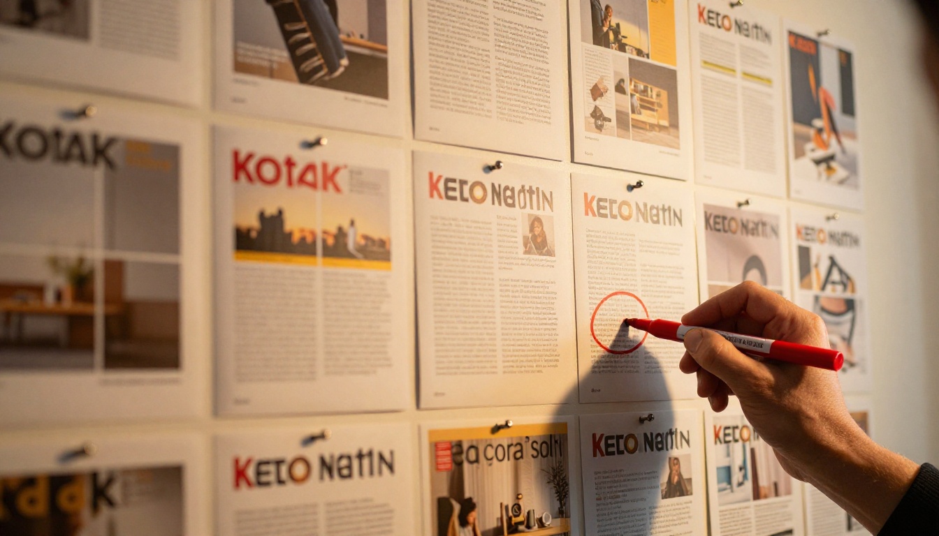
Readers don't read your design consciously. They absorb it. A publication that looks the same across every issue trains their brain to trust it. The logo in the same corner, the same header treatment, the same weight of pull quote text: these signals build familiarity.
The moment those signals break, readers feel it as dissonance. They may describe it as the issue looking "off" or "different" without pointing to a single element. That vague discomfort is your brand inconsistency showing up in their gut.
Build Your Brand Style Guide First
The Non-Negotiables to Document
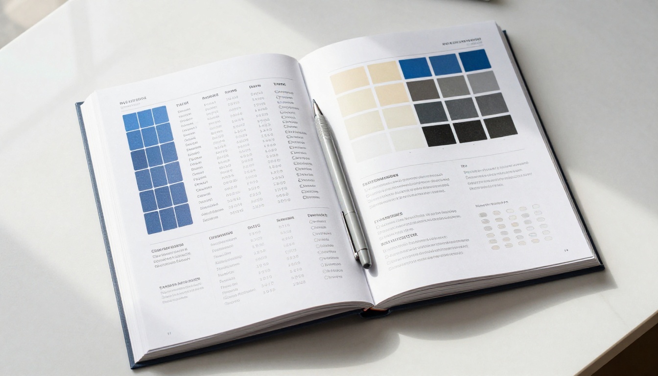
Before you can enforce visual consistency, you need to write it down. A brand style guide isn't just for large companies. If you produce a newsletter, a magazine, a catalog, or any recurring publication, you need a single document that defines exactly how your brand looks.
Your style guide needs to answer these questions unambiguously:
- What is the exact hex code (and CMYK equivalent) for every brand color?
- What typefaces are used, at what weights, and for what elements?
- Where does the logo appear, and what is the minimum clear space around it?
- What photography style represents the brand?
- What tone do captions, pull quotes, and callouts use?
Every person who touches your publication, from the designer to the contributor to the social media manager, should be able to open this document and find the answer to any visual question without asking anyone.
Colors, Fonts, and Spacing Rules
Here is the format your style guide entries should follow for each major element:
| Element | Specification | Do This | Not This |
|---|
| Primary Color | Cobalt Blue #1A3B8C | Use for headers, CTAs, borders | Do not use "close" blues |
| Secondary Color | Warm Cream #FAF3E0 | Background panels, callouts | Do not use pure white instead |
| Heading Font | Inter 700 (Bold) | H1, H2, section titles | Do not swap with system fonts |
| Body Font | Inter 400 (Regular) | All body copy, 16px+ | Do not use below 14px |
| Logo Placement | Top-left, 24px margin | Every cover, every header | Do not center, do not scale below 80px |
This level of specificity removes all ambiguity. "Close enough" becomes "not allowed" when the spec is written down.
💡 Export your style guide as a PDF and store it in the same shared folder as your design templates. It should be one click away from anyone working on the publication.
Lock in Your Visual Templates
One Master Template Per Format
The single most effective way to keep your brand look the same across issues is to work from locked master templates. One template per publication format, stored in a protected location, and never edited directly.
Every issue starts as a copy of the master. Never a copy of the previous issue, which may have accumulated drift. A copy of the master.
This is the discipline that separates publications with consistent visual identity from those that gradually diverge. The previous issue always has small deviations. The master is always correct.
Your template library should include:
- Cover page template with logo, masthead, and cover art placement locked in
- Interior spread template with grid, margin, gutter, and column definitions
- Section opener template standardized for divider pages
- Pull quote template with font, size, color, and background defined
- Caption template with style, size, and positioning rules
Version Control for Design Files
Treat your brand templates like code. Use version numbering (Template_v1.0, Template_v1.1) and never overwrite the previous version. When you make a change to the master, note why.
A simple version log for templates looks like this:
| Version | Date | Change Made | Reason |
|---|
| v1.0 | Jan 2024 | Initial template | Launch |
| v1.1 | Mar 2024 | Updated font to Inter from Roboto | Brand refresh |
| v1.2 | Jul 2024 | Added pull quote block | Reader feedback |
| v2.0 | Jan 2025 | New grid, 12-col from 8-col | Redesign |
Anyone looking at any issue can now trace back to the template version it used, and you know exactly what changed and when.
⚠️ Never let deadlines pressure your team into editing the master template for a "quick fix." Create the fix, test it, then update the master officially.
Typography Across Every Issue
Font Families and Hierarchy Rules
Typography is the most common place where brand drift shows up. It's subtle: a headline that's 34px instead of 32px, a subheading that slipped into Regular weight instead of Medium, a caption that somehow became italic across all pages.
Define your full type hierarchy explicitly and then use styles (in InDesign, Word, or any design tool) to apply them. Never manually format text. Always use paragraph and character styles. This forces every element to match the definition.
Your type hierarchy for a standard publication:
| Level | Style Name | Font | Weight | Size | Usage |
|---|
| H1 | Cover Title | Inter | 800 | 48-56px | Cover headline only |
| H2 | Section Title | Inter | 700 | 32px | Major section openers |
| H3 | Article Title | Inter | 600 | 24px | Individual article headings |
| Body | Body Copy | Inter | 400 | 16px | All body paragraphs |
| Caption | Image Caption | Inter | 400 Italic | 13px | Under all images |
| Pull Quote | Pull Quote | Inter | 300 | 22px | Standout quotes |
Heading Sizes That Never Drift
The key to heading sizes that stay consistent: define a type scale rather than individual sizes. A type scale is a mathematical ratio (like 1.25 or 1.333) applied from the base font size upward.
If your body copy is 16px and you use a 1.25 scale: captions at 13px, subheadings at 20px, section titles at 25px, major titles at 31px. Every size is derived from one formula. There's no guessing, no "looks about right."
✅ Use Google Fonts or Adobe Fonts with a synced library so every team member pulls the exact same font files. Local font installations are the single biggest source of font substitution errors.
Color Consistency From Issue to Issue
Stop Relying on Memory
"I think it was that shade of teal." "It looked darker in the last issue." "I matched it by eye." These phrases are how brand color drift gets started. Your color system cannot rely on human memory or visual matching across different screens and printing setups.
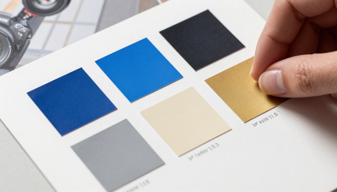
The fix is simple: codify every color in multiple color spaces.
| Color Name | HEX | RGB | CMYK | Pantone |
|---|
| Brand Blue | #1A3B8C | 26, 59, 140 | 81, 58, 0, 45 | PMS 287 C |
| Brand Cream | #FAF3E0 | 250, 243, 224 | 0, 3, 10, 2 | PMS 9182 C |
| Accent Gold | #C9A84C | 201, 168, 76 | 0, 16, 62, 21 | PMS 7752 C |
| Text Dark | #1E1E1E | 30, 30, 30 | 0, 0, 0, 88 | N/A |
When you have all four values, you can match your colors accurately whether you are designing for screen, printing at a vendor, or setting up a digital flipbook.
Hex Codes, CMYK, and Pantone Bridges
The most important thing to understand about color consistency across digital and print: screens show colors in RGB, printers use CMYK, and Pantone spot colors are the most precise of all.
If your digital publication goes out via Flipbooks AI and a print version also ships, the HEX code in your digital template should convert cleanly to the CMYK value you use for print. Document both. The Pantone reference ensures that even if a printing vendor uses a different press, they can hit your exact color.
💡 Calibrate your monitor with a hardware colorimeter at least once a year. Colors that "look right" on an uncalibrated screen may be significantly different from what your readers see and what your printer produces.
Logo Placement and Clear Space Rules
The Grid That Holds Everything Together
Your logo is the single most recognizable element of your brand. Where it appears, how large it is, and how much space surrounds it must be identical in every issue. This is non-negotiable.
Define your logo placement rules in relation to the page grid, not in absolute pixels. Why? Because your publication may be viewed at different sizes, screen resolutions, and print formats. "Logo sits in the top-left corner, within a 24px margin, at a width of 15% of the page width" scales correctly regardless of the output size. "Logo at 120px wide in the top-left" breaks on a 4K display.
Clear space rules: define a minimum exclusion zone around your logo equal to the height of the capital X in your logo wordmark. Nothing should enter that zone. No text, no images, no decorative elements.
What Not to Do With Your Logo
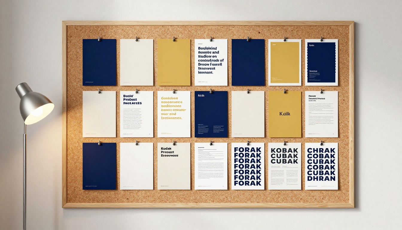
A "don't" sheet for your logo is just as important as a "do" sheet. Include these in your style guide as visual examples:
- Do not stretch or compress the logo horizontally or vertically
- Do not apply drop shadows or outer glows
- Do not place the logo on a background color that has insufficient contrast
- Do not use an outdated version of the logo file
- Do not rotate the logo
- Do not crop the logo
- Do not recreate the logo in a different font
Every one of these transgressions happens regularly in real publications. The style guide with visual examples of what NOT to do is the fastest way to prevent them.
How Flipbooks AI Keeps Every Issue On-Brand
Flipbooks AI is built specifically for publishers who need their digital publications to look polished and consistent across every issue. Whether you are producing a monthly newsletter, a seasonal catalog, or a quarterly magazine, the platform gives you tools to lock in your brand and apply it systematically.
Step-by-Step: Setting Up Brand Consistency in Flipbooks AI
Step 1: Create your account and access your workspace
Head to flipbooksai.com/account and create or log into your account. Your workspace stores all your flipbooks in one place, organized and accessible.
Step 2: Upload your branded PDF
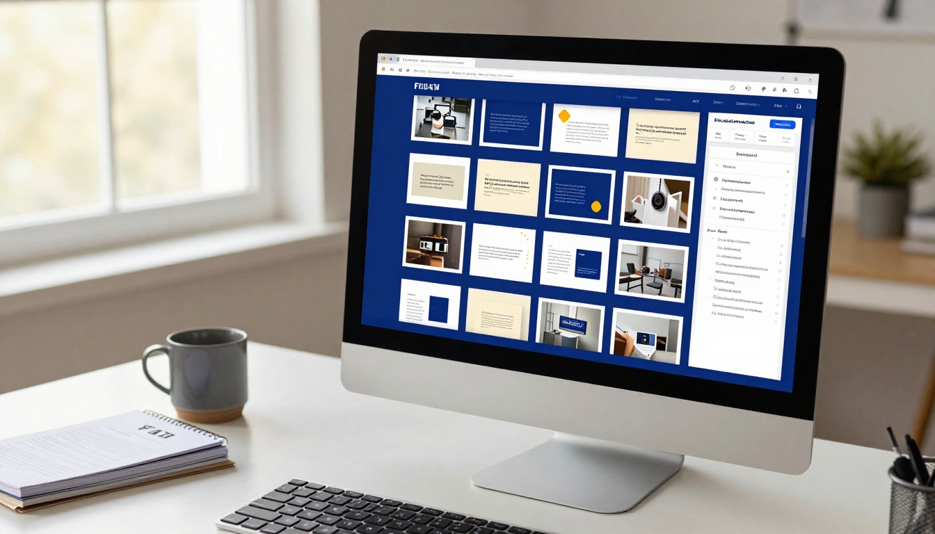
Prepare your PDF using your locked master template. Every element should already conform to your style guide before you upload. Flipbooks AI converts your PDF into an interactive flipbook, preserving your layout, colors, and typography exactly as designed. Use the PDF to Flipbook Converter to begin.
Step 3: Apply your brand colors and custom settings
After conversion, Flipbooks AI lets you apply brand customization directly in the editor. Set your brand colors for the flipbook interface, controlling the player controls, background, and loading screen. This ensures the interactive shell around your content matches your publication's visual identity.
Step 4: Set your consistent publication details
Every issue should share the same flipbook player settings: the same background color, the same navigation style, the same layout treatment. Create a brand settings profile in your account and apply it to every new issue with one action instead of reconfiguring each time.
Step 5: Publish and share consistently
Use the same sharing structure for every issue. Direct links follow a predictable format your readers recognize. Use the Embed Flipbook on Website feature to place your publication in the same location on your site, every time. Readers know exactly where to find it.
✅ Flipbooks AI offers no watermarks on Standard plan and above, unlimited flipbooks, and password protection for private content. Advanced analytics and lead generation tools are available on the Professional plan.
Templates That Carry Across Publications
For recurring publication types, Flipbooks AI integrates with specialist tools that carry their own structural templates:
Each tool is designed around the specific layout conventions of its publication type, which means structural consistency is built in from the start.
What Breaks Consistency (And How to Stop It)
The Team Handoff Problem
The most dangerous moment in any publication cycle is when one person hands a file to another. This is when unlicensed fonts get substituted. This is when "I'll fix it in the next issue" decisions get made. This is when the master template gets accidentally modified.
Build handoff checklists that every contributor and editor must complete before submitting:
A checklist takes two minutes to complete and prevents hours of correction work after the fact.

3 Systems That Enforce Brand Rules Automatically
Beyond checklists and guidelines, you can build systems that make inconsistency structurally difficult:
1. Shared asset library with access control
Store all approved brand assets (logo files, color swatches, font files, approved image libraries) in a shared folder with download access for the team but edit access restricted to the brand owner. If contributors can only use what is in the approved library, they cannot accidentally use off-brand assets.
2. Paragraph and character styles in your design tool
In Adobe InDesign, Affinity Publisher, or even Microsoft Word, define paragraph styles for every text element. Body copy, captions, pull quotes, headings: all defined, named, and applied via style selection. Anyone editing a file must use the defined styles. Manual overrides become immediately visible as inconsistencies.
3. Pre-flight checks before publication
Before uploading your PDF to Flipbooks AI or sending to print, run a pre-flight check. InDesign's built-in preflight panel flags missing fonts, low-resolution images, and RGB images in print-intended files. Establish a preflight profile for your publication and make it mandatory before any file is finalized.
⚠️ A pre-flight error at publication time is always better than a brand drift problem discovered three issues later.
Not all digital publishing platforms treat brand consistency the same way. Here is how they compare on the features that matter most for maintaining visual identity:
| Feature | Flipbooks AI | Basic PDF Hosting | Generic CMS |
|---|
| Preserves PDF layout exactly | ✅ Yes | ✅ Yes | ❌ Often reformats |
| Custom brand colors in player | ✅ Yes | ❌ No | ⚠️ Limited |
| No watermarks | ✅ Standard plan+ | ❌ Usually watermarked | ✅ Yes |
| Embed on website | ✅ Yes | ❌ No | ✅ Yes |
| Analytics per issue | ✅ Professional plan | ❌ No | ⚠️ Depends |
| Password protection | ✅ Yes | ❌ No | ⚠️ Plugin needed |
| Mobile-responsive | ✅ Yes | ❌ No | ✅ Yes |
| Consistent sharing URL format | ✅ Yes | ❌ No | ✅ Yes |
| Offline download | ✅ Yes | ✅ Yes | ❌ Rarely |
For publishers serious about brand consistency in digital format, Flipbooks AI offers the most complete feature set. Compare pricing plans to see what each tier includes.
Your Brand Is a Promise
Every issue is a renewal of that promise. When readers open your tenth issue and it looks, feels, and communicates the same as your first, you have built something valuable: a publication they recognize instantly, trust implicitly, and return to without thinking.
That consistency doesn't happen by accident. It happens because someone wrote down the rules, built the templates, enforced the handoffs, and chose tools that respect the work.
Flipbooks AI gives you the publishing infrastructure to honor that promise in every issue you release. Your brand goes in; a consistent, polished publication comes out.
Ready to build your first fully on-brand flipbook? Get started free and see how your publication looks when every issue follows the same standard. Or compare plans to find the right fit for your publishing volume.
Browse all available flipbook tools and templates to find the format that fits your publication type.



