The gap between words that feel like a chore to read and text you simply glide through comes down to one thing nobody talks about: the space between lines. Not the font choice, not the color, not the layout grid. The vertical rhythm of the text block, also called leading, shapes the entire reading experience before the reader processes a single word. Getting it right means readers stay longer, absorb more, and associate your content with clarity rather than effort. Getting it wrong means they leave quietly, wondering why your otherwise solid article felt so tiring. Flipbooks AI was built with this in mind, and this article breaks down the exact values that work across every context.
What Line Spacing Does to the Reader's Brain
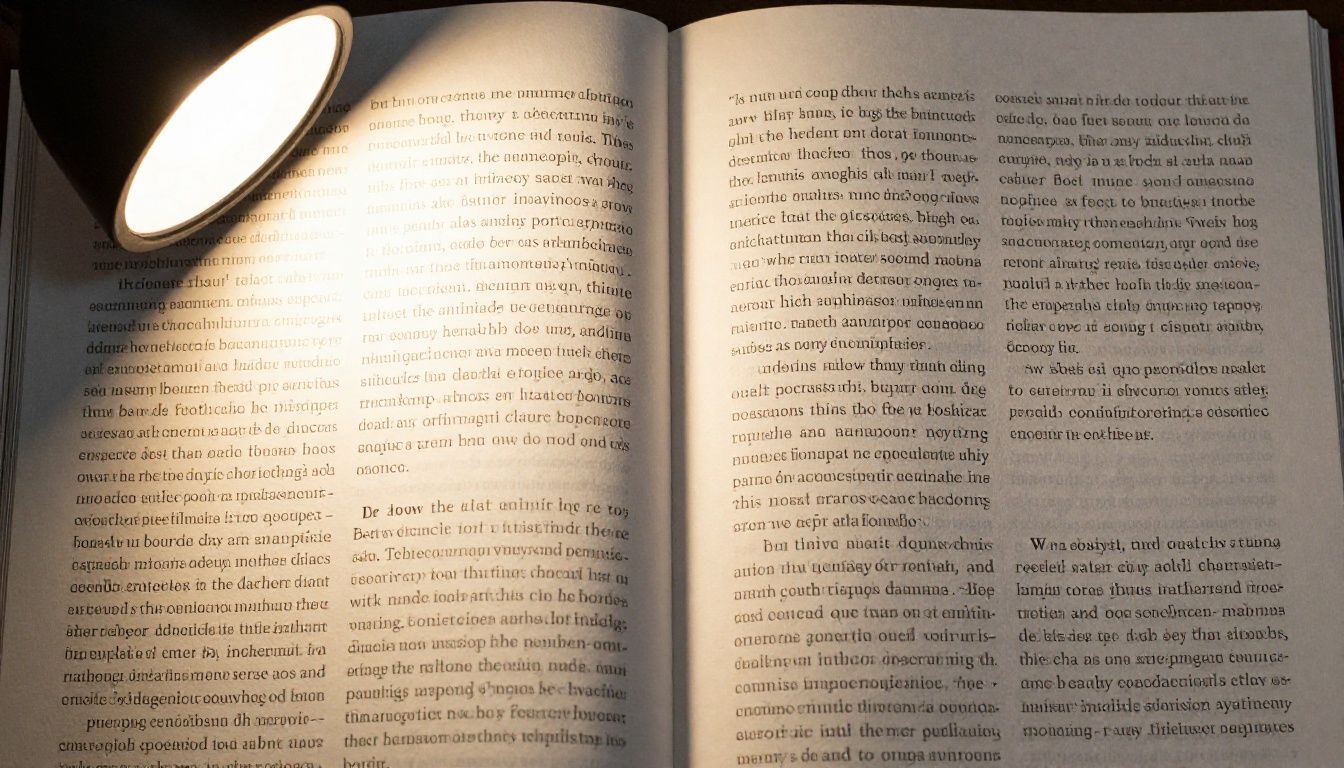
When you read, your eyes do not travel smoothly across the page. They jump in short, rapid bursts called saccades, pausing briefly at clusters of words before leaping forward again. After each line ends, the eye must return to the start of the next one, a movement called the return sweep.
Tight line spacing makes that return sweep error-prone. Your eye does not have a clear visual target. It drops to the wrong line, re-reads, loses its place, and burns cognitive energy compensating. None of this feels like "bad typography" to the reader. It feels like the article is boring, confusing, or too long.
When Tight Lines Cause Eye Fatigue
Research in reading science consistently shows that insufficient leading increases the number of fixation errors. Readers skip lines, re-read sentences, and report higher perceived effort, even when the content itself is simple. A widely cited study in the British Journal of Educational Technology found that increasing line spacing from 1.0 to 1.5 improved reading speed by roughly 8% in typical readers, and significantly more in those with dyslexia.
💡 The problem is not just aesthetic. Poor line spacing activates the parts of the brain responsible for error correction, pulling attention away from actual comprehension.
When Lines Get Too Loose
The opposite problem is just as real. Excessive leading disconnects text from itself. Lines start to feel like isolated fragments rather than a continuous thought. The reader loses the sense of flow. Paragraphs feel longer than they are, and the eye struggles to match the end of one line with the beginning of the next.
The Numbers That Actually Work
Line spacing is typically expressed as a ratio of line height to font size, or as a unitless multiplier. A setting of 1.5 means the line height is 1.5 times the font size. In CSS, this translates directly to line-height: 1.5. In InDesign or Affinity Publisher, it maps to the leading value in points.
| Context | Font Size | Recommended Leading | Line-Height Multiplier |
|---|
| Body text (print) | 10-12pt | 13-16pt | 1.3-1.4x |
| Body text (screen) | 16-18px | 24-28px | 1.5-1.6x |
| Long-form articles | 16-20px | 28-32px | 1.6-1.75x |
| Pull quotes | 20-28px | 28-36px | 1.2-1.4x |
| Captions | 11-13px | 15-18px | 1.3-1.4x |
Screen text consistently needs more leading than print. Displays have lower contrast resolution than printed ink on paper. The pixel grid creates subtle optical noise that tightens the visual perception of line gaps. What looks spacious on paper often feels cramped on screen.
Body Text: The Sweet Spot
For body text in web articles, blog posts, e-books, and digital flipbooks, 1.5 to 1.65 is the accepted baseline. Many premium editorial sites, including publications known for long-form quality, set body text at 1.6 or 1.65. This is not a stylistic preference. It is the range where the return sweep becomes automatic and unconscious.
Below 1.4 for screen body text is where problems start. Above 1.8 for most fonts, coherence begins to fracture. The safe operational window is narrower than most designers assume.
⚠️ Never copy a line-height setting from a print layout directly into a digital publication. Print uses different units, different rendering, and different reading conditions. Recalibrate every time you change medium.
Font-Size-to-Line-Height Ratio by Content Type
| Content Type | Font Size | Ideal Line-Height | Notes |
|---|
| Novel / e-book body | 16-18px | 1.6x | Prioritize fatigue reduction |
| Digital magazine | 15-17px | 1.55-1.65x | Balance density with elegance |
| Product catalog | 13-15px | 1.4-1.5x | Compact but scannable |
| Restaurant menu | 14-16px | 1.4-1.55x | Low light conditions often apply |
| Annual report | 11-13pt | 1.3-1.4x | Often print; tight but professional |
| Landing page | 17-20px | 1.5-1.6x | Short reads, higher contrast environments |

Headlines vs. Body Text: Two Different Rules
Headings behave completely differently from body copy. A body text leading of 1.5 applied to a 36px headline looks like the lines are falling apart. The relationship between character size and the space around it shifts fundamentally at display sizes.
For headlines and large display text, tighter leading looks more intentional and polished. The standard range for headings:
- H1 (32-48px): line-height 1.1 to 1.2
- H2 (24-32px): line-height 1.15 to 1.25
- H3 (20-24px): line-height 1.25 to 1.35
The reason is optical. At large sizes, the ascenders and descenders of letterforms already create generous-feeling internal space. Adding external leading amplifies that space past the point of visual cohesion.
💡 A practical test: if a two-line headline looks like it has a paragraph break in the middle, your heading line-height is too loose. Tighten until it reads as a single connected thought.
Mobile vs. Desktop Reading
Reading on a phone is physically different from reading on a desktop. The viewing distance is shorter, typically 30-40cm versus 50-70cm for desktop. The screen is smaller, and the text line length is much narrower, often 45-55 characters per line instead of 65-80.
Shorter line length means the return sweep is shorter and faster. You can afford slightly tighter leading on mobile without causing errors. In practice, a body text setting of 1.5 on mobile versus 1.6-1.65 on desktop is a well-tested split that most mobile-first reading platforms use.

Line Spacing in Digital Publications
PDFs are the most common format for sharing reports, catalogs, and brochures, but they carry a structural problem: they replicate print layouts on screens where the rendering context is completely different. A PDF designed for A4 paper at 12pt body text with 14.5pt leading looks fine printed. On a laptop at 72% zoom, it becomes dense and difficult.
Why PDFs Often Feel Hard to Read
The answer is almost always line spacing, compounded by font rendering differences between print and screen. PDF viewers do not reflow text. They do not adapt leading for screen pixel density. The document locks in its original typographic decisions and presents them regardless of context.
This is precisely why digital flipbooks, designed from the ground up for screen reading, have a significant advantage over static PDFs when reader experience matters.
How Flipbooks Handle It Differently
A well-built digital flipbook maintains responsive typography. Text elements scale with the viewport rather than staying frozen at their original print dimensions. The reading experience is closer to a well-built website than a static PDF, which means all the typographic best practices for screen, including appropriate leading, actually apply.
Flipbooks AI approaches this by converting your PDF into an interactive, mobile-responsive flipbook that preserves your design while adding navigational and multimedia capabilities that print cannot deliver. The result is a document that feels native to the screen rather than pasted onto it.
How to Set Line Spacing in Flipbooks AI
Flipbooks AI is directly relevant here because the platform handles a critical challenge: taking your designed PDF with its fixed typographic settings and presenting it in a format that reads comfortably on any device.
Step 1: Prepare your source PDF with the right line spacing
Before uploading, review your PDF typography. Body text should be set at minimum 1.3x leading for print documents, with font sizes of 10-12pt. This baseline ensures the PDF's typographic intentions survive the conversion with readability intact. For publications meant primarily for screen reading, push that to 1.4x or higher before generating your PDF.
Step 2: Create an account and upload
Go to Flipbooks AI and create a free account. Upload your PDF directly from the dashboard. The platform converts it to an interactive flipbook while preserving your original layout and typography across all devices, with no watermarks on Standard plans and above.
Step 3: Set your branding and page behavior
Within the editor, apply your brand colors and logo. Configure page turn effects. The smooth page-flip animation reinforces the document's visual flow, which complements well-spaced text by giving the reader a moment to orient before new content appears.
Step 4: Test on mobile
Before publishing, use the built-in mobile preview to check that your text remains readable on small screens. If your source PDF used very tight line spacing for print, the preview will reveal exactly where to adjust your leading before your next conversion.
Step 5: Share or embed
Use the share link or embed code to publish your flipbook on your website or send directly to readers. Browse pricing plans to access password protection, analytics, and lead generation for gated content. The Interactive E-Book Publisher and E-Magazine Publishing Tool are particularly suited to text-heavy long-form publications where line spacing has the biggest impact on reader retention.
✅ Best practice: Design your source PDF at 1.4x leading for body text, not the print minimum of 1.3x, to give yourself a comfortable buffer. What reads well on a high-resolution print proof may read tighter than expected when viewed on a mid-range consumer screen.

Common Mistakes That Hurt Readability
Too Tight, Too Loose: The Two Failure Modes
Most line spacing errors fall into one of two camps. The first is the designer working in print who exports to digital without adjusting. The second is the designer who opens up leading generously everywhere without considering paragraph and heading hierarchy. Both approaches break something.
| Mistake | What It Looks Like | The Fix |
|---|
| Uniform leading for all text sizes | Headings feel too airy, body too tight | Apply different leading to each text style |
| Print leading applied on screen | Dense, fatiguing body text | Increase body text to 1.5x minimum for screen |
| Ignoring line length | Short lines with loose leading, or long lines with tight leading | Scale leading with line length |
| Using pt units in CSS | Inconsistent rendering across browsers | Use unitless multipliers or em values |
| No mobile testing | Increased line-return errors on small screens | Test on physical devices at actual viewing distance |
Ignoring Font-Specific Behavior
Different typefaces have different x-heights, the relative size of lowercase letters compared to cap height. A typeface with a tall x-height (like Roboto, Inter, or Lato) needs more leading than a typeface with a shorter x-height (like Garamond or Times). Applying the same numeric leading value to both produces very different visual results.
💡 A practical check: set your font, then reduce your line-height until lines just start to feel cramped. Then add 0.15 to that number. That is your floor for comfortable reading. Add another 0.1 to 0.15 for long-form content.
The Paragraph Spacing Trap
Line spacing and paragraph spacing work together. Many designers compensate for too-tight line spacing by adding large paragraph gaps. This creates a strange visual rhythm: text is dense within paragraphs but empty between them. The correct approach is to set comfortable line spacing first, then add paragraph spacing of roughly 0.75 to 1x the body font size, just enough to signal a paragraph break without fragmenting the flow.
Real-World Applications
E-Books and Magazines
Long-form e-books are the highest-stakes environment for line spacing decisions. A reader may spend hours in a single document. Every fraction of a unit of leading has a compounding effect over pages and chapters.
Premium e-book publishers consistently use 1.6x to 1.75x for body text. This is notably more generous than what many designers initially choose. The instinct is often to match the tight, high-density feel of print books. But screen reading is cognitively more demanding at baseline, and the leading must compensate.
Digital magazines sit in a middle zone. They have shorter reads per page but often more complex multi-column layouts. A leading of 1.55 to 1.65 for body text, combined with generous column gutters and short column widths of 5 to 7 words per line, produces the scannable, fast-reading experience that magazine readers expect. Tools like the Magazine Flipbook Creator and E-Magazine Publishing Tool are built specifically for this format.
Menus and Catalogs
Restaurant menus and product catalogs are read in constrained conditions: low light, time pressure, and partial attention. These contexts reward slightly tighter leading than long-form reading, but still need enough space for the eye to separate items cleanly.
The Restaurant Menu Creator tool handles this with a format optimized for scannable content in varied lighting conditions. For product catalogs, the Product Catalog Generator provides layouts designed for item-by-item scanning where the reader is comparing options rather than reading continuously.
Annual Reports and Corporate Documents
Corporate reports occupy a specific niche where typographic credibility matters enormously. Tight, professional typography signals authority, but cramped text signals cost-cutting. The Annual Report Creator and Corporate Report Maker target exactly this balance: professional density without sacrificing readability for stakeholders who may read these documents under pressure.
The Difference Between Good and Effortless
Line spacing that makes reading feel easy is invisible. When it works, no one notices. When it fails, the reader blames the content, the writing, or their own attention span. The space between lines is one of those typographic decisions where perfection means complete transparency.
The practical takeaway: set body text at 1.5x minimum for screen, push to 1.6-1.65 for anything long-form, apply different leading to headings (1.1-1.25x for display sizes), and test every format on an actual device at actual reading distance before calling it done.
For digital publications that need to work across multiple devices and reading contexts, building on a platform that handles responsive layout natively removes one of the biggest variables. Create your first flipbook on Flipbooks AI and see how a well-structured conversion from PDF handles your typography across desktop, tablet, and mobile without requiring you to rebuild the document for each format.
Browse all tools and templates to find the right format for your content, from product catalogs to e-books to annual reports. Or check out available plans to see which tier fits the scale of your publishing needs.