A lookbook has one job: make someone want the outfit on the page. Not admire it, not scroll past it, but want it. The photography matters, yet the layout around the photography decides whether a shopper lingers for three seconds or three minutes. Brands that sell well treat every spread like a tiny store window, and they plan it that way. Whether you print a lookbook or publish it digitally with Flipbooks AI, the same layout logic applies.
This article breaks down the lookbook layout ideas fashion brands use again and again, why each one works, and how to build them yourself. You will see spreads, sequencing rules, caption habits, and a short tutorial for turning your finished PDF into a page-turning digital lookbook.
Why Spreads Sell Outfits
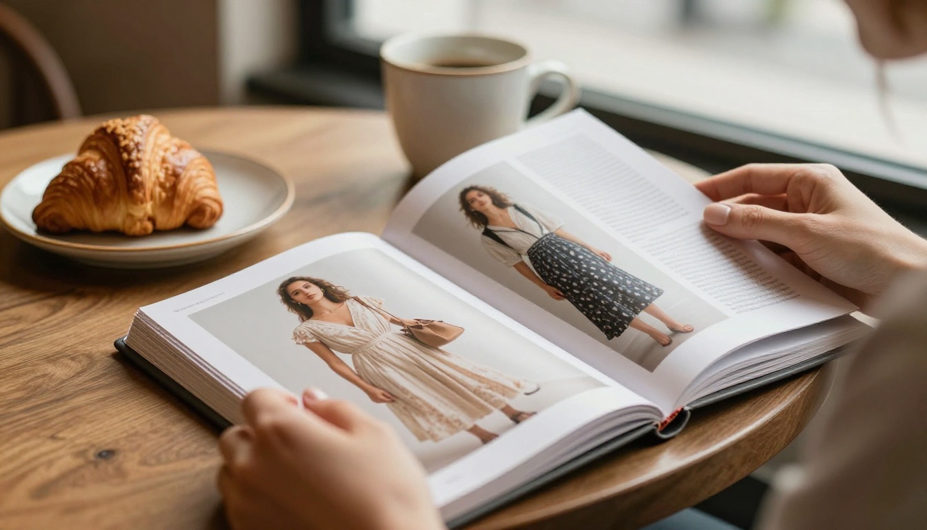
A spread is two facing pages seen at once. That is the unit your reader actually experiences, so it is the unit you should design. A single page is only half of the thought.
One Outfit, One Idea
Strong spreads carry one message. A trench coat spread says "rainy city mornings." A linen set spread says "weekend away." When a spread tries to say three things, the eye wanders and nothing gets remembered.
Ask one question before placing any image: what should the reader feel after two seconds? Build the spread around that answer.
How the Eye Moves
Readers enter a spread at the largest image, then move to the face or the garment, then to the smallest text. That path is predictable, so you can use it.
- Put the hero image where the eye lands first, usually the left page or the largest block.
- Place detail crops along the path the eye follows next.
- Keep captions in the quietest corner so they are found, not fought with.
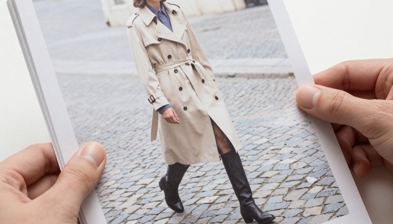
💡 Pro tip: Squint at your spread until the details blur. If you cannot tell where to look first, the hierarchy is too flat.
Layouts Fashion Brands Rely On
Most commercial lookbooks lean on a small set of spread types. Mixing them in a deliberate order is what creates rhythm.
The Full-Bleed Hero
One image runs across both pages, edge to edge, with no text over the garment. It works as an opener or a closer, because it sets mood fast. Use it for your strongest look, the one you would put in a shop window.
Leave the gutter in mind. Never let a face or a seam fall into the fold, since that is where the picture breaks in print and where page-turn animations bend in digital.
The Clean Grid
A grid places four, six or nine equal images in rows. It reads as order, range and choice. Brands use it to show one garment in many colors, or one outfit from several angles.
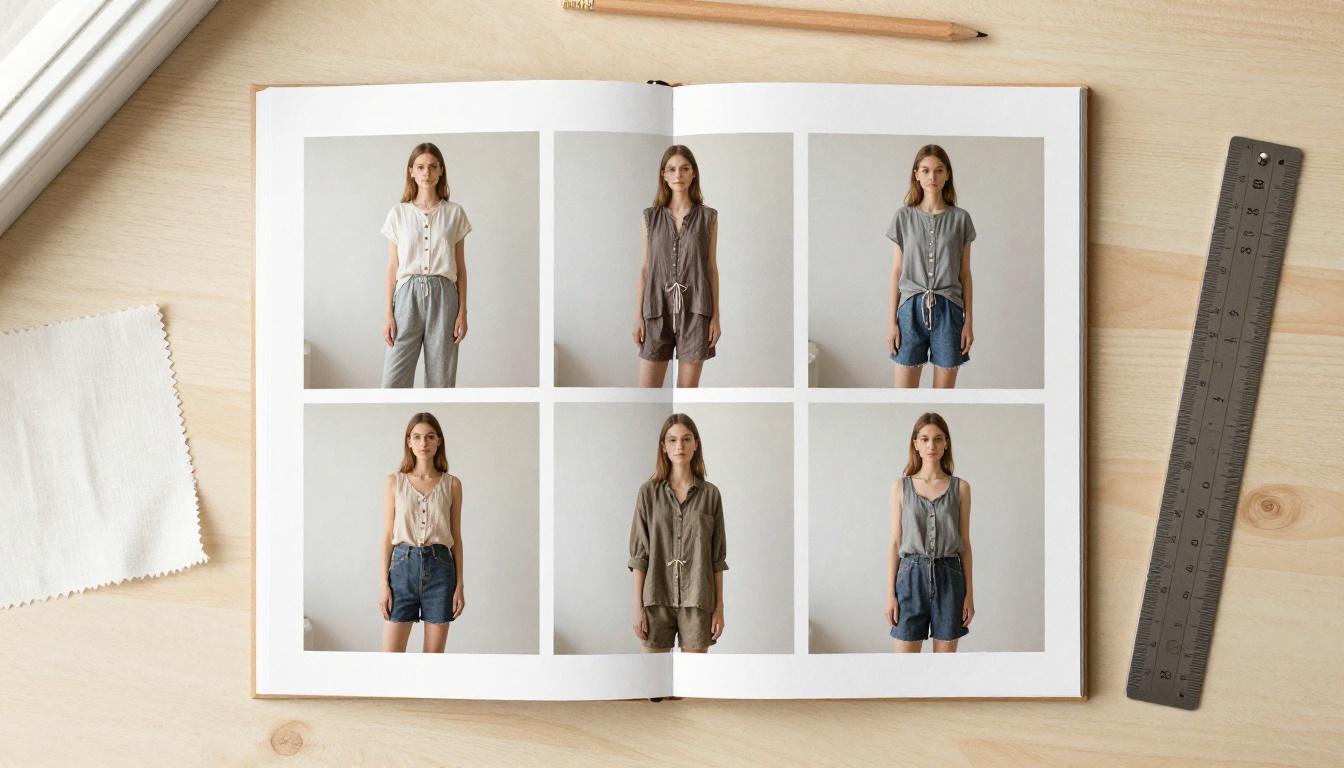
Grids punish inconsistency. Matching crop, matching light and matching background are not optional here. One off-tone image breaks the whole block.
Hero Plus Details
This is the workhorse. A large full-length look on one page, and on the facing page two or three small crops: fabric, hardware, a hem, a pocket. The shopper sees the outfit first and the reasons to buy second.
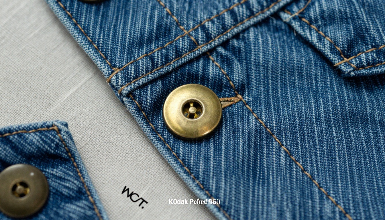
Details answer silent questions: Is it lined? Does it feel heavy? Is the stitching clean? Answer them visually and you reduce hesitation.
The Color Story
Group looks by palette instead of by product type. Rust, olive and cream on one spread feel curated, and they make cross-selling natural, because a shopper sees which pieces belong together.

The Lifestyle Sequence
Here the clothes recede and a scene takes over: a café, a street, a train platform. Brands use this layout to sell an identity rather than a product. Keep one clear garment visible in each frame, or the spread becomes a mood board with no path to purchase.
Layout Comparison at a Glance
Use this table to pick the right spread for the job you need it to do.
| Layout | Best For | Images | Strength | Watch Out For |
|---|
| Full-bleed hero | Openers, closers, hero looks | 1 | Instant mood | Faces in the gutter |
| Clean grid | Colorways, range, angles | 4 to 9 | Shows choice | Inconsistent crops |
| Hero plus details | Premium or textured pieces | 3 to 4 | Builds trust | Too many tiny crops |
| Color story | Capsule collections | 3 to 5 | Encourages outfit sets | Palette clashes |
| Lifestyle sequence | Brand identity | 2 to 4 | Emotional pull | No visible product |
| Product-only page | Catalog-style ordering | 1 to 6 | Clarity | Feels cold alone |
Sequencing the Whole Book
Great single spreads do not guarantee a great lookbook. Order creates momentum.
Opener, Middle, Closer
Think of the book as three acts.
- Opener: a full-bleed hero that states the collection's mood.
- Middle: rotating grids, hero-plus-details and color stories, each outfit given room.
- Closer: a lifestyle image or a strong final look, followed by a clear next step, such as a shop link or contact line.
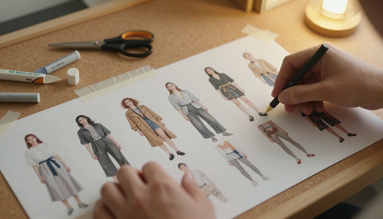
Pin printed pages to a wall or corkboard before you commit. Walking past a storyboard tells you more about pacing than any screen can.
Pace With White Space
Alternate dense spreads with quiet ones. After a six-image grid, give the reader a single large photo and plenty of empty space. White space is not wasted space, it is where the reader breathes and where the next image gets its impact.
✅ Best practice: Follow every busy spread with a calm one. If three dense spreads sit side by side, fatigue sets in and readers stop turning pages.
Type and Captions That Sell
Text in a lookbook should work like a good sales assistant: present when needed, silent otherwise.
Shoppable Captions
Each look needs, at most, a name or number, the pieces, and a price or code. Keep it to one or two short lines.
| Caption Element | Example | Why It Helps |
|---|
| Look name | "Look 07, Harbor Coat" | Easy to reference |
| Pieces | "Wool coat, knit polo, wide trousers" | Encourages outfit buying |
| Price or code | "$240 / SKU HC-07" | Removes a click |
| Link | Hotspot to product page | Turns viewing into buying |
Fonts and Contrast
Choose one display face for titles and one plain sans-serif for captions. Test captions at small size, because they will be read on a phone. Dark text on a pale paper tone outperforms light text over a busy photograph almost every time.
Print Versus Digital Lookbooks
Print has weight and texture. Digital has reach and links. Many brands now publish both, and the layout rules stay the same with a few adjustments.
| Feature | Print Lookbook | Digital Flipbook |
|---|
| Cost per copy | Rises with every copy | Near zero after publishing |
| Updating a look | Reprint needed | Replace the PDF |
| Clickable products | No | Yes, with links |
| Video and audio | No | Yes, embedded |
| Sharing | Mail or hand out | One link or embed |
| Tracking views | Guesswork | Analytics on Professional plan |
| Feels tactile | Yes | Page-turn effect mimics it |
A digital edition also solves the old problem of stock changes. When a coat sells out, you update the file and every shared link shows the new version.
Real-World Example
A small knitwear label shoots twelve looks for autumn. It builds an eight-spread book: a full-bleed opener, three hero-plus-details spreads, two color story grids, one lifestyle sequence and a closing look with a price list. The same PDF goes into a printed run of fifty for wholesale buyers and into a flipbook link for newsletter subscribers. One layout, two channels.
Build One With Flipbooks AI
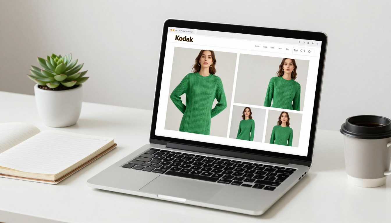
Once your spreads are designed in your layout tool, publishing takes minutes. The Lookbook Flipbook Builder and the Interactive Lookbook Designer are made for exactly this workflow. If your brand also sells from a product range, the Fashion Catalog Creator pairs well with it.
Step 1: Create an Account
Create an account and open the dashboard. You can try the platform before choosing a plan, and every flipbook is published with no watermarks.
Step 2: Upload Your PDF
Export your lookbook from your design software as a PDF with spreads in order. Upload it, and the PDF to Flipbook Converter turns each page into a turnable page. Export at full resolution so detail crops stay sharp when readers zoom.
⚠️ Warning: Export single pages in reading order, not printer spreads. Otherwise the page-turn will show pages out of sequence.
Step 3: Customize the Look
Set your brand colors, add your logo, pick a background tone that suits your palette and choose the page effect. A neutral background keeps attention on the clothes. You can also embed videos or audio, such as a short runway clip on the closing look.
Step 4: Share and Embed
Publish and copy the direct link, or use the Embed Flipbook on Website option to place the lookbook on a product or campaign page. For wholesale lookbooks or early drops, turn on password protection so only invited buyers can open it.
Step 4b: Track and Capture Leads
On the Professional plan you can see which pages get attention and collect contact details before a reader opens the book. Compare options on the pricing page. Offline downloads let buyers keep a copy for showroom visits with weak signal.
| Plan Need | What to Use |
|---|
| Public seasonal lookbook | Standard plan, unlimited flipbooks |
| Private wholesale book | Password protection |
| Page-level reader data | Professional analytics |
| Lead capture before viewing | Professional lead generation |
Mistakes That Cost Sales
Even good photography fails inside a weak layout. These are the problems that show up most often.
Too Many Ideas Per Spread
Four moods, three type styles and eight images on one spread leave the reader with nothing. Cut until one idea remains.
Inconsistent Photography
Mixed lighting, mixed crops and mixed color grading make a collection look unplanned. Edit images to one tone before building any grid.
Hiding the Product
Lifestyle shots feel beautiful but they must show the garment clearly. If a shopper cannot tell what you are selling, they cannot buy it.
No Next Step
A lookbook that ends on a pretty image and nothing else wastes the attention it earned. Close with a link, a code or a contact line.

💡 Pro tip: Show your lookbook to someone outside your team for ten seconds, then ask what they remember. Their answer is your real hierarchy.
A quick checklist before you publish:
- One clear idea per spread
- Consistent color grading across all photos
- Nothing important in the gutter
- Captions readable on a phone
- A calm spread after every busy one
- A final call to action
Ready to Publish Yours?
Good lookbook layout ideas are simple: one story per spread, a sequence with rhythm, captions that help, and a format that lets people act. The spreads above are used by large houses and small labels alike, and none of them need a big budget, only careful choices.
Ready to turn your spreads into a page-turning experience? Get started for free on Flipbooks AI, browse all flipbook tools to find the right fit, and compare pricing plans to choose what works for your brand. When you are set to go live, pick a plan and publish.



