You have spent months on patterns, fabric sourcing and fittings. Then the lookbook, the one document buyers, stylists and customers actually open first, gets thrown together in a weekend. It is the most common story among independent labels, and it is why so many strong collections launch to silence. The good news: the lookbook mistakes small fashion brands make before launch are predictable, and every one of them can be fixed before you press publish. If you want a fast way to turn a finished PDF into a page-turning experience, Flipbooks AI does it in minutes, but the tool only helps if the content underneath is right.
Why Your Lookbook Matters More Than You Think
A lookbook is not a photo dump. It is a sales tool, a brand statement and a press asset in one file. Buyers skim it in under two minutes. Editors decide whether to feature you from the first three pages. Customers judge your price point by the way the garments are shown, long before they read a number.
For a small brand, there is no marketing team to rescue a weak first impression. That makes the following mistakes expensive. Each one below includes a quick fix you can apply this week.
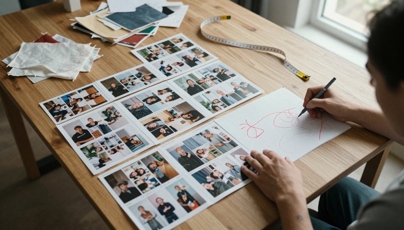
💡 Pro tip: Print your lookbook as thumbnails on one sheet of paper. If the story is not obvious at thumbnail size, a buyer will not see it on screen either.
Mistake 1: No Clear Story or Theme
The first and biggest error is showing everything you made with no narrative. Twenty-four looks in random order feels like a clearance rack. Strong lookbooks have a point of view: a season, a place, a mood, a customer.
Start With One Sentence
Write one sentence describing who wears the collection and where they are going. "Weekend travelers who dress for the train, not the runway." Every photo, caption and page order should serve that sentence. If a look does not fit, cut it or save it for the next drop.
Group Looks Into Chapters
Break the collection into three or four chapters, such as outerwear, daywear, evening and accessories. Chapters give buyers a map and give you natural places to add a short note about fabric or inspiration.
Mistake 2: Crowded and Inconsistent Layouts
Small brands often try to fit four photos, a paragraph and a price on every page. The result is visual noise. Luxury brands do the opposite: one strong image, lots of space, minimal text.
Pick a Grid and Keep It
Choose two or three page templates and reuse them. For example: full-bleed single image, two-image split, and a detail page with one close-up and a caption. Consistency feels expensive. Chaos feels amateur.
Give Every Page One Job
Each spread should do exactly one thing: introduce a look, show a detail, or present a product list. When a page tries to do all three, nobody remembers any of them.
| Layout Style | Best For | Common Risk |
|---|
| Full-bleed single image | Hero looks, mood setting | Hard to show fabric detail |
| Two-image split | Front and back views | Images clash if lighting differs |
| Grid of four | Accessories, color options | Feels crowded on mobile |
| Detail plus caption | Fabric, stitching, fit notes | Too much text slows the flow |
Mistake 3: Photography That Fights the Clothes
Beautiful clothes in the wrong light look cheap. The usual culprits are harsh midday flash, cluttered backgrounds, and models whose styling competes with the garment.
Fix the Light First
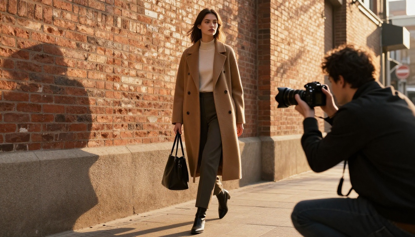
Natural window light or open shade is the cheapest way to look professional. Golden hour outdoors gives warm skin tones, but it vanishes fast, so plan the shot list in advance and shoot your hero looks first.
Keep Backgrounds Quiet
A brick wall, a plain studio sweep or an empty street works. A busy cafe with signs and strangers does not. If the viewer's eye goes to the background, you have lost the sale.
Shoot the Details Too
Buyers want to see seams, buttons, linings and drape. Budget at least one detail shot per hero piece. It answers questions before they are asked.
⚠️ Warning: Never use photos where the garment is partly hidden by a bag, hair or crossed arms. If a customer cannot see the neckline or hem, they will not trust the fit.
Mistake 4: Color That Does Not Match Reality
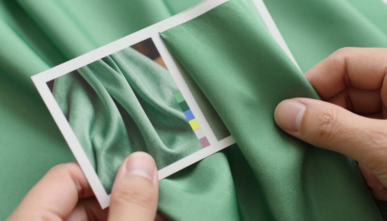
Few things generate returns faster than a lookbook that shows a sage green dress as mint. Screens, cameras and printers all shift color differently.
A Simple Color Check
- Hold the physical fabric next to your screen at normal brightness.
- Compare it with the exported lookbook page, not the raw photo.
- Adjust white balance until the fabric and the image agree.
- Repeat on a phone, since most viewers will use one.
Use a gray card or color chart in the first frame of every shoot. It takes ten seconds and saves hours of editing guesses.
| Color Problem | Typical Cause | Quick Fix |
|---|
| Garment looks washed out | Overexposed photo | Lower exposure, keep highlights intact |
| Colors differ between pages | Mixed lighting or edits | Apply one preset to the whole set |
| Skin tone looks orange | Wrong white balance | Reset from a gray card frame |
| Looks fine on laptop, off on phone | Uncalibrated screen | Test on two or three devices |
A lookbook that is only pretty frustrates buyers. They need names, sizes, fabrics and wholesale or retail pricing without sending three emails.
Add a Clean Line Sheet
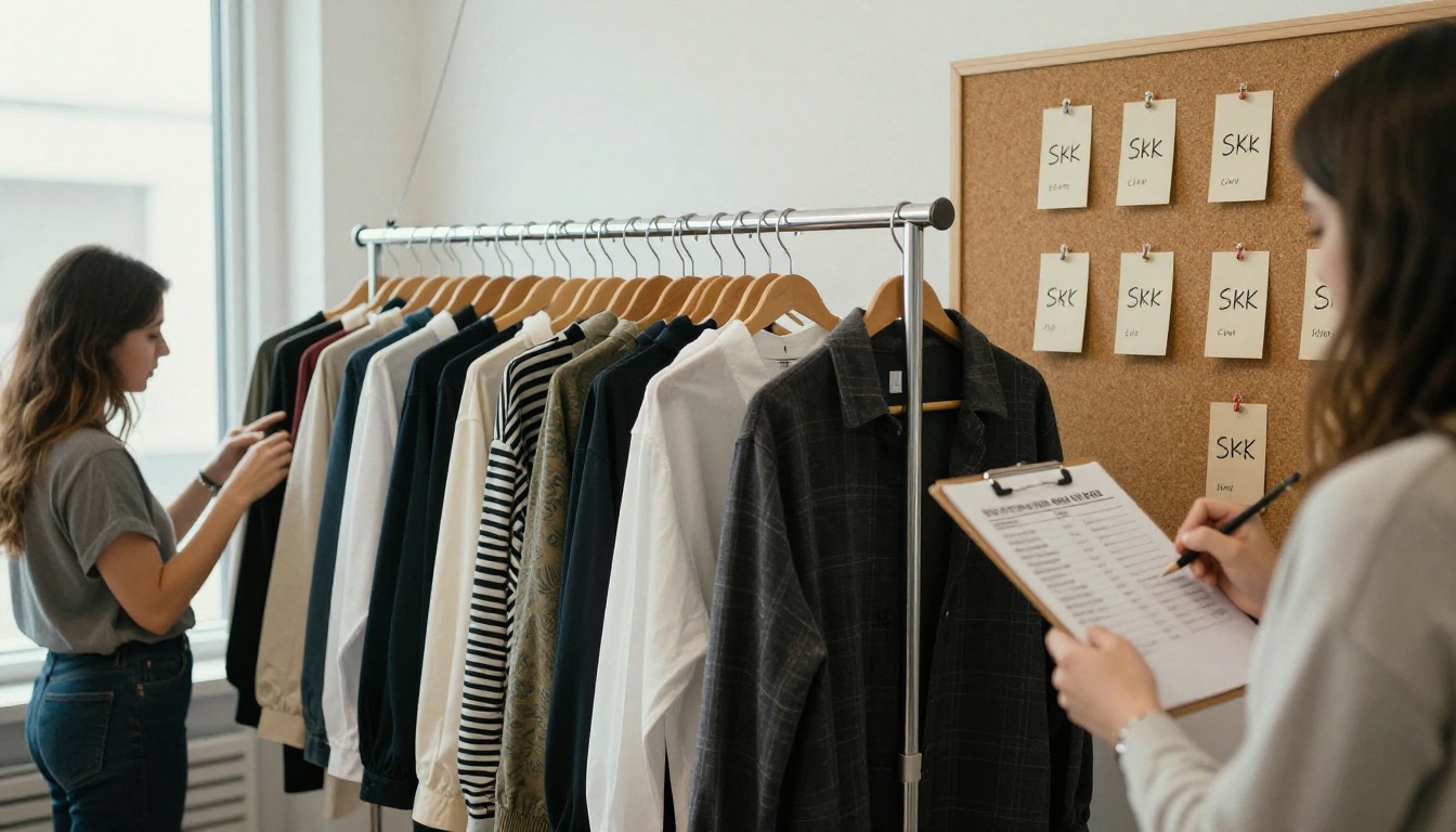
Put a one-page product list at the end: style name, SKU, fabric, available sizes, colors and price. Keep the same order as the looks so a buyer can scan down the page and match each item.
Use Real Names, Not Codes Only
"Style 204" tells nobody anything. "Harbor Trench, SKU 204" is memorable and searchable. If you plan to sell through boutiques, a Digital Price List Generator approach keeps pricing tidy and easy to update.
✅ Best practice: Include model height and the size worn on at least one caption per chapter. It cuts fit questions dramatically.
Mistake 6: Ignoring How People Actually View It
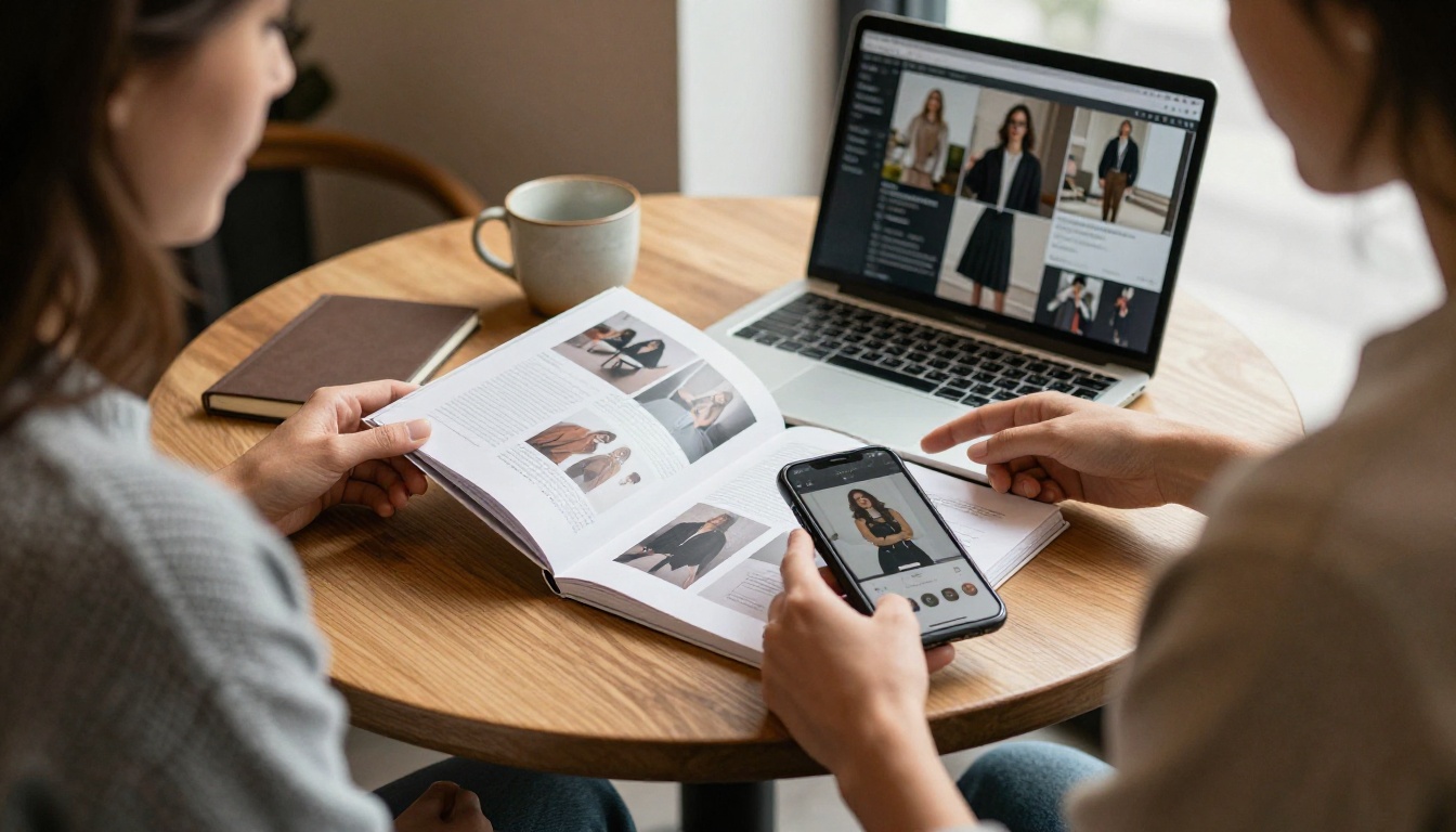
Most small brands design on a large monitor and forget that the majority of viewers open the lookbook on a phone, often in a hurry.
Check the Small Screen
Open your file on a phone before you finalize it. Is the text readable without zooming? Do the images crop well? Are tap targets and links easy to hit? If anything feels cramped, simplify.
Skip the Heavy PDF Attachment
A 60 MB PDF clogs inboxes, fails to open on slow connections and gives you no idea whether anyone read it. Compare the common ways to share:
| Format | File Size | Mobile Experience | Tracking |
|---|
| Emailed PDF | Often 20 to 80 MB | Slow, needs zoom | None |
| Image-heavy website page | Varies | Can be slow and long | Basic page views |
| Hosted flipbook link | Loads page by page | Responsive, page-turn feel | Views and time spent |
A hosted flipbook solves the weight and mobile problem with one link. You can convert your PDF to a flipbook without re-designing anything.
Mistake 7: No Clear Call to Action
Your lookbook should end with a next step. Too many finish on a last photo and nothing else, leaving buyers with no idea what to do.
Make the Next Step Obvious
Add a final page with a single instruction: shop the collection, book a wholesale appointment, or reserve a pre-order. Include a link or QR code and your contact email. One action, clearly stated, beats a menu of options.
Link Inside the Pages
Where possible, link each look to its product page. A reader who loves the trench should be one tap from buying it, not hunting through your site.
Mistake 8: Skipping Branding and Proofreading
Typos on page two erode trust faster than any design flaw. So do mismatched fonts, a logo that appears in three different versions, or a collection name spelled two ways.
A Four-Person Proof Rule
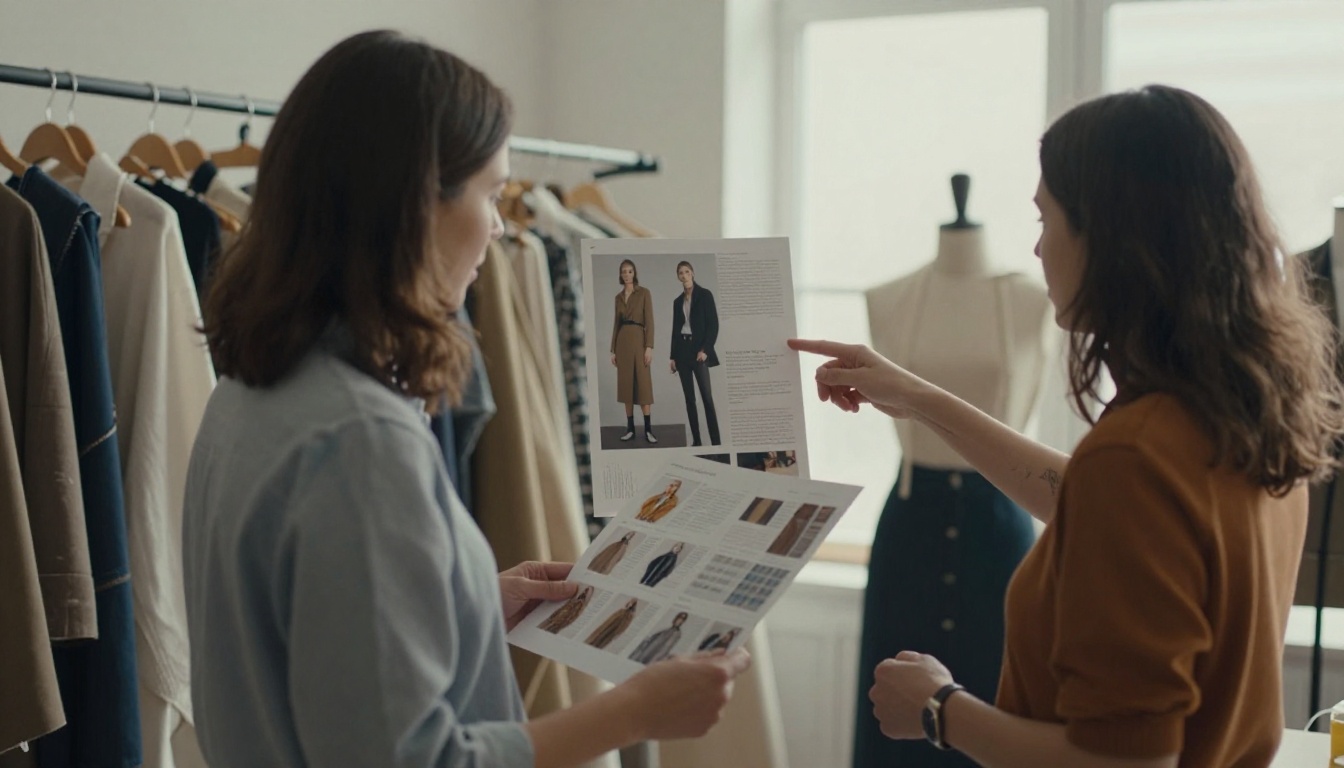
Have at least two people who did not make the lookbook read every word, and one person check every link and price. Fresh eyes catch what yours have stopped seeing.
Lock Your Brand Basics
Decide on two fonts, a short color palette and one logo placement. Write them on a sticky note and keep it on your monitor. The Interactive Lookbook Designer lets you apply custom branding across every page so nothing drifts.
How to Build an Interactive Lookbook With Flipbooks AI
Once the content is solid, presentation is the last step. Here is a simple workflow.
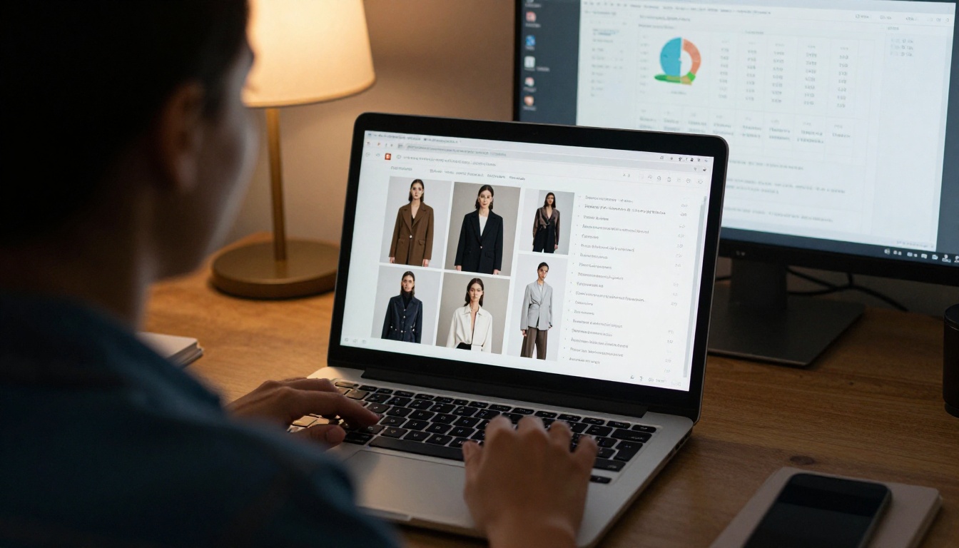
- Export your lookbook as a PDF from your design tool at a web-friendly resolution.
- Create a free account on Flipbooks AI and upload the file. The platform converts each page automatically.
- Customize the look. Add your logo, pick background colors that match your brand, and choose a page-turn effect that suits a fashion feel.
- Add multimedia. Drop in short runway clips or audio notes. Embedded videos and audio keep the reader on the page.
- Set sharing rules. Copy the direct link, grab an embed code for your website with the Embed Flipbook on Website option, or add password protection for wholesale buyers.
- Review on mobile. Open the link on a phone and a tablet before sending it to anyone.
- Track what happens. On the Professional plan, analytics and lead generation show who opened the book and which pages held attention. See the pricing plans to compare options.
There are no watermarks, and Standard plans and above include unlimited flipbooks, so you can create a separate book for press, one for wholesale and one for customers. For a head start, try the Lookbook Flipbook Builder or the Fashion Catalog Creator.
💡 Pro tip: Create a password-protected version with wholesale pricing and a public version without it. Same photos, two audiences, no extra design work.
Mistake 9: Launching Without a Test Run
Sending your lookbook to a hundred people before anyone has tried it is a gamble. Broken links, missing pages and slow loading discovered after sending cannot be taken back.

Run a Soft Launch
Send the lookbook to five trusted contacts: a customer, a fellow designer, a friend who does not work in fashion, and two people on different phones. Ask them one question: "What did you want to click that you could not?" Fix what they report, then send widely.
Prepare for Orders
If the lookbook works, orders arrive. Check that stock counts, packaging and shipping are ready before the link goes out. A great lookbook followed by a three-week delay creates more damage than no lookbook at all.
Pre-Launch Checklist
| Area | Question to Ask | Done |
|---|
| Story | Can I state the theme in one sentence? | ☐ |
| Layout | Do I use only two or three page templates? | ☐ |
| Photos | Is every garment fully visible and well lit? | ☐ |
| Color | Does it match the real fabric on a phone? | ☐ |
| Info | Are names, sizes, fabrics and prices listed? | ☐ |
| Mobile | Does it read well without zooming? | ☐ |
| Action | Is there one obvious next step? | ☐ |
| Proof | Did two other people check every word and link? | ☐ |
| Test | Did five people open it on different devices? | ☐ |
Real-World Examples Worth Copying
A swimwear label with three people. They cut a 40-look draft down to 18, grouped it into "Beach Day," "Poolside" and "Evening," and added one size chart page. Wholesale inquiries doubled over the previous season because buyers could finally scan the line in one sitting.
A tailoring studio. They replaced a 70 MB PDF with a hosted flipbook link and a password for trade clients. Open rates rose because the link loaded instantly on phones, and the owner could see which pages were viewed most before follow-up calls.
A knitwear brand. They added a detail page for each hero piece showing stitch texture up close. Return rates dropped because customers knew exactly what the yarn looked like in person.
Ready to Launch With Confidence?
Every mistake above comes down to the same thing: treating the lookbook as an afterthought instead of the product's first impression. Fix the story, tighten the layout, protect your color, add the information buyers need, and test on real phones. Then put it in a format people actually want to open.
Ready to build yours? Get started for free on Flipbooks AI, browse all flipbook tools to find the right template, or compare pricing plans to choose what suits your launch. Your collection deserves a lookbook as good as the clothes.



