Most readers give your publication three pages. That's it. If those pages fail to pull them forward, they close the tab, put down the magazine, or swipe to something else. Three pages to prove you're worth their time, and almost every creator wastes at least one of them on something forgettable. Flipbooks AI exists precisely because the difference between a flipbook people share and one they abandon almost always comes down to those first three spreads.
This article breaks down what actually works: the visual hierarchy that stops scrolling, the content structure that creates momentum, and the specific design decisions you can make right now to make your first three pages impossible to walk away from.
Why Three Pages Decide Everything
The 30-Second Reader
Online attention is ruthless. Readers form strong opinions about a publication's quality within 8 to 15 seconds of opening it. But the decision to actually keep reading, to commit, happens somewhere between page two and page three. Page one creates curiosity. Page two builds trust. Page three either earns the next ten minutes of their attention or loses it permanently.
This pattern holds across formats: restaurant menus, product catalogs, real estate brochures, corporate reports, and digital magazines all follow the same psychological arc. Readers need to feel rewarded for turning each page before they'll commit to the next.
What Readers Scan First
Eye-tracking studies on editorial content reveal a consistent pattern:
- Large image or visual anchor (upper left quadrant)
- Headline (size and contrast determine this, not position)
- Subheadline or caption (first secondary information point)
- Pull quote or callout (if visually distinct)
- Body text first paragraph (only if previous elements built trust)
Notice that body text comes fifth. If your first three pages are text-heavy with small images and standard headlines, most readers never reach the actual content.
Page One Rules That Stop the Scroll
The Cover Image Equation
Your cover image carries the entire emotional weight of the publication before a single word is read. It needs to communicate the topic, the tone, and the quality level simultaneously. The formula is simpler than most designers think:
One dominant subject + one clear mood + zero visual clutter = a cover that works.
Avoid covers with multiple competing focal points. The eye needs somewhere clear to land. A fashion catalog with a single model against a clean background outperforms one with four models in a collage every time. A restaurant menu featuring one beautifully plated dish beats a grid of twelve smaller photos.
Headlines That Pull Weight
The headline on your first spread is not a title. It is a reason to keep reading. There is a massive difference between these two approaches:
| Weak Approach | Strong Approach |
|---|
| "Welcome to Our 2025 Catalog" | "Everything That Sold Out in 48 Hours" |
| "About Our Restaurant" | "The Dish Three Chefs Argue About" |
| "Annual Report 2025" | "The Year We Said No to Fast Growth" |
| "Our Services" | "We Do One Thing. We Do It Perfectly." |
| "Product Overview" | "Built Different. Here's Why." |
The strong headlines create a gap. Readers feel a pull because the headline promises something they don't yet have: information, a surprise, a strong opinion. That gap is what turns a page.
White Space as a Power Move
Counter-intuitive but true: less content on page one means more readers reach page two. White space signals confidence. It tells the reader this publication doesn't need to shout. Publications that cram every pixel with content feel like they don't trust their own material.
💡 Pro tip: Remove 30% of what you planned to put on your opening spread. Then remove another 10%. What remains is usually exactly what belongs there.
Page Two: The Promise You Must Keep
Setting Up the Value Hook
Page one creates curiosity. Page two has to justify it. This is where most creators make the mistake of immediately going into a table of contents or an "About Us" section. Both are momentum killers.
Instead, page two should answer the question every reader is unconsciously asking: "What's actually in this for me?"
For a product catalog, that means showing your absolute best product with a compelling angle and price that makes people feel they found something valuable. For a magazine, it means delivering the first piece of genuinely useful or surprising information. For a real estate brochure, it means the property feature that makes this listing different from every other listing they've seen this week.
The Visual Rhythm Readers Expect
Visual rhythm is the pace at which the eye moves through a spread. Pages with good rhythm have:
- Contrast: at least one large element and one small element
- Direction: visual lines or arrows that guide the eye across the spread
- Breathing room: margins that keep content from feeling compressed
- One surprise: something the reader didn't expect, whether it's an unusual crop, an unexpected color, or a quote in a dramatically large size
| Page Two Element | Purpose | Common Mistake |
|---|
| Hero image (full bleed or large) | Maintains visual momentum from page one | Using a generic stock photo |
| Value statement | Explains why this matters to the reader | Writing it as company-speak |
| First piece of real content | Rewards the reader for turning the page | Replacing with more promises |
| Visual hierarchy contrast | Keeps the eye moving naturally | Making everything the same size |
| Single CTA or directional cue | Tells the reader what to notice next | Having three competing CTAs |

✅ Best practice: On page two, the reader should feel like they've already received something valuable. Even a single surprising statistic, a beautiful image they weren't expecting, or a one-sentence insight counts. Give before you ask.
Page Three: The Commitment Trigger
When Readers Decide to Stay
Page three is the tipping point. Readers who reach page three without feeling rewarded leave immediately. Readers who feel rewarded twice, on pages one and two, give page three the benefit of the doubt. But page three needs to seal the commitment.
The mechanics here are about depth and surprise working together. Page three should go slightly deeper than pages one and two. It should reveal something that the previous pages hinted at but didn't fully deliver. This is the moment where a reader shifts from "I'm checking this out" to "I want to see what's on page four."
The Three-Second Content Preview
One powerful technique for page three is the structured preview: a visual or textual hint at what's coming deeper in the publication. This works because it transforms the reading experience from linear (one page at a time) to anticipatory (reading toward something).
Practical versions of this:
- A small grid of four upcoming product images with page numbers
- A pull quote from a later section that is provocative enough to create curiosity
- A numbered list of the four things this publication covers, presented with enough specificity to feel valuable in itself
- A single striking image from a later section with a short teasing caption
How to Build This With Flipbooks AI
Flipbooks AI gives you the tools to put these principles into practice without needing a design team. Here's how to build an opening sequence that holds attention:
Step 1: Create your account
Go to flipbooksai.com/account and sign up. The Standard plan gives you unlimited flipbooks with no watermarks, which matters the moment you start sharing with clients or audiences.
Step 2: Upload your PDF
Flipbooks AI converts any PDF into an interactive flipbook. Before uploading, make sure your first three pages are already designed with the principles above in mind. The flipbook format adds interactivity to what you've built, so the underlying design still needs to do the work.
Step 3: Customize branding and page effects
Use the branding controls to set your color palette, logo position, and background color. These elements should be consistent with what's on the pages themselves. A publication with strong brand color on page one but a generic grey background in the flipbook interface breaks visual continuity.
Step 4: Add multimedia to the first three pages
Flipbooks AI lets you embed video and audio directly into pages. For the first three pages specifically, a short embedded video on page two, just 5 to 10 seconds of motion, creates a dramatic difference in how long readers stay. A product catalog can show a product rotating. A real estate brochure can embed a short walkthrough clip.
Step 5: Set up your sharing options
Use the embed code to place your flipbook wherever your audience is: your website, a landing page, an email campaign. For private content, the password protection feature keeps it exclusive. For campaigns where you need to know who's reading, the Professional plan analytics show you exactly which pages readers spend the most time on, which tells you immediately whether your first three pages are working.
Step 6: Test and iterate
Share a link to a small audience first. Check the analytics. If readers are consistently dropping off after page two, something on page two broke the momentum. If they're making it to page five and beyond, your opening sequence is doing its job.
Design Elements That Trap Attention
Typography That Commands
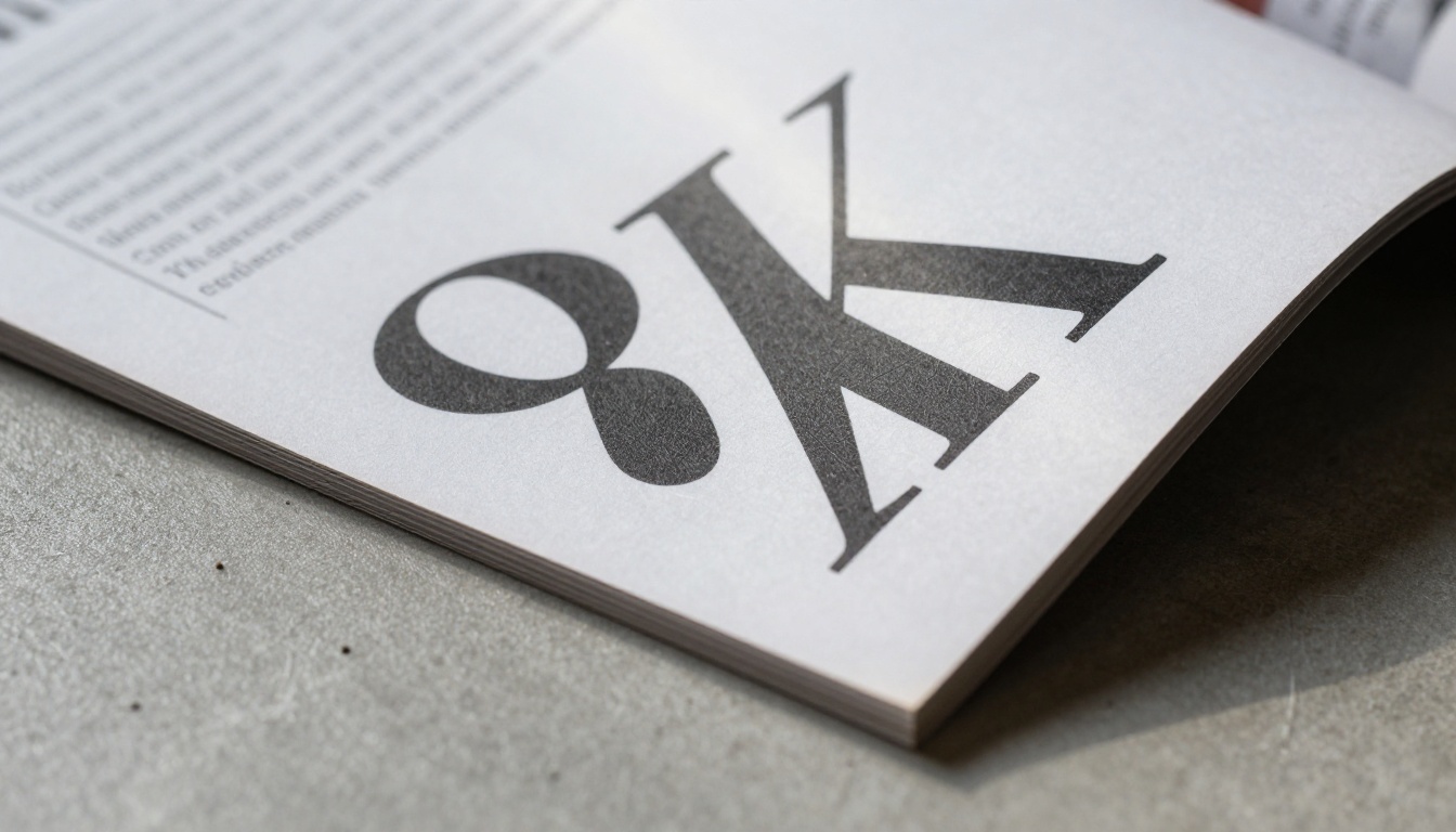
Typography is the most overlooked tool in the first three pages. Most creators default to the same font sizes and weights throughout, which creates visual flatness. Strong opening pages use dramatic scale contrast:
- Display headline: 60 to 120pt (or larger)
- Subheadline: 18 to 24pt
- Body text: 10 to 12pt
- Captions and labels: 8 to 9pt
That's a ratio of roughly 10:1 between the largest and smallest text. It creates visual hierarchy that guides the eye automatically without any conscious effort from the reader.
Font choice matters too. For the opening pages, choose one serif and one sans-serif and use them for different functions: the serif for headlines and pull quotes (authority, elegance), the sans-serif for body text and labels (clarity, modernity). Two fonts maximum.
Color Blocking for Impact
Color blocking, using large areas of solid color to organize content, is one of the fastest ways to add visual energy to an opening spread without adding more content.
For page one, a single bold background color behind a headline creates instant visual contrast with the white or neutral pages that follow. For page two, a colored sidebar or horizontal band can organize secondary content visually without making the layout feel chaotic.
⚠️ Warning: More than three colors on an opening spread creates visual noise that competes with the content. Pick one dominant color, one neutral, and one accent used sparingly.

Real-World Examples That Work
Restaurant Menus That Sell Before They List
A restaurant menu's first page has one job: make the reader hungry and curious before they've seen a single price. The most effective approach is a full-bleed photograph of the signature dish, a three to five-word name that sounds unlike anything else, and nothing else on the page.
Page two introduces the menu concept: a short paragraph, two to three sentences, about the food philosophy, followed by the category structure. Page three opens the first category with three featured items, each with a photograph.
Use the Restaurant Menu Creator to build this format. The tool handles the structural layout so you can focus on the photography and copy.
Real Estate Brochures That Create Urgency
For real estate, the first page is always the hero shot: the property's best angle, shot at golden hour, with the address presented minimally at the bottom. Page two shows the floor plan next to a lifestyle image, morning coffee in the kitchen, for example, that helps buyers picture themselves there. Page three delivers the three to four features that differentiate this property from comparable listings in the area.
The Real Estate Brochure Creator is built for exactly this sequence and includes templates that follow the three-page momentum structure by default.
Product Catalogs That Close Sales
For catalogs, the three-page rule means leading with your bestseller or newest product, not a company introduction. Page one: the product at its most dramatic angle. Page two: the product in use, with a price and single most compelling specification. Page three: two to three related products that create cross-sell opportunity.
The Product Catalog Generator supports this sequence and lets you add "new" or "bestseller" badges that boost the visual credibility of your opening pages.
Common Mistakes to Fix Right Now
| Mistake | Why It Kills Momentum | Fix |
|---|
| "Welcome to our publication" as page one headline | Tells readers nothing compelling | Replace with your strongest benefit or most surprising claim |
| Table of contents on page two | Readers haven't been hooked yet | Move the TOC to page four or later |
| Identical image sizes across all three pages | Creates visual monotony | Use at least one full-bleed image in the first three pages |
| Body text leading on page one | Nobody reads before they're engaged | Lead with image and headline, text comes after trust is built |
| Multiple calls to action per page | Creates decision paralysis | One clear directional cue per page, maximum |
| Generic stock photos on opening pages | Signals low quality immediately | Invest in one strong, specific photograph per page |
| Centering every element | Feels static and corporate | Use asymmetric layouts to create visual tension |
💡 Pro tip: Print your first three pages at actual size and hold them at arm's length. Everything that reads clearly from that distance belongs. Everything that requires squinting is probably creating visual clutter.

Flipbooks AI offers a full suite of tools organized by use case. For the opening pages specifically, the right tool gives you a structural head start with layouts already optimized for the three-page momentum pattern.
Browse the complete tools directory to find the exact format that matches your use case.
Start With Three Pages. Win the Rest.
The rest of your publication can be brilliant. But if the first three pages don't earn the reader's trust, that brilliance goes unseen. The principles here aren't complicated: strong visuals, one clear message per page, progressive depth, and the structural confidence to let white space do some of the work.
The fastest way to put these into practice is to build your next publication on Flipbooks AI. The interactive format, the analytics, and the template library handle the technical side. What you bring is the editorial judgment to make those first three pages impossible to skip.
Ready to see what your opening pages can do? Create your first flipbook for free or compare pricing plans to find the right fit for your workflow.



