Most restaurant owners blame slow Tuesdays, rising food costs or a quiet street when the average check stays flat. Very few blame the one thing every guest holds in their hands for several minutes: the menu. A menu is a silent salesperson, and a badly designed one talks guests out of the starter, the second drink and the dessert without anyone noticing. If you want to build, test and update menus faster, a tool like Flipbooks AI lets you publish a clean digital version in minutes. First, though, let's look at what is actually going wrong.
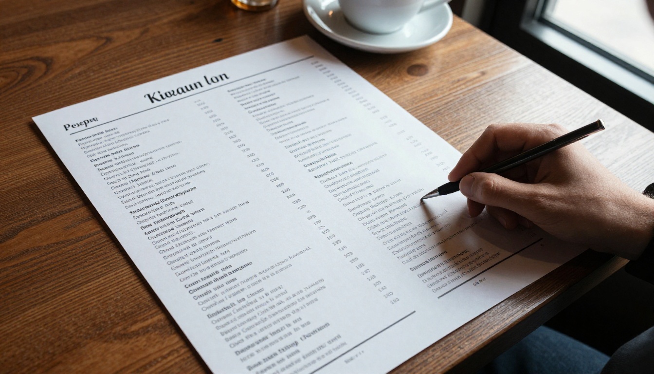
Guests do not read menus the way they read books. Eye-tracking studies on printed menus keep showing the same pattern: people scan for a few seconds, lock onto a handful of items, and order from that small group. Whatever your layout puts in front of them wins. Everything else is decoration.
That means menu design is less about beauty and more about attention management. A beautiful menu that sends attention to your lowest-margin dishes is an expensive mistake. A plain menu that sends attention to your best sellers is a quiet profit engine.
💡 Pro tip: Ask three regulars what they ordered last time and why. Their answers usually reveal what the menu made easy to see, not what they truly wanted.
The Math Behind a Small Lift
Consider a 60-seat bistro serving 90 covers a night with an average check of $34. A lift of just $2.50 per guest adds up quickly:
| Metric | Before | After a $2.50 lift |
|---|
| Covers per night | 90 | 90 |
| Average check | $34.00 | $36.50 |
| Nightly revenue | $3,060 | $3,285 |
| Monthly revenue (26 nights) | $79,560 | $85,410 |
| Extra revenue per year | n/a | about $70,000 |
None of that needs more guests, more staff or a bigger kitchen. It needs a menu that stops getting in the way.
Where the Money Leaks
Four areas cause most of the damage:
- Layout: the eye lands on the wrong items.
- Pricing presentation: prices shout when they should whisper.
- Wording and photos: dishes are described in ways that do not create appetite.
- Format: the menu is outdated, hard to read or hard to open.
Mistake One: Too Many Choices
The most common problem is a menu with 60 items on a single page. It feels generous, but it triggers decision fatigue. Guests who feel overwhelmed tend to pick the safest, cheapest thing or ask the server for a recommendation, which slows your service.

How Many Items Is Enough
A useful rule of thumb is 7 items or fewer per category. For a full-service restaurant, that usually means 5 to 7 starters, 7 to 9 mains, 4 to 5 desserts and a short drinks list. Cutting a sprawling menu also reduces waste, speeds up the kitchen and makes your best dishes easier to prepare well.
Group Dishes the Way Guests Think
Guests think in moments: something to share, something light, something hearty. Sections like "To Share" or "From the Grill" guide orders better than a strict appetizer, entree, dessert split.
✅ Best practice: Run a sales report for the last 90 days. Remove the bottom 10 to 15 percent of dishes by volume unless they carry a very high margin.
Mistake Two: Prices That Shout
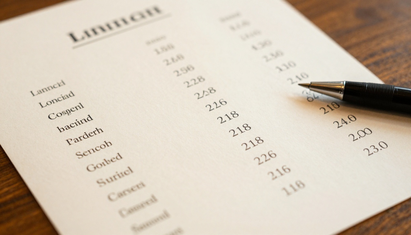
Dollar signs, long dotted lines leading to prices and prices lined up in a neat column all push guests to compare numbers instead of enjoying dishes. A right-aligned column invites a quick scan from cheapest to most expensive, and guests usually stop at the cheapest.
Quiet Pricing Habits
- Drop the currency symbol: write 24 instead of $24.00.
- Put the price at the end of the description text, in the same font and size.
- Avoid dotted leader lines.
- Avoid rounding patterns that scream discounts, like .99.
Price Presentation Compared
| Style | Example | Effect on guests |
|---|
| Aligned column with symbol | Salmon ........ $26.00 | Triggers price comparison, favors cheapest |
| Inline, no symbol | Salmon, lemon butter, fennel 26 | Keeps focus on the dish |
| Price in bold | Salmon 26 | Draws attention to cost |
| Rounded whole numbers | 26 | Feels premium and calm |
⚠️ Warning: Do not mix styles on the same menu. A single bold price among quiet ones becomes the most noticed number on the page.
Mistake Three: Burying Your Best Dishes
Every menu has items that earn more profit per plate. Often those dishes sit in the middle of a page, in the same type as everything else. The guest never sees them.
Use the Sweet Spots
On a single page, attention tends to go first to the top right corner and the top of each column, then to the last item in a section. Put your highest-margin dishes there. On a two-page spread, the first item of the right page does a lot of work.
Highlight Without Shouting
You have a few options to flag a profitable dish:
- A subtle box or tint behind the item.
- A small icon such as a chef hat for a signature plate.
- A one-line story, such as "Smoked in house over apple wood."
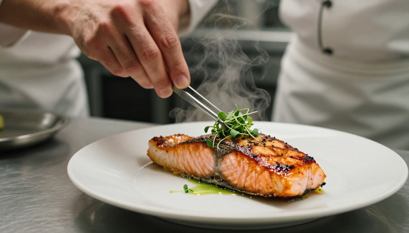
- A single high-quality photo of the dish.
Pick one method and use it for three to five items at most. If everything is highlighted, nothing is.
The Decoy Effect
Placing a very expensive item near a strong seller makes the seller look reasonable. A 58 dollar tomahawk steak beside a 38 dollar ribeye turns the ribeye into the "sensible" choice, even if few people order the tomahawk. This is not a trick on guests, it is simply context for the price they see.
Mistake Four: Weak Descriptions
"Grilled chicken with vegetables" sells a plate of nothing. "Herb-brined chicken, charred broccolini, roasted garlic jus" sells the same dish with taste, texture and care. The difference in price a guest will accept can be several dollars.
What Good Descriptions Do
- Name the cooking method: charred, slow-roasted, wood-fired.
- Name the origin when it adds value: local, seasonal, hand-picked.
- Keep it to 12 to 20 words.
- Avoid adjectives that mean nothing, such as "delicious" or "amazing".
Before and After Examples
| Before | After |
|---|
| Pasta with sauce | Hand-rolled pappardelle, slow-braised beef ragu |
| Chocolate cake | Warm dark chocolate tart, sea salt, cherry compote |
| House salad | Little gem lettuce, shaved radish, buttermilk herb dressing |
| Fish of the day | Line-caught sea bass, brown butter, capers |
💡 Pro tip: Read each description aloud to a server. If they cannot say it in one breath with a smile, it is too long.
Mistake Five: Photos That Hurt
Photos can lift sales of a featured dish by a noticeable margin, but only when they are good. Dim, oversaturated or stock photos signal a cheap kitchen. A menu covered in small thumbnails also fights the layout and invites comparison.
Photo Rules That Work
- Use one photo per section at most, or only for signature dishes.
- Shoot in natural light from a side window, just like a good food magazine.
- Show the dish as it actually leaves your kitchen.
- Skip photos entirely for fine dining; plain, confident type often sells better.

Mistake Six: Hard-to-Read Design
A menu can have the right dishes and prices and still fail because people cannot read it. Dim restaurants, small fonts and low-contrast color combinations are common culprits.
Readability Checklist
- Use a body size of 11 to 12 points or larger for printed menus.
- Keep strong contrast: dark text on a light background, not gold on cream.
- Limit yourself to two typefaces, one for headings and one for body.
- Leave white space around sections; crowding signals discount dining.
- Test the menu under your actual dining room lighting.
Printed Versus Digital Menus
| Factor | Printed menu | Digital flipbook menu |
|---|
| Update speed | Days, plus reprint cost | Minutes |
| Cost per change | $50 to $500 | Free |
| Seasonal rotation | Slow | Instant |
| Photos and video | Limited | Easy to embed |
| Accessibility | Fixed size | Zoom and larger text |
| Guest tracking | None | Views and clicks |
A digital menu does not have to look cold. A well-built page-turning menu keeps the feel of a printed book, while letting you correct a price or remove a sold-out dish right away.
Many menus are reprinted once a year, or never. Ingredients change, margins change, and guests change. A static menu cannot respond.
The Cost of Staying Still
- Dishes that lose money keep getting ordered.
- Sold-out items frustrate guests and servers.
- Seasonal products go unmentioned.
- Typos and outdated prices stay for months.
A Simple Review Rhythm
| Frequency | Task |
|---|
| Weekly | Check sold-out items and specials |
| Monthly | Review top and bottom sellers |
| Quarterly | Adjust prices and descriptions |
| Twice a year | Redesign layout and test new sections |
✅ Best practice: Keep a short "specials" page separate from the main menu. It lets you test dishes and push margin without changing the whole layout.
Mistake Eight: Ignoring the Server
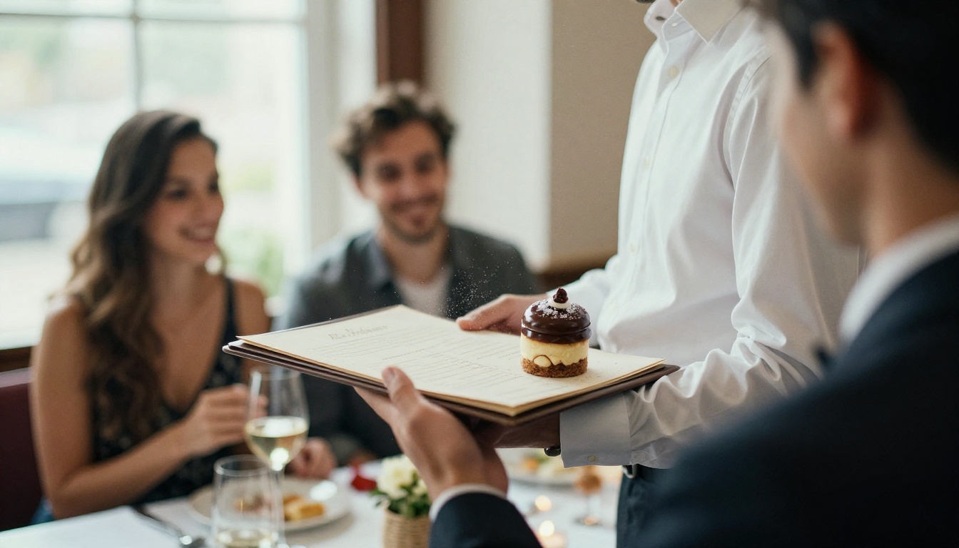
Your menu and your team work together. A menu that nobody on staff has been trained on wastes its design. Servers should know which dishes are the signature plates and be ready to suggest a pairing.
Add Prompts That Work Quietly
- A short "Pairs well with" line under mains.
- A dessert and coffee note on the last page.
- A "Chef recommends" label on a single dish per section.
- A drink suggestion beside cocktails and wine lists.
Fixing It: A Practical Plan
You do not have to rebuild everything. Try this plan over two weeks:
- Audit: pull 90 days of sales and mark the top 10 and bottom 10 dishes.
- Cut: remove weak dishes and trim each section to seven items or fewer.
- Reorder: put high-margin dishes in the sweet spots.
- Rewrite: improve descriptions for your top 15 dishes.
- Quiet the prices: remove symbols and columns.
- Test: run the new menu for two weeks and compare the average check.
Real-World Example
A neighborhood Italian restaurant with 70 items cut its menu to 38, rewrote descriptions on twelve plates, removed the dollar signs and added a small box around three signature dishes. After four weeks, starter sales rose, the signature pasta became the top seller and the average check moved up by about 8 percent. The owner changed no ingredient costs and added no staff.
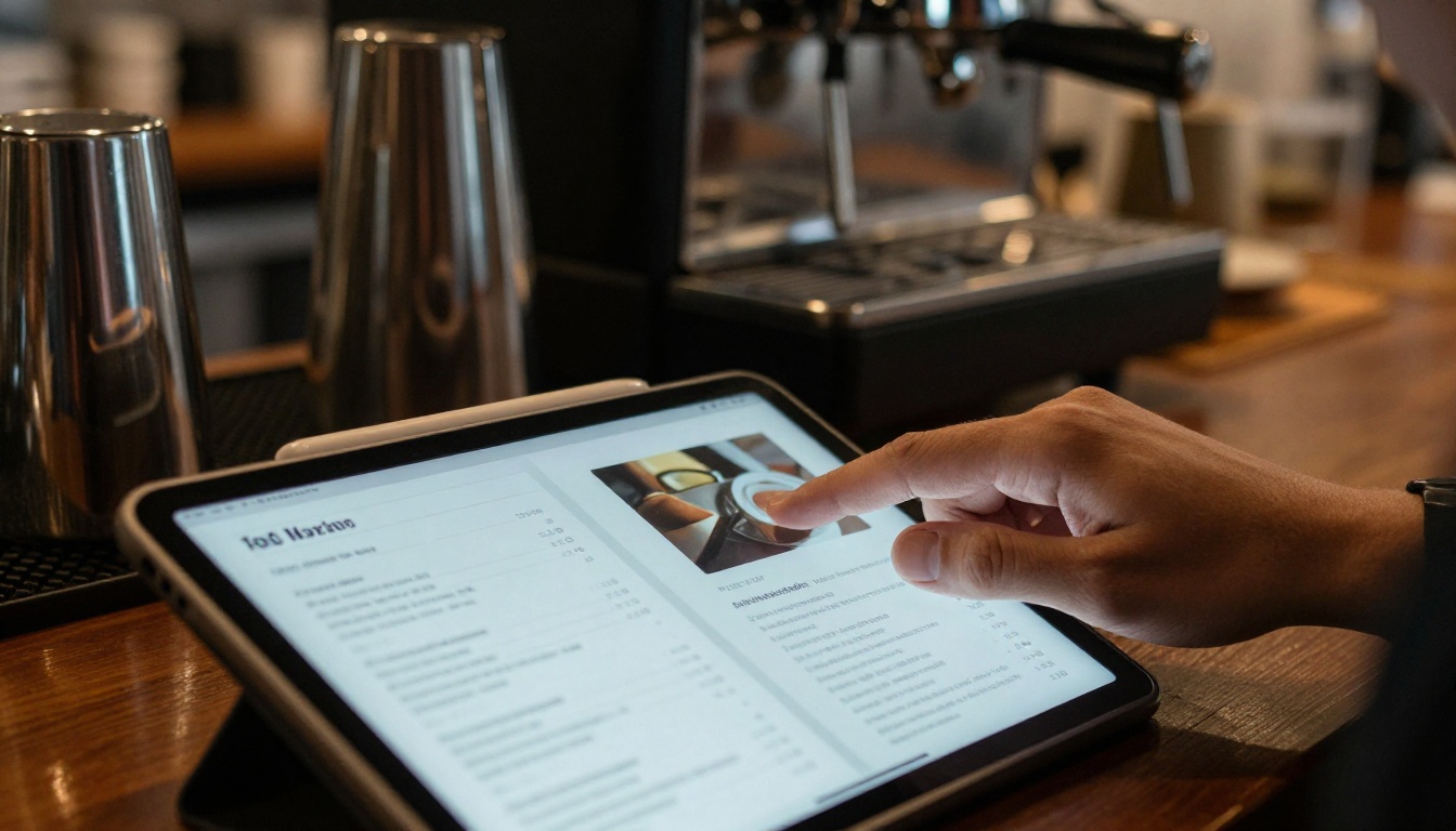
If your menu lives in a PDF or a printed file, you can turn it into an interactive page-turning menu and test changes without reprinting. Here is the process using the Restaurant Menu Creator:
- Create an account: sign up at Flipbooks AI.
- Upload your PDF: drag in your menu file and the PDF to Flipbook Converter turns each page into a flipbook page.
- Customize: add your logo, brand colors and page-turn effects. Embed a short video of your signature dish or an audio loop if it fits the mood.
- Share: use a direct link, a QR code on the table, or embed the flipbook on your website. Add a password if you want a private tasting menu.
- Track: on the Professional plan, analytics show which pages guests view most, so you can see whether your sweet spots really work.
What You Get
- ✅ No watermarks, ever
- ✅ Mobile-responsive design for guests on their phones
- ✅ Custom branding so the menu matches your room
- ✅ Offline downloads for guests with weak signal
- ✅ Embedded videos and audio
If you run a spa or wellness venue, the Spa and Wellness Menu tool offers the same setup, and the Menu Flipbook Designer suits cafes, bars and food trucks.
Plan Comparison
| Feature | Standard | Professional |
|---|
| Unlimited flipbooks | Yes | Yes |
| No watermark | Yes | Yes |
| Password protection | Yes | Yes |
| Analytics | No | Yes |
| Lead generation | No | Yes |
See the full details on the pricing page.
Your Next Step
Your menu is working every service, for better or worse. Start by trimming the list, quieting the prices and giving your best dishes the best spots. Then publish the update in minutes instead of weeks.
Ready to try it? Get started for free on Flipbooks AI, browse all flipbook tools, or compare pricing plans to choose what suits your restaurant.



