Open the analytics of almost any document you publish and the same pattern appears: most of your readers are holding a phone. Mobile reading statistics from the last several years point in one direction, and the gap keeps widening. If you send brochures, reports or catalogs as PDFs, the way people read them on a six-inch screen decides whether your work gets finished or abandoned. Platforms like Flipbooks AI exist because a fixed A4 page was never designed for a thumb.
A note on numbers before we start. Figures differ by region, industry and year, and no single survey settles the question. The ranges below reflect what published industry reports and typical publisher dashboards tend to show, so treat them as planning benchmarks and check your own data before you commit to them.

The Big Picture on Phones
Across most web traffic reports, phones account for roughly half to well over half of all page views, depending on the sector. Documents behave a little differently from web pages. Many people still open a long PDF on a laptop, but the first touch very often happens on a phone: a link in a chat, an email opened on the train, a QR code scanned at a counter.
That first touch matters. If the document is hard to read, the visitor rarely switches devices to try again. They leave.
Where Phone Reading Happens
Phone reading is opportunistic. It fills the gaps in a day:
- Commutes and waiting rooms, in short bursts of a few minutes
- Couch and bed, in the evening, with longer sessions
- Standing in a shop or restaurant, when a QR code leads to a menu or catalog
- Between meetings, skimming a report someone just shared
💡 Pro tip: Design for the interrupted reader. If someone can resume a document exactly where they stopped, completion rates tend to rise.
Phone vs Desktop at a Glance
| Behavior | Phone | Desktop |
|---|
| Typical session length | Short, often under a few minutes | Longer, with deeper reading |
| Reading style | Skim, scroll, zoom | Scan, compare, print |
| Entry point | Messaging apps, social links, QR codes | Search, email, bookmarks |
| Tolerance for load time | Very low | Moderate |
| Likelihood to zoom | High with fixed PDFs | Low |
How Long People Actually Stay
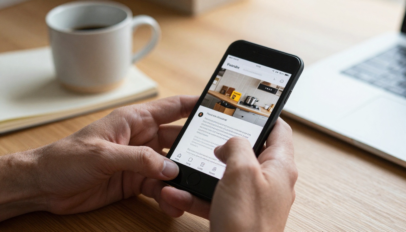
The most repeated finding in reader behavior studies is also the most humbling: attention on a phone is short. Many publishers see the median visit to a long document end within a minute or two, while a smaller group of motivated readers stays far longer. The average hides two very different audiences.
The Drop Off Curve
Most documents lose a large share of readers in the first few pages. A common shape looks like this:
- A steep fall within the opening pages, as people decide whether the file is worth the effort
- A flatter middle where the committed readers continue
- A small bump near the end for readers who jump to prices, contact details or the summary
That means page one carries more weight than any other page. A dense cover with tiny type loses people before the content has a chance.
What Slows Readers Down
- Pinching and panning across a page built for a large sheet
- Text smaller than the surrounding interface
- Heavy files that stall on mobile data
- Pages that jump or reflow when the screen rotates
⚠️ Warning: A 40 MB PDF may open fine in the office and freeze on a train. Test on a real phone with a weak connection.
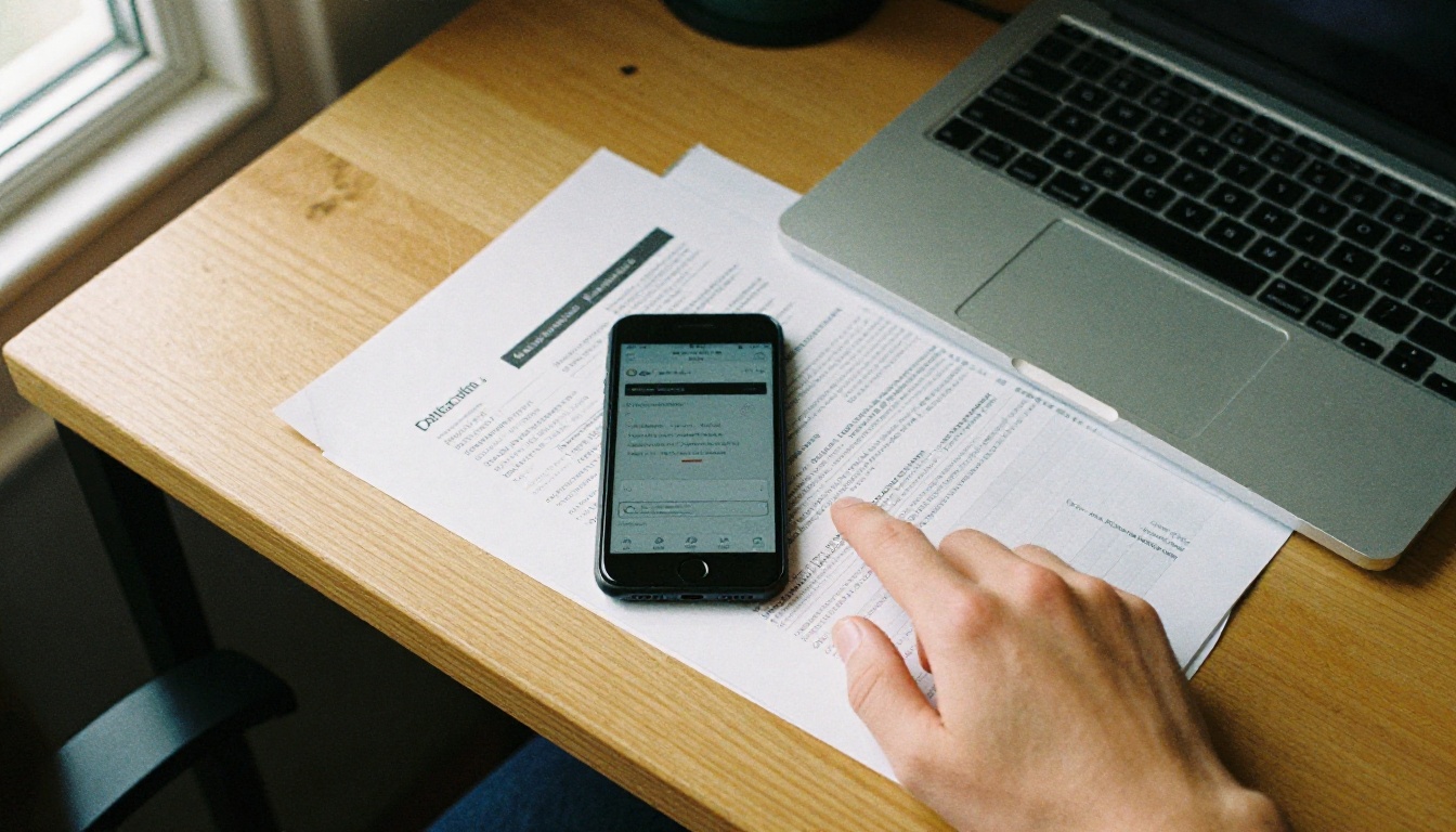
Readers do not refuse long content on phones. They refuse content that fights the screen. A well built 60 page catalog can outperform a clumsy 8 page flyer, because the experience is smooth.
Common Document Formats on Mobile
| Format | Strength on phones | Weakness on phones | Best use |
|---|
| Plain PDF | Universal and familiar | Needs zooming, slow to load | Contracts, forms |
| Responsive web page | Reflows to the screen | Loses page layout | Articles, help content |
| Flipbook | Keeps design, natural page turns | Needs a good viewer | Catalogs, magazines, brochures |
| Slide deck export | Quick to skim | Text often too small | Short pitches |
| E-book file | Adjustable text size | Limited visual design | Long form reading |
A flipbook sits in a useful middle ground. It preserves the visual layout that designers spent time on, while the viewer handles zooming, page turns and loading. You can try that with the PDF to Flipbook Converter on any file you already have.
Text Size and Line Length
Readers on phones struggle most when the effective font size drops below what they see in their messaging apps. When you design a page that will often be viewed on a phone, keep these rules in mind:
- Use body text that stays legible without zooming at typical viewing width
- Keep lines short, around 35 to 50 characters in a single column layout
- Leave generous space between blocks so a thumb can scroll without losing the place
- Put the main message in the top third of each page

When Phone Readers Read Most
Time of day shapes behavior as much as device. Evening hours tend to bring longer sessions with more scrolling, while mid day sessions skew short and task driven.
| Time window | Typical behavior | Content that fits |
|---|
| Morning commute | Quick skim, news and email | Summaries, short reports |
| Work hours | Look up a specific fact | Price lists, manuals, menus |
| Lunch break | Casual browsing | Catalogs, lookbooks |
| Evening | Longer, relaxed reading | Magazines, guides, e-books |
| Late night | Slow scrolling, high attention | Long features, portfolios |
Practical Examples
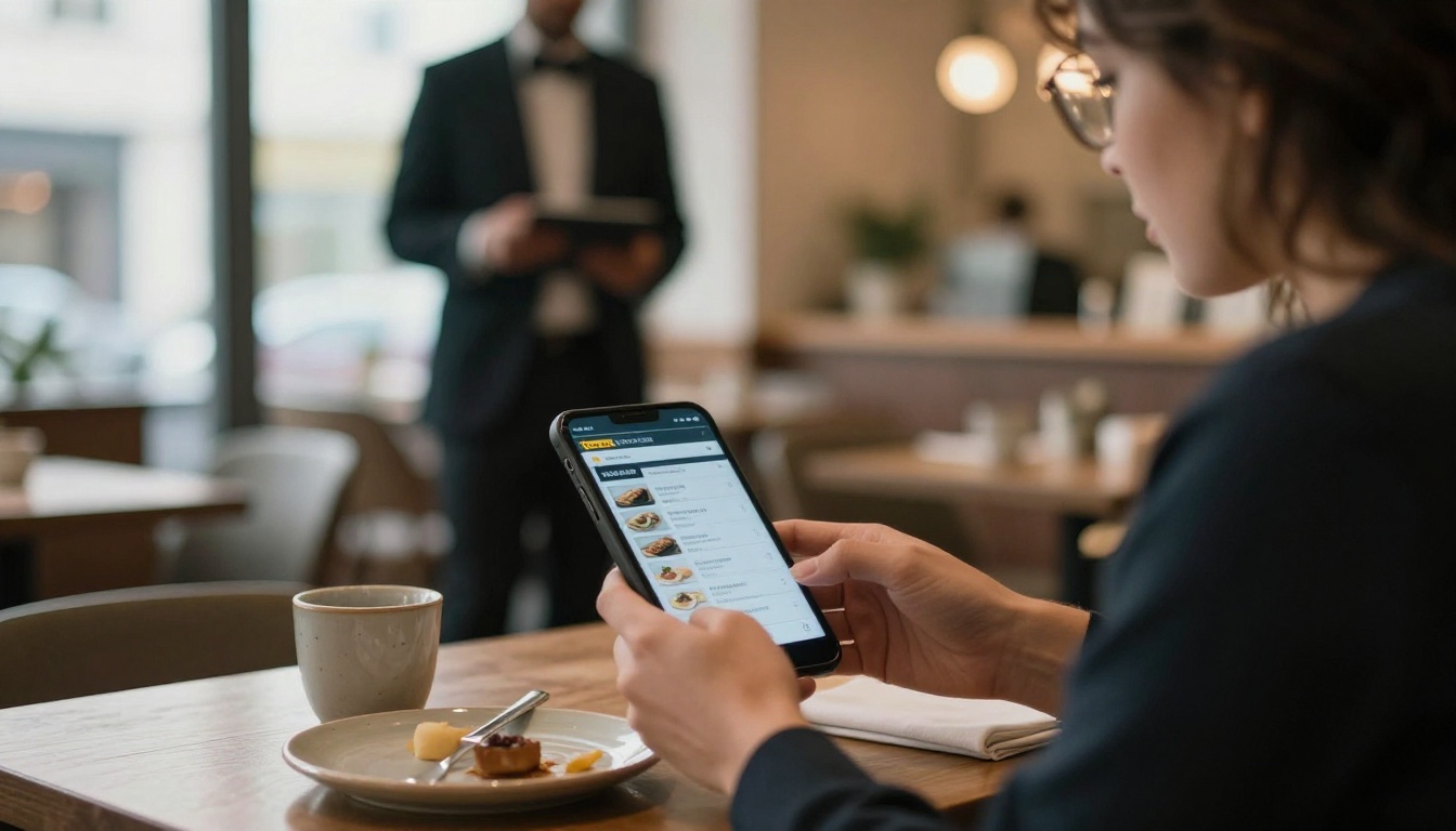
A restaurant shares its menu through a QR code on the table. The reader is standing or seated, hungry, and wants a price in seconds. A fast opening menu flipbook with large section headings beats a scanned PDF every time.
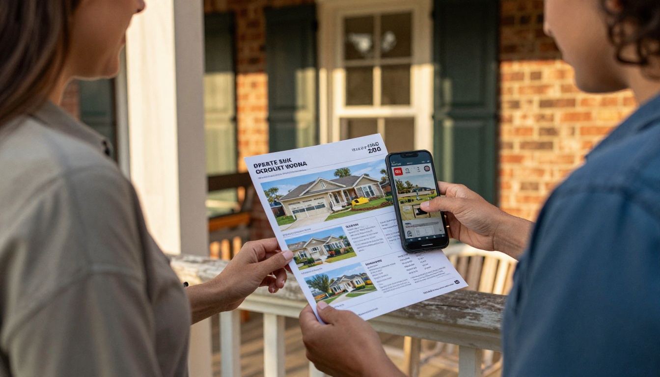
A real estate agent sends a property brochure by message. The buyer opens it in a hallway. Photos need to load first, and the price and address need to sit on the first page.
A school distributes a newsletter to parents who open it on a phone in the evening. A school newsletter with short blocks and big photos gets read; a dense multi column page does not.
What Different Audiences Do
Phone behavior is not uniform. Age, profession and context change how documents are consumed.
- Younger readers are more comfortable with vertical scrolling and often expect motion, video or audio inside a document
- Professionals open attachments on a phone to decide whether to read them properly later
- Shoppers jump straight to images and prices, rarely reading text from top to bottom
- Students read course material on phones in transit, often highlighting and returning to the same pages
Three Common Mistakes
- Publishing the print file as is. Print layouts assume a sheet of paper in the hand and a reader who will look at both facing pages.
- Hiding the point. Phone readers decide quickly. If the value is on page twelve, many will never see it.
- Ignoring file weight. Uncompressed images punish readers on mobile data and raise abandonment.

How to Make Documents Read Well on Phones
You do not need to redesign everything. A few changes to the way you publish can improve the experience a lot. Here is a simple process using Flipbooks AI.
Step by Step
- Create your account. Sign up here and open the dashboard.
- Upload the PDF. Drag in your file. The platform converts each page into a flipbook page, so you keep your original layout.
- Check the first page on a phone. Open the preview on your own device. If the title or offer needs zooming, rework that page.
- Customize. Add your logo, brand colors and page effects. Embed videos or audio where a short clip explains more than a paragraph.
- Set sharing options. Copy a direct link, grab an embed code for your website, or add password protection for private material. The Embed Flipbook on Website tool shows how.
- Measure. Professional plans include analytics and lead generation, so you can see where readers stop and which pages hold them. Compare options on the pricing page.
✅ Best practice: Publish, read the first week of analytics, then adjust the opening pages. The first three pages usually decide the outcome.
Features Worth Using on Mobile
| Feature | Why it helps phone readers |
|---|
| Mobile responsive viewer | Pages fit the screen without manual zooming |
| No watermarks | Keeps the design clean on a small display |
| Offline downloads | Lets people read without a connection |
| Embedded video and audio | Replaces long explanations with short clips |
| Password protection | Protects private reports shared by link |
| Custom branding | Builds recognition in a few seconds |

Metrics Worth Tracking
If you want to move beyond general mobile reading statistics and know how your own audience behaves, track a small set of numbers:
- Device split: the share of opens from phones, tablets and desktops
- Average time on document: compare phone against desktop
- Page drop off: the page where the largest share of readers leave
- Link clicks: how many readers act on a call to action
- Return visits: a sign that people bookmark or resume the document
Browse the tools directory to find a template that matches your format, from catalogs and reports to portfolios and travel material.

Reading Habits Worth Designing For
Looking at the patterns together, a few habits show up again and again:
- Readers scroll and swipe far more than they type
- They judge a document in seconds, then decide to stay or leave
- They prefer images and short blocks over long paragraphs
- They return to documents they find easy to resume
- They share links more readily than attachments
A travel brochure illustrates this well. A travel guide flipbook opened at the airport gate must load fast, show the destination in the first image and let the reader flip to maps without zooming.
Ready to Publish for Phones?
The pattern is consistent: phone readers are quick, interrupted and picky about format, yet they will read for a long time when the experience is smooth. Start by checking how your current documents look on a real device. Then convert your best performing PDF and compare the numbers.
Ready to create your first flipbook? Get started for free on Flipbooks AI, browse all tools and templates, or compare pricing plans to choose what works for you.



