Every month, someone at your school spends hours writing the one story that really matters: a new building opening, a record-breaking fundraiser, a change to pickup times. Then the newsletter goes out, and half the parents never see it. The writing was fine. The layout buried it. If you want a quick way to fix this, a tool like Flipbooks AI can turn your PDF into a clean, readable page, but the real work starts with knowing where newsletters go wrong.
This article walks through the most common newsletter layout mistakes, why they hurt, and what to do instead. You will find tables, checklists, and a short tutorial for publishing a better version.
How Readers Actually Scan
Before fixing anything, you need to know how people read. Nobody studies a newsletter line by line. They glance, scan, and decide in about three seconds whether to stay.
The Scan Path Is Predictable
Most readers start at the top left, sweep across the headline area, then drop down the left edge. This pattern is often called the F-pattern. Anything in the bottom right corner gets the least attention.
Size and Contrast Decide Everything
The eye lands on the biggest, darkest, most contrasted element first. If that element is a decorative banner or a clip-art apple, your top story loses before the race starts.
💡 Pro tip: Squint at your page. Whatever you can still see when blurred is what readers see first. If it is not your top story, move things around.
Mobile Changes the Rules
Most parents open school news on a phone. A two-column print layout shrinks into tiny text, and the top story may sit three screens down. Layout has to work on a small screen, not just on paper.
Mistake 1: A Decorative Banner Wins the Page
Many templates open with a huge header: school crest, cartoon border, seasonal graphics. It looks festive. It also eats 30 percent of the first screen.
Why It Hurts
The banner is the largest element, so it grabs attention. Your story starts below the fold, where many readers never go.
How to Fix It
- Shrink the masthead to a slim strip, ideally under 15 percent of the page height.
- Put the top story headline directly beneath it.
- Keep decoration to one small accent, not a frame around everything.
Mistake 2: Every Story Looks Equally Important
When all headlines share the same size, color, and weight, readers have no signal about what to read first. A fundraiser total, a lunch menu reminder, and a safety alert all shout at the same volume.
Build a Clear Hierarchy
Use three levels and stick to them:
- Lead story: the largest headline, a strong image, a short summary.
- Secondary stories: medium headlines, one or two lines each.
- Quick items: small text, bullets, dates.
Here is how that looks in practice:
| Element | Lead Story | Secondary Story | Quick Item |
|---|
| Headline size | 28 to 36 pt | 18 to 22 pt | 12 to 14 pt |
| Image | Large, top placement | Small thumbnail | None |
| Word count | 80 to 150 | 40 to 80 | Under 30 |
| Position | Top left | Middle | Sidebar or bottom |
✅ Best practice: One lead story per issue. If you have two big announcements, pick one for the lead and tease the other.
Mistake 3: The Best News Sits at the Bottom
It happens more than you would think. The principal's message goes first because of tradition, while the exciting announcement lands on page three. Readers drop off before they reach it.
Fix the Order, Not Just the Look
Ask a simple question when you plan each issue: if a reader only sees the first screen, what must they know? That answer becomes your lead.
A Real-World Example
A middle school sent a newsletter that opened with a welcome note, then a calendar, then a list of volunteer needs. The news that the school had won a state science award was in the last paragraph of page two. After moving the award to the top with a photo of the students, click-throughs on the issue nearly doubled.
Common Order Problems
- Welcome letters that run 300 words before any news appears
- Calendars placed above stories
- Sponsor logos ahead of content
- Reminders about forms taking the top slot
Mistake 4: Walls of Text
Dense paragraphs scare readers away. A top story written in a single 200-word block looks like homework.
Break It Down
- Keep paragraphs to two or three sentences.
- Add a subheading every 100 words or so.
- Use bold for the single most important phrase in each section.
- Turn lists of dates into bullets or a table.
Before and After
| Version | What Readers See | Result |
|---|
| Dense block | One gray rectangle | Skipped |
| Short paragraphs | White space, clear entry points | Skimmed |
| Short paragraphs plus bold lead sentence | Message in five seconds | Read |
⚠️ Warning: Shrinking the font to fit more words is not a fix. It pushes readers away and breaks on phones.
Mistake 5: Ignoring the Grid
Newsletters built by dragging boxes around tend to drift. Columns do not line up, margins vary, and the eye has nowhere stable to rest.
Why a Grid Matters
A grid is an invisible set of columns and margins. It tells readers where to look next. Without it, your top story floats in visual noise.
Simple Grid Rules
- Choose a one-, two-, or three-column structure and keep it for the whole issue.
- Align headlines and images to the same column edges.
- Leave consistent gaps between blocks, about the same as your line height.
- Place the lead story across the full width or the widest column.
A sketch on paper often helps. Lay out boxes for the lead, secondary stories, and quick items before touching any software.
Mistake 6: Weak or Missing Images
A top story without an image is easy to ignore. But the wrong image does just as much damage.
Image Problems to Avoid
- Tiny thumbnails that look like afterthoughts
- Stock photos unrelated to the school
- Group photos where no one is recognizable
- Images placed far from the headline they support
What Works Instead
Use one strong photo for the lead story, placed next to or directly above the headline. Real faces, real action, good light. A student holding the trophy beats a generic graphic every time.
| Image Choice | Attention Pull | Trust Level |
|---|
| Clip art | Low | Low |
| Generic stock photo | Medium | Low |
| Real school photo, cropped tight | High | High |
Mistake 7: Forgetting the Phone
A layout designed for letter-size paper often falls apart on a small screen. Pinch-and-zoom reading is a chore, and most parents will not bother.
Test Before You Send
Open your newsletter on a phone before it goes out. Ask yourself:
- Can I read the headline without zooming?
- Is the lead story visible in the first scroll?
- Do buttons and links have room for a thumb?
Print Layouts vs. Mobile-Ready Layouts
| Feature | Print-Only PDF | Mobile-Ready Flipbook |
|---|
| Text size on phone | Tiny | Readable with page-fit view |
| Navigation | Endless scrolling | Page flips and links |
| Links | Often dead or small | Clickable, trackable |
| Sharing | Attachment | One link |
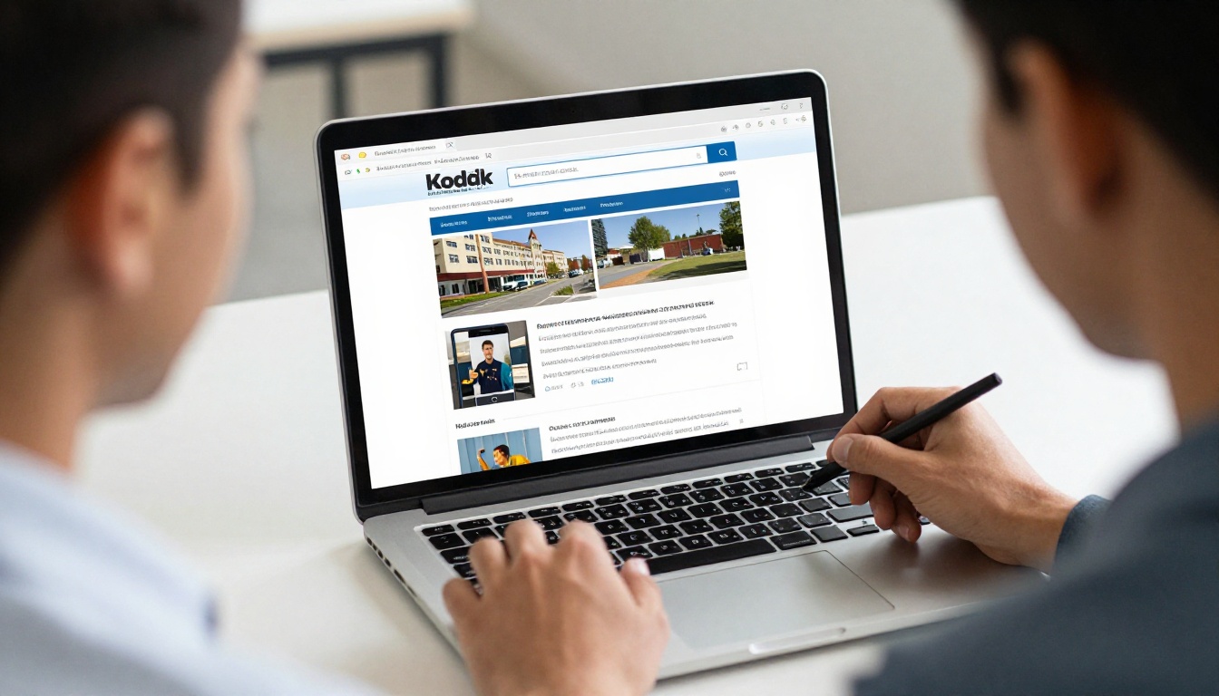
💡 Pro tip: If your newsletter is a PDF, convert it into a mobile-responsive reader so parents can tap through pages instead of zooming around.
Mistake 8: Burying the Call to Action
Your top story probably asks readers to do something: register, donate, attend, reply. If the action sits in tiny text at the end of the page, few will follow through.
Make the Next Step Obvious
- Put the action in a bold sentence near the top of the story.
- Use a clear verb: "Register by Friday."
- Repeat it once at the end of the story.
- Include one link, not five.
Example
Weak: "More information about the spring fair may be found in the attached document."
Better: "Sign up to bake or volunteer by March 3. The spring fair needs 20 more helpers."
How to Publish a Cleaner Newsletter with Flipbooks AI
Once your layout is sound, you still have to deliver it in a format people will open. Here is how to turn your finished PDF into a readable, shareable page.
Step 1: Create Your Account
Head to Flipbooks AI and sign up. You can start without a long setup.
Step 2: Upload Your PDF
Export your newsletter as a PDF and upload it. The platform converts each page into a flipbook automatically. For school-specific needs, try the School Newsletter Creator or the Newsletter Flipbook Publisher. If you already have a file, the PDF to Flipbook Converter handles it in one step.
Step 3: Customize the Look
Add your school colors, logo, and background. Pick page-turning effects that feel simple, not distracting. You can also embed short videos or audio, such as a principal's thirty-second welcome, right inside the issue. There are no watermarks, so the page stays yours.
Step 4: Share It
You have several options:
- Send a direct link by email or text.
- Use the embed code to place it on your school website.
- Add password protection for staff-only or parent-only issues.
Step 5: Track What Works
With the Professional plan, analytics show which pages readers view and how long they stay. That tells you whether your top story is being seen. Lead generation tools can capture sign-ups for volunteer lists. Check pricing plans for details, and offline downloads let families keep a copy.

A Quick Layout Audit You Can Run Today
Grab your last issue and score it. Give one point for each yes.
| Question | Yes / No |
|---|
| Is the top story the biggest element after the masthead? | |
| Can a reader find the main news in under five seconds? | |
| Do headlines follow three clear size levels? | |
| Are paragraphs under four sentences? | |
| Does the lead story have one strong, real photo? | |
| Is there a single, bold call to action? | |
| Does the page read well on a phone? | |
| Do columns and margins line up? | |
7 to 8 points: You are in good shape. 4 to 6: Fix the hierarchy first. Under 4: Rebuild the first screen from scratch.
A Checklist for Your Next Issue
Before you hit send, run through this list:
- ✅ Lead story chosen and placed top left
- ✅ Masthead trimmed to a thin strip
- ✅ Three headline levels applied
- ✅ One real photo next to the lead
- ✅ Paragraphs short, key phrase in bold
- ✅ Call to action visible without scrolling
- ✅ Tested on a phone
- ✅ Exported as a PDF and published as a flipbook
Get the Team on the Same Page
Layout problems often come from habit. The newsletter has always opened with the welcome letter, so it still does. Changing that takes a conversation.
Bring Evidence
Show colleagues two versions of the same issue, one with the old order and one with the lead story on top. Ask which one they would read on a busy morning.
Set Simple Rules
- One person decides the lead story each month.
- Every contributor gets a word limit.
- The layout template is locked, so the grid stays consistent.
- Nobody adds a new banner without a reason.
Ready to Put Your Best Story First?
Your top story deserves to be seen. Fix the hierarchy, trim the banner, cut the walls of text, and test on a phone. Then publish it in a format families will actually open.
Get started for free on Flipbooks AI, browse all flipbook tools, or compare pricing plans to pick what works for your school.



